10 Smartphone and Tablet Games for Designers
As a designer, you spend most of your time making things look good. It's understandable that you would want the apps you use to look good as well. It'd be quite strange if you didn't really. There's thousands upon thousands of mobile games out there, be they for tablet or smartphone, iOS or Android. You have to have some way to pick the ones you play around with. What the screencaps and icon look like are of the least frivolous criteria you can choose.
Of course, good design doesn't mean good gameplay, and good design most certainly doesn't guarantee the game works well on your particular device. These are other criteria, but you can't know of these for sure until you've downloaded them. The icon and screencaps are the things you go by when first choosing to download or not to download a game.
We've collected 10 of the best looking mobile games out there and we'll show them off to you for a dual purpose: first of all, they're great design inspiration and secondly, they might just be your cup of tea for wasting time when in public transportation or when you have 10 minutes to kill. So take a look down below and pick your favorite!
Dots
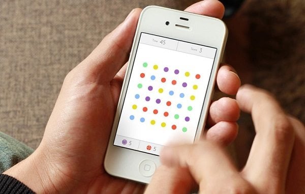
Dots is a beautiful minimalistic game much in the vein of games like Connect-4. It's a great experience with beautiful graphics and hand-drawn achievement illustrations. Design-wise, the game is in the vein of flat design that is so popular nowadays. The game is highly addictive and is available for iOS, iPad and Android devices. Definitely worth checking out!
Hidden Doodles
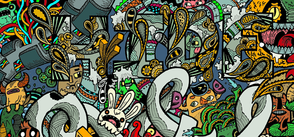
Hidden Doodles is a beautiful spot the difference game that features beautiful graphics and that is guaranteed to keep you entertained for hours on end. It can be called a spot the hidden object game in the vein of the “Where's Waldo?” books we all played with as kids, but it's much more than that. First of all, it has three gameplay styles: “Catch them”, “Wave them” and “Find them”. While “Find Them” is pretty much an against-the-clock “Where's Waldo?”, “Catch Them” lobs various doodled creatures in an arc across the screen and you have to catch the ones you're looking for, while “Wave Them” starts you off with a clutter of creatures in the middle of the screen which you have to clear out by dragging the ones you aren't looking for away from the ones you are. It's a great game and you're guaranteed to have hours of fun with it.
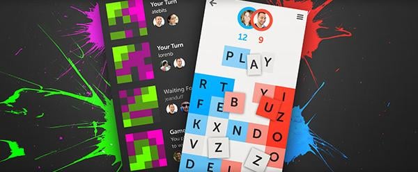
Letterpress is a complex word game created by the developer of Tweetie, which eventually became the official Twitter app. It's a minimalist two-player game. You and your adversary are presented with a 5x5 grid of various letters. You can tap any letters in order to create a word. After your turn, the tiles you used turn blue. The tiles your opponent uses turn pink. If you make all the tiles around a blue tile blue, it will turn a darker shade of blue, which means that, even should your opponent use it, it won't change color anymore. The goal of the game is to have more tiles than your opponent. It's a simple concept that's extremely fun and addictive.
The Font Game is a change of pace in this list, as it's less geared toward casual gaming and more oriented towards designers and typography aficionados. You choose one of the three difficulty settings (Somewhat Difficult, Rather Difficult and Exceedingly Difficult) and you're presented with the word “fargo” in a random font that you have to identify. Obviously, as the difficulty increases, so does the obscurity of the fonts you have to identify. The game has another important aspect as well – The Terminology Game, wherein you're presented with a character that has a certain portion highlighted. You then have to pick the name that certain portion of the character has. All in all, The Font Game is a great way to familiarize yourself with various fonts and typography terminology.
Helvetica vs. Arial
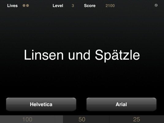
It's hard to write an article containing typography games and other game resources for designers without mentioning Helvetica vs. Arial. It's, simply put, the game that highlights the biggest typography-related ongoing gag in the design industry other than “Comic Sans is terrible”.
Basically, it's a game that presents you with a random text written in either Helvetica or Arial and lets you guess which one of the two fonts it is. Simple and yet surprisingly difficult. Play it and really hone your recognition skills.
Kern
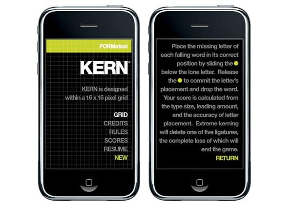
Kern is a nifty little game that teaches you kerning. Kerning is the typography practice of adjusting the spaces between characters in a proportional font, adjusting spaces between individual letter forms. You're presented with a random word missing a letter at a variable point size. You place the letter in its proper space and are scored based on the size of the type, the leading height and how well you've placed it. It's a fun game that helps you enhance and keep your kerning skills on par.
Type:Rider
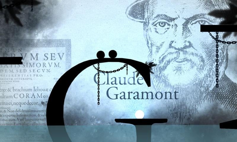
Type:Rider is the first game by the European cultural TV channel Arte. It's yet another typography game, but it's more focused on the history of type. You play as two dots and roam through the history of typography, solving puzzles and learning. You start with prehistoric cave paintings and go through the most famous fonts – Garamond, Helvetica, Times New Roman and up to the pixel fonts of the 2000s. It's a beautifully designed game with an extremely immersive atmosphere. A must-play for typography enthusiasts everywhere.
Typography* Star
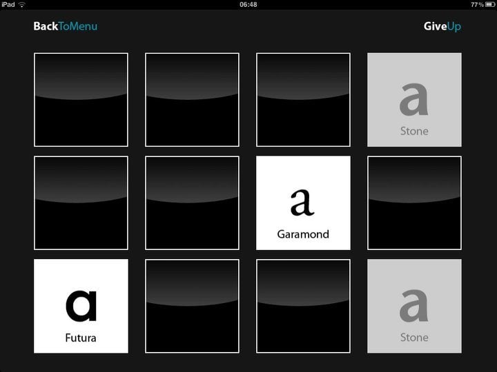
Typography* Star is a fun memory game. You're presented with a number of cards each of which contains a font and you have to pair the matching ones. The memory type gameplay makes you remember various font names and their shapes, making you able to quickly identify various fonts. While it's not the most innovative game on this list, it's surely a game that helps hone your typography skills and knowledge.
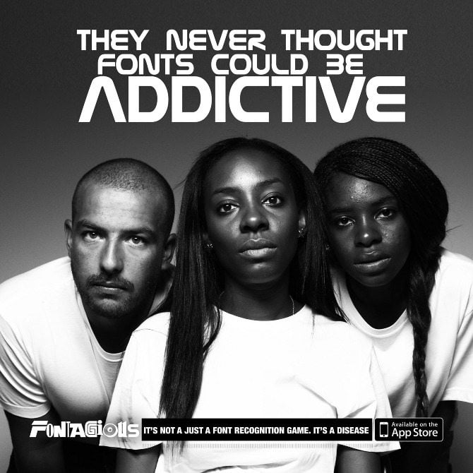
Fontagious is a cool mobile game that has you naming various famous fonts you're bound to bump into your everyday life. You see three tips written in the font you have to guess and you have to write the name of the font before the timer runs out. It can enhance your typographic knowledge – training you to easily identify famous fonts and it's a pretty cool time-waster at the least.
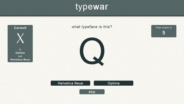
Type War is a game much in the vein of Helvetica vs. Arial, but with a much wider selection of fonts. Where Helvetica vs. Arial makes you distinguish between the two fonts over and over again, Type War has a lot of similar-looking fonts that you have to properly identify. Now you can not only ask yourself if it's Helvetica or Arial, but also if its Times New Roman or Baskerville, Helvetica Neue or Optima and many other tough calls like that.
That concludes our list of the most exciting and well-designed games you should check out on your mobile apps, be they Android or Apple, smartphone or tablet. Which one was your favorite? Did we miss any great games? Let us know in the comments section below!
Don’t miss out these all-time favourites
- The best hosting for a WordPress website. Tap our link to get the best price on the market with 82% off. If HostPapa didn’t impress you check out other alternatives.
- Monthly SEO service and On-Page SEO - to increase your website organic traffic.
- Website Installation service - to get your template up and running within just 6 hours without hassle. No minute is wasted and the work is going.
- ONE Membership - to download unlimited number of WordPress themes, plugins, ppt and other products within one license. Since bigger is always better.
Get more to your email
Subscribe to our newsletter and access exclusive content and offers available only to MonsterPost subscribers.


Leave a Reply
You must be logged in to post a comment.