10 Ways To Screw Up Your WordPress Theme
Don’t get me wrong, I’m a huge fan of DIY and I believe that nothing inspires more than a website owner, who is doing his very best to set everything up by himself. However, in some cases, involving professionals is crucial and defines your website integrity.
Make sure the content on your homepage is hard to read
Here is the deal with the content on your homepage, this is the first and main channel of your communication with your audience or potential clients. Once a customer opens your website, he will try to find all the needed info regarding your business or services right on the main page and, let’s admit, this is quite reasonable. Sometimes, things go wrong and this happens:
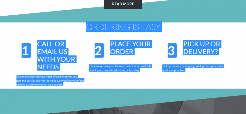
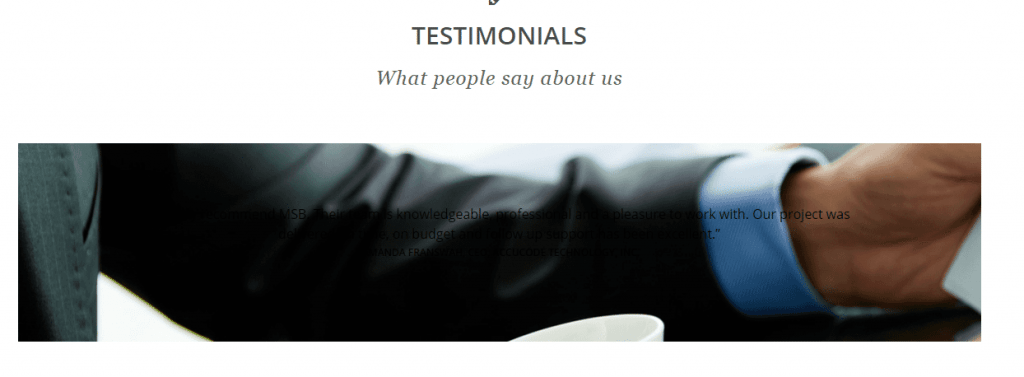
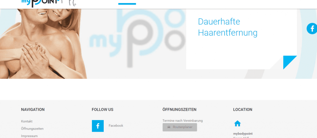
No, this is not a countdown to a rocket launch, this is white text on a white background; Look, I’ll show you how to solve this tricky puzzle.
So in order to understand how a customer can work with this company, he has to highlight the text on his own. There is nothing bad at placing white text on the white background, but don’t forget to outline this text, so the customer could at least see it. Otherwise, it will just look like your website has a bunch of blank blocks without any info.
Such kind of issues are very popular, let’s take a quick look at a few more examples and move on.
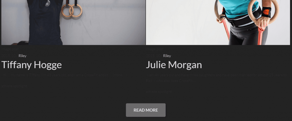
Sharing success stories is a crucial part of a good gym or sports community website. However, it’s quite annoying when you see a story and you are excited to dive into it and get some motivation, but it’s impossible to read the actual post because of the wrongly picked color. Can you see anything here besides the names and pictures?
Make sure your content is easy to read since it affects your success and profit fundamentally.
Pin as many things on the main page as possible
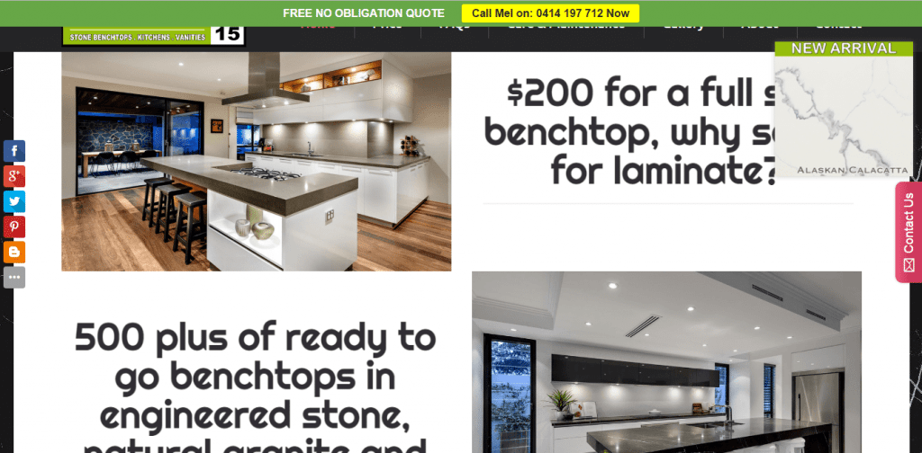
Trying to provide a client with as much information as possible is a good attitude, but try not to overload your website with banners, pinned panels, and ads. If you are not following my thought, here is what I am talking about:
So basically, when you scroll this website, you have 5 elements following along with you right over the homepage, covering the actual content and making it hard to read.
I actually like this website in general, it seems to me that these guys understand the whole idea of how crucial is presenting all the important content to the customer on the homepage. However, they should consider working on cleaning up the mess on the main page, it will definitely make their website more attractive and user-friendly.
Use images with the low quality and/or wrong sizing
Each website theme is carefully tailored by the designer with the expectations that you will use images of correct sizing and quality. There is always a reason why the slideshow images should be wide and informative or why each post of your blog should have the same sizing.
Of course, some website owners simply disregard all the main concepts of their theme and post the first picture available in google, even if it has wrong sizing or low quality.
Prior to going live with your website, make sure you prepare all the graphic materials and tune all the slideshow plugins correctly, this is the face of your company after all.
Don’t post any images at all, just plain text
To be honest with you, I am not even sure what is better: low-quality pictures or missing pictures all over the website.
You should always check if the path to your pictures is correct and all the graphic elements of your website are loaded once someone opens it. Missing image pictograms are not sexy at all.
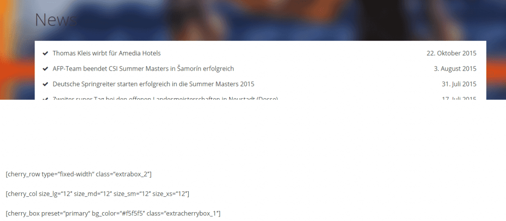
If some necessary plugins are not turned on, just leave it as is
I understand that sometimes it’s hard to set up the plugin correctly. Do not hesitate to contact specialists and let them handle this for you. Of course, you can try to figure it out yourself, but if you see that it still doesn’t work, let professionals do their job, it will save your nerves and, believe me, you will be happy with the result you’ll get.
Trying to get your hands dirty and apply changes to the code of the working plugins without HTML/CSS/JS knowledge may result in breaking the whole plugin or page structure.
Do not post anything on your main page
Slideshows and showcases are amazing tools for featuring key information in a beautiful way. However, you shouldn’t neglect the whole body area of your website. There is plenty of space you may use for grabbing customers attention and proving him that he should use your services or buy your products. Why leave it empty?
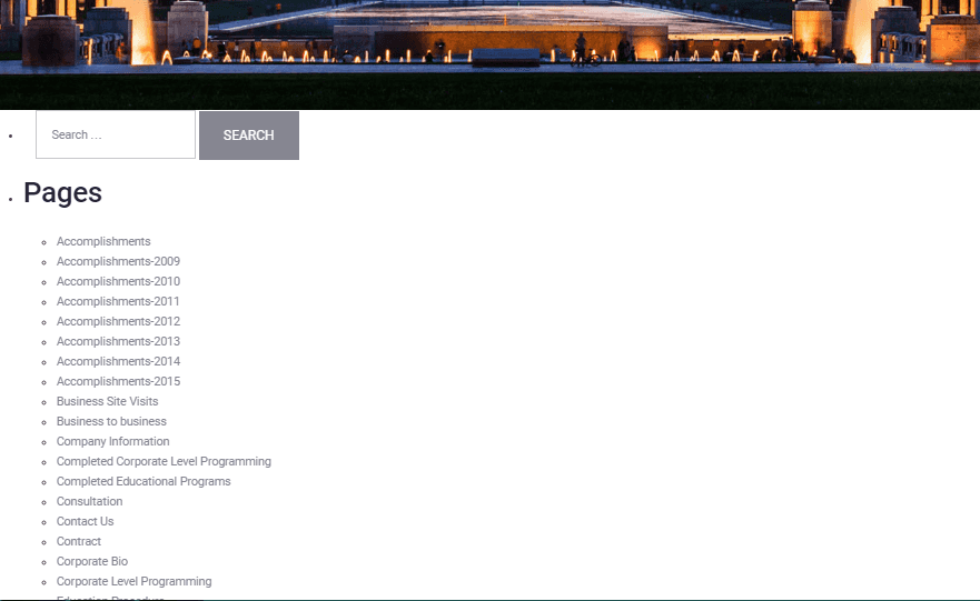
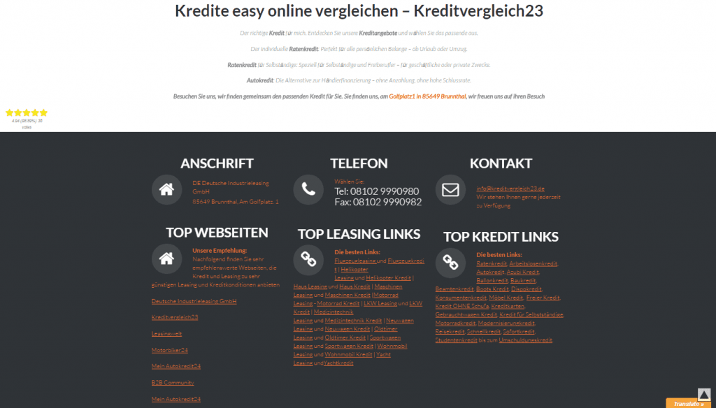
Make a huge long read out of your footer
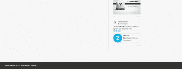
There is nothing bad about using your footer for giving additional links to a customer or showing him your twitter account feed, but you should know where to stop and say: ‘That’s enough’.
If you have too many links or subcategories lists, you can make a cute drop-down menu and if you are using a twitter feed plugin, just adjust its height, so it wouldn’t use so much space.
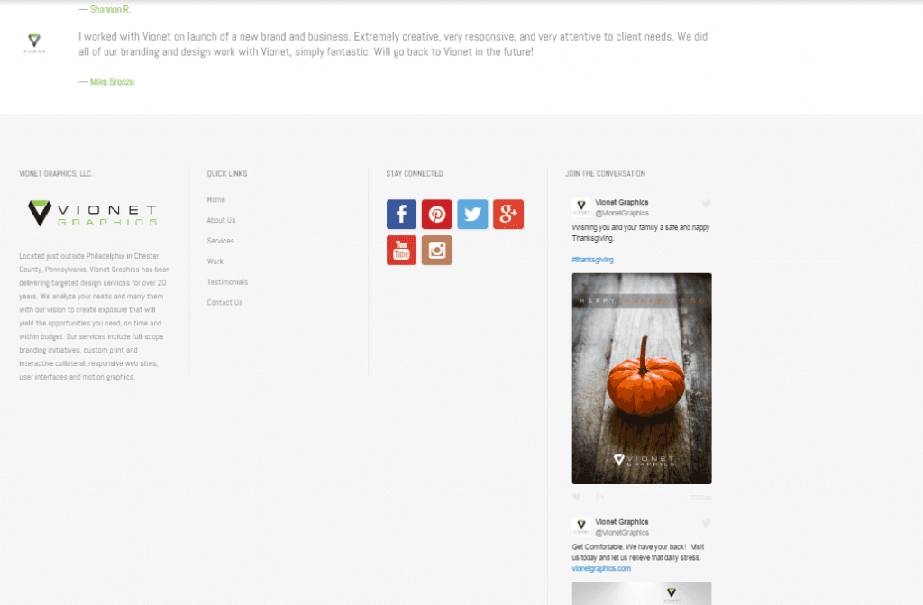
Try not to make another page of content out of your footer area and use this space properly. Always remember: Brevity is the soul of wit.
Make your fixed menu as big as possible
If you decide that you want your menu to be fixed, you should remember the main rule: it should be useful, not annoying.
Yes, it is quicker to navigate a website with the fixed menu on the top, but the size of the menu bar should be reasonable and should not steal too much space from the visitor’s screen.
Free space matters and if it doesn't, everyone would pin their drop-down menus all over their websites.
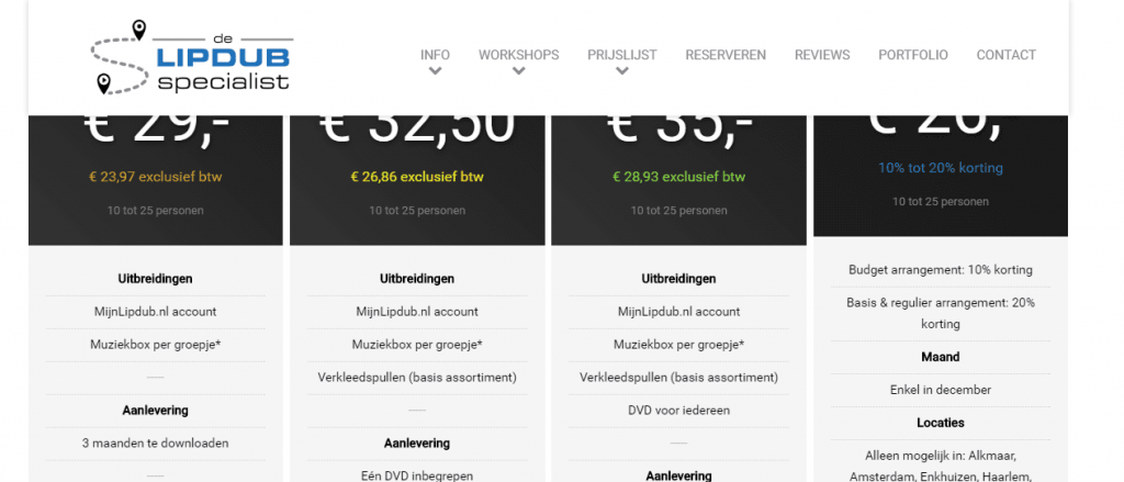
As you can see, the main issue here is the size of the logo, since it makes the whole bar too big. The best solution in this situation would be making your navigation bar get smaller when a customer is scrolling down and the bar becomes pinned on the top. So originally your logo will be big, but it will get a little bit smaller when you scroll the page down. It will help to save some space for your customer and give him a wider view on your website’s content.
Place pictures on other pictures and then sprinkle some pictures on top of them
It’s great when you have a lot of pictures from company events and there is nothing bad in showing them to your customers using the slideshows or showcases. But things get complicated when you decide to use the same kind of pictures as a background.
As a result, your website will look like a huge collage and your eyes will not always see where one picture ends and the other one begins, it feels really weird.
Do not structure your content
There are no exact rules that will tell you how to structure your content, it is totally up to you. If you are considering possibilities of getting more customers and getting their attention right away, you should work on structuring your content on the main page.
It is not a good practice having a messy homepage, so you should definitely think about how you can organize your content in the most efficient, but also a beautiful way.
As you can see in this example above, once you enter the website, your mind will not know for sure, what information is the most important and deserves your attention the most. It is hard to say that these guys are not giving enough info, they have plenty. But some work on organizing it properly will definitely benefit their website appearance and business as well.
Are you having trouble with your website design or functionality?
Of course, you can try and figure them out on your own, but as you can see, sometimes you should consider getting some help from professionals. On our end, we really care about the customers’ experience with our products, that is why we have our TemplateMonster Service Center. Our guys will transform the chosen template to a unique working website and will ensure that your project is ready to go.
Also, we recently started our new web studios catalog that will help you to locate our partners near you and work with their studio on getting your website up and going.
Feel free to give us your feedback in the comments section below, any suggestions and questions are always welcomed.
Get more to your email
Subscribe to our newsletter and access exclusive content and offers available only to MonsterPost subscribers.











Leave a Reply
You must be logged in to post a comment.