Analyze 100 Successful Landing Pages and Choose the Best Conversion Strategy
We have reviewed 100 top landing pages owned by such giants as Google, Unbounce, and UpWork. They are impressive but not perfect. Today we are excited to share the research results, along with some meaningful statistics and best practices. We hope that they will help you build highly converting landing pages that will work towards your financial success.
The list is pretty long, so use this mini-navigation to quickly get to the section you are interested in.
- 1-10: Marketo, BigCommerce, Shopify, Unbounce, Optimizely… >>
- 11-20: VWO, iPhone 7, Hootsuite, Formstack, Magento… >>
- 21-30: MOZ, WordPress, Wix, Squarespace, Buffer… >>
- 31-40: SquareUp, Google Cloud, Jira, UpWork, Hubspot… >>
- 41-50: Dropbox, Spendee, Oculus Rift, InVision, Evernote… >>
- 51-60: Team Treehouse, Apple Plug, Bukket, Tilda, Google Ara… >>
- 61-70: Stripe, prismic.io, Cornerstore, Freshform, Leadfeeder… >>
- 71-80: Sceatt, Yubl, Todoist, Simple, Stencil… >>
- 81-90: Plume, Pearr, Blendle, SumoMe, ConversionXL… >>
- 91-100: Paste, Workstack, WooCommerce, Quick Sprout, Medium… >>
- Consolidated statistics >>
- Optimized Landing Page Templates >>
The analysis is based on 12 parameters which are explained in the first section.
Stop for a moment and take a look at a beautiful example of the innovative all-in-one landing page template.
Lintense - All-in-one Landing Page Template
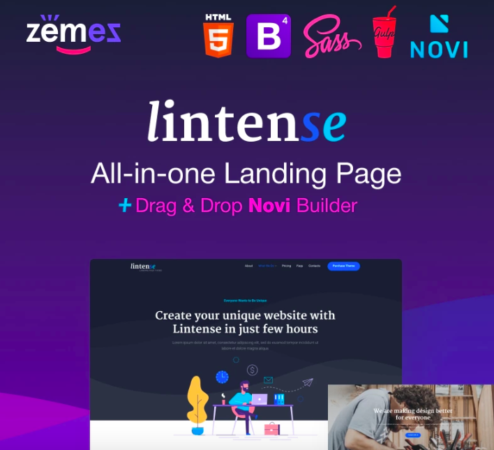
With Lintense, it is easy to build the selling structure of your landing page as the main and mega-important tool for increasing the conversion of the site. Each structure should meet the needs of the target audience and maximize the advantage of the company/product/service. Lintense is an all-in-one landing page, which will help you to build a powerful web page with no hassle and technical skills required. The template comes with 5 perfectly designed templates, SEO-optimized code, effective plugins and technologies, regular updates and dedicated 24/7 support. HTML5 & Bootstrap-based layout is fully responsive and cross-browser compatible. Novi Builder allows to create a web page quickly and effectively. Innovative web practices implemented in the product will get your online project to the new quality level.
More features:
- Parallax effect
- Easy installation
- Top-notch performance
- Exceptional design
- Valid and clean HTML code
- Google web fonts
- Google map
- Accurate documentation
Need some cool data visualization ideas? Professional slides will get the job done.
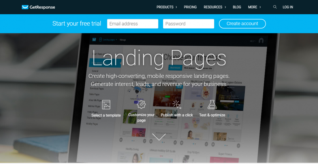
GetResponse
GetResponse is the company you would want to build your new landing page because their own is above average. The design looks a bit dull but you’ll get persuaded to start a free trial by the compelling copy and smart infographics. The only serious weakness is the lack of any testimonials or other social proof.
- Length – The length of the page layout –Average
- Copy length –The number of words, including testimonials and headlines. ‘Longer’ can result in poorer outcomes when it comes to conversion. Sometimes, you’ll want to get straight to the point rather than overwhelm your visitors with much information– 555 words
- Navigation removed – There should be no navigation. Most landing pages also serve as homepages, so it is impossible to remove the navigation completely. However, it can be hidden inside a hamburger button or moved to the bottom– No
- Call to action above the fold – Whether the button is accessible instantly (it should be perfectly clear what you want visitors to do next) – Yes
- Contrasting buttons – Whether it is highlighted with color, and visitors can find it at once – Yes
- Multiple action alls – Often you’ll see one CTA button at the beginning of the page and one in the end – Yes
- Social proof – Testimonials, influencer reviews, media references, etc – No
- Video/Animation – Using product or service promotion videos and animations is can make wonders to the conversion rates – Yes
- Benefit-oriented copy – It should be scannable and focused around at least one user pain point – Yes
- Numbers used – Users prefer landing pages that contain numbers because they usually want to learn more data, stats, and calculations on the topic– Yes
- Live chat – A contact form is OK but it’s even better if visitors can actually have a live conversation – No
- Load time – Slow pages lose traffic due to high bounce rate scores – 1.79s
Quintly
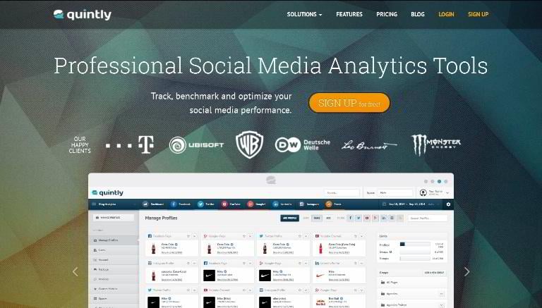
Quintly would be a good example of a company seeking to increase its average conversion rate with animated GIFs, good graphics in landing designs, but the sticky navigation bar and clumsy Sign Up button ruins the show for them.
- Length – Average
- Copy length – 279 words
- Navigation removed – No
- Call to action above the fold – Yes
- Contrasting buttons – Yes
- Multiple CTAs – Yes
- Social proof – Yes
- Video/Animation – Yes
- Benefit-oriented copy – Yes
- Numbers used – No
- Live chat – No
- Load time – 2.29s
Agile CRM
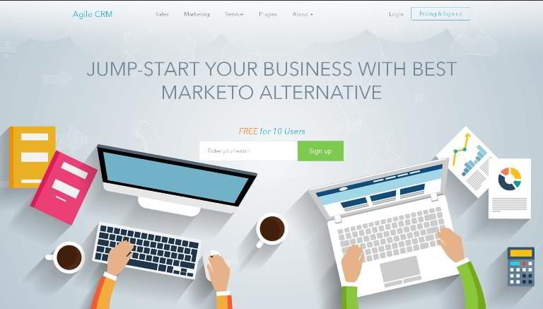
This sample of aggressive copy resembles a poor attempt to declare a marketing war rather than a value proposition. The Agile CRM marketers build their campaign around the name of their way more recognized competitor, it looks rather desperate. However, the design of the page is pretty well balanced, and all the components work seamlessly to make visitors convert.
- Length – Average
- Copy length – 252 words
- Navigation removed – No
- Call to action above the fold – Yes
- Contrasting buttons – Yes
- Multiple action calls – Yes
- Social proof – Yes
- Video/Animation – Yes
- Benefit-oriented copy – Yes
- Numbers used – Yes
- Live chat – No
- Load time – 1.81s
Marketo

To see the increase in leads, Marketo needs to get more personal with their simple landing design. Enticing and empathic copy increases conversion, and this one, though short enough, simply doesn’t. And the load time is horrible, by the way.
- Length – Short
- Copy length – 61 words
- Navigation removed – Yes
- Call to action above the fold – Yes
- Contrasting buttons – Yes
- Multiple action calls – No
- Social proof – Yes
- Video/Animation – No
- Benefit-oriented copy – No
- Numbers used – No
- Live chat – No
- Load time – 3.92s
BigCommerce
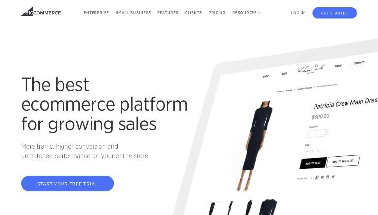
BigCommerce website templates and landing page will leave you impressed with its smart copy and minimalist design, but the sticky navigation bar spoils the picture.
- Length – Average
- Copy length – 370 words
- Navigation removed – No
- Call to action above the fold – Yes
- Contrasting buttons – Yes
- Multiple action calls – Yes
- Social proof – Yes
- Video/Animation – No
- Benefit-oriented copy – Yes
- Numbers used – Yes
- Live chat – No
- Load time – 2.67s
Shopify Free Trial
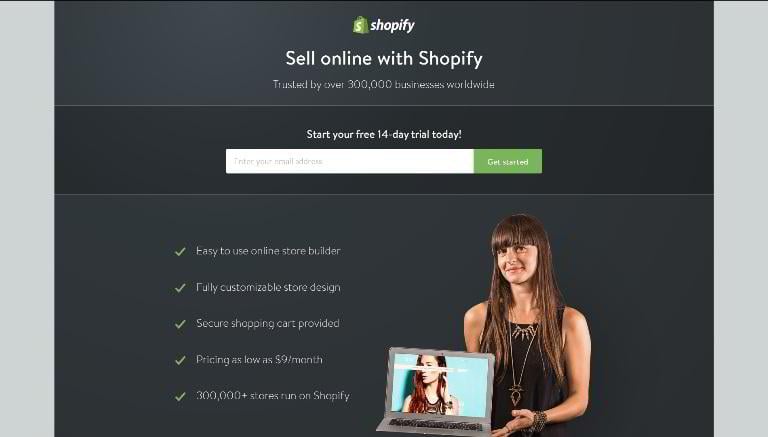
This one is extremely good. The Shopify team knows how to build pages that attract leads. The page is short yet intense, with media references included.
- Length – Short
- Copy length – 46 words
- Navigation removed – Yes
- Call to action above the fold – Yes
- Contrasting buttons – Yes
- Multiple action calls – No
- Social proof – Yes
- Video/Animation – No
- Benefit-oriented copy – Yes
- Numbers used – Yes
- Live chat – No
- Load time – 882ms
Unbounce
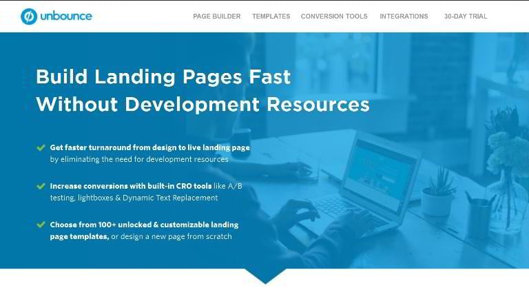
Unbounce’s internet marketers don’t seem to use their huge expertise for optimizing their long landing page. It is overloaded with text and very slow.
- Length – Long
- Copy length – 1484 words
- Navigation removed – Yes
- Call to action above the fold – No
- Contrasting buttons – Yes
- Multiple action calls – No
- Social proof – Yes
- Video/Animation – Yes
- Benefit-oriented copy – Yes
- Numbers used – Yes
- Live chat – No
- Load time – 4.66s
Optimizely
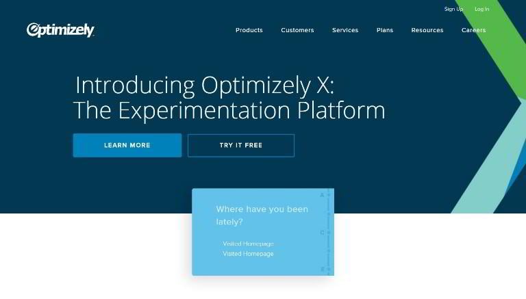
Optimizely is the main competitor of Unbounce. Optimizing their landing page would start with reducing the load time and removing navigation.
- Length – Average
- Copy length – 241 words
- Navigation removed – No
- Call to action above the fold – Yes
- Contrasting buttons – Yes
- Multiple action calls – Yes
- Social proof – Yes
- Video/Animation – No
- Benefit-oriented copy – Yes
- Numbers used – Yes
- Live chat – No
- Load time – 4.77s
MixPanel
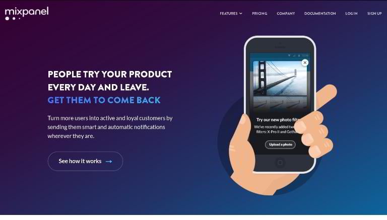
Seems like folks from MixPanell don’t want people to try out their product – the “See how it works” button in this otherwise smart design is hardly noticeable.
- Length – Long
- Copy length – 503 words
- Navigation removed – No
- Call to action above the fold – Yes
- Contrasting buttons – No
- Multiple action calls – Yes
- Social proof – Yes
- Video/Animation – No
- Benefit-oriented copy – Yes
- Numbers used – No
- Live chat – No
- Load time – 2.23s
To the top To the statistics Landing page templates
The Landing Page Course
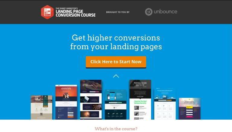
Too many outbound links and not enough clarity make the landing design look controversial. The header and the footer are nice, but the central part (where all the persuasive stuff is supposed to be) is oddly structured.
- Page length – Average
- Copy length – 392 words
- Navigation removed – Yes
- Call to action above the fold – Yes
- Contrasting buttons – Yes
- Multiple action calls – Yes
- Social proof – Yes
- Video/Animation – No
- Benefit-oriented copy – Yes
- Numbers used – Yes
- Live chat – No
- Load time – 2.22s
Hootsuite
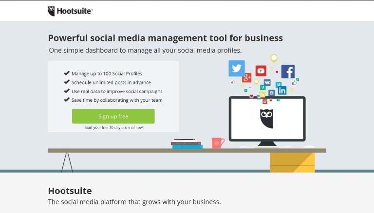
Sometimes, landing pages get our standing ovations – like this masterpiece by Hootsuite. It has everything you’ll need to convert your visits – nice buttons, feature lists, and action-oriented copy. We would add just one more detail – a short educational video.
- Length – Short
- Copy length – 261 words
- Navigation removed – Yes
- Call to action above the fold – Yes
- Contrasting buttons – Yes
- Multiple action calls – Yes
- Social proof – Yes
- Video/Animation – No
- Benefit-oriented copy – Yes
- Numbers used – No
- Live chat – No
- Load time – 1.45s
Formstack
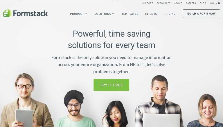
Conversion rates are typically reduced by many outbound links, so the great copy we can see here simply won’t deliver.
- Length – Average
- Copy length – 472 words
- Navigation removed – No
- Call to action above the fold – Yes
- Contrasting buttons – Yes
- Multiple action calls – Yes
- Social proof – Yes
- Video/Animation – No
- Benefit-oriented copy – Yes
- Numbers used – Yes
- Live chat – No
- Load time – 1.67s
DigitalOcean
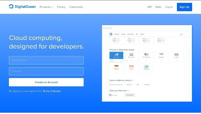
The dynamic price table displaying monthly and hourly rates plus the technical specifications for each plan is cool. But we would dump the stick-to-top navigation bar.
- Length – Average
- Copy length – 167 words
- Navigation removed – No
- Call to action above the fold – Yes
- Contrasting buttons – Yes
- Multiple action calls – Yes
- Social proof – Yes
- Video/Animation – Yes
- Benefit-oriented copy – Yes
- Numbers used – Yes
- Live chat – No
- Load time – 1.21s
Lumosity

This one, with a sticky CTA button and a background video, is awesome. We would add some social proof, though.
- Length – Average
- Copy length – 356 words
- Navigation removed – Yes
- Call to action above the fold – Yes
- Contrasting buttons – Yes
- Multiple action calls – Yes
- Social proof – No
- Video/Animation – Yes
- Benefit-oriented copy – Yes
- Numbers used – Yes
- Live chat – No
- Load time – 784ms
Magento Enterprise for Fashion
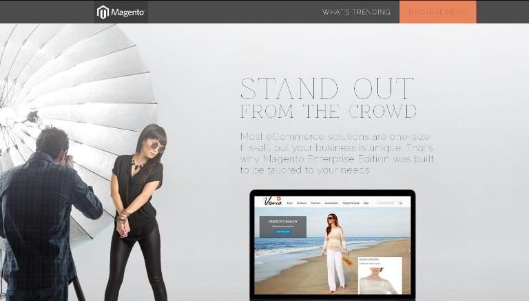
Magento has a compelling, user-oriented copy, rendered unreadable bythe thin, low-contrast font.
- Length – Long
- Copy length – 673 words
- Navigation removed – Yes
- Call to action above the fold – Yes
- Contrasting buttons – Yes
- Multiple action calls – Yes
- Social proof – Yes
- Video/Animation – No
- Benefit-oriented copy – Yes
- Numbers used – No
- Live chat – No
- Load time – 2.08s
ConversionLab
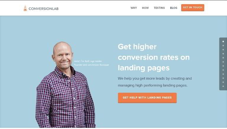
Though easy to scan and with a nice flow, this design has pop-up windows and banners. Make sure your landing page doesn’t have any.
- Length – Long
- Copy length – 645 words
- Navigation removed – No
- Call to action above the fold – Yes
- Contrasting buttons – Yes
- Multiple action calls – Yes
- Social proof – Yes
- Video/Animation – No
- Benefit-oriented copy – Yes
- Numbers used – Yes
- Live chat – No
- Load time – 2.08s
To the top To the statistics Landing page templates
AgencyAnalytics
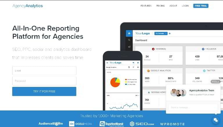
This one has a simple form to be filled, optimized structure, and a live chat (companies use it less often these days).
- Length – Average
- Copy length – 655 words
- Navigation removed – No
- Call to action above the fold – Yes
- Contrasting buttons – Yes
- Multiple action calls – Yes
- Social proof – Yes
- Video/Animation – No
- Benefit-oriented copy – Yes
- Numbers used – Yes
- Live chat – Yes
- Load time – 2.81s
MOZ Keyword Research
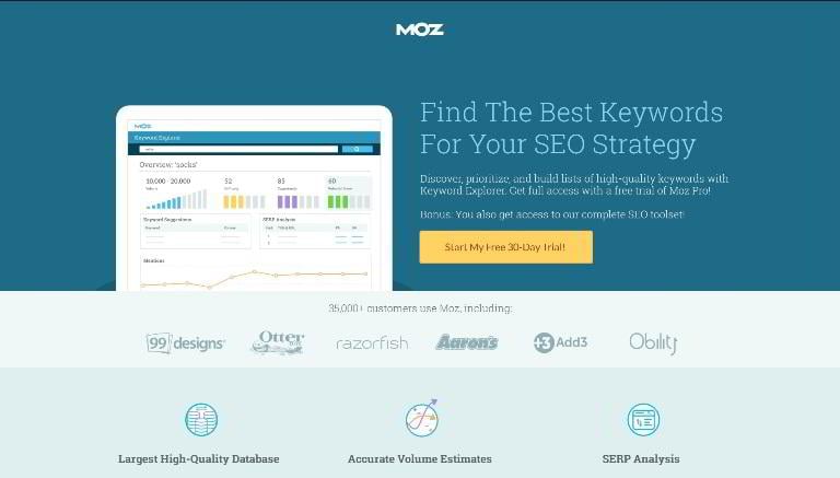
The landing page of MOZ Pro is simple, clutter-free and pixel-perfect. It has expressive CTA buttons, is supported by trustworthy testimonials, and is devoid of any distracting elements. This is by far one of the most consistent short-form landings on our list.
- Page length – Short
- Copy length – 193 words
- Navigation removed – Yes
- CTA above the fold – Yes
- Contrasting CTA – Yes
- Multiple CTAs – Yes
- Social proof – Yes
- Video/Animation – No
- Benefit-oriented copy – Yes
- Numbers used – Yes
- Live chat – No
- Load time – 2.08s
WordPress.com
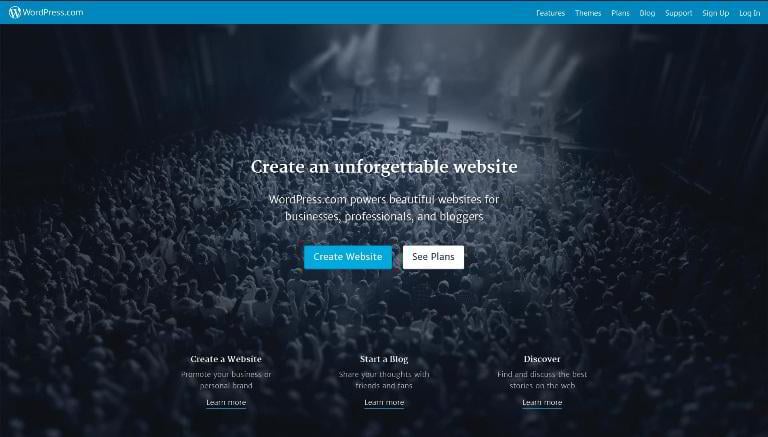
This page has an optimized, action-oriented copy, a nice flow, and informative pricing tables. But the navigation should be hidden or removed for a better performance.
- Page length – Average
- Copy length – 460 words
- Navigation removed – No
- CTA above the fold – Yes
- Contrasting CTA – Yes
- Multiple CTAs – Yes
- Social proof – No
- Video/Animation – No
- Benefit-oriented copy – Yes
- Numbers used – Yes
- Live chat – No
- Load time – 772ms
Wix

A generally good landing page with a polished design and a compelling copy. The footer is large and full of outbound links, but due to the absence of images it is not distracting. Anyway, the page would perform much better without it.
- Page length – Short
- Copy length – 150 words
- Navigation removed – Yes
- CTA above the fold – Yes
- Contrasting CTA – Yes
- Multiple CTAs – Yes
- Social proof – No
- Video/Animation – No
- Benefit-oriented copy – Yes
- Numbers used – No
- Live chat – No
- Load time – 3.43s
Squarespace
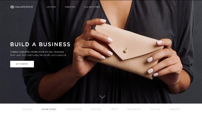
In this long-form landing page by Squarespace the copy is optimized, but the call-to-action buttons don’t stand out against the background, and should be redesigned, or at least recolored.
- Page length – Long
- Copy length – 433 words
- Navigation removed – No
- CTA above the fold – Yes
- Contrasting CTA – Yes
- Multiple CTAs – No
- Social proof – Yes
- Video/Animation – No
- Benefit-oriented copy – Yes
- Numbers used – Yes
- Live chat – No
- Load time – 2.04s
Buffer
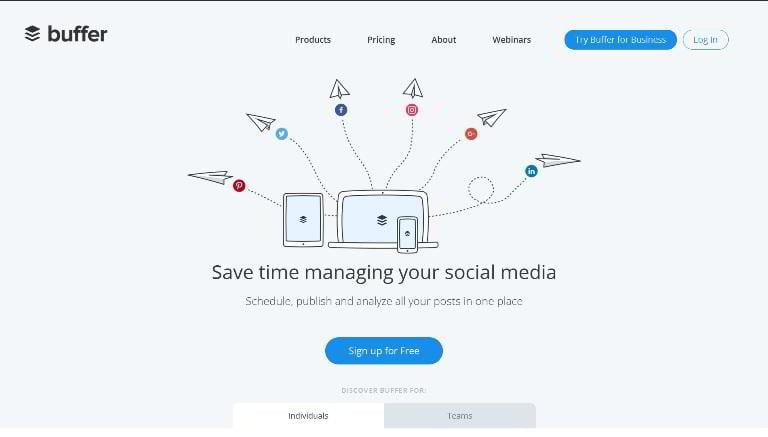
A great landing page with no major conversion optimization mistakes. The header menu and the large footer are too distracting, though.
- Page length – Average
- Copy length – 245 words
- Navigation removed – No
- CTA above the fold – Yes
- Contrasting CTA – Yes
- Multiple CTAs – Yes
- Social proof – Yes
- Video/Animation – Yes
- Benefit-oriented copy – Yes
- Numbers used – Yes
- Live chat – No
- Load time – 1.81s
CrazyEgg Visual Analytics
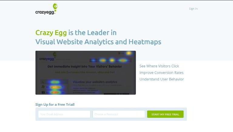
This one is an awesome short-form landing page built by CrazyEgg. The CTA is visible from everywhere on the page, and boasts a clear and optimized button text. Some animated content could be added to make it look more dynamic.
- Page length – Short
- Copy length – 39 words
- Navigation removed – Yes
- CTA above the fold – Yes
- Contrasting CTA – Yes
- Multiple CTAs – No
- Social proof – Yes
- Video/Animation – No
- Benefit-oriented copy – Yes
- Numbers used – Yes
- Live chat – No
- Load time – 317ms
Inspectlet
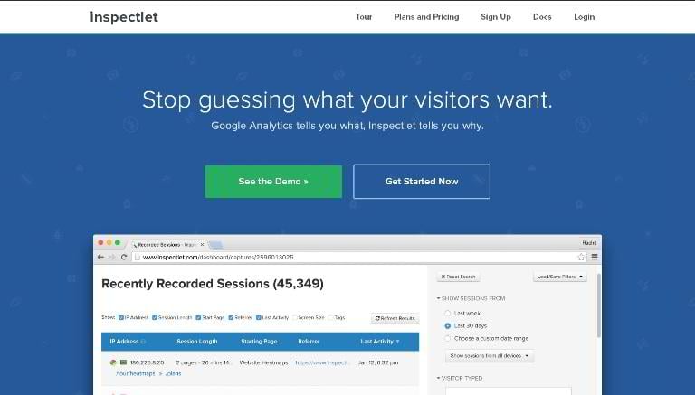
Another professionally optimized with a classic structure. Here you will see multiple call-to-action buttons, the list of prominent partners, and other must-have conversion-oriented elements.
- Page length – Long
- Copy length – 844 words
- Navigation removed – No
- CTA above the fold – Yes
- Contrasting CTA – Yes
- Multiple CTAs – Yes
- Social proof – Yes
- Video/Animation – Yes
- Benefit-oriented copy – Yes
- Numbers used – No
- Live chat – No
- Load time – 1.22s
To the top To the statistics Landing page templates
HotJar
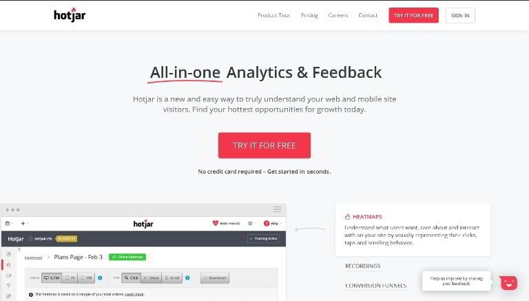
The copy, the call-to-action buttons, the social proof and the images are optimized on this page; the navigation is not.
- Page length – Average
- Copy length – 412 words
- Navigation removed – No
- CTA above the fold – Yes
- Contrasting CTA – Yes
- Multiple CTAs – Yes
- Social proof – Yes
- Video/Animation – No
- Benefit-oriented copy – Yes
- Numbers used – No
- Live chat – No
- Load time – 2.52s
Sweet Tooth Rewards
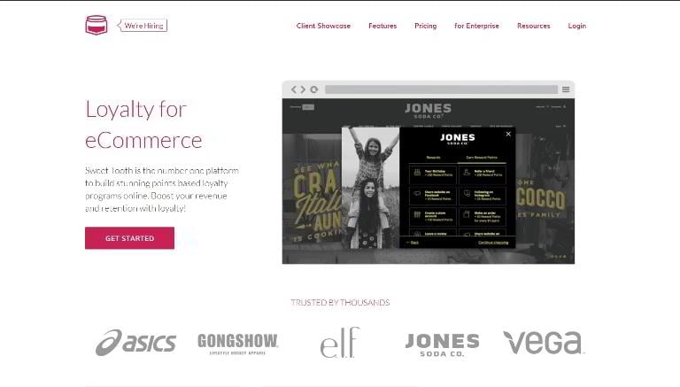
This landing page by Sweet Tooth Rewards features a great copy, properly placed CTAs and animated achievement counters. The speed should be optimized, and the navigation (including the ‘We’re hiring’ button) should be hidden.
- Page length – Average
- Copy length – 327 words
- Navigation removed – No
- CTA above the fold – Yes
- Contrasting CTA – Yes
- Multiple CTAs – Yes
- Social proof – Yes
- Video/Animation – No
- Benefit-oriented copy – Yes
- Numbers used – Yes
- Live chat – No
- Load time – 3.38s
SquareUp
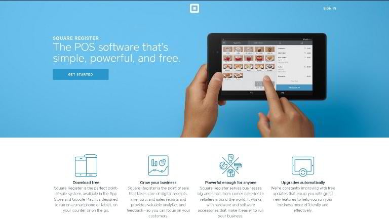
The feature blocks here are too overloaded with text, but the overall structure of the page is OK. The top CTA should be made with a color other than blue.
- Page length – Short
- Copy length – 152 words
- Navigation removed – Yes
- CTA above the fold – Yes
- Contrasting CTA – Yes
- Multiple CTAs – Yes
- Social proof – No
- Video/Animation – No
- Benefit-oriented copy – No
- Numbers used – No
- Live chat – No
- Load time – 1.61s
Google Cloud Free Trial
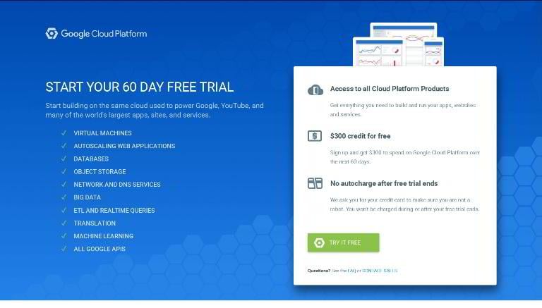
The above-the fold part is perfect, but the rest of this landing page is just awful: the giant footer with lots of links is completely out of place, and the copy is too long and poorly structured.
- Page length – Average
- Copy length – 1100 words
- Navigation removed – Yes
- CTA above the fold – Yes
- Contrasting CTA – Yes
- Multiple CTAs – Yes
- Social proof – Yes
- Video/Animation – No
- Benefit-oriented copy – No
- Numbers used – No
- Live chat – No
- Load time – 2.75s
Jira
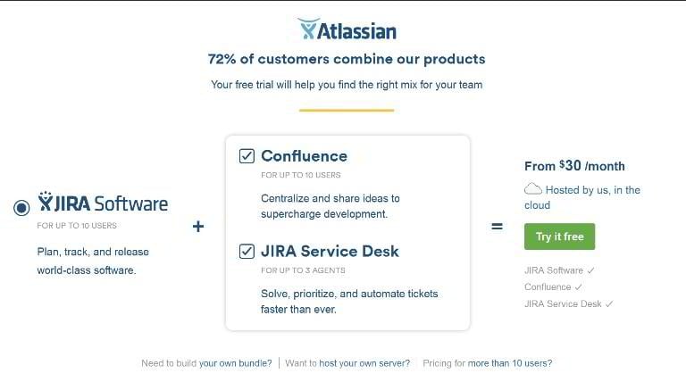
- Page length – Short
- Copy length – 75 words
- Navigation removed – Yes
- CTA above the fold – Yes
- Contrasting CTA – Yes
- Multiple CTAs – No
- Social proof – No
- Video/Animation – No
- Benefit-oriented copy – Yes
- Numbers used – Yes
- Live chat – No
- Load time – 1.72s
Upwork
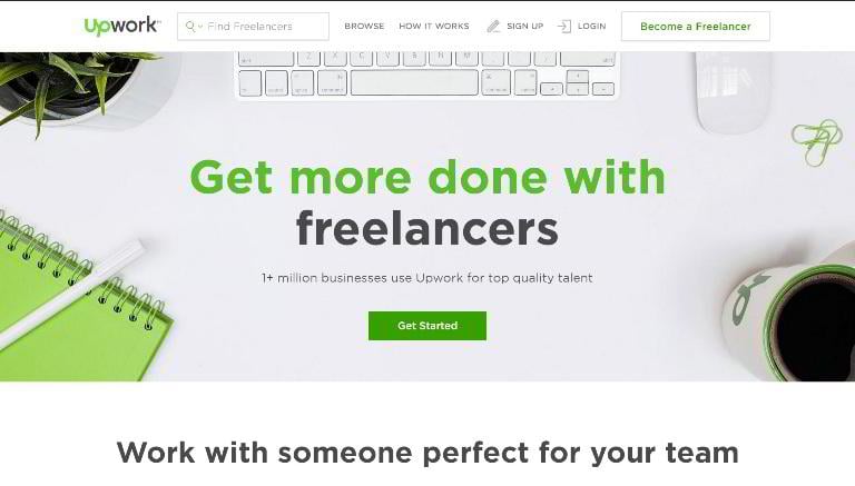
The homepage of Upwork has a good structure, highly contrasting call-to-actions and an optimized sticky navigation bar. But the footer area needs to be tested.
- Page length – Long
- Copy length – 396 words
- Navigation removed – No
- CTA above the fold – Yes
- Contrasting CTA – Yes
- Multiple CTAs – Yes
- Social proof – Yes
- Video/Animation – No
- Benefit-oriented copy – Yes
- Numbers used – Yes
- Live chat – No
- Load time – 3.23s
BitBucket
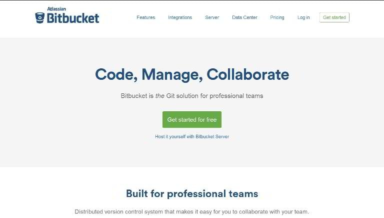
This landing page is very well optimized, except for the navigation. The header area needs to be more descriptive.
- Page length – Average
- Copy length – 353 words
- Navigation removed – No
- CTA above the fold – Yes
- Contrasting CTA – Yes
- Multiple CTAs – Yes
- Social proof – Yes
- Video/Animation – No
- Benefit-oriented copy – Yes
- Numbers used – No
- Live chat – No
- Load time – 1.71s
WeDo
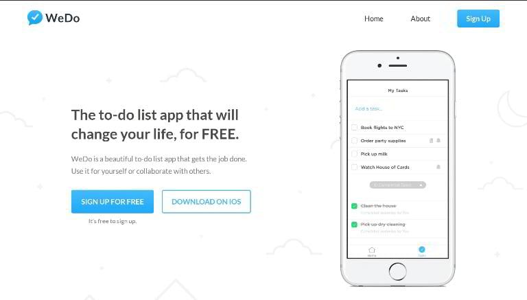
A great minimalist landing page with a short, yet compelling copy.
- Page length – Average
- Copy length – 393 words
- Navigation removed – Yes
- CTA above the fold – Yes
- Contrasting CTA – Yes
- Multiple CTAs – Yes
- Social proof – Yes
- Video/Animation – No
- Benefit-oriented copy – Yes
- Numbers used – No
- Live chat – No
- Load time – 1.83s
Leadin by HubSpot
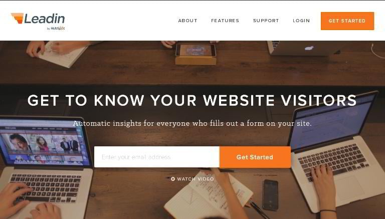
Designed by Hubspot, it is a good example of a robust landing page with a classic layout. The only thing we would change is the selection of fonts: this mix of sans and slab serif typefaces doesn’t look professional.
- Page length – Average
- Copy length – 179 words
- Navigation removed – No
- CTA above the fold – Yes
- Contrasting CTA – Yes
- Multiple CTAs – Yes
- Social proof – Yes
- Video/Animation – Yes
- Benefit-oriented copy – Yes
- Numbers used – No
- Live chat – No
- Load time – 2.37s
Heap Analytics
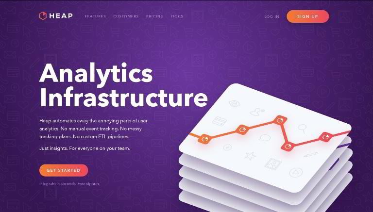
This one is a very consistent landing page, but the images used in its body add no value, and should be replaced with real screenshots or animations.
- Page length – Long
- Copy length – 373 words
- Navigation removed – No
- CTA above the fold – Yes
- Contrasting CTA – Yes
- Multiple CTAs – Yes
- Social proof – Yes
- Video/Animation – No
- Benefit-oriented copy – Yes
- Numbers used – No
- Live chat – No
- Load time – 2.96s
To the top To the statistics Landing page templates
Now when you know what a great landing page should look like, can you spot the strengths and weaknesses of the 60 pages listed below?
Bear Writer
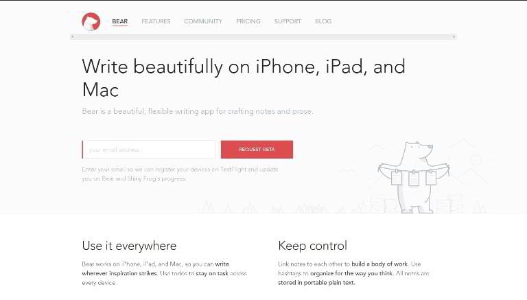
- Page length – Average
- Copy length – 516 words
- Navigation removed – No
- CTA above the fold – Yes
- Contrasting CTA – Yes
- Multiple CTAs – Yes
- Social proof – No
- Video/Animation – No
- Benefit-oriented copy – Yes
- Numbers used – No
- Live chat – No
- Load time – 1.03s
Dropbox Productivity Tools
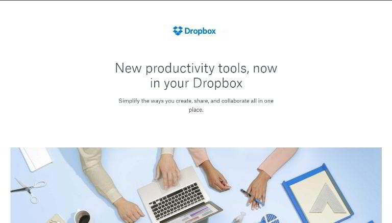
- Page length – Long
- Copy length – 242 words
- Navigation removed – Yes
- CTA above the fold – No
- Contrasting CTA – Yes
- Multiple CTAs – No
- Social proof – No
- Video/Animation – Yes
- Benefit-oriented copy – Yes
- Numbers used – No
- Live chat – No
- Load time – 4.54s
Robinhood
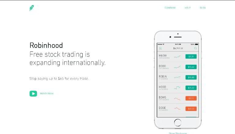
- Page length – Long
- Copy length – 332 words
- Navigation removed – No
- CTA above the fold – No
- Contrasting CTA – No
- Multiple CTAs – Yes
- Social proof – No
- Video/Animation – Yes
- Benefit-oriented copy – Yes
- Numbers used – Yes
- Live chat – No
- Load time – 2.51s
Spendee
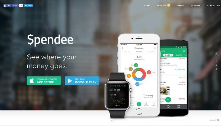
- Page length – Average
- Copy length – 742 words
- Navigation removed – No
- CTA above the fold – Yes
- Contrasting CTA – Yes
- Multiple CTAs – Yes
- Social proof – Yes
- Video/Animation – No
- Benefit-oriented copy – Yes
- Numbers used – No
- Live chat – No
- Load time – 1.75s
Oculus Rift
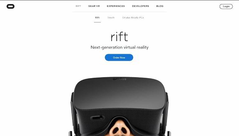
- Page length – Long
- Copy length – 395 words
- Navigation removed – No
- CTA above the fold – Yes
- Contrasting CTA – Yes
- Multiple CTAs – Yes
- Social proof – No
- Video/Animation – Yes
- Benefit-oriented copy – Yes
- Numbers used – No
- Live chat – No
- Load time – 1.98s
InVision App
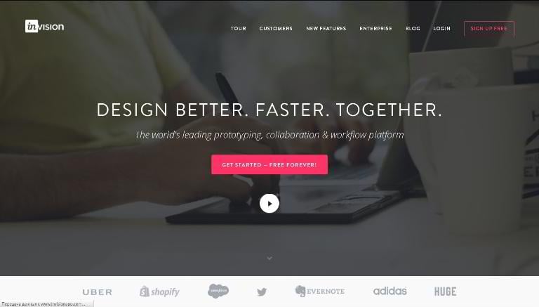
- Page length – Long
- Copy length – 731 words
- Navigation removed – No
- CTA above the fold – Yes
- Contrasting CTA – Yes
- Multiple CTAs – Yes
- Social proof – Yes
- Video/Animation – Yes
- Benefit-oriented copy – Yes
- Numbers used – No
- Live chat – No
- Load time – 3.49s
That Clean Life
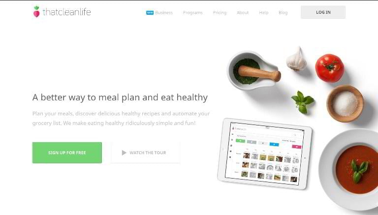
- Page length – Average
- Copy length – 324 words
- Navigation removed – No
- CTA above the fold – Yes
- Contrasting CTA – Yes
- Multiple CTAs – Yes
- Social proof – Yes
- Video/Animation – Yes
- Benefit-oriented copy – Yes
- Numbers used – Yes
- Live chat – No
- Load time – 1.39s
Evernote Work Chat
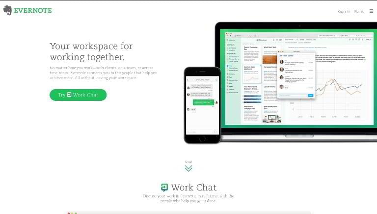
- Page length – Average
- Copy length – 343 words
- Navigation removed – Yes
- CTA above the fold – Yes
- Contrasting CTA – Yes
- Multiple CTAs – Yes
- Social proof – No
- Video/Animation – No
- Benefit-oriented copy – Yes
- Numbers used – No
- Live chat – No
- Load time – 1.86s
To the top To the statistics Landing page templates
Pushh
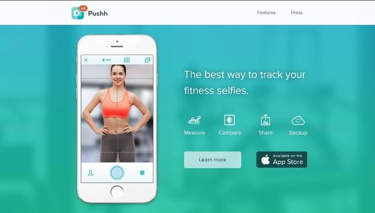
- Page length – Average
- Copy length – 349 words
- Navigation removed – Yes
- CTA above the fold – Yes
- Contrasting CTA – Yes
- Multiple CTAs – Yes
- Social proof – Yes
- Video/Animation – Yes
- Benefit-oriented copy – Yes
- Numbers used – No
- Live chat – No
- Load time – 1.04s
Days App
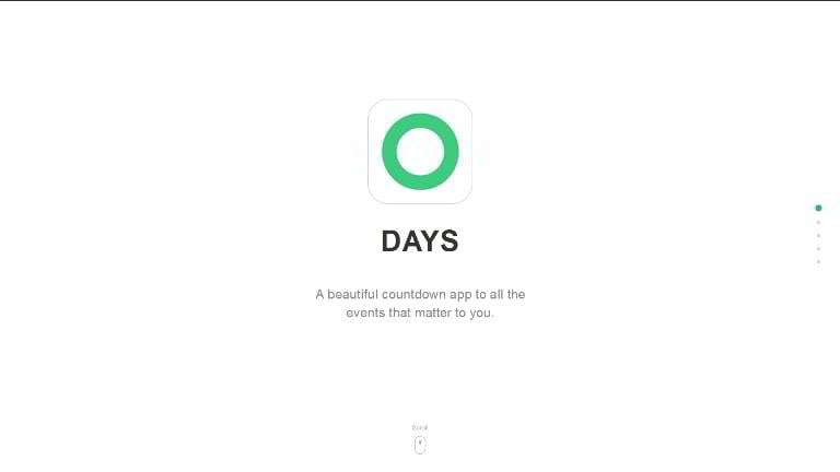
- Page length – Average
- Copy length – 100 words
- Navigation removed – Yes
- CTA above the fold – No
- Contrasting CTA – Yes
- Multiple CTAs – No
- Social proof – No
- Video/Animation – Yes
- Benefit-oriented copy – Yes
- Numbers used – No
- Live chat – No
- Load time – 412ms
Instapage
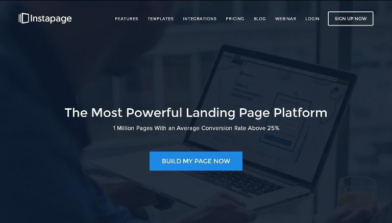
- Page length – Average
- Copy length – 264 words
- Navigation removed – No
- CTA above the fold – Yes
- Contrasting CTA – Yes
- Multiple CTAs – Yes
- Social proof – Yes
- Video/Animation – No
- Benefit-oriented copy – Yes
- Numbers used – Yes
- Live chat – No
- Load time – 1.64s
Treehouse
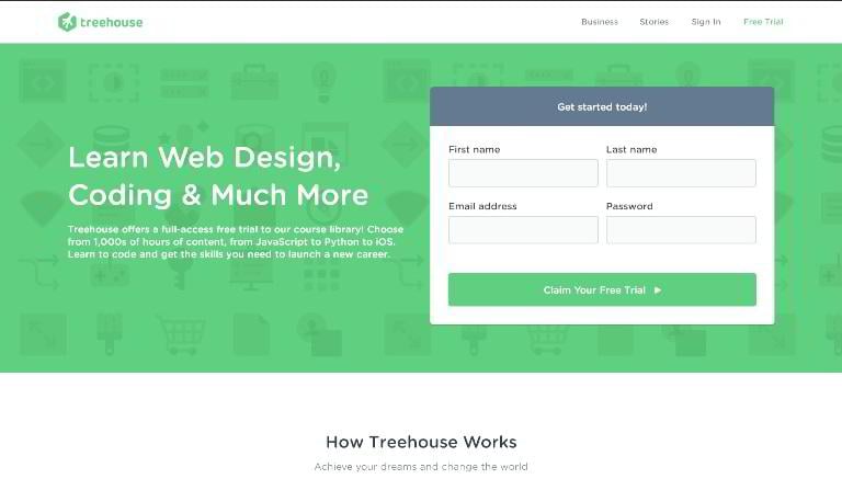
- Page length – Average
- Copy length – 316 words
- Navigation removed – No
- CTA above the fold – Yes
- Contrasting CTA – Yes
- Multiple CTAs – Yes
- Social proof – Yes
- Video/Animation – Yes
- Benefit-oriented copy – Yes
- Numbers used – Yes
- Live chat – No
- Load time – 2.13s
Sticker Mule
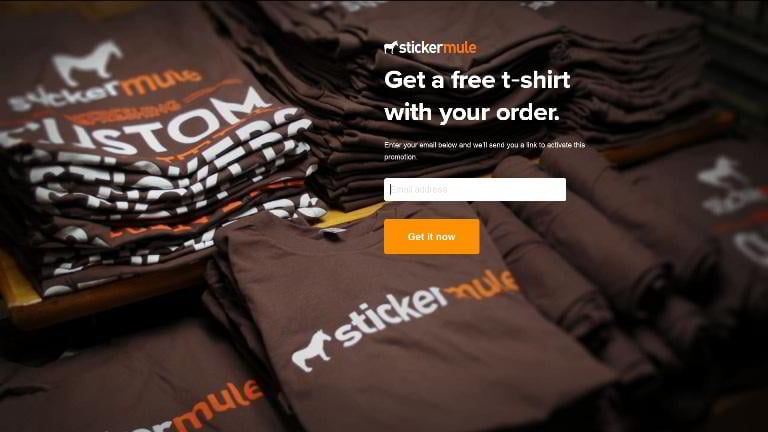
- Page length – Short
- Copy length – 21 words
- Navigation removed – Yes
- CTA above the fold – Yes
- Contrasting CTA – Yes
- Multiple CTAs – No
- Social proof – No
- Video/Animation – No
- Benefit-oriented copy – Yes
- Numbers used – No
- Live chat – No
- Load time – 1.86s
Morninghead
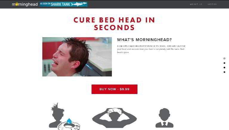
- Page length – Average
- Copy length – 268 words
- Navigation removed – No
- CTA above the fold – Yes
- Contrasting CTA – Yes
- Multiple CTAs – Yes
- Social proof – Yes
- Video/Animation – Yes
- Benefit-oriented copy – Yes
- Numbers used – Yes
- Live chat – No
- Load time – 2.29s
Bukket
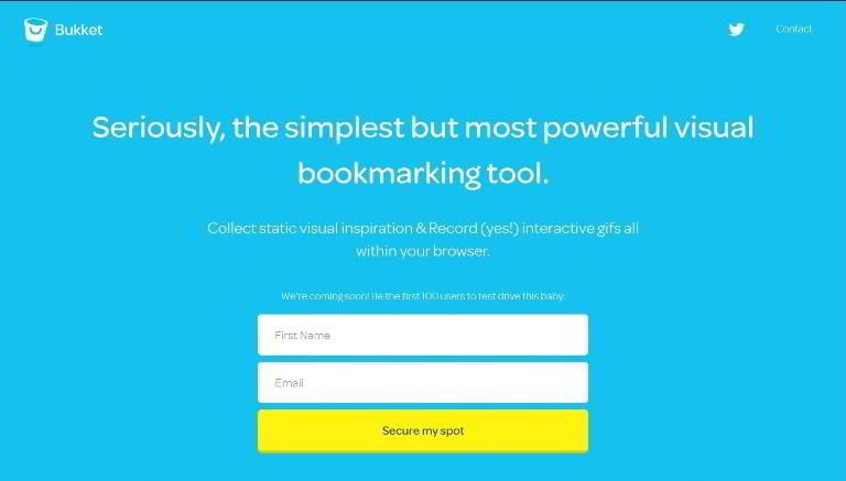
- Page length – Average
- Copy length – 145 words
- Navigation removed – Yes
- CTA above the fold – Yes
- Contrasting CTA – Yes
- Multiple CTAs – Yes
- Social proof – No
- Video/Animation – Yes
- Benefit-oriented copy – Yes
- Numbers used – Yes
- Live chat – No
- Load time – 974ms
Tilda Zero Blog
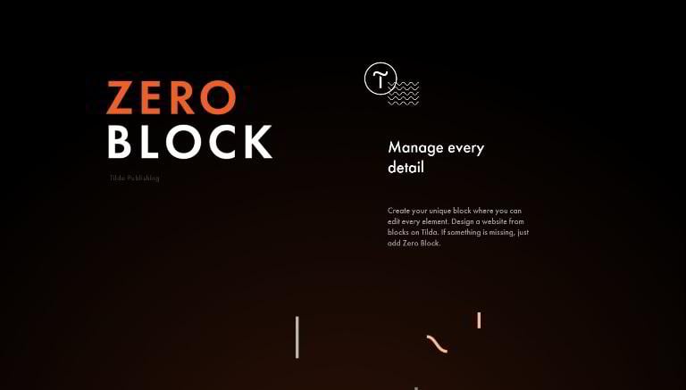
- Page length – Long
- Copy length – 168 words
- Navigation removed – Yes
- CTA above the fold – No
- Contrasting CTA – Yes
- Multiple CTAs – No
- Social proof – Yes
- Video/Animation – Yes
- Benefit-oriented copy – Yes
- Numbers used – No
- Live chat – No
- Load time – 3.01s
Google Ara
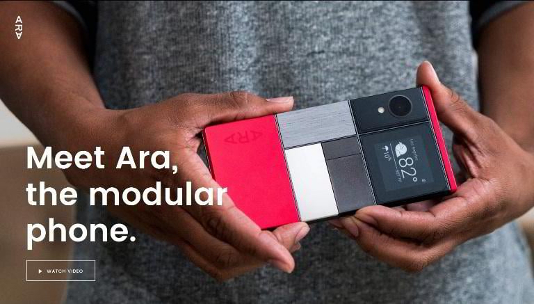
- Page length – Short
- Copy length – 122 words
- Navigation removed – Yes
- CTA above the fold – No
- Contrasting CTA – No
- Multiple CTAs – No
- Social proof – No
- Video/Animation – Yes
- Benefit-oriented copy – Yes
- Numbers used – Yes
- Live chat – No
- Load time – 379ms
To the top To the statistics Landing page templates
Serio Verify
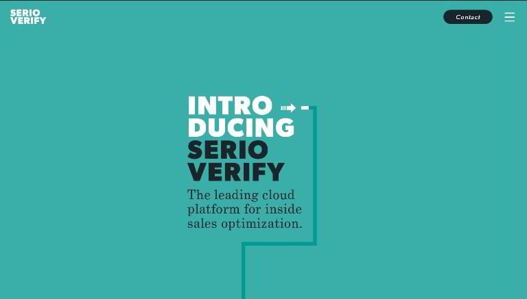
- Page length – Long
- Copy length – 331 words
- Navigation removed – Yes
- CTA above the fold – No
- Contrasting CTA – No
- Multiple CTAs – No
- Social proof – No
- Video/Animation – Yes
- Benefit-oriented copy – No
- Numbers used – Yes
- Live chat – No
- Load time – 2.28s
Newton for Mac
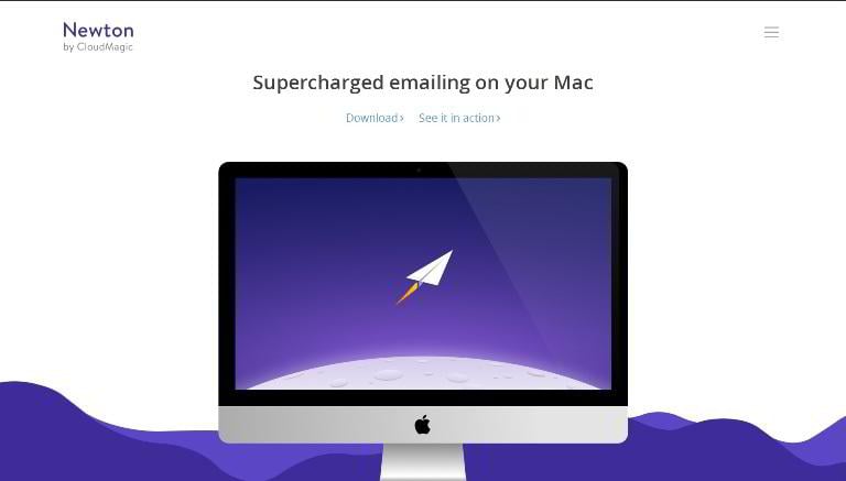
- Page length – Average
- Copy length – 309 words
- Navigation removed – Yes
- CTA above the fold – Yes
- Contrasting CTA – No
- Multiple CTAs – Yes
- Social proof – No
- Video/Animation – No
- Benefit-oriented copy – Yes
- Numbers used – No
- Live chat – No
- Load time – 942ms
OIVO iPhone Charger
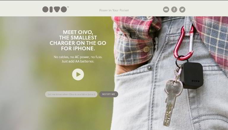
- Page length – Average
- Copy length – 374 words
- Navigation removed – Yes
- CTA above the fold – Yes
- Contrasting CTA – Yes
- Multiple CTAs – Yes
- Social proof – No
- Video/Animation – Yes
- Benefit-oriented copy – No
- Numbers used – No
- Live chat – No
- Load time – 2.20s
Stripe: Apple Pay
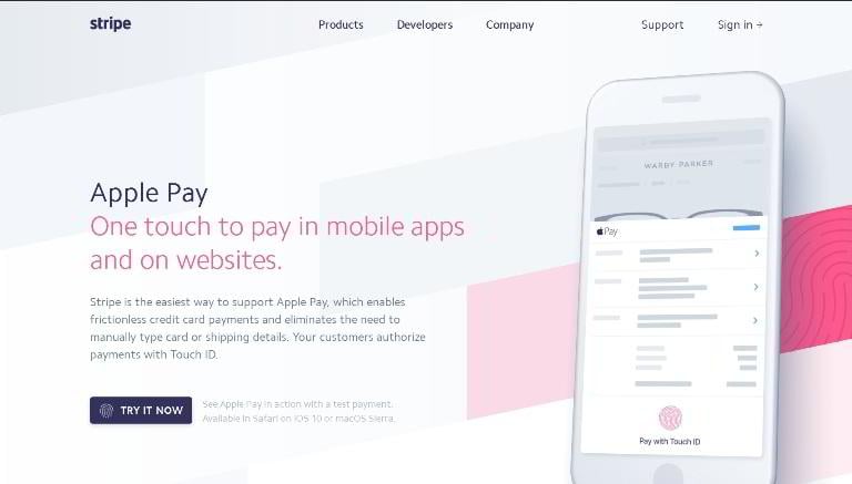
- Page length – Average
- Copy length – 387 words
- Navigation removed – No
- CTA above the fold – Yes
- Contrasting CTA – Yes
- Multiple CTAs – Yes
- Social proof – Yes
- Video/Animation – Yes
- Benefit-oriented copy – Yes
- Numbers used – Yes
- Live chat – No
- Load time – 1.42s
Prismic.io
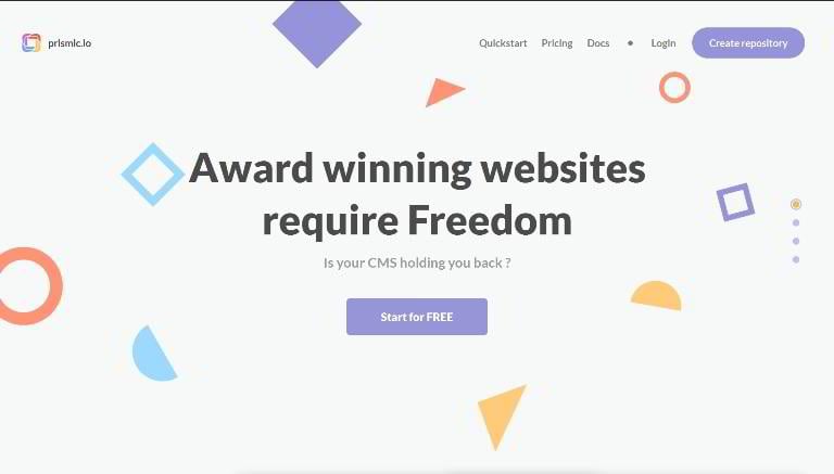
- Page length – Long
- Copy length – 378 words
- Navigation removed – No
- CTA above the fold – Yes
- Contrasting CTA – Yes
- Multiple CTAs – Yes
- Social proof – Yes
- Video/Animation – Yes
- Benefit-oriented copy – Yes
- Numbers used – No
- Live chat – No
- Load time – 1.15s
Grum
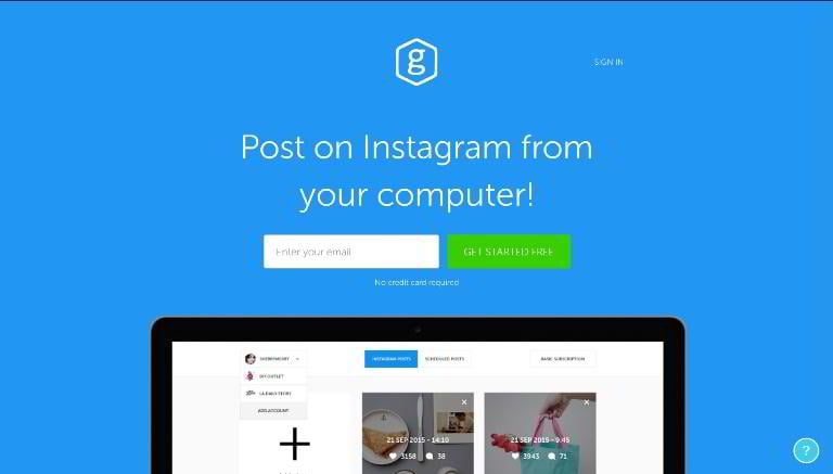
- Page length – Short
- Copy length – 97 words
- Navigation removed – Yes
- CTA above the fold – Yes
- Contrasting CTA – Yes
- Multiple CTAs – Yes
- Social proof – No
- Video/Animation – No
- Benefit-oriented copy – Yes
- Numbers used – No
- Live chat – No
- Load time – 1.96s
Cornerstone
- Page length – Long
- Copy length – 354 words
- Navigation removed – Yes
- CTA above the fold – No
- Contrasting CTA – Yes
- Multiple CTAs – Yes
- Social proof – No
- Video/Animation – Yes
- Benefit-oriented copy – Yes
- Numbers used – No
- Live chat – No
- Load time – 1.70s
Freshform
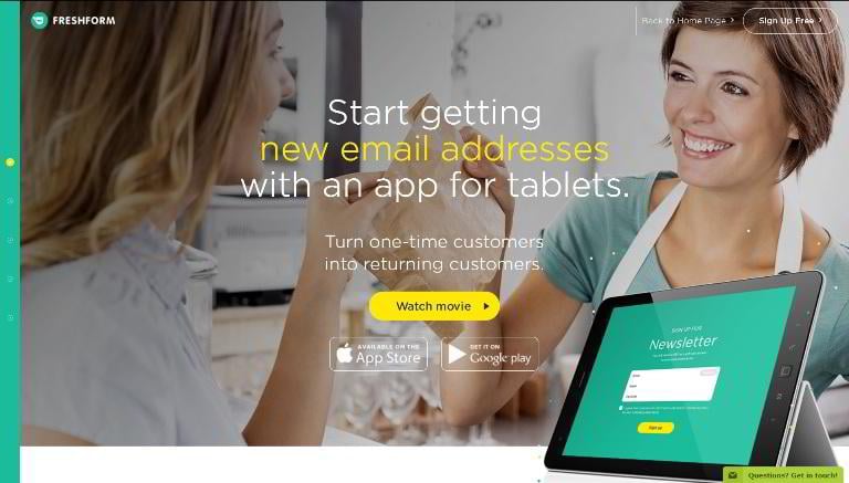
- Page length – Average
- Copy length – 118 words
- Navigation removed – Yes
- CTA above the fold – Yes
- Contrasting CTA – Yes
- Multiple CTAs – Yes
- Social proof – No
- Video/Animation – No
- Benefit-oriented copy – Yes
- Numbers used – No
- Live chat – Yes
- Load time – 1.55s
Farbenhaus
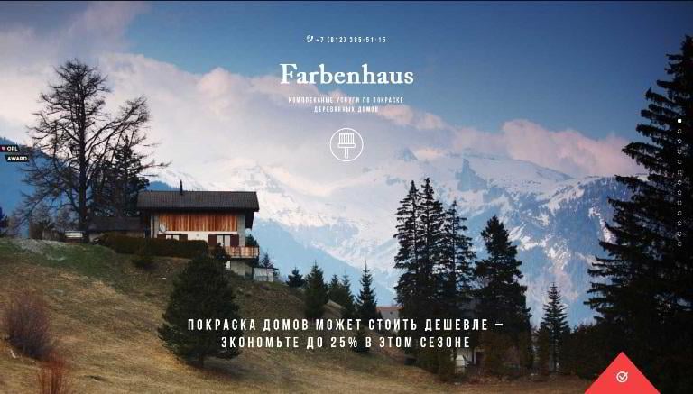
- Page length – Long
- Copy length – 606 words
- Navigation removed – Yes
- CTA above the fold – No
- Contrasting CTA – Yes
- Multiple CTAs – Yes
- Social proof – No
- Video/Animation – No
- Benefit-oriented copy – Yes
- Numbers used – Yes
- Live chat – No
- Load time – 2.52s
Leadfeeder
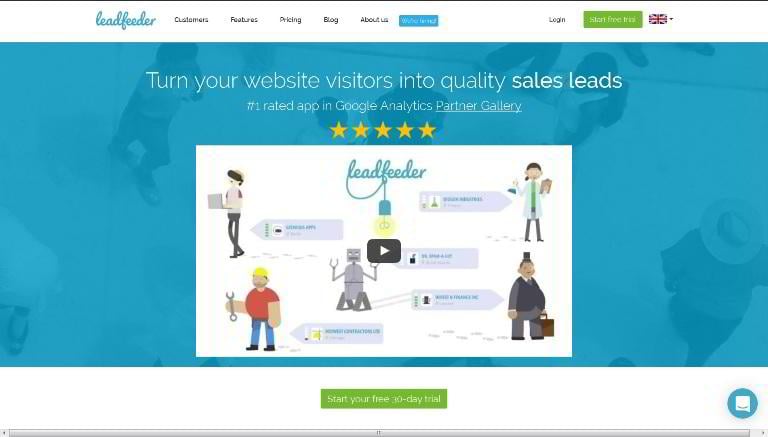
- Page length – Average
- Copy length – 223 words
- Navigation removed – No
- CTA above the fold – Yes
- Contrasting CTA – Yes
- Multiple CTAs – Yes
- Social proof – Yes
- Video/Animation – Yes
- Benefit-oriented copy – No
- Numbers used – No
- Live chat – Yes
- Load time – 6.82s
To the top To the statistics Landing page templates
Zazn Meditation App
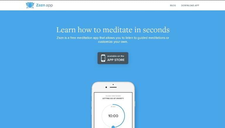
- Page length – Short
- Copy length – 24 words
- Navigation removed – No
- CTA above the fold – Yes
- Contrasting CTA – Yes
- Multiple CTAs – No
- Social proof – No
- Video/Animation – No
- Benefit-oriented copy – No
- Numbers used – No
- Live chat – No
- Load time – 1.99s
ecobud
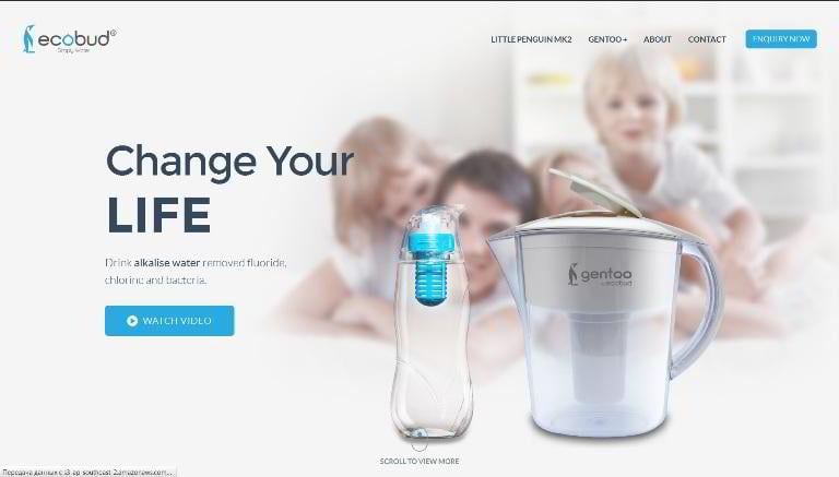
- Page length – Long
- Copy length – 1158 words
- Navigation removed – Yes
- CTA above the fold – Yes
- Contrasting CTA – Yes
- Multiple CTAs – Yes
- Social proof – Yes
- Video/Animation – Yes
- Benefit-oriented copy – Yes
- Numbers used – Yes
- Live chat – No
- Load time – 5.75s
Sceatt
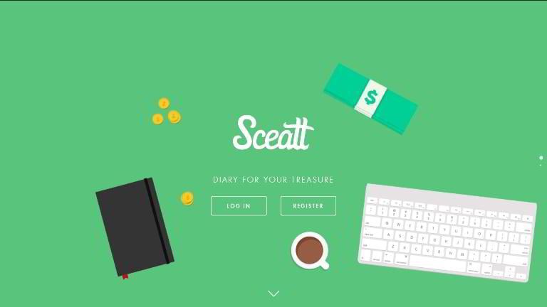
- Page length – Short
- Copy length – 25
- Navigation removed – Yes
- CTA above the fold – Yes
- Contrasting CTA – Yes
- Multiple CTAs – No
- Social proof – No
- Video/Animation – Yes
- Benefit-oriented copy – No
- Numbers used – No
- Live chat – No
- Load time – 1.06s
Harpoon
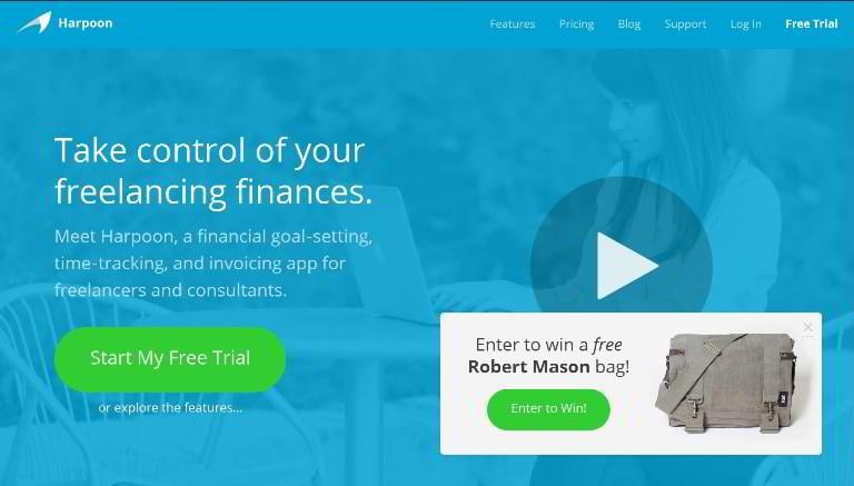
- Page length – Average
- Copy length – 417 words
- Navigation removed – No
- CTA above the fold – Yes
- Contrasting CTA – Yes
- Multiple CTAs – Yes
- Social proof – Yes
- Video/Animation – Yes
- Benefit-oriented copy – Yes
- Numbers used – Yes
- Live chat – No
- Load time – 1.26s
Evernote
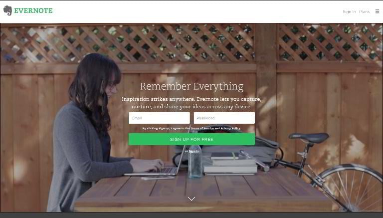
- Page length – Average
- Copy length – 209 words
- Navigation removed – Yes
- CTA above the fold – Yes
- Contrasting CTA – Yes
- Multiple CTAs – Yes
- Social proof – No
- Video/Animation – No
- Benefit-oriented copy – Yes
- Numbers used – No
- Live chat – No
- Load time – 3.04s
Todoist
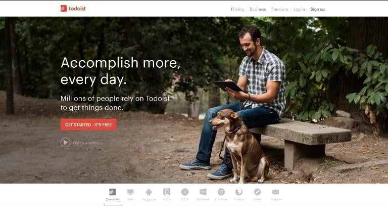
- Page length – Average
- Copy length – 586 words
- Navigation removed – No
- CTA above the fold – Yes
- Contrasting CTA – Yes
- Multiple CTAs – Yes
- Social proof – Yes
- Video/Animation – Yes
- Benefit-oriented copy – Yes
- Numbers used – No
- Live chat – No
- Load time – 740ms
Stencil
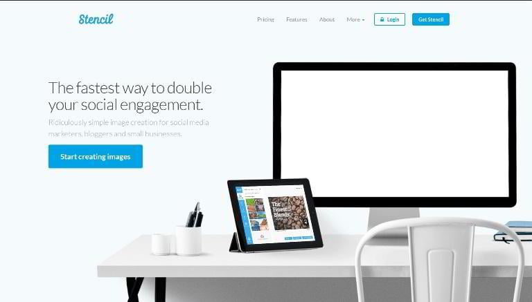
- Page length – Average
- Copy length – 353 words
- Navigation removed – No
- CTA above the fold – Yes
- Contrasting CTA – Yes
- Multiple CTAs – Yes
- Social proof – Yes
- Video/Animation – Yes
- Benefit-oriented copy – Yes
- Numbers used – Yes
- Live chat – No
- Load time – 1.42s
To the top To the statistics Landing page templates
Plume
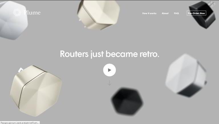
- Page length – Long
- Copy length – 487 words
- Navigation removed – No
- CTA above the fold – Yes
- Contrasting CTA – No
- Multiple CTAs – Yes
- Social proof – Yes
- Video/Animation – Yes
- Benefit-oriented copy – Yes
- Numbers used – No
- Live chat – No
- Load time – 2.62s
Flamyngo
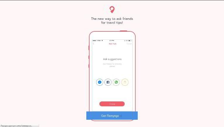
- Page length – Average
- Copy length – 9 words
- Navigation removed – Yes
- CTA above the fold – Yes
- Contrasting CTA – Yes
- Multiple CTAs – No
- Social proof – No
- Video/Animation – No
- Benefit-oriented copy – No
- Numbers used – No
- Live chat – No
- Load time – 501ms
Clearbit
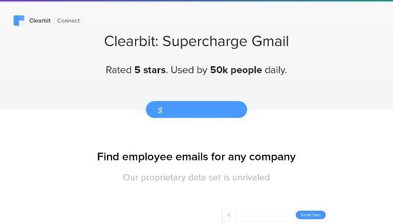
- Page length – Short
- Copy length – 234 words
- Navigation removed – Yes
- CTA above the fold – Yes
- Contrasting CTA – Yes
- Multiple CTAs – Yes
- Social proof – Yes
- Video/Animation – No
- Benefit-oriented copy – Yes
- Numbers used – Yes
- Live chat – No
- Load time – 1.65s
Blendle
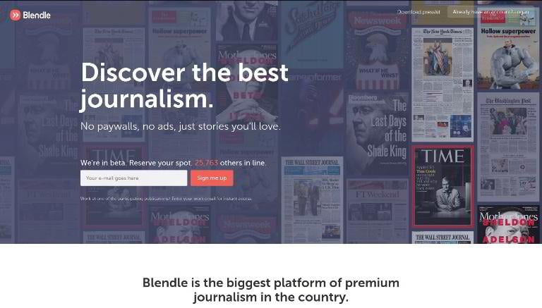
- Page length – Average
- Copy length – 189 words
- Navigation removed – Yes
- CTA above the fold – Yes
- Contrasting CTA – Yes
- Multiple CTAs – Yes
- Social proof – Yes
- Video/Animation – Yes
- Benefit-oriented copy – Yes
- Numbers used – Yes
- Live chat – No
- Load time – 1.88s
SumoMe
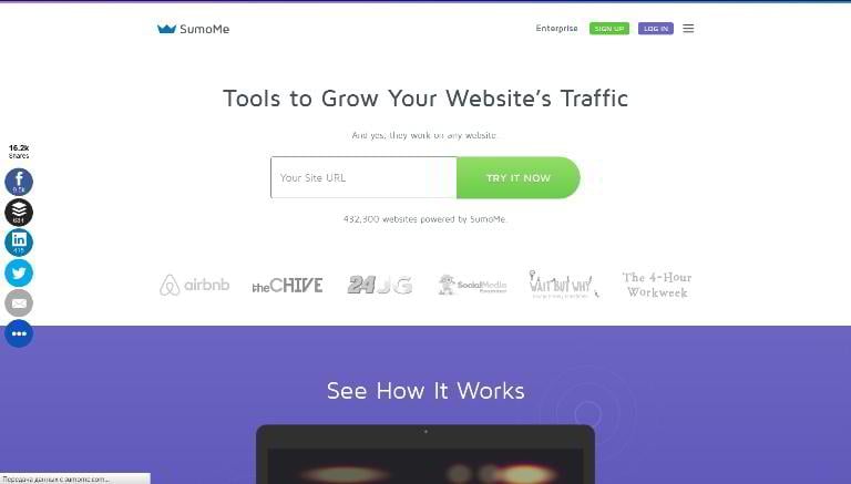
- Page length – Average
- Copy length – 236 words
- Navigation removed – Yes
- CTA above the fold – Yes
- Contrasting CTA – Yes
- Multiple CTAs – Yes
- Social proof – Yes
- Video/Animation – Yes
- Benefit-oriented copy – Yes
- Numbers used – Yes
- Live chat – No
- Load time – 1.86s
ConversionXL Institute
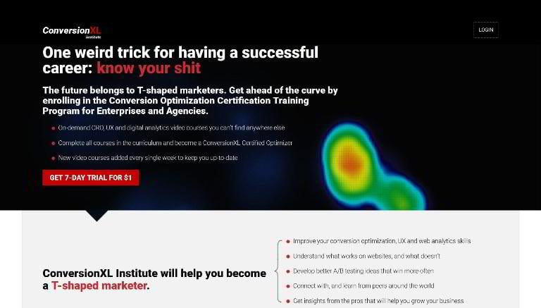
- Page length – Long
- Copy length – 1309 words
- Navigation removed – Yes
- CTA above the fold – Yes
- Contrasting CTA – Yes
- Multiple CTAs – Yes
- Social proof – Yes
- Video/Animation – No
- Benefit-oriented copy – Yes
- Numbers used – No
- Live chat – Yes
- Load time – 2.22s
Ballpark
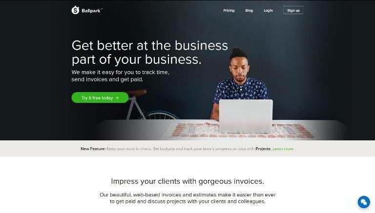
- Page length – Average
- Copy length – 240 words
- Navigation removed – No
- CTA above the fold – Yes
- Contrasting CTA – Yes
- Multiple CTAs – Yes
- Social proof – Yes
- Video/Animation – No
- Benefit-oriented copy – Yes
- Numbers used – No
- Live chat – Yes
- Load time – 969ms
Web Profits SEO
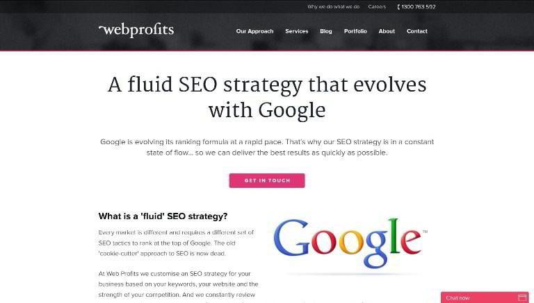
- Page length – Average
- Copy length – 654 words
- Navigation removed – No
- CTA above the fold – Yes
- Contrasting CTA – Yes
- Multiple CTAs – Yes
- Social proof – Yes
- Video/Animation – No
- Benefit-oriented copy – Yes
- Numbers used – No
- Live chat – Yes
- Load time – 9.34s
To the top To the statistics Landing page templates
Paste
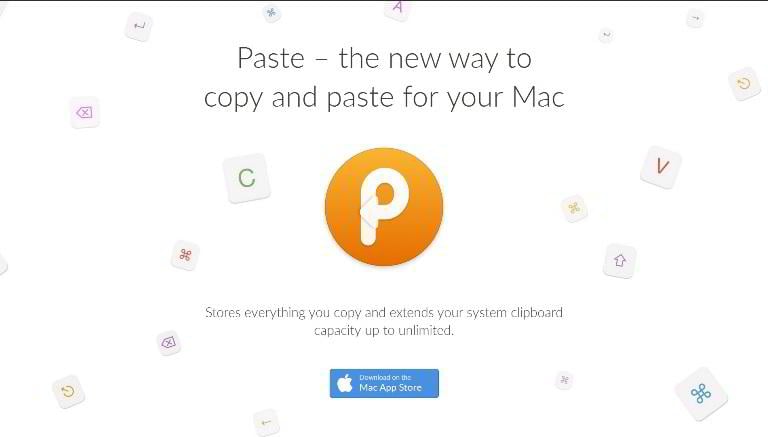
- Page length – Average
- Copy length – 356 words
- Navigation removed – Yes
- CTA above the fold – Yes
- Contrasting CTA – Yes
- Multiple CTAs – Yes
- Social proof – Yes
- Video/Animation – No
- Benefit-oriented copy – Yes
- Numbers used – No
- Live chat – No
- Load time – 1.32s
Tinycards by Duolingo
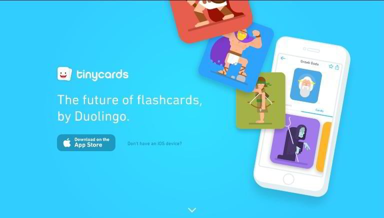
- Page length – Average
- Copy length – 148 words
- Navigation removed – Yes
- CTA above the fold – Yes
- Contrasting CTA – Yes
- Multiple CTAs – Yes
- Social proof – No
- Video/Animation – No
- Benefit-oriented copy – Yes
- Numbers used – No
- Live chat – No
- Load time – 638ms
Freewrite
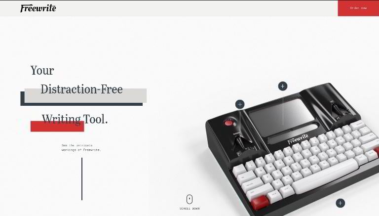
- Page length – Average
- Copy length – 418 words
- Navigation removed – Yes
- CTA above the fold – Yes
- Contrasting CTA – Yes
- Multiple CTAs – Yes
- Social proof – Yes
- Video/Animation – Yes
- Benefit-oriented copy – Yes
- Numbers used – Yes
- Live chat – No
- Load time – 1.53s
Workstack
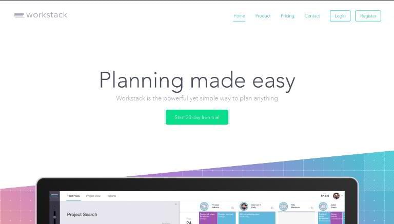
- Page length – Average
- Copy length – 128 words
- Navigation removed – No
- CTA above the fold – Yes
- Contrasting CTA – Yes
- Multiple CTAs – Yes
- Social proof – Yes
- Video/Animation – Yes
- Benefit-oriented copy – Yes
- Numbers used – No
- Live chat – No
- Load time – 1.92s
Montage
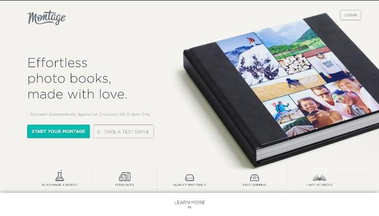
- Page length – Average
- Copy length – 486 words
- Navigation removed – Yes
- CTA above the fold – Yes
- Contrasting CTA – Yes
- Multiple CTAs – Yes
- Social proof – Yes
- Video/Animation – No
- Benefit-oriented copy – Yes
- Numbers used – Yes
- Live chat – No
- Load time – 2.95s
WooCommerce
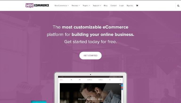
- Page length – Average
- Copy length – 153 words
- Navigation removed – No
- CTA above the fold – Yes
- Contrasting CTA – Yes
- Multiple CTAs – Yes
- Social proof – Yes
- Video/Animation – No
- Benefit-oriented copy – Yes
- Numbers used – Yes
- Live chat – No
- Load time – 1.42s
Quick Sprout Pro
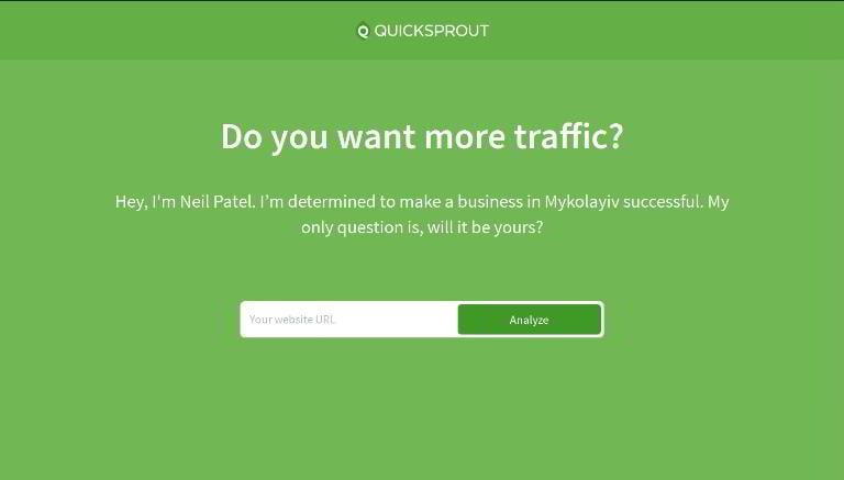
- Page length – Short
- Copy length – 27 words
- Navigation removed – Yes
- CTA above the fold – Yes
- Contrasting CTA – Yes
- Multiple CTAs – No
- Social proof – No
- Video/Animation – No
- Benefit-oriented copy – Yes
- Numbers used – No
- Live chat – No
- Load time – 1.16s
Medium for Publishers
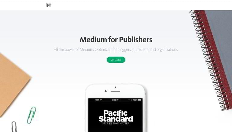
- Page length – Long
- Copy length – 649 words
- Navigation removed – Yes
- CTA above the fold – Yes
- Contrasting CTA – Yes
- Multiple CTAs – Yes
- Social proof – Yes
- Video/Animation – No
- Benefit-oriented copy – Yes
- Numbers used – No
- Live chat – No
- Load time – 1.81s
In a nutshell
Now it’s time for some entertaining consolidated statistics. We have put together all the data from the section above to give you an understanding of the modern state of landing page conversion optimization.
Most of the landing pages (59) that we’ve analyzed are of an average length (3-7 full-screen segments). The least popular are short-form layouts (18 pages). There are also 23 long-form pages, which take a while to scroll.
The average copy length is 372 words. The shortest copy has as little as 9 words of text. The longest copy has 2478 words, but it’s rather an exception.
Most of the copies (79) are under 500 words.
16 of the copies are between 500 and 1000 words.
There are only 5 copies that are longer than 1000 words.
56 of the analyzed pages have no visible main navigation. There are 44 landing pages with header navigation, most of which are homepages. Dedicated landings usually come without any outbound links.
Call-to-action buttons are very well optimized in almost all of the landing pages we’ve reviewed. Out of 100 landing pages, 91 have contrasting, clearly visible call-to-action buttons; 79 use multiple CTAs throughout the page; 90 have their CTAs placed above the fold.
Only ~10% of the companies didn’t bother to optimize their CTA buttons.
36 of the landing pages don’t feature any testimonials, media mentions or partner showcases.
46 of the analyzed landing pages use descriptive videos or video-like animations to increase user engagement.
88 of the pages have well-structured and well-written copies. Respectively, 12% of the companies think that a compelling copy doesn’t matter for conversion (and they are obviously wrong).
50 out of 100 landing pages use fancy numbers to attract visitors.
Only 8 of the analyzed companies use live chat on their landing pages. This fact shows that companies either don’t consider it as a conversion booster, or can’t afford supporting such functionality.
The average load time is 2.08 seconds, which it’s more than the recommended maximum of 2 seconds. 43 of landing pages load in less than 2 seconds, 15 – in less than 1 second. The slowest landing page in our showcase takes a whopping 9.34 seconds to load, which means that its suffers a severe traffic loss because of its low speed.
Landing Page Templates
We at TemplateMonster have a bunch of cool landing page templates in our store. Today we have picked the hottest of them to get you started with promoting your products and services in a professional and cost-effective way. Have a look!
Mobile Repair Service Landing Page Template
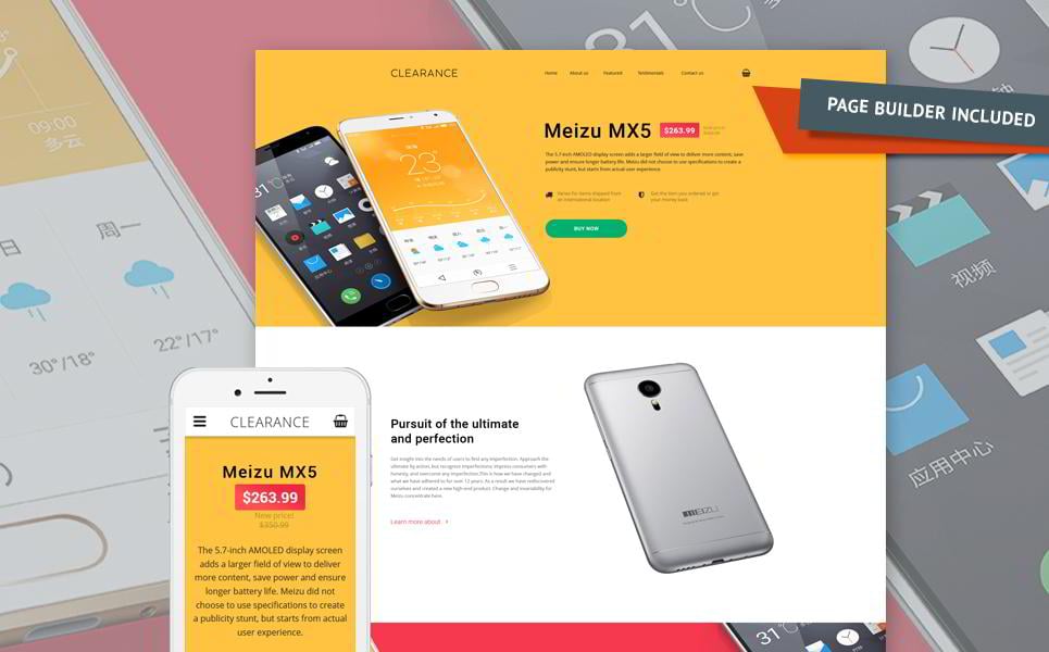
Clearance is a flexible next-generation landing page template, which makes A/B testing a breeze. It has been created for promoting hi-end devices, that’s why its layout is rich in large images and feature blocks. It comes with a drag-and-drop page bui
lder, and allows you to construct a custom page using dozens of pre-designed content blocks, which can be added, removed and rearranged in seconds. Change any element by simply clicking on it, change with one movement of your mouse, and optimize the CTA buttons without a hassle.
Education Landing Page Template
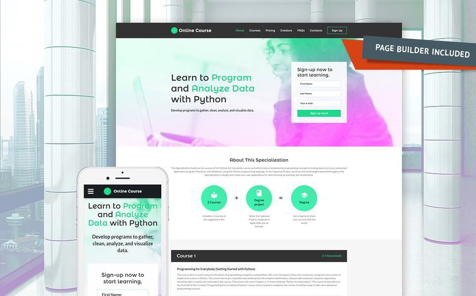
Online Course is another awesome landing page template based on the intuitive layout builder. With 70+ professionally designed content segments at your disposal it is extremely easy to change the layout, optimize the position of call-to-action elements, and edit the content. It features bright call-to-action buttons, pricing tables, various header and footer styles, and more. This template is optimized for collecting emails and accepting applications,making it perfectfor promotingonline courses, webinars and other events.
Business Landing Page Template

Business Consultant is a minimalist landing page template that can be used to promote just any product thanks to its multipurpose look. This template boasts pre-designed pricing tables, a space-effective FAQ section, built-in Google Maps and video blocks. The highly contrasting CTA button in the above-the-fold area ensures great conversion rates, while the section with testimonials works towards increasing the credibility of your landing page. Well optimized and modern-looking, it will become an ideal foundation for your PPC campaigns.
Night Club Landing Page Template
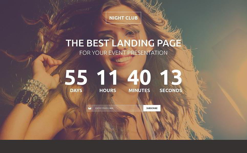
This image-first template can be effectively used both as a ‘coming soon’ homepage and a full-featured landing page. Designed using dark colors it provides immersive user experience and conveys the genuine spirit of a night club. In the top part of the page there is a countdown timer, which can be leveraged to create a sense of urgency in your visitors. We recommend using this landing page for email marketing.
Job Seeker Landing Page Template
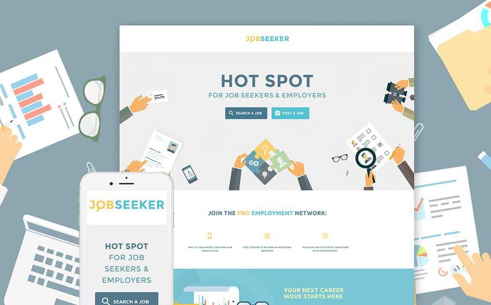
Job Seeker is a long form business landing page template designed in a flat style. It comes with a host of user interface components that will be of great help for building the presentation of your brand. The template is complemented with a live chat plugin and Google Maps out of the box, thus being beneficial for small and medium businesses.
Tea Shop Landing Page Template
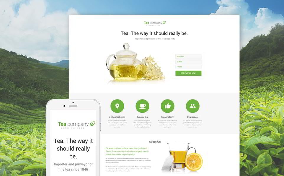
You can leverage this fully responsive ready-made landing page to convert your visitors into email subscribers, or to sell your products online. Its clean, distraction-free layout with multiple CTA buttons, flexible forms and catchy images is well-optimized for lead generation, allowing you to launch your landing page without any additional tune-ups. This template is content-first and straightforward – as any good landing page should be.
Print Shop Landing Page Template
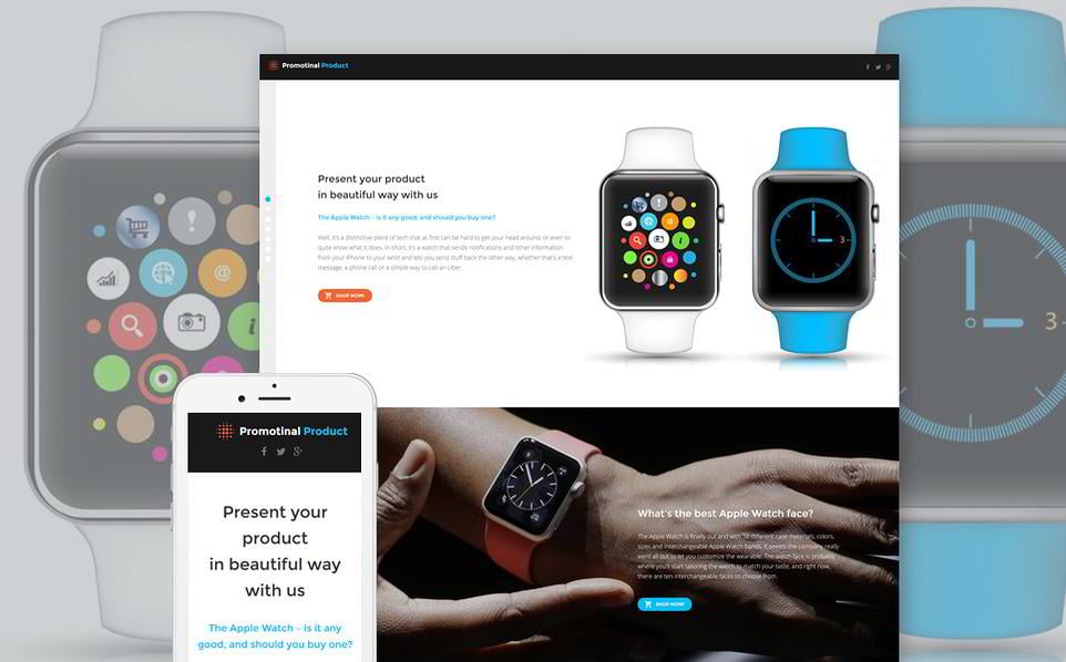
This template is best suitable for selling hi-tech devices such as smartphones and smartwatches. Its visually advanced design offers you such innovative features as video backgrounds and parallax scrolling, making it easy for your landing page
to stand out above its peers. The layout is divided into segments, each in perfect compliance with the AIDA principle (Attention – Interest – Desire - Action).
Wrapping Up
And what about you? Have you ever used landing pages to promote your goods or services? What techniques did you implement, and were they successful? Please share your experience with us in the comment section below!
Don’t miss out these all-time favourites
- The best hosting for a WordPress website. Tap our link to get the best price on the market with 82% off. If HostPapa didn’t impress you check out other alternatives.
- Monthly SEO service and On-Page SEO - to increase your website organic traffic.
- Website Installation service - to get your template up and running within just 6 hours without hassle. No minute is wasted and the work is going.
- ONE Membership - to download unlimited number of WordPress themes, plugins, ppt and other products within one license. Since bigger is always better.
Get more to your email
Subscribe to our newsletter and access exclusive content and offers available only to MonsterPost subscribers.

Leave a Reply
You must be logged in to post a comment.