150 Website Designs Based on Rich Textures
There have always been many design trends which determined the most popular aspects of web design. Today we'll focus our attention on the diverse texture patterns being applied to website designs.
We all know that textures now are extremely common and popular, though it's a long way already that they have been commonly employed. The designers currently have put various textured patterns to even greater use, eventually accomplishing completely different, seamlessly tiling website styles.
But what is the point of such an insane popularity? It may well be that the textures give the websites completely different feel with all those subtle undertones which are rendered within each particular pattern. The websites with a textured look can easily articulate various messages the designer wanted to imply. Plus, the texture usually sets the overall mood of the website creating truly unique and individual foundation.
When it comes down to the applying aspect, texture patterns can be differently accomplished to a web design. In some cases textures can be used to emphasize a particular part of the design. More often they are tailored in combination with many other design elements. Throughout the layout, the textures usually remain in the background to support the tone of the design and make the website content easier to perceive. We may also spot the textured samples in headers, sidebars, footers, or other content areas – it actually depends.
In this post we're featuring the variety of 150 awesomely textured websites sorted by certain motifs – that is the texture pattern used in each particular set. Make sure, there are lots of design options to find inspirational and useful. In this stunning showcase you may also discover TemplateMonster templates where textures have been as well applied to the design. Ok, now it's high time to get started:
Wood Texture Set
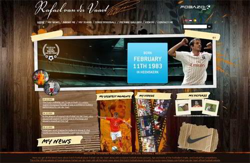
Vandervaartofficial.com
* * *
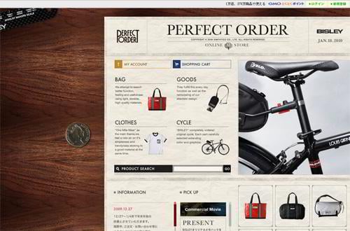
Perfectorder.jp
* * *
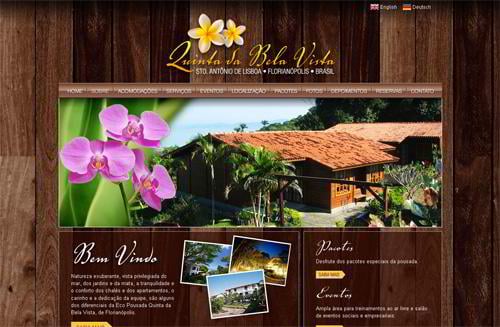
Quintadabelavista.com.br
* * *
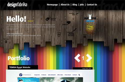
Designfabrika.com
* * *
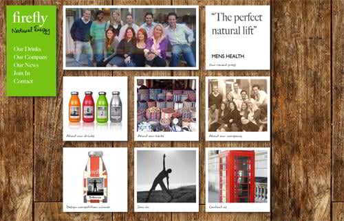
Fireflytonics.com
* * *
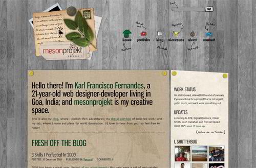
Mesonprojekt.com
* * *
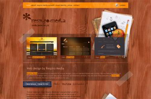
Respiromedia.com
* * *
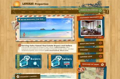
Lanikaiproperties.com
* * *
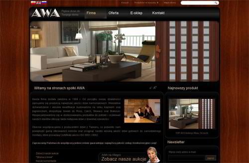
Awa.pruszkow.pl
* * *
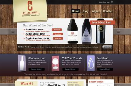
Cellarthief.com
* * *
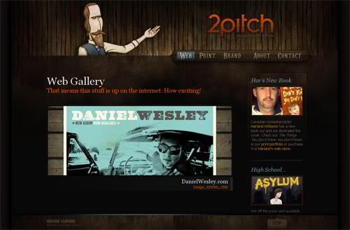
2pitch.com
* * *
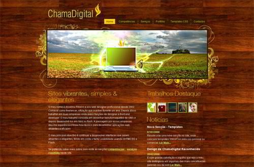
Chamadigital.com
* * *
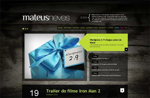
Mateusneves.com
* * *
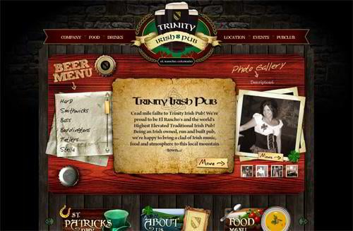
Thetrinitypub.com
* * *
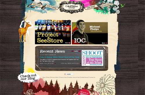
Coleweber.com
* * *
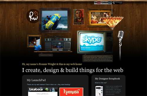
Ronniewright.co.uk
* * *
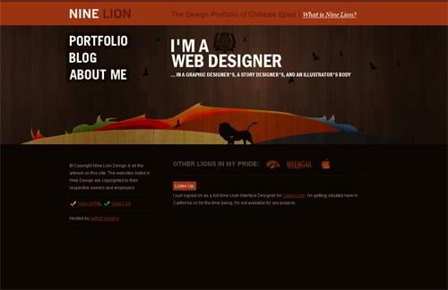
Nineliondesign.com
* * *
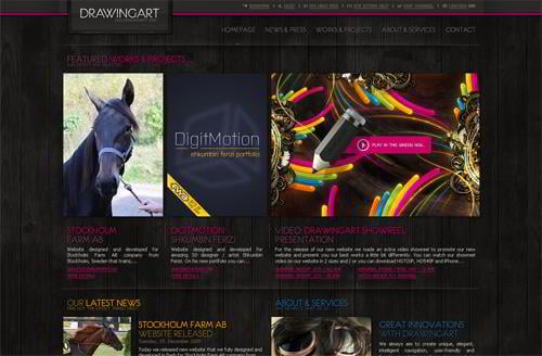
Drawingart.org
* * *
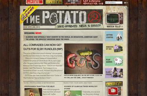
Slabovia.tv
* * *
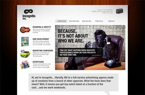
Incognitoincorporated.com
* * *
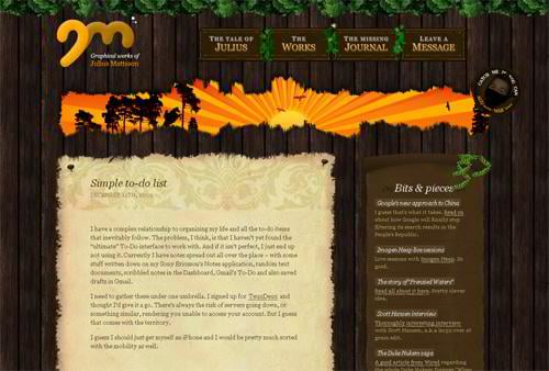
Juliusmattsson.com
* * *
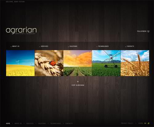
Flash template #26677
* * *
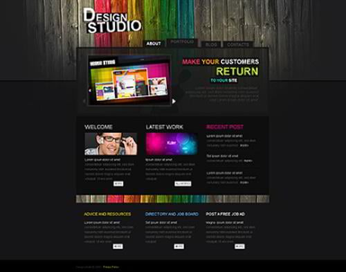
Website template #26340
* * *
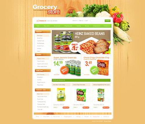
Website template #25384
* * *
Flash template #26520
Paper Texture Set
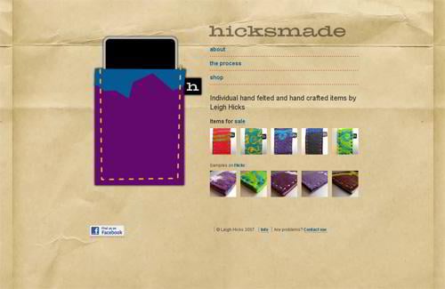
Hicksmade.com
* * *
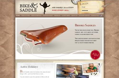
Bikeandsaddle.com
* * *
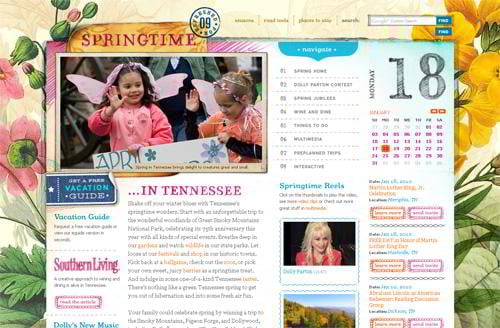
Edu.tnvacation.com
* * *
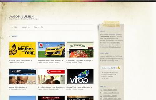
Jasonjulien.com
* * *
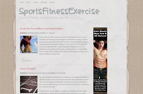
Sportsfitnessexercise.com
* * *
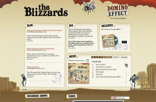
Theblizzards.ie
* * *
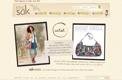
Thesak.com
* * *
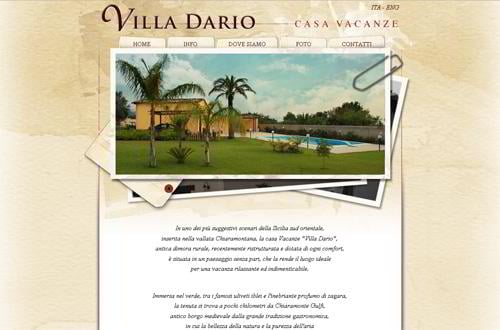
Villadario.it
* * *
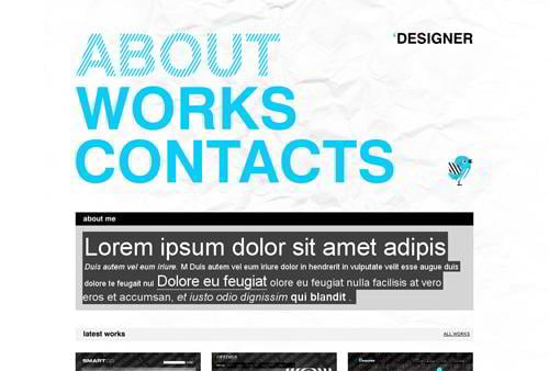
Website template #27106
Fabric Texture Set
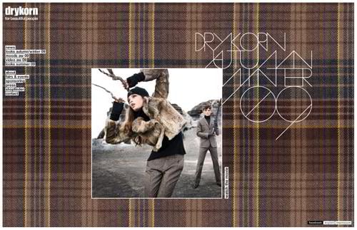
Drykorn.com
* * *
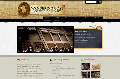
Wanderinggoat.com
* * *
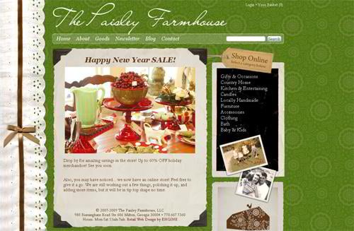
Paisleyfarmhouse.com
* * *
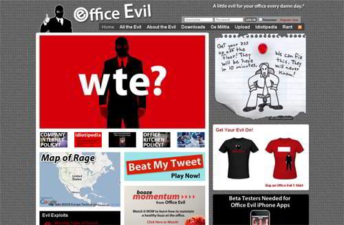
Officeevil.com
* * *
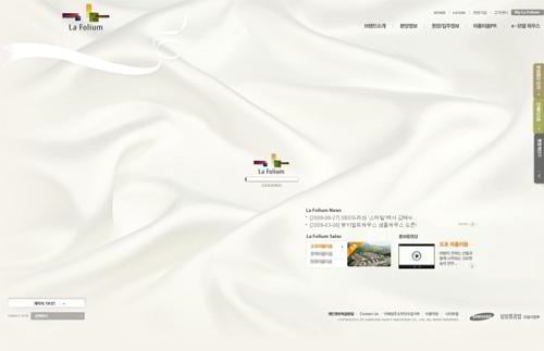
Lafolium.co.kr
* * *
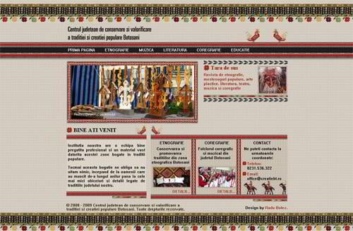
Creatiebt.ro
* * *
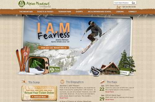
Skialpine.com
* * *
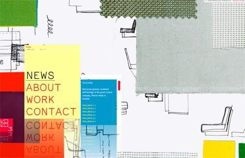
Koko3.fi
* * *
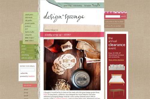
Designspongeonline.com
* * *
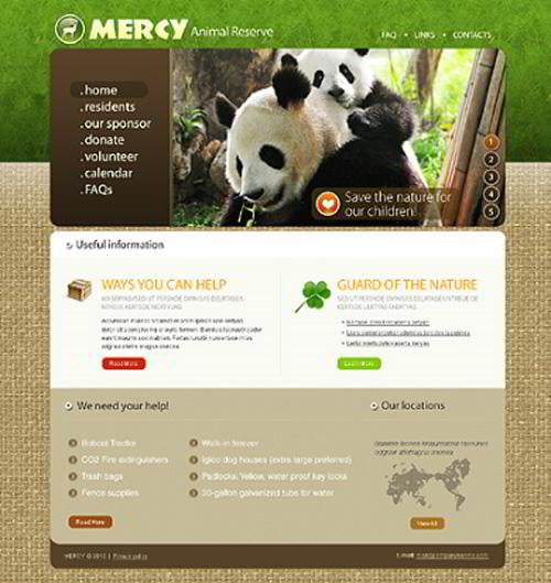
Website template #27223
* * *
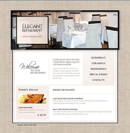
Website template #23783
Brick Texture Set
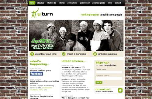
Homeless.org.za
* * *
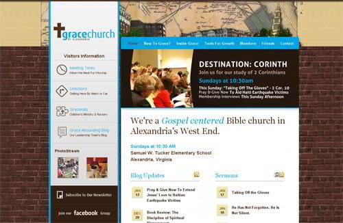
Graceofalexandria.org
* * *
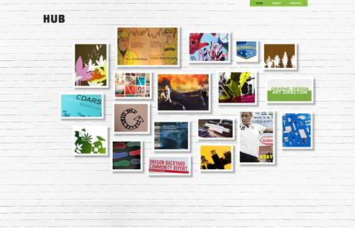
Hubltd.com
* * *
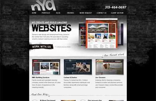
Nyqdesign.com
* * *
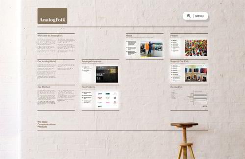
Analogfolk.com
* * *
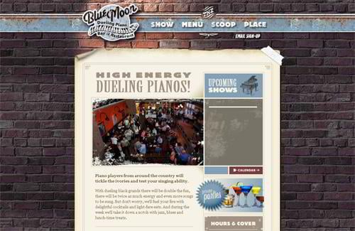
Bluemoonduelingpianobar.com
* * *
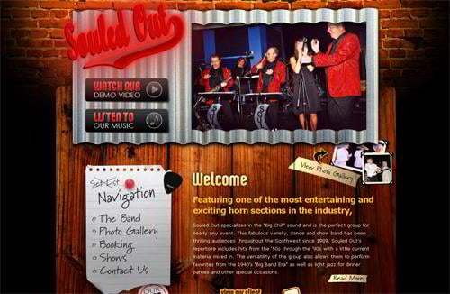
Souledoutrocks.com
Loam Wall Texture Set
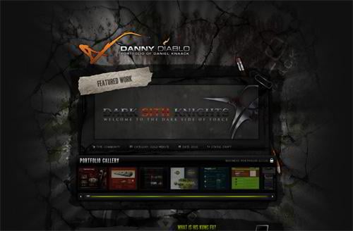
Dannydiablo.de
* * *
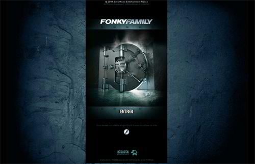
Fonkyfamily.com
* * *
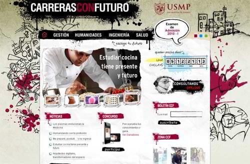
Carrerasconfuturo.com
* * *
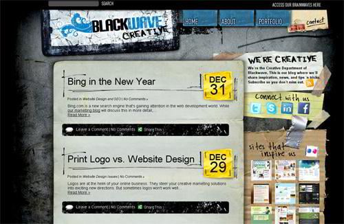
Blackwavecreative.com
* * *
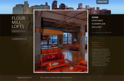
Flourmilllifestyle.com
Cardboard Texture Set
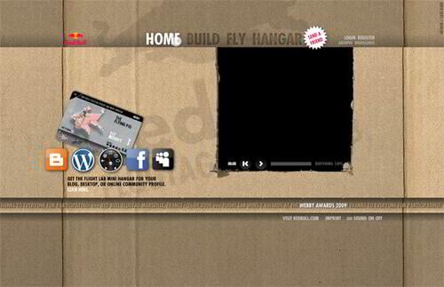
Redbullflightlab.com
* * *
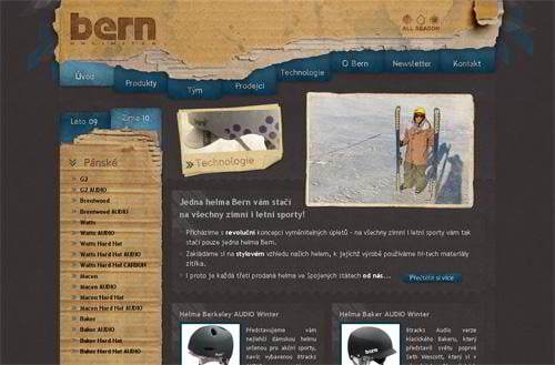
Helmy-bern.cz
* * *
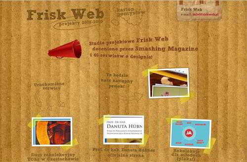
Friskweb.pl
* * *
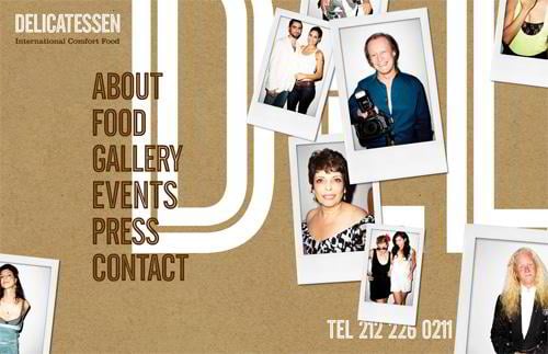
Delicatessennyc.com
* * *
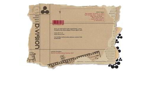
Dvsn.at
* * *
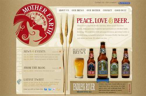
Motherearthbrewing.com
* * *
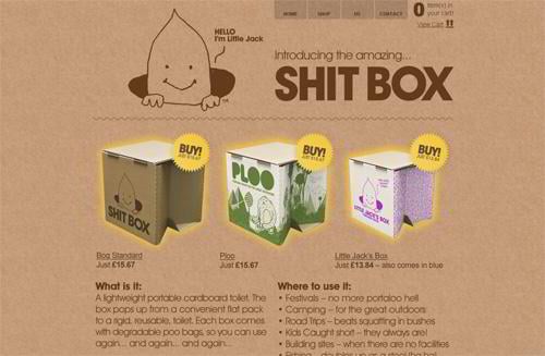
Thebrowncorporation.com
* * *
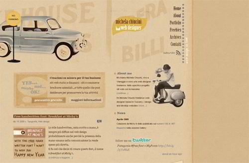
Colazionedamichy.it
* * *
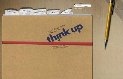
Thinkup.org
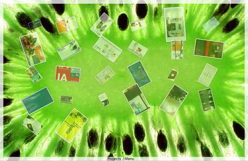
Fruits Texture Set
Edgelabinc.com
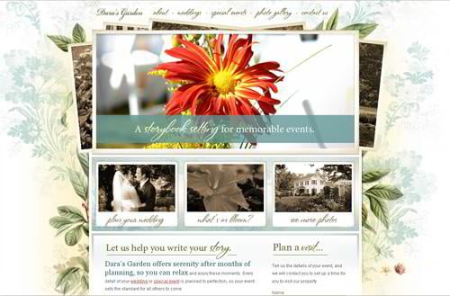
Canvas Flowers Texture Set
Darasgarden.com
* * *
Spring.tnvacation.com
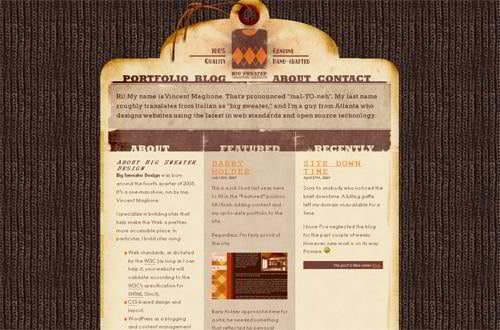
Knit Texture Set
Bigsweaterdesign.com
* * *
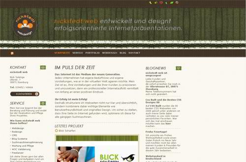
Nickstedt.de
Shell Texture Set
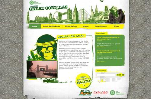
Greatgorillas.org
Sand Texture Set
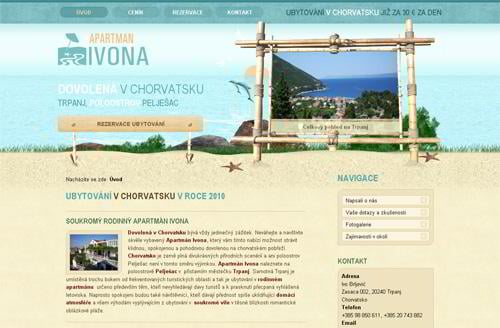
Apartman-ivona.cz
* * *
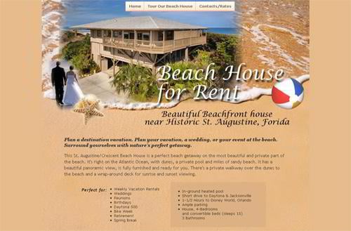
Staugustinebeachvacationrental.com
* * *
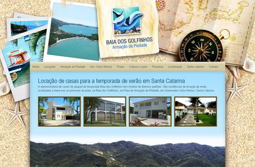
Baiadosgolfinhos.com.br
* * *
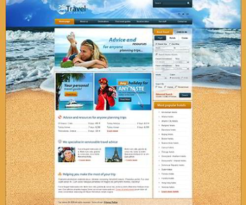
Website template #25511
Stucco Texture Set
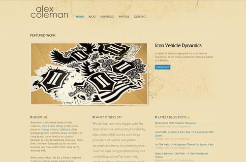
Alexcoleman.net
* * *
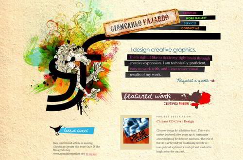
Giancarlo-fajardo.com
* * *
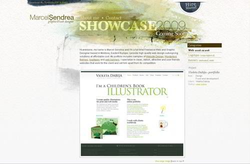
Marcelsendrea.com
* * *
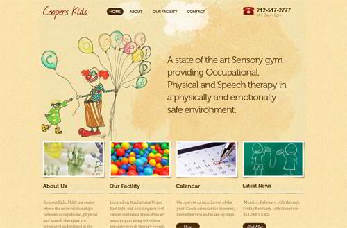
Cooperskids.com
* * *
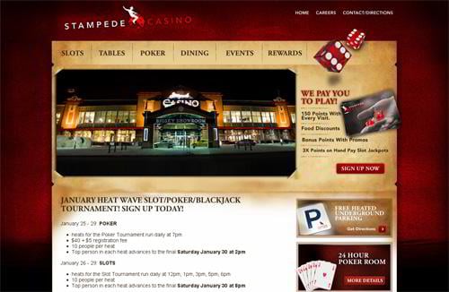
Stampedecasino.com
* * *
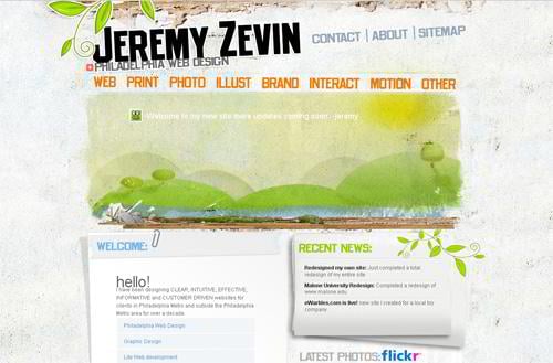
Jeremyzevin.com
Plaster Texture Set
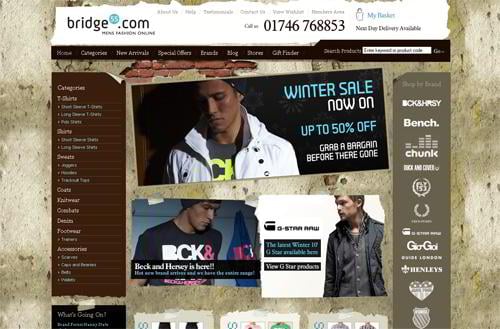
Bridge55.com
* * *
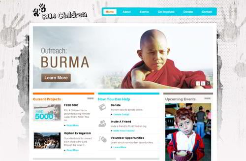
Ru4children.org
* * *
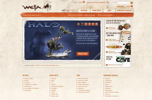
Wetanz.com
* * *
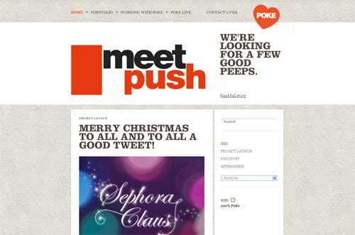
Pokenewyork.com
Rock Texture Set
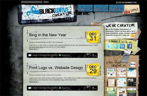
Blackwavecreative.com
* * *
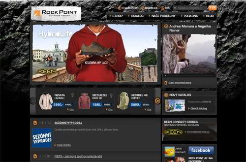
Rockpoint.cz
* * *
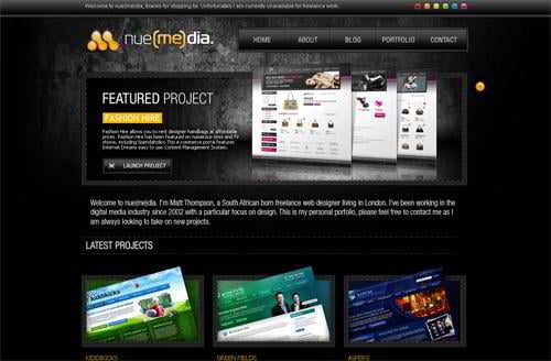
V1.nue-media.com
* * *
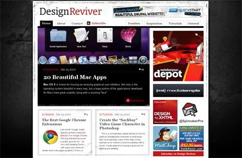
Designreviver.com
Crushed Stone Texture Set
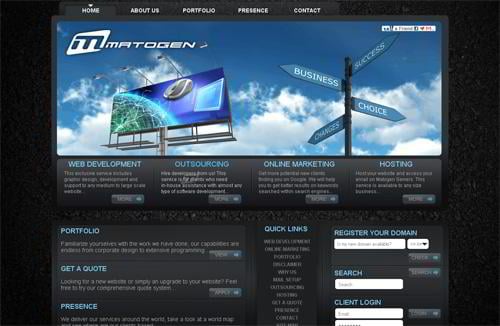
Matogen.com
* * *
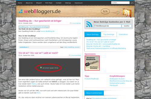
Webbloggers.de
Concrete Texture Set
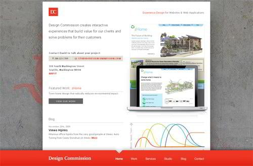
Designcommission.com
* * *
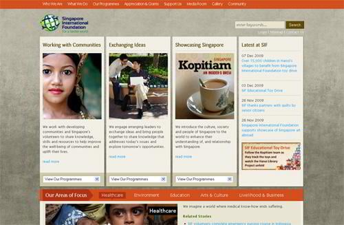
Sif.org.sg
* * *
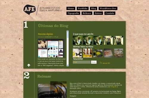
A-falange.net
* * *
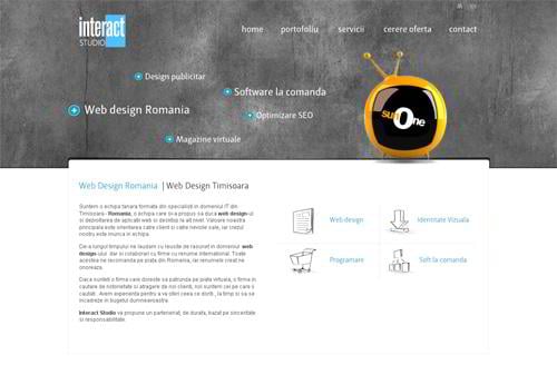
Interact-studio.com
* * *
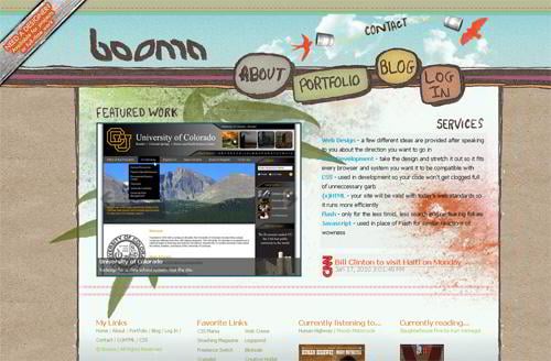
Boomawebdesign.com
Spatter Texture Set
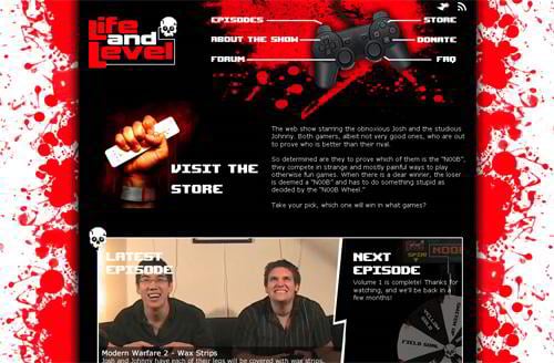
Lifeandlevel.com
Sky Texture Set
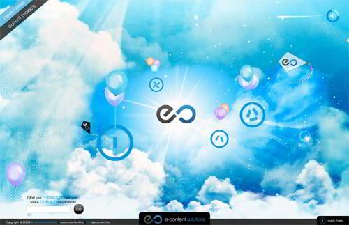
Econtent.hu
* * *
Legendaryaircraft.hu
* * *
Rolando.com.br
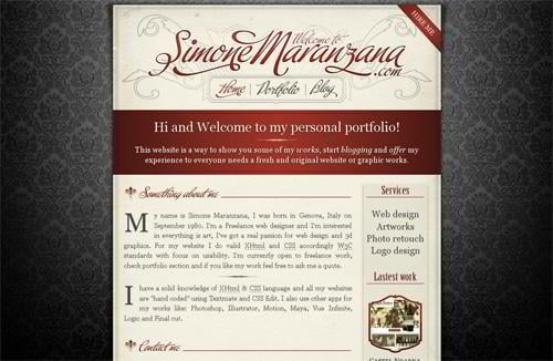
Simonemaranzana.com
* * *
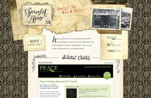
Sprockethouse.com
* * *
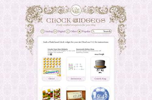
Clockwidgets.net
* * *
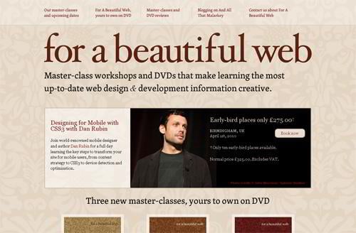
Forabeautifulweb.com
* * *
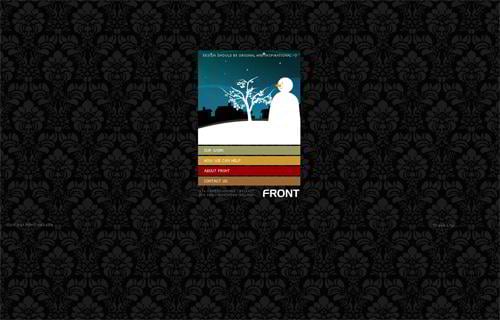
Flash.designbyfront.com
* * *
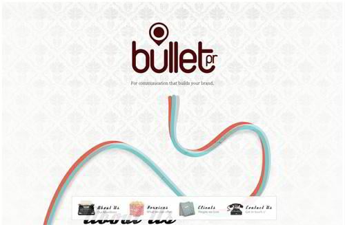
Bulletpr.co.uk
* * *
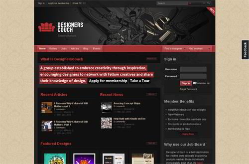
Designerscouch.org
* * *
Joomla template #24975
* * *
osCommerce template #23133
Grass Texture Set
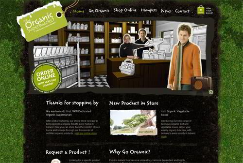
Organicsupermarket.ie
* * *
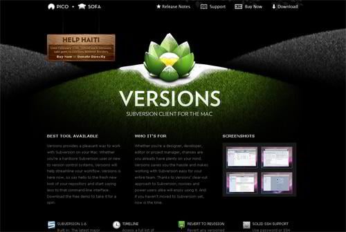
Versionsapp.com
* * *
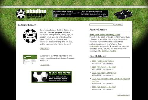
Sidelinesoccer.com
* * *
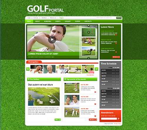
Website template #25387
Corkboard Texture Set
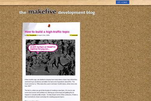
Blog.makefive.com
* * *
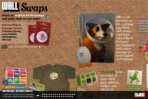
Wallswaps.com
* * *
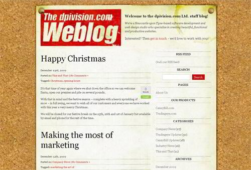
Blog.dpivision.com
Ground Texture Set
Storypixel.com
* * *
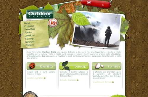
Outdooritalia.it
* * *
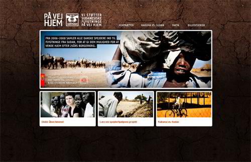
Paavejhjem.dk
* * *
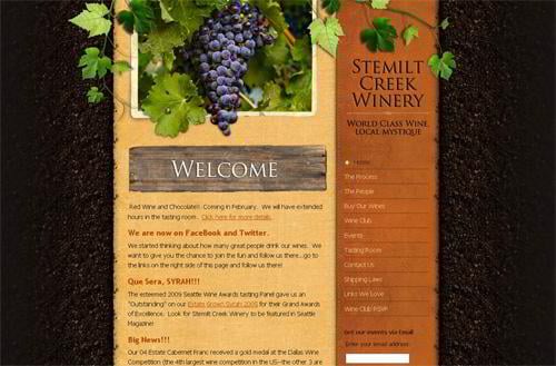
Stemiltcreekwinery.com
Jeans Texture Set
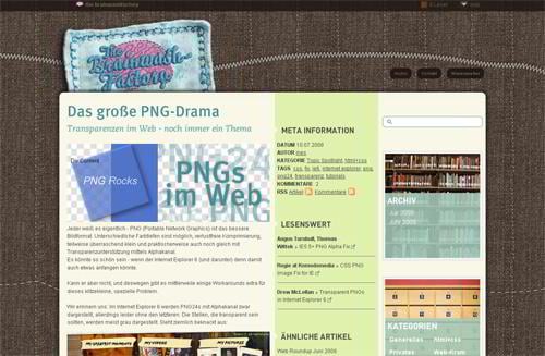
Brainwashfactory.org
* * *
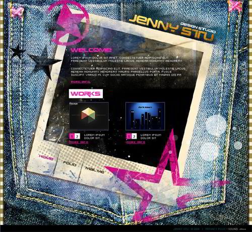
Flash template #25654
Map Texture Set
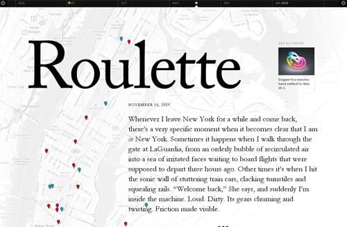
Jackcheng.com
* * *
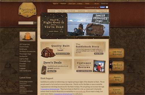
Saddlebackleather.com
* * *
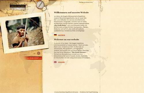
Denis-katzer.com
Liquid Texture Set
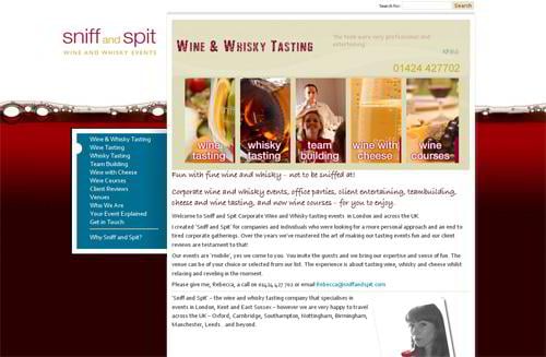
Sniffandspit.com
* * *
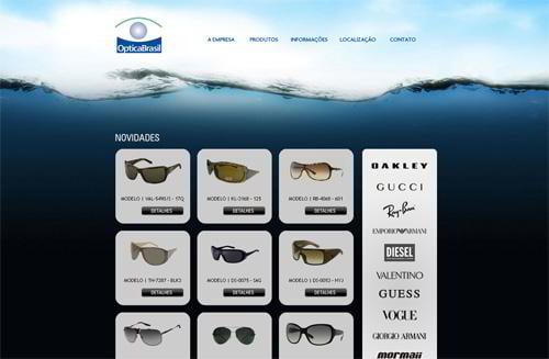
Opticasbrasil.com.br
* * *
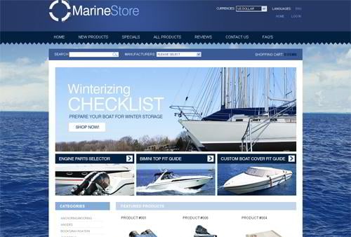
Website template #27003
* * *
WordPress theme #23999
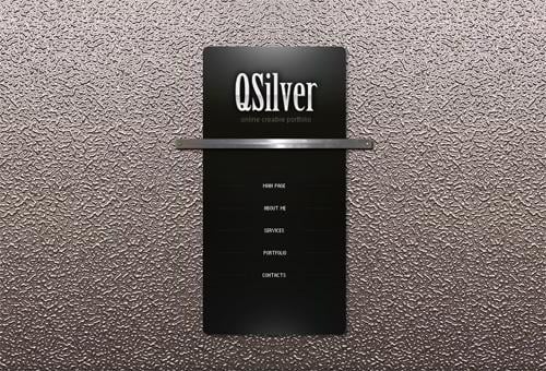
Metal Texture Set
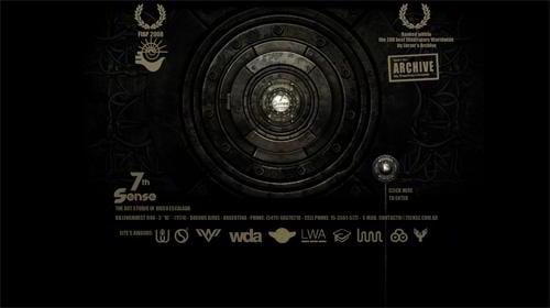
7sense.com.ar
* * *
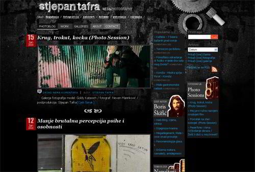
Stjepantafra.com
* * *
Flash template #25375
* * *
Flash template #25813
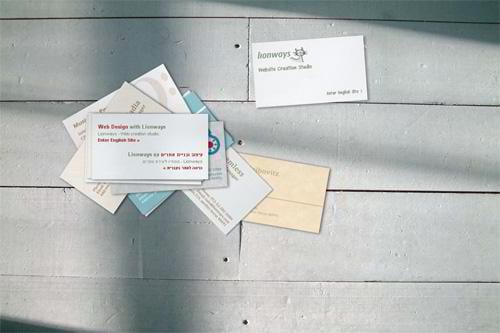
Floor Texture Set
Lionways.com
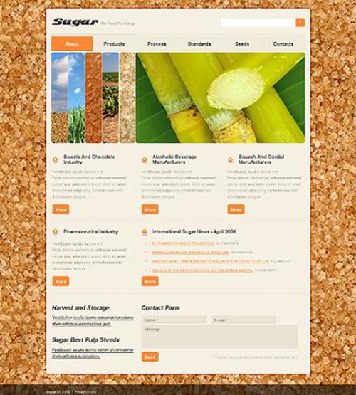
Sugar Texture Set
Website template #26016
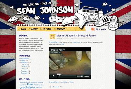
Flag Texture Set
Seanjohnson.net
* * *
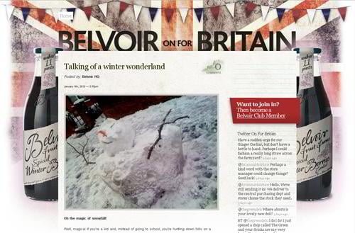
Blog.belvoirfruitfarms.co.uk
* * *
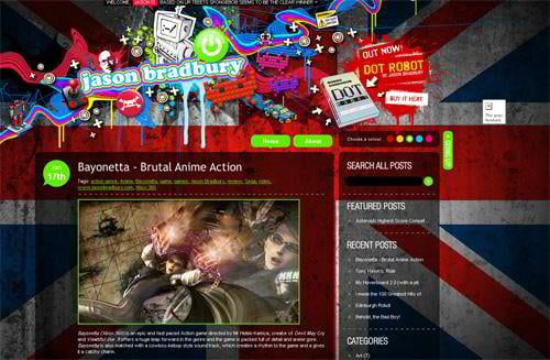
Jasonbradbury.com
Mixed Texture Set
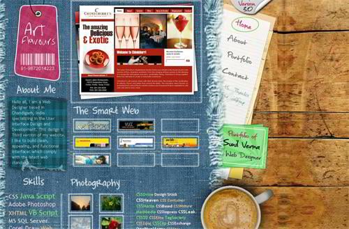
Artflavours.com
* * *
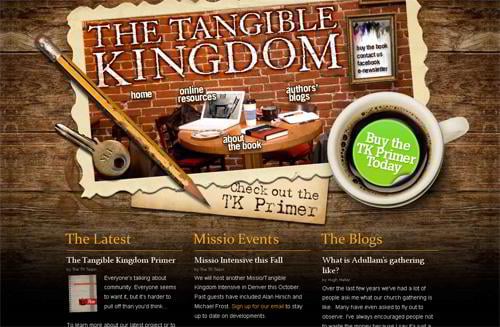
Tangiblekingdom.com
* * *
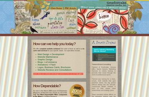
Timeforcake.com
* * *
Thinkdesignblog.com
* * *
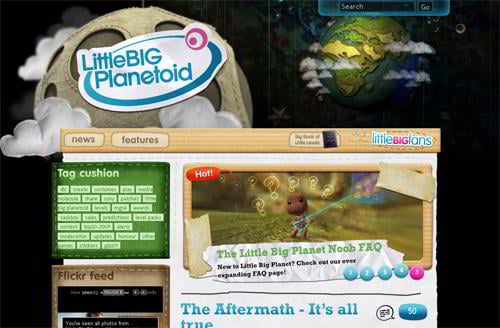
Littlebigplanetoid.com
* * *
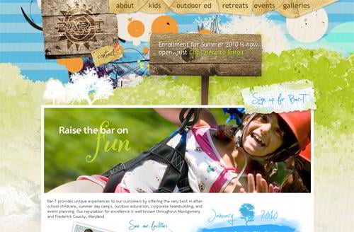
Bar-t.com
* * *
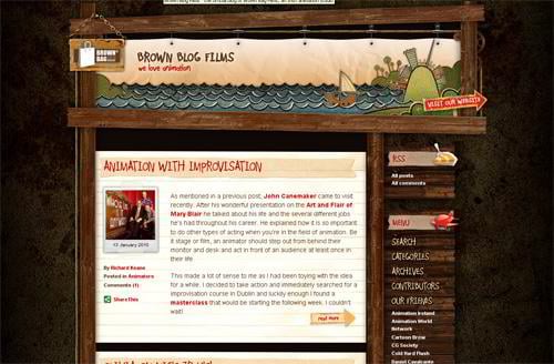
Brownblogfilms.com
As you've seen in this round-up, it contains multiple different texture sets. If to examine closely most web designs usually employ wood texture. It's more likely an over-used pattern in modern web design, though paper, fabric, brick, stone textures are as well perfectly used to highlight the content. And I guess the last point we've mentioned – one of the latest design trends now is the tendency to merge the use of textures catering to a specific website look and feel.
We hope you enjoyed this showcase and that it was an impressive visual source of unique and artful aspects of textured web designs.
Don’t miss out these all-time favourites
- The best hosting for a WordPress website. Tap our link to get the best price on the market with 82% off. If HostPapa didn’t impress you check out other alternatives.
- Monthly SEO service and On-Page SEO - to increase your website organic traffic.
- Website Installation service - to get your template up and running within just 6 hours without hassle. No minute is wasted and the work is going.
- ONE Membership - to download unlimited number of WordPress themes, plugins, ppt and other products within one license. Since bigger is always better.
Get more to your email
Subscribe to our newsletter and access exclusive content and offers available only to MonsterPost subscribers.






Leave a Reply
You must be logged in to post a comment.