


There is no doubting the fact that mobile technology is paving the way for future advancements through mobile devices such as tablets, phones and, in a restricted capacity, wrist watches. According to a 2012 survey, the global smartphone audience easily surpassed the 1 billion mark, followed by the totality of 1.75 billion two years later.
It’s been just a little over a decade that the modern smart phone started becoming common, while tablets have been there for a mere four years or even less.
Due to the rapidly increasing tech-consumer base, web designers and developers realized that soon the World Wide Web would need to be displayed more clearly and distinctively for the massive audience online.
This necessity was the main cause for the development of Responsive Web Design (RWD). This is basically a ‘responsive’ approach by designers to ensure that a website provided its viewers an optimal experience across a wide range of electronic devices – from desktop monitors and laptops to mobile phones and tablets.
The basic idea behind the proposition is to understand which device the user has and automatically respond to that viewing preference.
What mobile-first strategy is all about
There are two main branches of the mobile-first concept that fall into everyday conversation: design philosophy and technical implementation. It is important to treat these two as separate ideas, as more than often there is confusion when terms like ‘mobile responsive’ come into the mix.The design perspective


Many of the web design functionalities that look and work great on desktop computers do not translate to being better on mobile devices. In fact, it makes the whole site unusable or, at the very least, extremely hard to navigate for mobile users.
However, the mobile-first web designing philosophy turns this concept upside down, allowing to start the design process with mobile considerations and then working their way up from there. Putting into account the smaller factors of the device, and serving an alternative version of the site makes all the relevant information easily readable, hiding everything that is needless to make a sale.
For instance, as a customer, you might receive an email from Best Buy promoting their latest holiday deals. Clicking on the link might send you to two completely different versions of the website, depending on whether you’re using your laptop, desktop computer or phone.


On the hand-held version, you will notice a lot of difference; For example, the introductory copy might be concise, category links collapsed by default, the navigation items extremely streamlined, and so forth.
Technical perspective
There are various forms of execution tactics available, including server-side user agent detection and client side responsive design that make ‘mobile first’ achievable. The client side of your device, for example, will look into the HTML mark and find the CSS files that fall into your gadget’s specified ‘responsive’ conditions. This will have its own impact on the usability and loading times, as only the main resources needed for your device will be connected, amongst other things like Wi-Fi, LTE, etc.
Why it’s important
Mobile-first web strategy can simply make you more money through an eommerce link building approach; and with the internet becoming more mobile every day, mobile phones are becoming faster and have more processing power than your average desktop computer. So, to keep up to date with this strategy, it is essential for websites and blogs to be compatible with these current changes.
Here are 4 more reasons why it’s so important to choose a mobile-first theme for your website;
Google ranking


First of all, speed matters for Google SEO ranking. Not only is Google considering site loading time a factor but is also prioritizing mobile optimized websites on mobile search.
Google is a one of a kind domain that rarely shares secrets on what impacts site-search positions, but back in 2010, they publicly acknowledged loading time to be one of the main factors they look at for ranking.
Google’s impact and an elevated preference on the mobile-friendly design acted as a catalyst for an increased number of mobile sites getting added to the legacy of outdated online domains (build years before mobile use became relevant).
Saving bandwidth costs

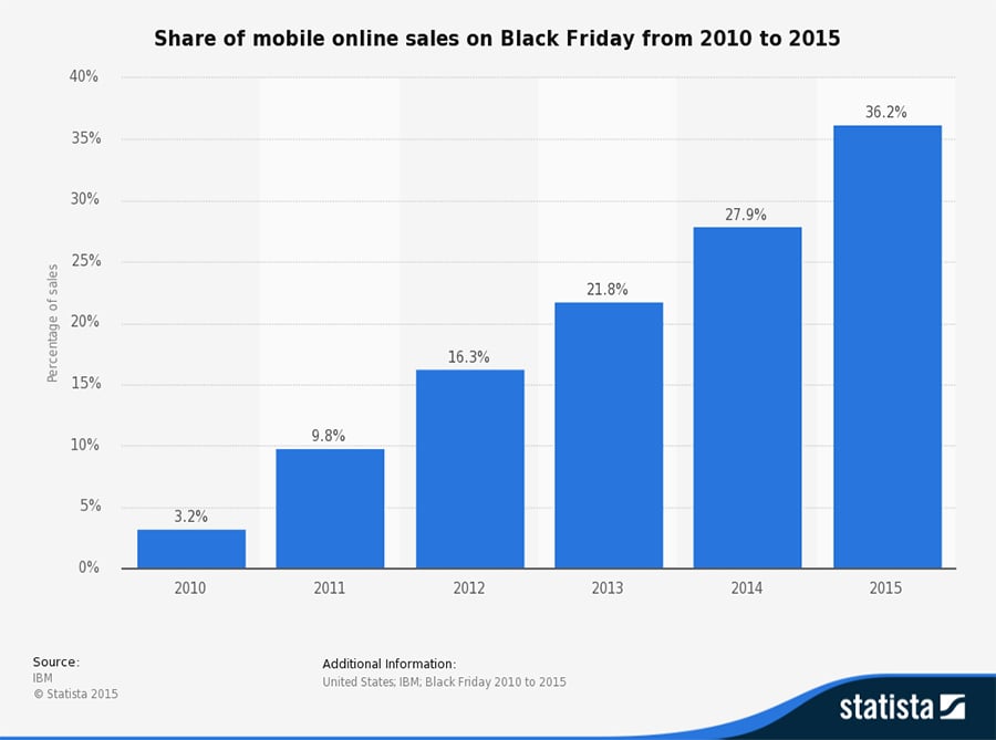
Furthermore, with the money saved from bandwidth costs, going mobile will pretty much pay for itself. The latest data from Black Friday 2015 showed how more and more sales are happening on mobile devices; mobile drove 36.3% of total sales, while Cyber Monday held a figure of 26%.
Going mobile-first can have real tangible benefits for your online business, adding to the statistics from global internet access that show how globally mobile broadband has taken over home internet use.
Companies have now started enforcing internet speed restraints to stimulate slow data connections since optimizing for mobile has become immensely important. For example, Facebook’s idea of ‘ 2G Tuesdays’ encourages their UX teams to understand what mobile experience is like for most people around the globe, where either a basic internet connection isn’t available or people can’t seem to afford it.


Focused content
Admittedly, it is easier to fill a house than to move from one apartment to another. Similarly, in the desktop realm, there is an option to add functions, content, and images to ‘fill space’ online. This eventually creates a visual clutter, inevitably reducing the amount of white-space or breathing room on the page.
However, under the mobile-first scenario, the content displayed must be clear, concise and easy to understand, since there is no ‘real estate’ for spaces to happen. Once done correctly, the desktop and tablet versions of your website result in a cleaner and more polished look, making a positive impact on the viewer.


Ten years have brought a lot of changes to NBC.com, keeping in mind the smartphone era had just started building momentum in 2004’s consumer market. Now, the company is ever-ready to do some pinching and scrolling via latest iPhone screens.
Improving shopper experience
Nowadays, since the stores are large, it is difficult for shoppers to find the things they need. On the other hand, shop owners keep staff lean to manage elevating costs. But, when customers can’t find what they’re looking for, with no salesperson to help them, they leave the store, frustrated.
By providing your clients with an app that not only works without GPS, but also helps them navigate through your store to get exactly what they want, your business can easily garner extra sales. For example, they can simply type in ‘Where are the gluten-free potato chips?’ and a Siri-like assistant will direct them to the place.

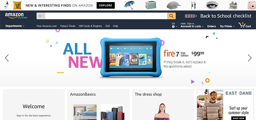
Amazon’s 29 per cent of overall web traffic comes from mobile-only shoppers, thus, the ecommerce giant cannot afford to overlook this important channel. While many other pure-play online retailers and service organizations have not been as proactive in mobile, savvy ones like Amazon and some dedicated web server hosting companies are aiming to support shoppers with browsing and app experiences; and they are able to do this by taking full advantage of the latest mobile functionalities.
Conclusion
Nowadays, it’s the user’s job to dictate how the websites should be formed, not the organization’s. Sure, the latter facilitates avenues for them to utilise, but the final say belongs solely to the buyer.
The web has changed many times in the past few years and will continue to do so. Change is not easy, but it’s not necessarily bad either. One of the better ways to alleviate anxiety during these times is to adopt the mobile-first strategy. After all, a potentially great product should be showcased clearly on all devices.
Related Posts
Three Opinions That Will Make You Feel Anxious about Mobile-First Design
How to Get Mobile Traffic to Your Blog
5 Must-have Skills Contemporary Mobile Designers Should Master
How to Go Mobile-friendly with Your Website after Mobilegeddon?


P.S. Don't forget to check out our mobile marketing website templates.