Movies are made to entertain the audiences, so do their websites. Yet the main part of the aim here is to spread the word about the movie and promote it by all possible means either giving a trailer that will trigger the interest or embracing a very dynamic action, some special sound effects and graphically rich animation.
What's obvious is that any movie website should give the visitors what they are looking for, so that once arrived on a site they could immediately determine if they want to see this movie. However, we've noticed that a lot of movie websites have 80% of common elements and are pretty boring. So the reason we're publishing this post today is to mark out the designs that are in fact creative and that differ from other movie websites. So please welcome a top list of the most unusual and attractive designs of movie websites. And if you're a real film buff, see the following section - it centers on captivating designs that cover the world of movie.
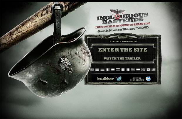
Inglourious Basterds
* * *
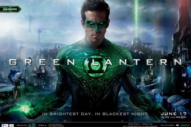
Green Lantern
* * *
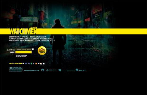
Watchmen
* * *
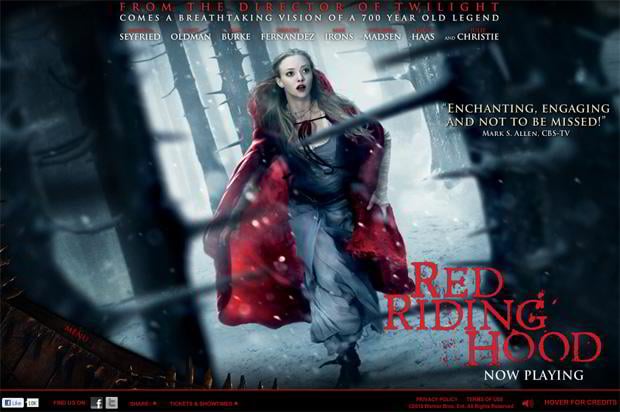
Red Riding Hood
* * *
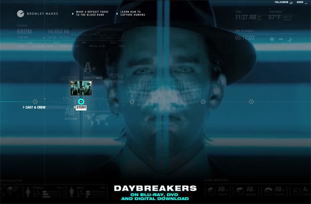
Day Breakers
* * *
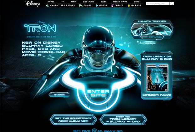
Tron
* * *
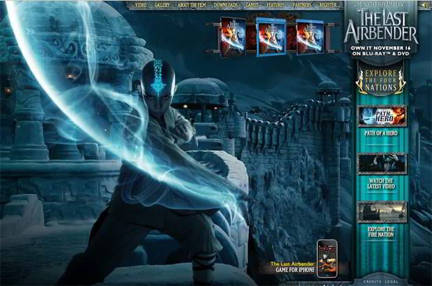
The Last Airbender
* * *
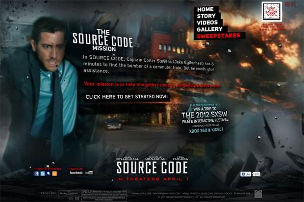
Enter The Source Code
* * *
Avatar
* * *
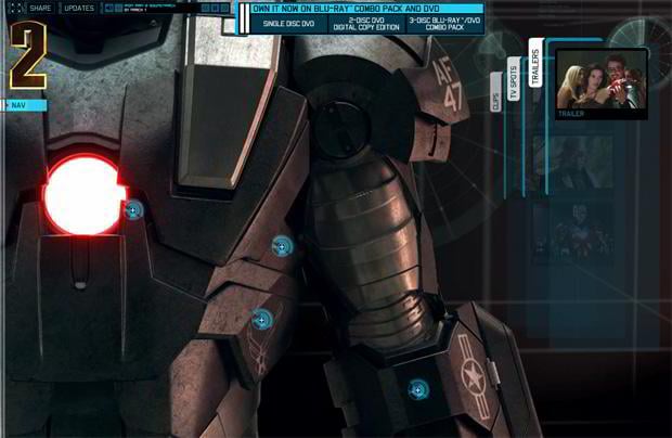
Iron Man
* * *
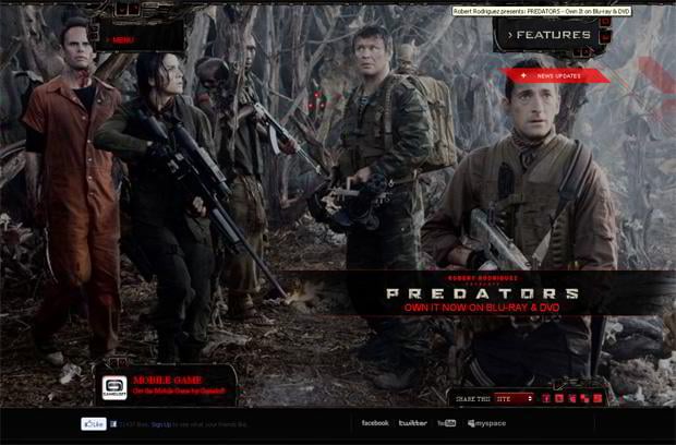
Predators
* * *
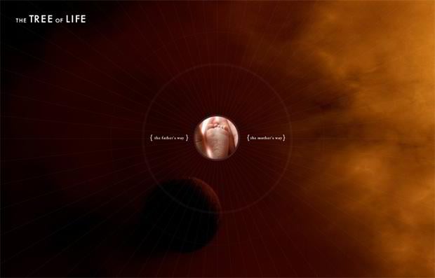
Two Ways Through Life
* * *
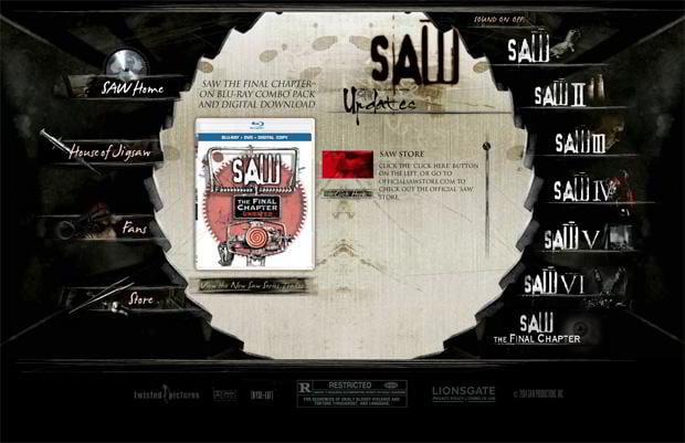
Saw
* * *
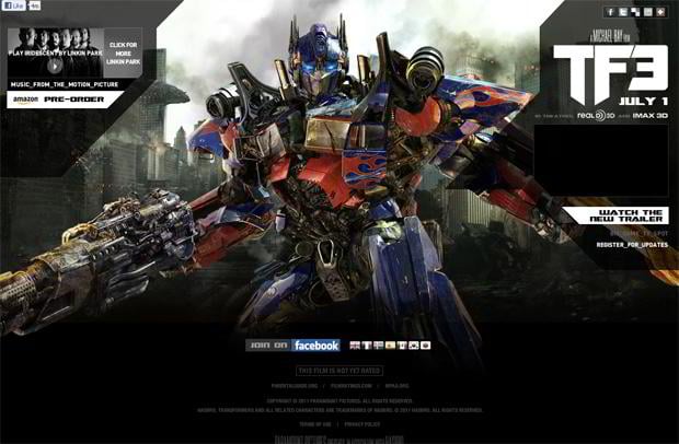
Transformers
* * *
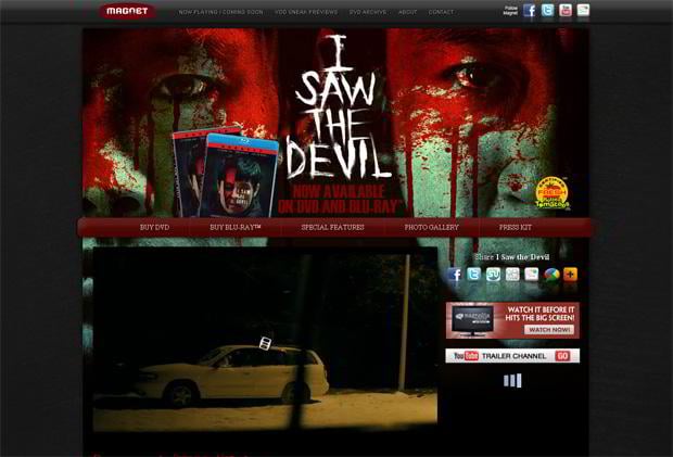
I Saw The Devil
* * *
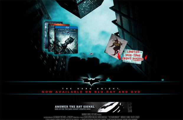
The Dark Knight
* * *
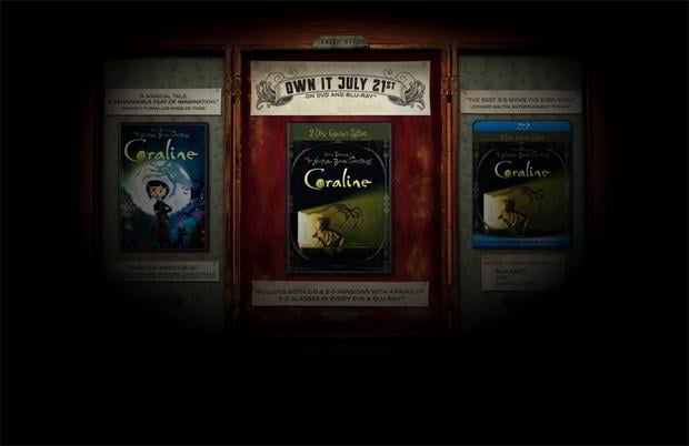
Coraline
* * *
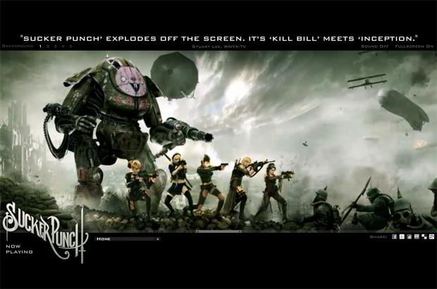
Sucker Punch
* * *
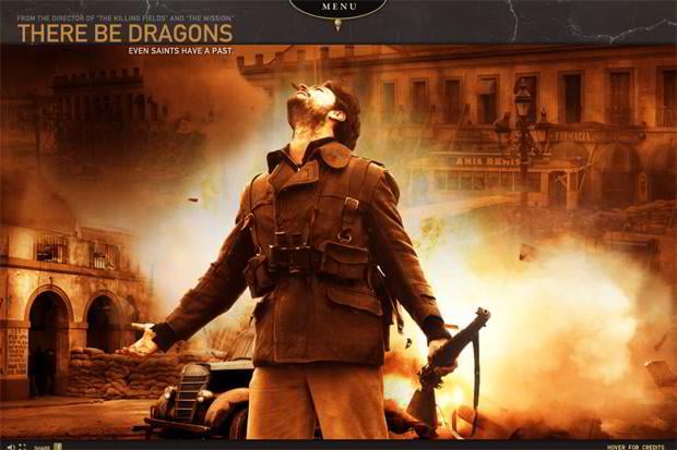
There Be Dragons
* * *
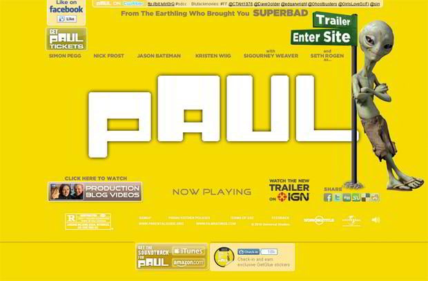
What Is Paul
* * *
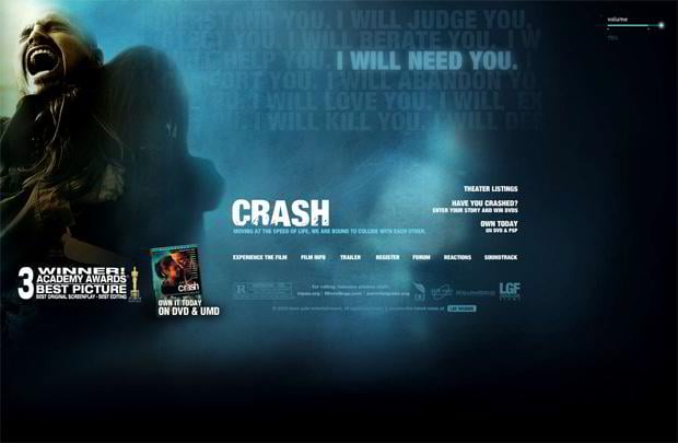
Crash
* * *
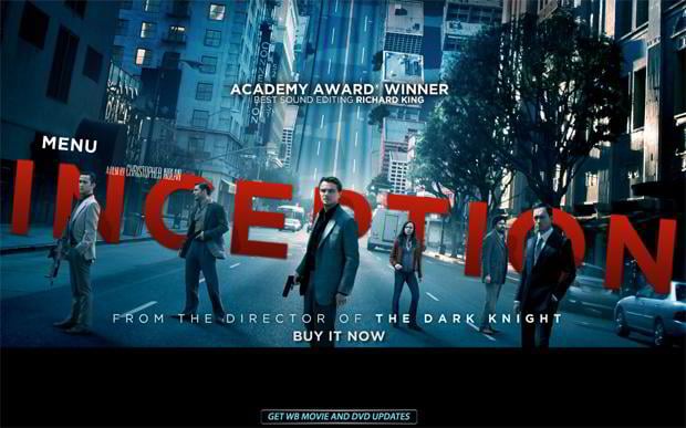
Inception
* * *
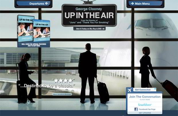
The Up In The Air
* * *
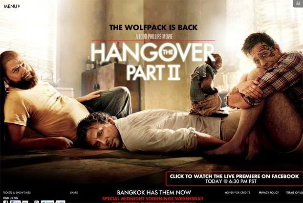
Hang Over Part 2
* * *
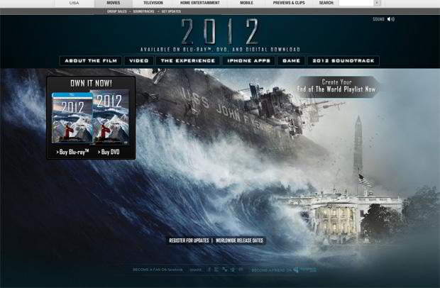
2012
* * *
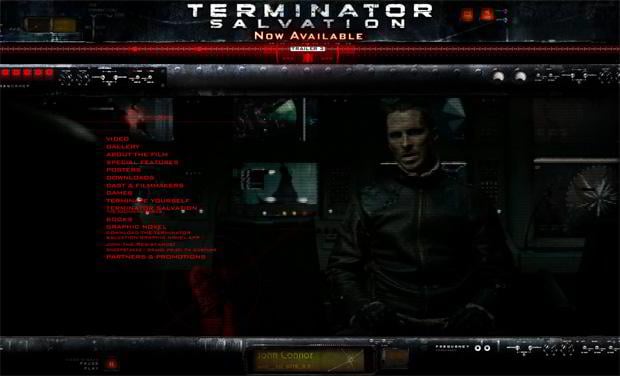
Terminator Salvation
* * *
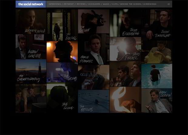
The Social Network
* * *
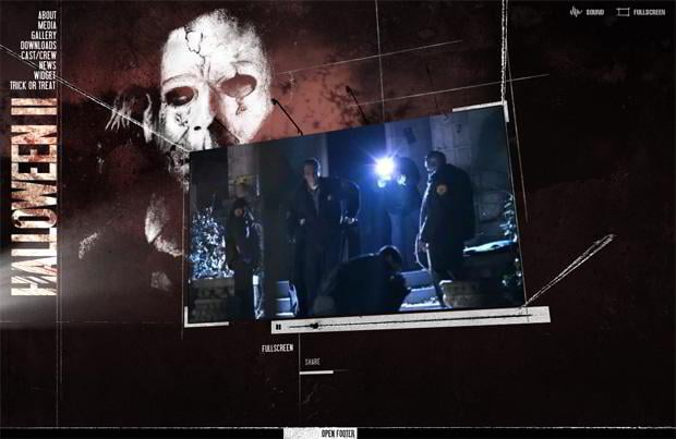
Halloween 2
* * *
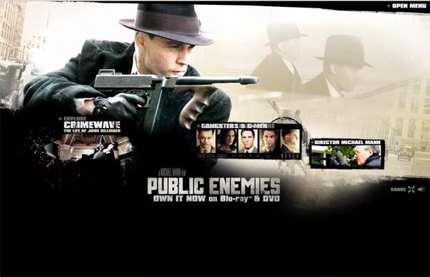
Public Enemies
* * *
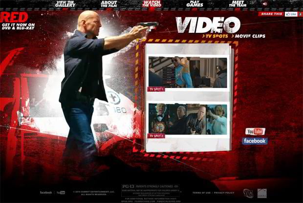
Red
* * *
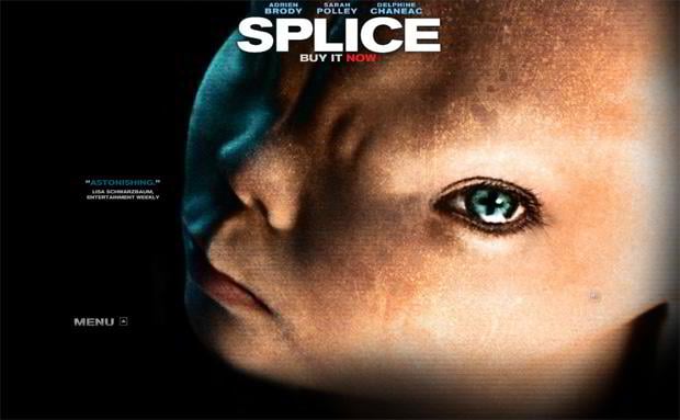
Splice
* * *
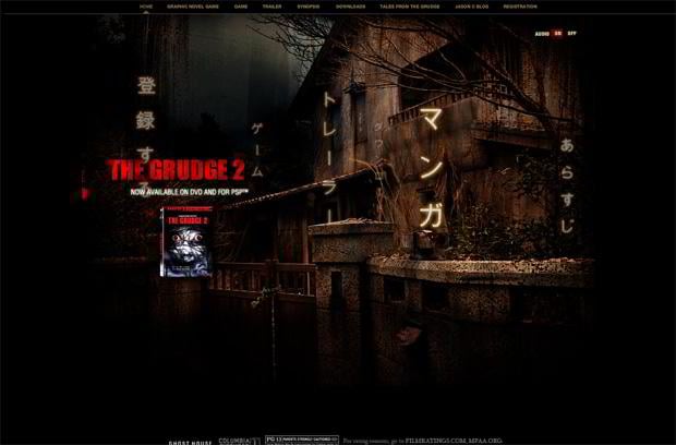
The Grudge 2
* * *
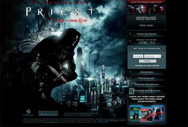
Priest
* * *
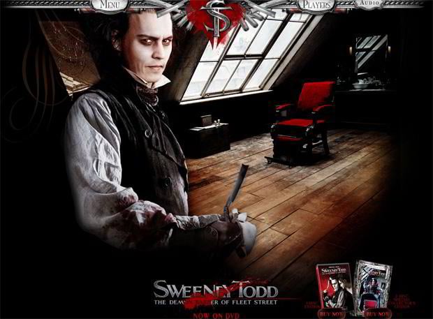
Sweeney Todd
* * *
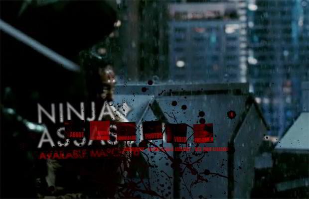
Ninja Assassin
* * *
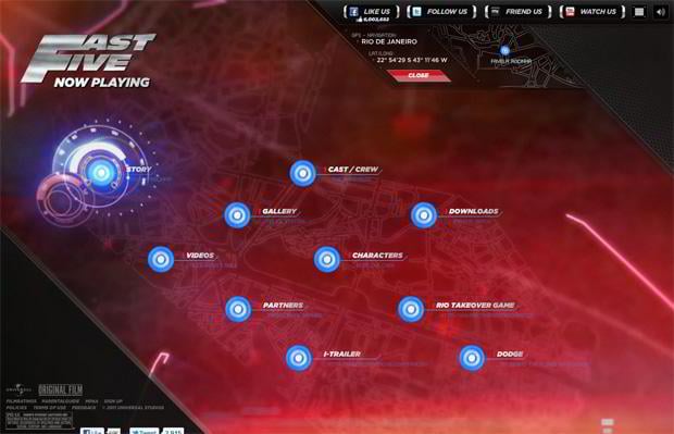
Fast Five
* * *
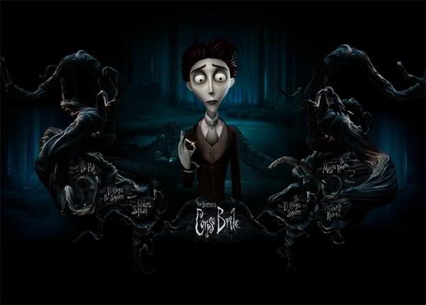
Corpse Bride
* * *
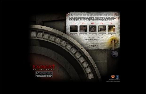
Exorcist The Beginning
* * *
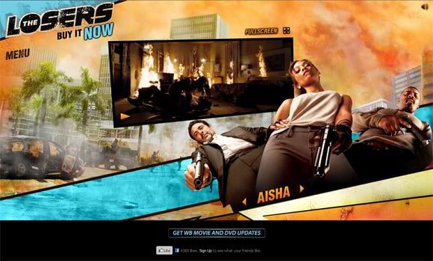
The Losers
* * *
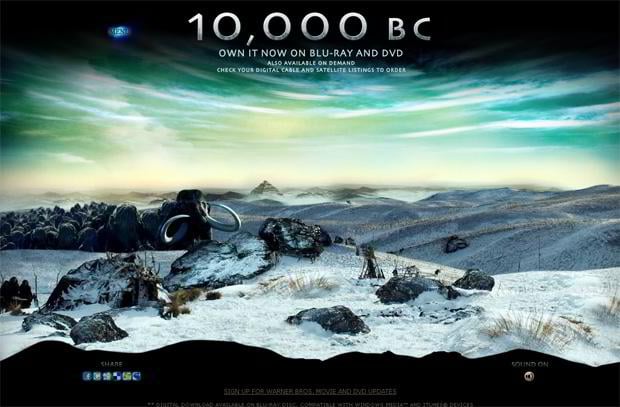
10,000 BC
* * *
Don’t miss out these all-time favourites
- The best hosting for a WordPress website. Tap our link to get the best price on the market with 82% off. If HostPapa didn’t impress you check out other alternatives.
- Monthly SEO service and On-Page SEO - to increase your website organic traffic.
- Website Installation service - to get your template up and running within just 6 hours without hassle. No minute is wasted and the work is going.
- ONE Membership - to download unlimited number of WordPress themes, plugins, ppt and other products within one license. Since bigger is always better.
Get more to your email
Subscribe to our newsletter and access exclusive content and offers available only to MonsterPost subscribers.

Leave a Reply
You must be logged in to post a comment.