5 Tips from AutoBlog About How to Create Auto Blog that Will Rock
If you have a car and are interested in auto industry news – you probably read AutoBlog. It is the most popular website about cars, automobile parts and the vehicles companies’ (yeah, they write about motorcycles too) news in general.
According to eBizMBA Ranks AutoBlog has more than 5,5 millions of unique monthly visitors. Carl, 5.5 million visitors! This auto blog has everything a profitable website should have – interesting content, appropriate, design, and up-to-date functionality. And this means that if you want to create an auto blog that will really rock for yourself – you should learn from the best. Let me point out to the most interesting and sufficient AutoBlog features you should use in your car blog too.
The slider at the top
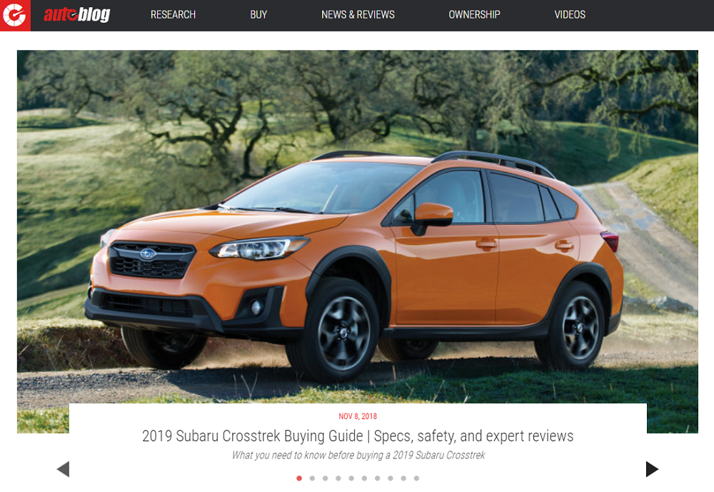
Big eye-catching photos, smoothly changing each other are the element I could hardly imagine a website without. At least, a cool and a fancy website. You need a slider for two purposes. First – to make the visitor feel interested in your website and stay there. And the second – to show users things you don’t want them to miss. For example, AutoBlog has put recent posts to the top slider. Visitors see them just as they enter the website and could be interested in the topic. A wise little trick that you too can use in your blog – place the latest or the most interesting articles to the top slider.
Built-in video player
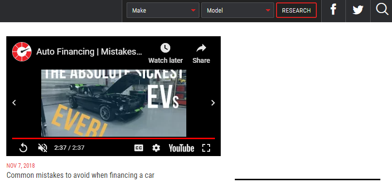
When you enter the AutoBlog website it immediately starts playing the latest video, located right at the top of the page. To add the same feature, you will need a video player which allows a user to watch videos right on your page. Such kind of player helps you to achieve the next goals:
- To show the visitors you have some interesting video to watch.
- Attract the attention and interest the user with content.
- To decorate the homepage.
- To promote your YouTube channel.
The best option is to get a template that already has a built-in video player, but it also won’t be a problem to use a plugin for that purpose. Though the video is a nice element I have to warn you that not every user would like if it will start playing the next second he comes to the blog. It may be annoying, so it will be better not to turn on the autoplay.
Popular posts slider
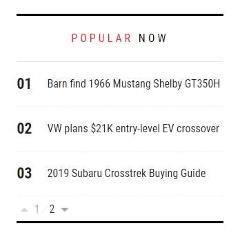
Almost all niche websites, including Auto Blogs, use the “Popular posts” section somewhere on the homepage. It could be either the sidebar, or a separate module, or even the top slider. AutoBlog adds a small “popular now” block at the top of the page with sliding posts titles. It's a clever solution – without pictures this slider won’t mess up the website’s look, but a pinch of animation can attract attention to it. You could create another type of post slider, but you totally need it on your car blog. This block is like a trailer of your blog and its content, looking at it user decides if he wants to stay and read something or not.
Simple design
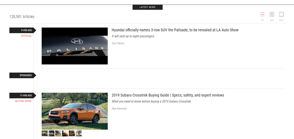
The general appearance of AutoBlog is extremely simple. No distracting pop-ups, no background videos or pictures, no hover animation effects. Just the white background and minimalistic design. That’s ok if you came here to read some useful information, didn’t you? The design of your auto blog has to match the mission you defined for it. If you want to concentrate on the texts – focus the visitor’s attention on it. One way or another – minimalism is now a trend and wide empty spaces are more preferable then messy sidebars with dozens of blinking messages.

Summarizing. An ideal template
We have a WordPress theme that meets all those requirements, so if you started to seek for one – check out the Mechanicum car WordPress theme. It's one of our best automobile themes and it will fit perfectly for an auto blog. A big, full-width slider in the hero area will impress the visitor from the first sight if you place some sharp photos there. The social media buttons are right on the header and a visitor will be able to follow your accounts without any issues.
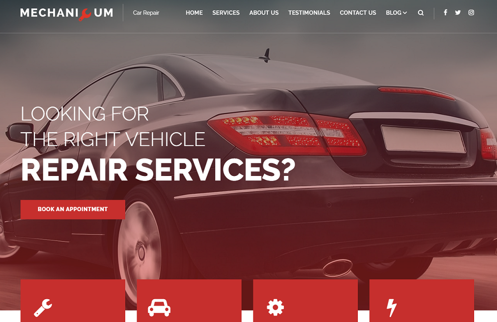
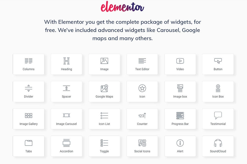
The template is compatible with Elementor Page Builder, so customization of the page is fairly simple. The theme pack includes a few Jet plugins, so adding a post slider or changing the look of the blog will be easy as cake. JetElements plugin will give you all the instruments you need to polish your auto blog to perfection.
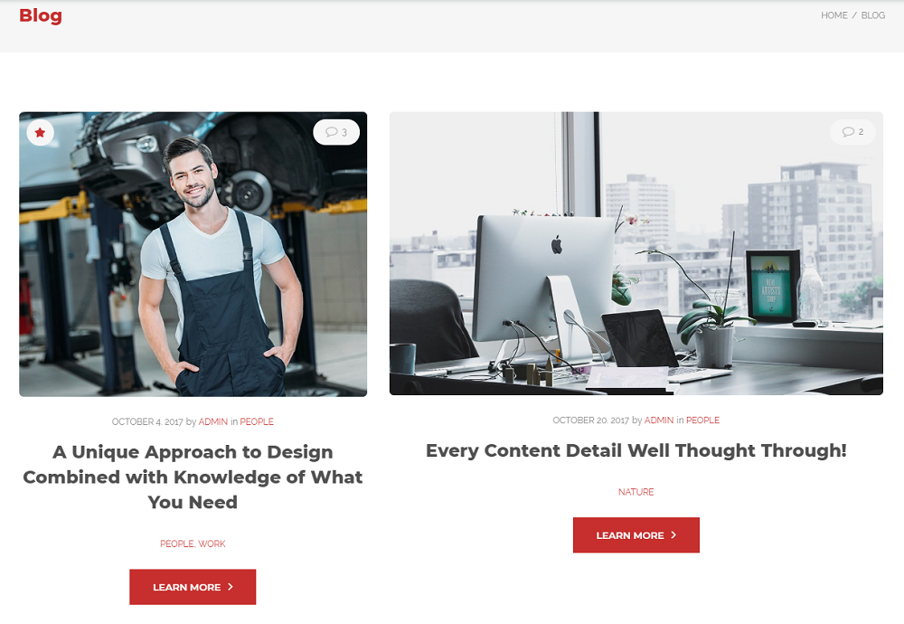
The design is rather simple, the blog could be displayed in three different layouts: grid, masonry and justify. There’s nothing redundant and the user stays focused on the information you want to give him. Due to the Elementor, you can customize the page looks without having to shift back and forth between the backend and the frontend.
Hope you found something useful in this article and made your auto blog more attractive. If you have some comments or questions – you are welcome in the comment section below.

Read Also
How to Start a Lifestyle Blog: 8 Tips to Make Your Blog a Success
70 Top-Trending Automotive WordPress Themes Designed in 2018
Top 50 Transportation Website HTML Templates
Step-by-Step Instructions on How to Create a Blog with
Don’t miss out these all-time favourites
- The best hosting for a WordPress website. Tap our link to get the best price on the market with 82% off. If HostPapa didn’t impress you check out other alternatives.
- Monthly SEO service and On-Page SEO - to increase your website organic traffic.
- Website Installation service - to get your template up and running within just 6 hours without hassle. No minute is wasted and the work is going.
- ONE Membership - to download unlimited number of WordPress themes, plugins, ppt and other products within one license. Since bigger is always better.
Get more to your email
Subscribe to our newsletter and access exclusive content and offers available only to MonsterPost subscribers.

Leave a Reply
You must be logged in to post a comment.