77 Clean Style Websites Powered by WordPress
Clean and minimal style is implemented widely throughout the internet. As one of the most prominent design trends, it deserves a decent tribute. Currently, we’ll bring together a showcase of 77 WordPress web designs that feel stark and minimal with their simple forefronts. Making use of plenty of white-space, these minimal WordPress sites show the content for a high impact and clean communication. With just enough contrast in tone and colors, they are very strong to properly transmit important concepts.
Still where it is highly important to draw a specific users’ attention, designers resort to using the bigger, bolder, and more contrasting design choices which however do not make the layout feel any cluttered. It seems that page elements are plunged into rather plain and fresh environment where there is no graphical overload or eye-itching visual saturation. Here it is exactly the content that screams for attention! Just take a look:
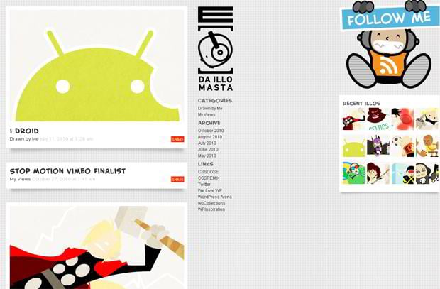
Elacorte.com
* * *
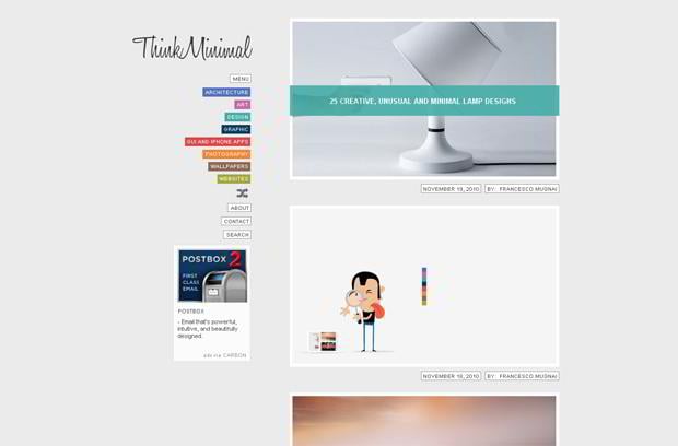
Thinkminimal.net
* * *
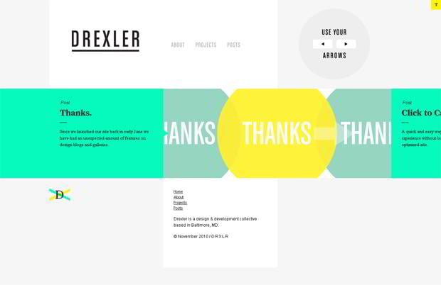
Drxlr.com
* * *
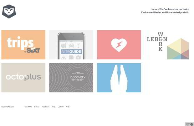
Lennartbasler.com
* * *
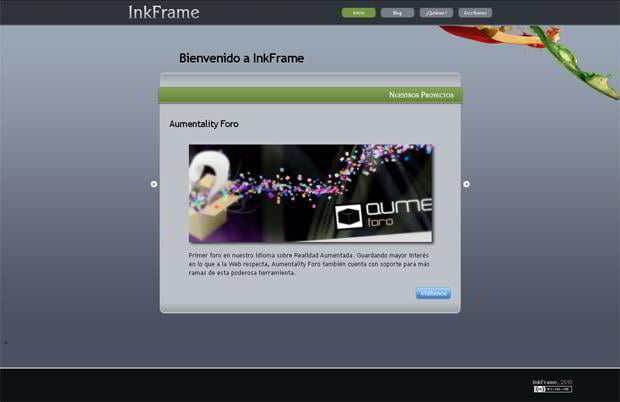
Inkframe.com
* * *
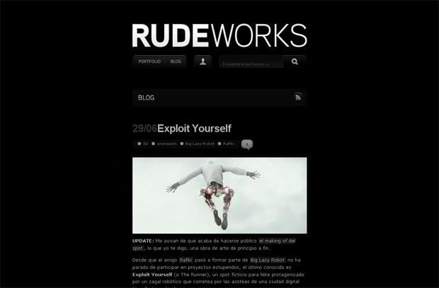
Rudeworks.com
* * *
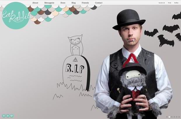
Catrabbit.com.au
* * *
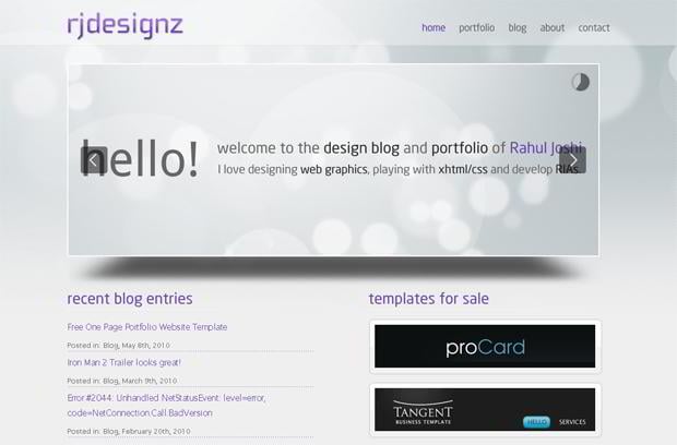
Rjdesignz.com
* * *
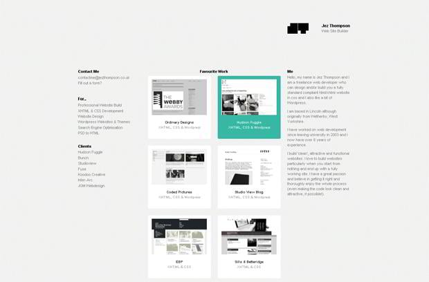
Jezthompson.co.uk
* * *
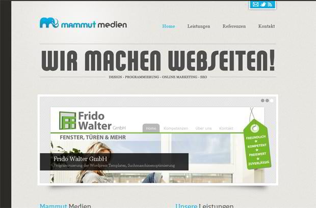
Mammut-medien.de
* * *
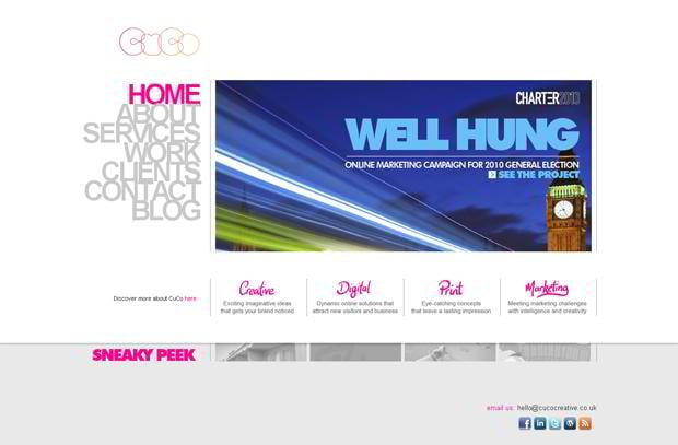
Cucocreative.co.uk
* * *
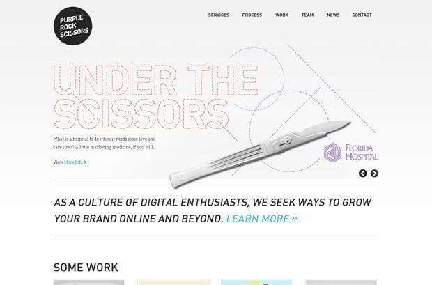
Purplerockscissors.com
* * *
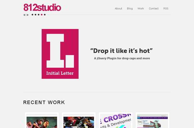
812studio.com
* * *
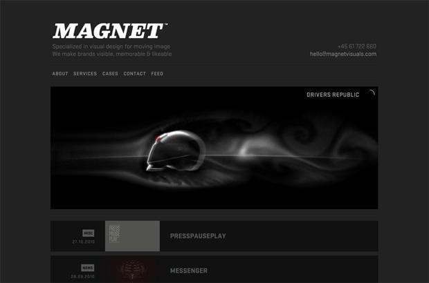
Magnetvisuals.com
* * *
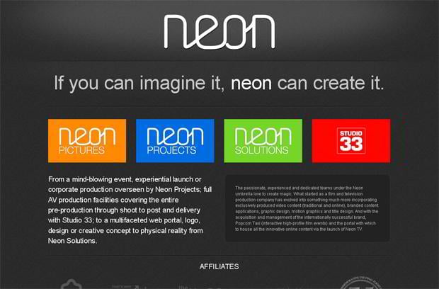
Neongroup.com.au
* * *
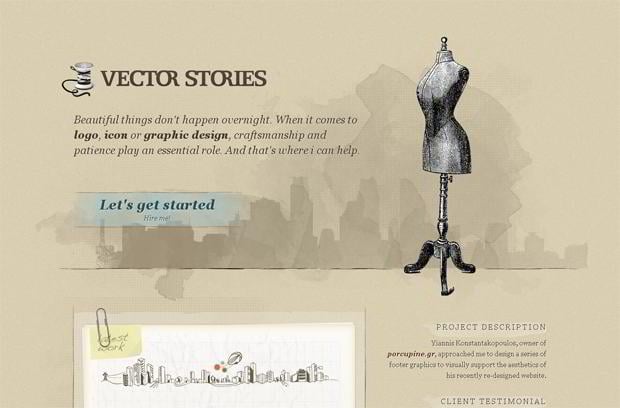
Vectorstories.com
* * *
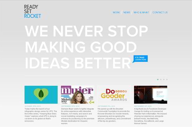
Readysetrocket.com
* * *
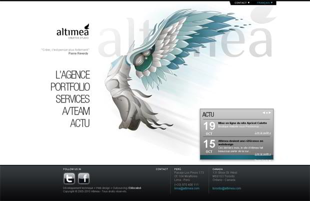
Altimea.com
* * *
Simonfosterdesign.com
* * *
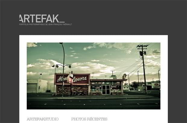
Artefakstudio.com
* * *
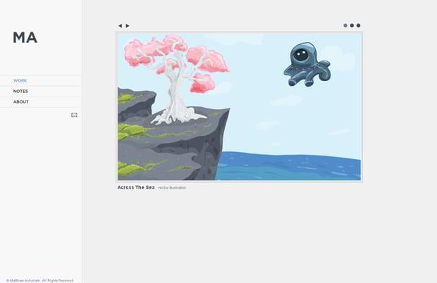
Achariam.com
* * *
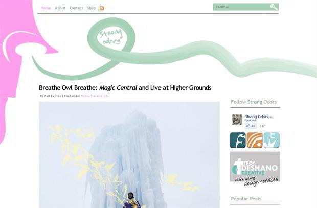
Strongodors.com
* * *
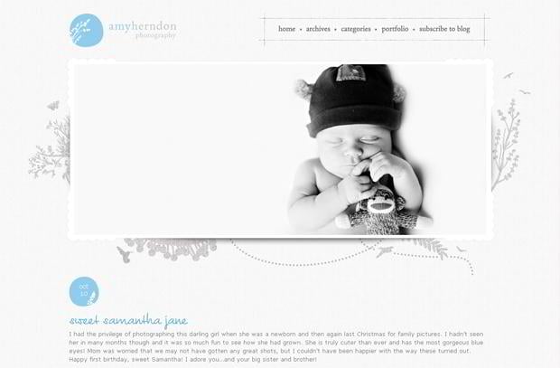
Amyherndonphotography.com
* * *
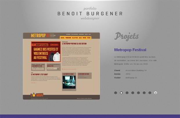
Benoitburgener.ch
* * *
Dhaneshtk.com
* * *
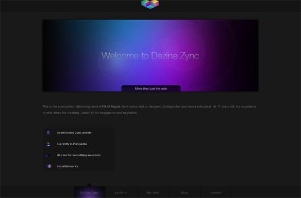
Dezinezync.com
* * *
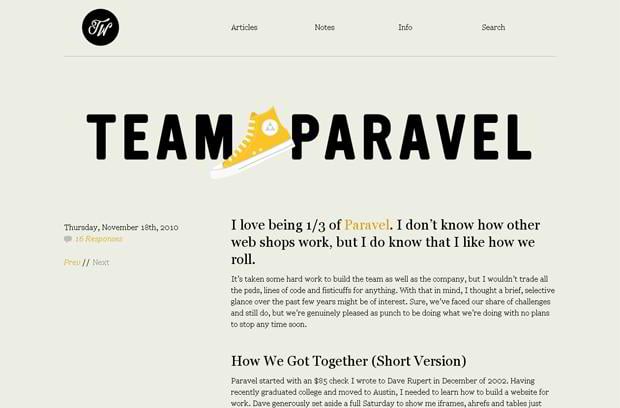
Trentwalton.com
* * *
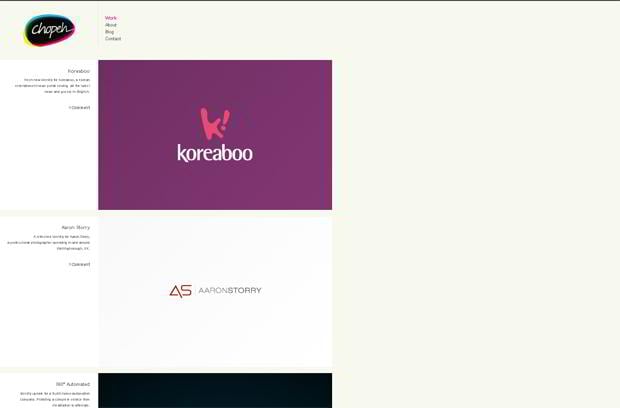
Chopeh.com
* * *
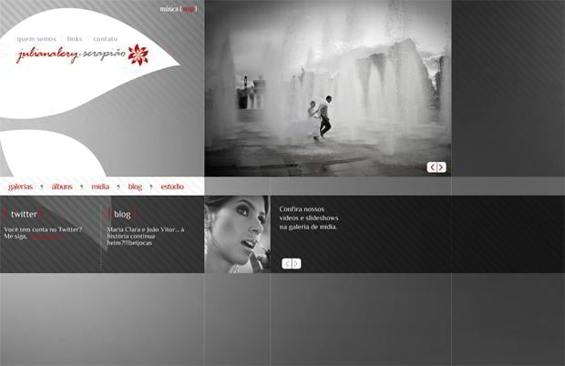
Julianaleryeserapiao.com.br
* * *
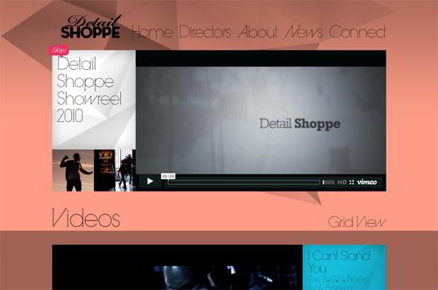
Detail-shoppe.com
* * *
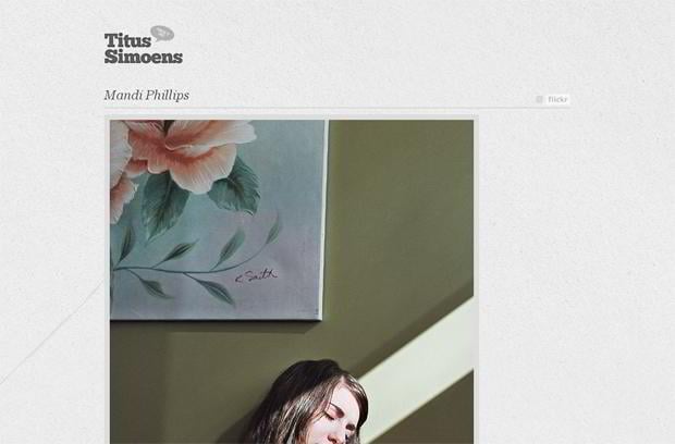
Blog.titussimoens.be
* * *
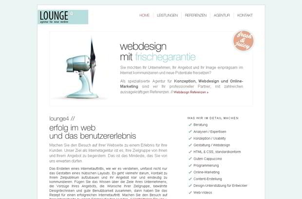
Lounge4.de
* * *
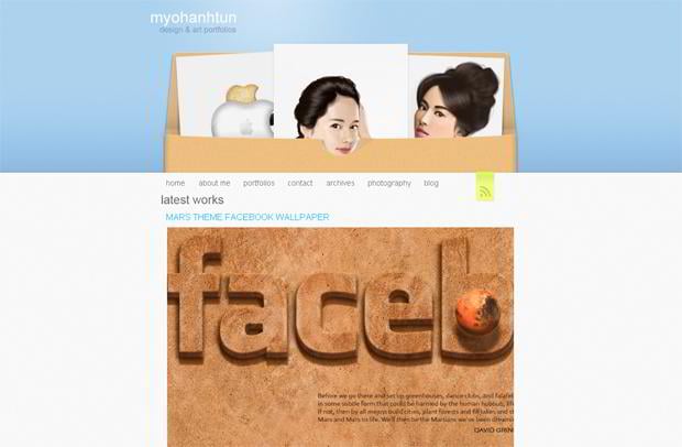
Myohanhtun.com
* * *
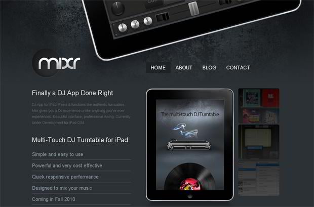
Ipadmixr.com
* * *
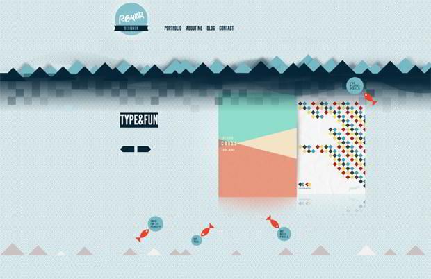
Romina.si
* * *
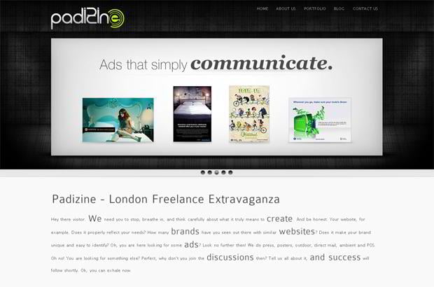
Padizine.com
* * *
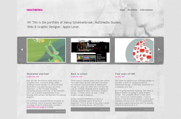
Whatthefrog.com
* * *
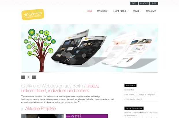
Artlemon.de
* * *
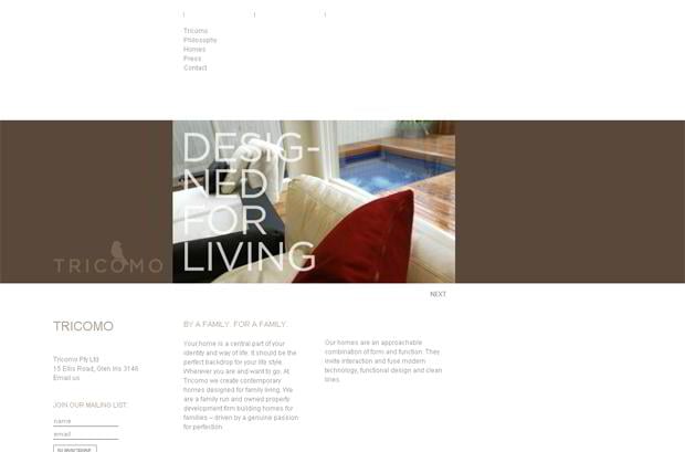
Tricomo.com.au
* * *
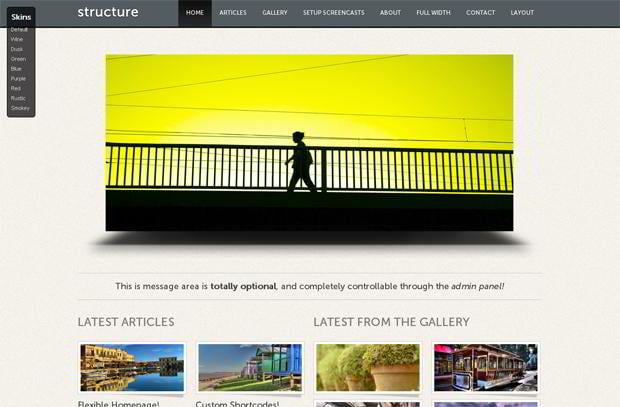
Wp.contempographicdesign.com
* * *
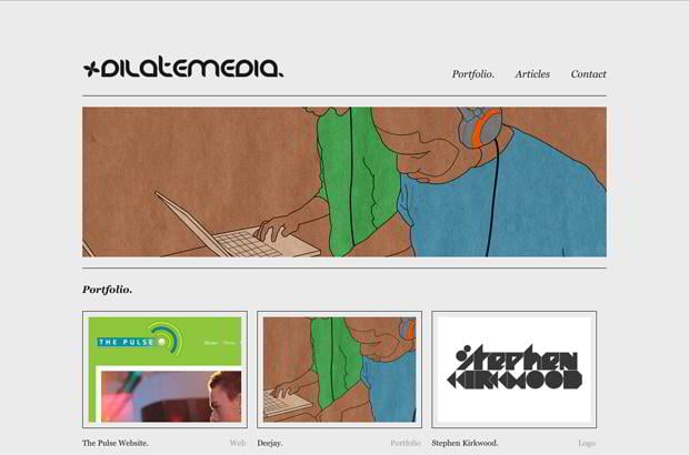
Dilatemedia.co.uk
* * *
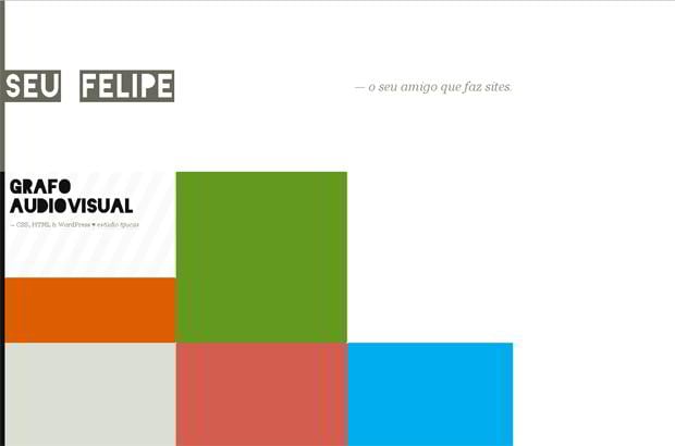
Seufelipe.com.br
* * *
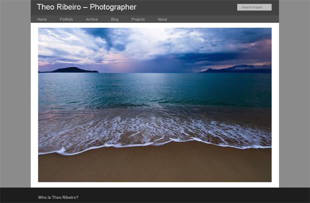
Theoribeiro.com
* * *
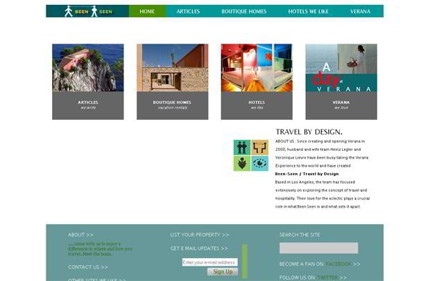
Been-seen.com
* * *
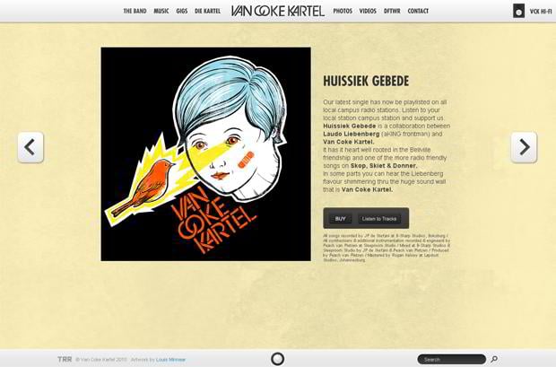
Vancokekartel.co.za
* * *
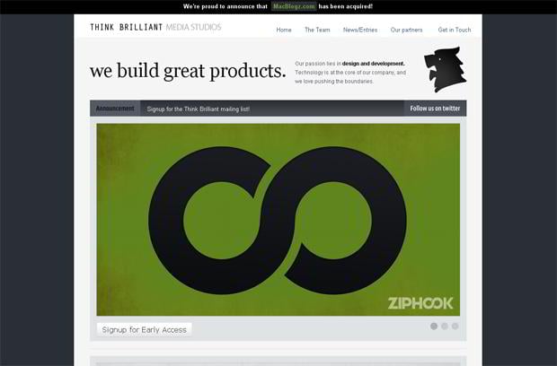
Thinkbrilliant.com
* * *
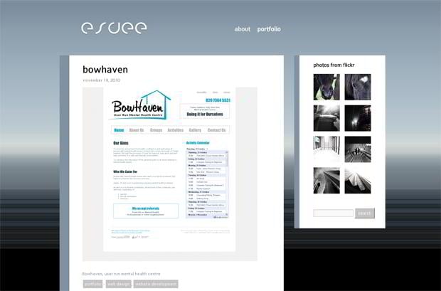
Esvee.co.uk
* * *
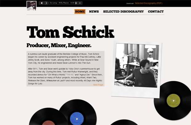
Tomschick.com
* * *
Icontoucan.com
* * *
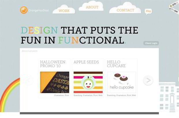
Orangeyouglad.com
* * *
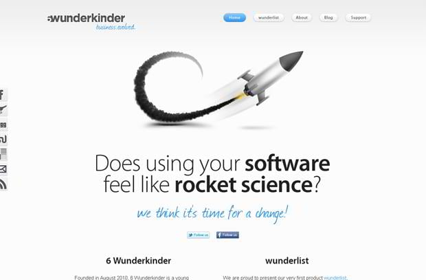
6wunderkinder.com
* * *
Heartworker.com
* * *
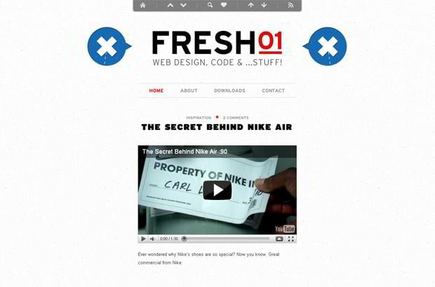
Fresh01.co.za
* * *
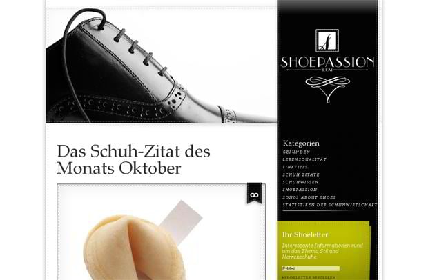
Shoepassion.de
* * *
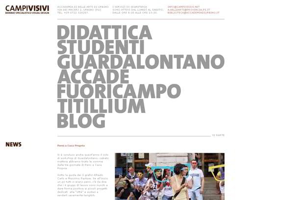
Campivisivi.net
* * *
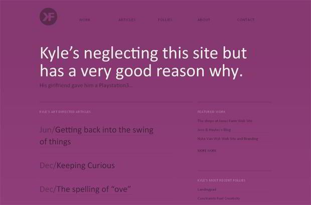
Kylefiedler.com
* * *
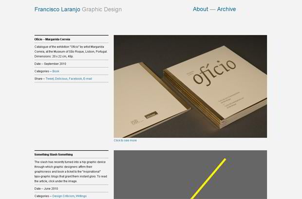
Laranjo.org
* * *
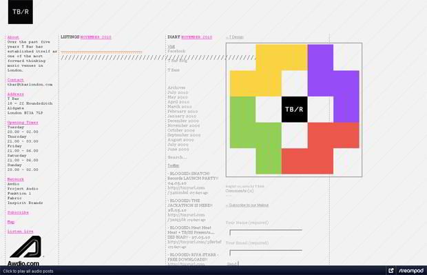
Tbarlondon.com
* * *
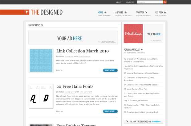
Thedesigned.com
* * *
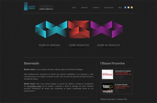
Maskin.cl
* * *
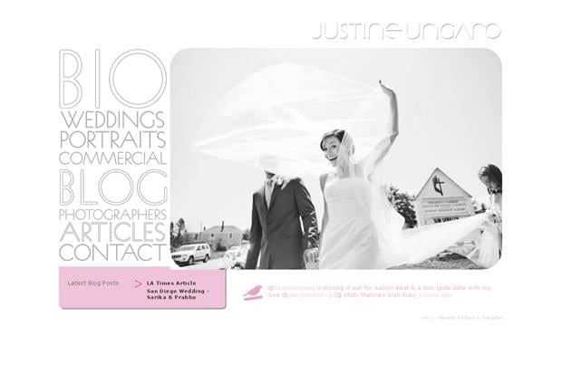
Justineungaro.com
* * *
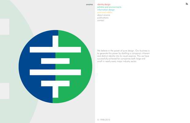
Onomadesign.com
* * *
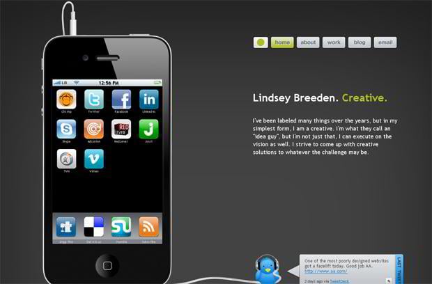
Lindseybreeden.com
* * *
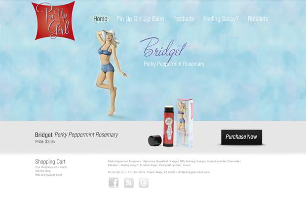
Pinupgirlproducts.com
* * *
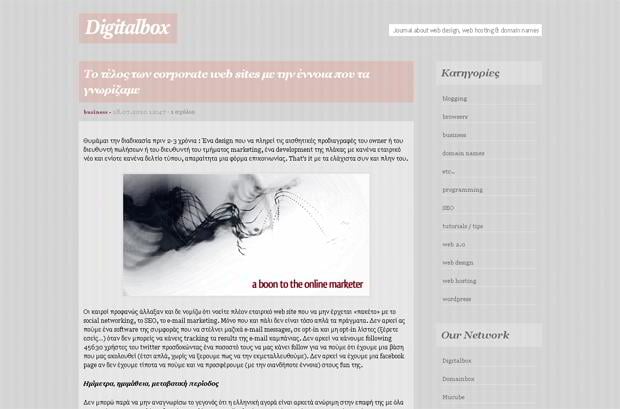
Digitalbox.gr
* * *
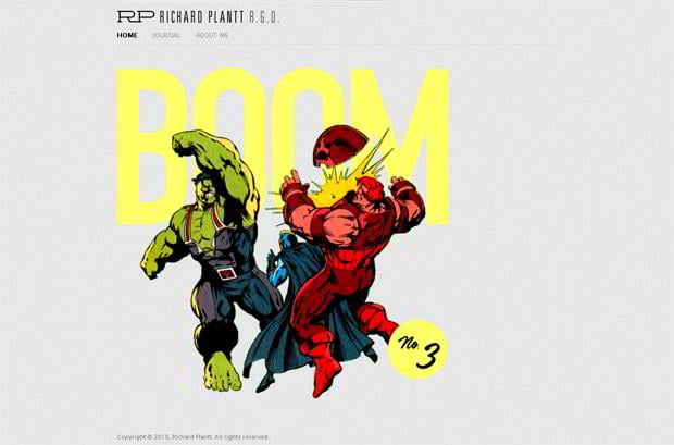
Plantt.ca
* * *
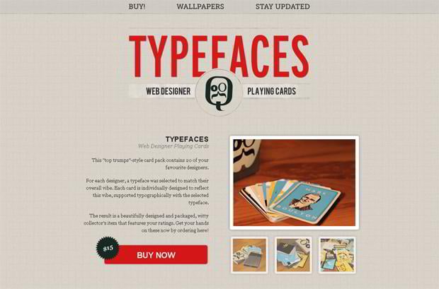
Thetypefac.es
* * *
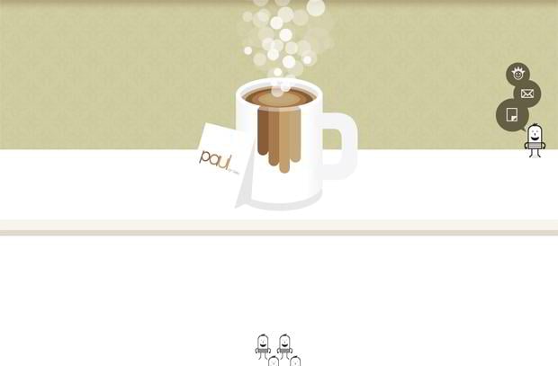
Paulramirez.net
* * *
Searchinsidevideo.com
* * *
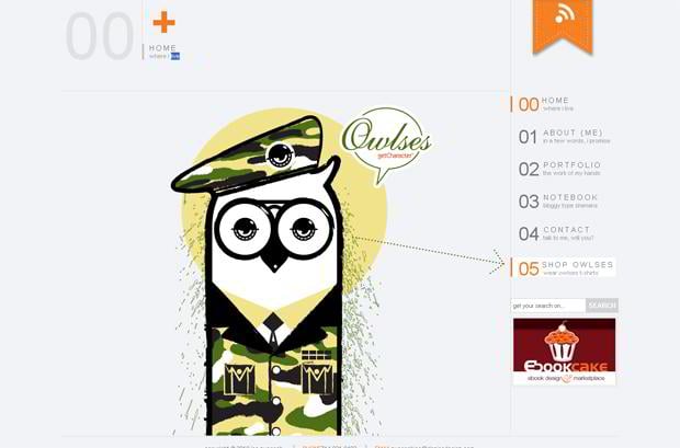
Danjoedesign.com
* * *
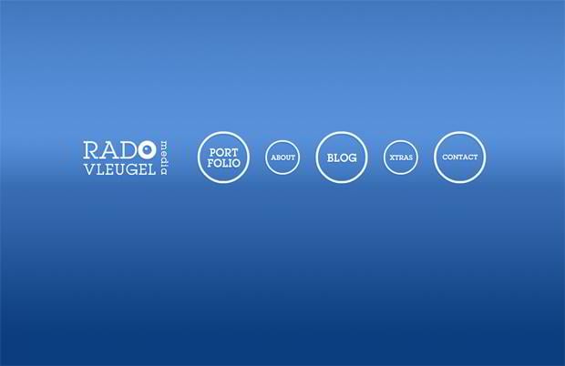
Radovleugel.com
* * *
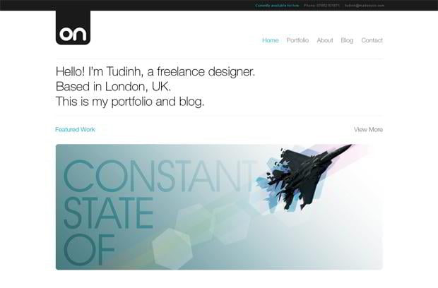
Madebyon.com
* * *
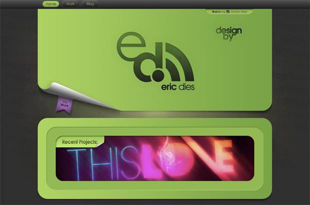
Ericdies.com
* * *
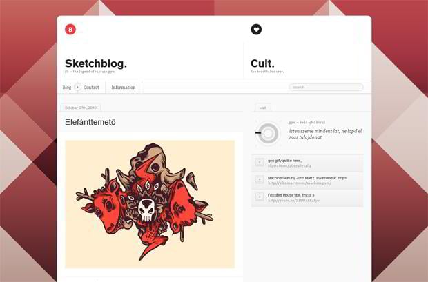
Z8.hu
* * *
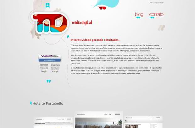
Midiadigital.com.br
* * *
Go ahead and see our WordPress Templates specializing in uniquely styled quality layouts to increase the overall consumers' appeal. Plus, be sure to browse TemplateMonster’s Clean Style Web Templates to discover simplistic, elegant designs with stark clear nature that will let your project content shine.
Don’t miss out these all-time favourites
- The best hosting for a WordPress website. Tap our link to get the best price on the market with 82% off. If HostPapa didn’t impress you check out other alternatives.
- Monthly SEO service and On-Page SEO - to increase your website organic traffic.
- Website Installation service - to get your template up and running within just 6 hours without hassle. No minute is wasted and the work is going.
- ONE Membership - to download unlimited number of WordPress themes, plugins, ppt and other products within one license. Since bigger is always better.
Get more to your email
Subscribe to our newsletter and access exclusive content and offers available only to MonsterPost subscribers.



Leave a Reply
You must be logged in to post a comment.