


Since CSS has grown some muscles, webmasters seem to be totally loving a special CSS framework namely 960 Grid System. This framework is convenient both for front-end users and developers and is doing a pretty good job in presenting a website layout with the maximum flexibility.
What the 960 Grid Framework Offers
960gs seems to be the most coveted grid system today. This is most likely because we can easily discern and accept a pattern consisting of logically located fractions. We subconsciously try to identify a trend allowing it to perceive the scene as a whole. Since we are more accustomed to logical organization of information, web pages need to be well structured. The grids come to the rescue and set the order of a page.
960 Grid System is a light-weight and thought-out CSS grid framework. Most of you probably know what it's about, but we'll briefly remind you that this system allows constructing of the content using a grid consisting of the definite, fixed number of columns that doesn't exceed 960px width.
Why 960? The answer is obvious: this number can make for many clean divisions using whole numbers for calculating the columns location, margins and widths. What also makes it great is that it fits the majority of screens. Considering modern screen resolutions, 960 is thought as a highly flexible number to play with.
Subtypes of the 960 Grids
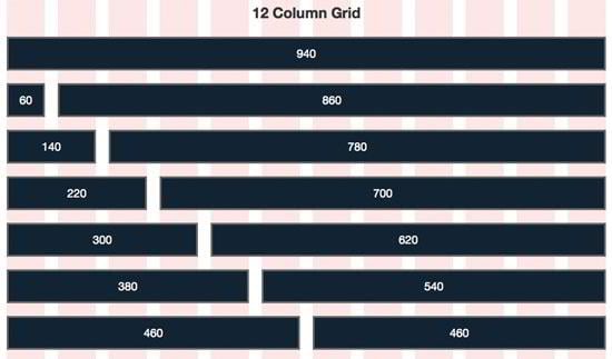
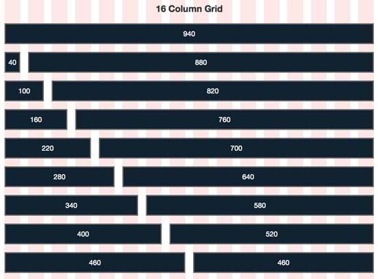
The 960 grid system is presented by 2 major variants comprising of a 12-column grid and a 16-column grid. The 24-column grid is also possible for the layouts that are needing extra structure complexity.
As for the 12-column grid, the narrowest column has the width of 60 pixels. All other columns can be increased by 80 pixels. So the column widths of 60, 140, 220, 300, 380, 460, 540, 620, 700, 780, 860 and 940px are all applicable. Or you may use 12 equal columns, 60px width with the gutters of 10px.

Speaking about the 16-column type, the narrowest column has the width of 40 pixels, and each other column can be increased by 60 pixels. This grid variant permits to create columns with the widths of 40, 100, 160, 220, 280, 340, 400, 460, 520, 580, 640, 700, 760, 820, 880 and 940px. The 16 column version can consist of 16 equal columns as well: each of the 40px width and the same with of 10px gutters.

960 Grid Importance and Usage Tips
The 960 gs is indisputably a very flexible grid system. Source ordering, great cross-browser and multi-platform support are one of the SEO benefits of 960 grid system. Each of the horizontal bars are to be considered as CSS classes in the 960 gs. For creating an object with the width of one of those bars you are to assign the proper class to your div. Using the push and pull CSS classes allow you to push or pull the blocks freely horizontally along the page.
Moreover, the fixed width makes it possible to make creative design concepts which are impossible with simple fluid widths. Feel free to use any imagery without concerning about tiling.
To create or prepare the Photoshop file for the 960 grid system you may downloaded the sample grid system offered for free at 960.gs and work with the 12 column PSD file using the proper tutorial (you will find the one below).
For creating the 960 grid layout without any specific knowledge and extra efforts you may use ready-made actions and tutorials on the 960 grid system:
The tutorial on designing a clean web 960 grid layout offered by Neale Reynolds gives a clear set of guidelines for prototyping the layout in various numbers of columns like 9 x 3, 4 x 4 x 4 x 4, 10 x 2 etc.
960 Grid Templates Examples
We've found some nice free 960gs template layouts for your inspiration:
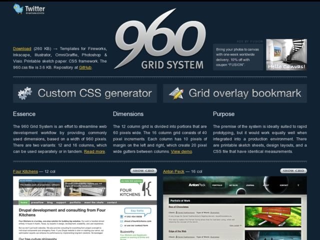
- First and foremost, the 960 Grid System system offered by Nathan Smith using effects from the Mootools JavaScript library.

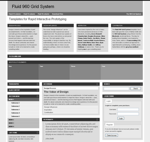
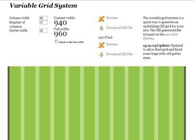
- The system created by Stephen Bau for the quick and easy development of interactive prototypes for websites is represented by Fluid 960 Grid System Templates. The system uses a library of commonly used HTML items in combination with the layout CSS. The templates have a 960 pixel fixed width, a 12-column fluid width and 16-column fluid width) and is based on the Nathan Smith's concept.

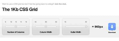
- Another lightweight grid system is offered by 1kbgrid. Being easy to work with, the system is highly customizable. The default width remains 960px.

- You may also use a simple CSS grid builder specifically for the 960 gs creation.

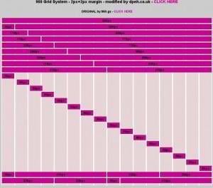
- Dpeh presents a modified 16 column 960 Grid System adding 2px margins.

Although the 960 system has faced a serious challenger lately— the 978 grid system is more convenient for larger font sizes. Some webmasters state that 960 gs is not enough because of all the content, widths and gutter spaces. Removing the margin space, you will get the actual content area that makes 940px. The majority of the earlier designs were built with the 12px font, while you may meet designs with the font size of 13px and higher today. And this problem can be solved with the new 978 grid system.
The 960 grid system is surely not a panacea, and we feel that excessive usage of this framework can lead to the lack of creativity and variety. But 960gs is undoubtedly in the forefront of website development claiming to be well-organized and flexible today.
There is a strong feeling that 960px is remaining the optimal size for web design and is not going to decline soon. Try to build a page using some 960 grid templates and enjoy the pure order and structure on your page!