Above-the-Fold Content Design Tips [200 Milliseconds That Matter]
In 1979, the whole Western scientific community was struck by an experiment conducted by Benjamin Libet.
His experiment unveiled truths behind the concept of “free will.”
He connected electrodes to the subjects’ heads to record brain activity, wrist sensors to record movements, and in front of their eyes he placed a clock. The participants were asked to point out the time at which they wanted to move their hand, await this moment on the dial of the clock, and make an action.
The results were overwhelming.
At first, the firing of the brain was detected, a result of which was that they "made their decision," but only after a brief period of time did the subject act upon it.
Later, this experiment was repeated using more advanced equipment which could detect the time of anticipation of action, which had not yet been accomplished.
It turns out that what we deem as conscious and willful decision is only a result of the brain’s inner-workings.
The brain, in its turn, decides on an action less than a half-second before the mind recognizes the choice.
People often say that everything which happens, one does of their own free will, however, this initiative appears about 200 milliseconds before the action itself.
Regarding consciousness, there are only around 100-150 milliseconds for the "veto right”, while in the last 50 milliseconds, corresponding spinal motor neurons responsible for the physical activity are activated.
Our freedom is tied to a 200-millisecond timeframe!
That’s how much time visitors to your website need to decide if they like it or not.
Next time, when someone new lands on your website, his/her brain will already have prepared a portion of criticism long before their eyes get to the end of the “above-the-fold” area.
What Can You Do About That?
While the term “above-the-fold” was first used in the context of print layout – newspaper layout, in particular – it has carried over into the web design field and is used to describe web design elements that are present at the top of the page.
Since this is the first thing visitors see, it’s imperative that you get it right, right?
5 Tips for an Above-the-Fold Design
The myth that you have five seconds to grab visitors’ attention was busted in 1979; sorry if you didn’t know that.
If you don’t engage them within this 200ms time frame, their chances of sticking around for any meaningful interaction plummet. Whether you are for or against this theory, it’s pretty clear that today’s online users have dwindling attention spans and need to be reeled in rather quickly.
Here are some above-the-fold design tips that will help you do this.
Keep it Simple [taking off my Captain Obvious hat]
Simple is always best with web design, especially above the fold.
The more you throw at your visitors, the more confused they become. By stripping out superfluous elements and only integrating the text, buttons, and images that matter, you have a chance to grab their attention and produce a meaningful interaction.
The Lexington Law website is a perfect example of what simple above-the-fold design looks like. One particularly noteworthy aspect is the lean navigation bar. Notice how there aren’t a ton of menu options and distracting drop-down menus, there is just a handful of straightforward options.
This is what minimalism looks like.
Applying Theory to Practice
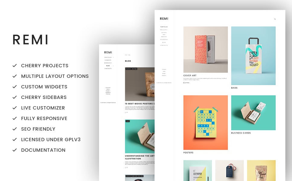
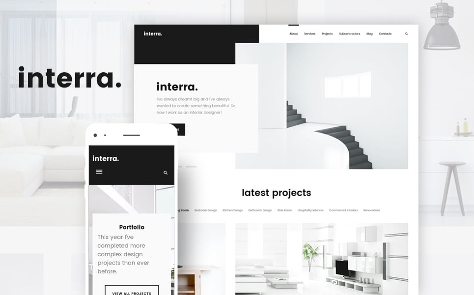
When you’re choosing a minimalist template you need to be sure that you don’t pick an over-minimal one. Here are three examples of templates, where a balance between minimalism vs. white space was finely maintained.
Check out these examples.
Trendomania - Lifestyle & Fashion Blog WordPress Theme
Remi - Photographer Portfolio WordPress Theme
Interra - Interior Designer Portfolio WordPress Theme
Use a CTA
Hiding CTAs (Calls-To-Action) will get you nowhere.
While many web designers choose to place their CTAs at the bottom of the page, common sense says it’s better to put them where they would get the most visibility.
There should always be a CTA above the fold for visitors to see as soon as they land on the page.
Building on the previous point, simple CTAs are usually best.
If you can boil your CTA down to just two or three words – such as “Buy Now” or “Try Today” – you’ll see better results. The Rogue Marketing website provides an illustration of what this looks like in practice.
Applying Theory to Practice
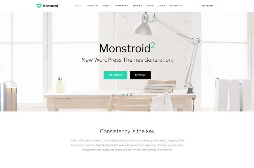
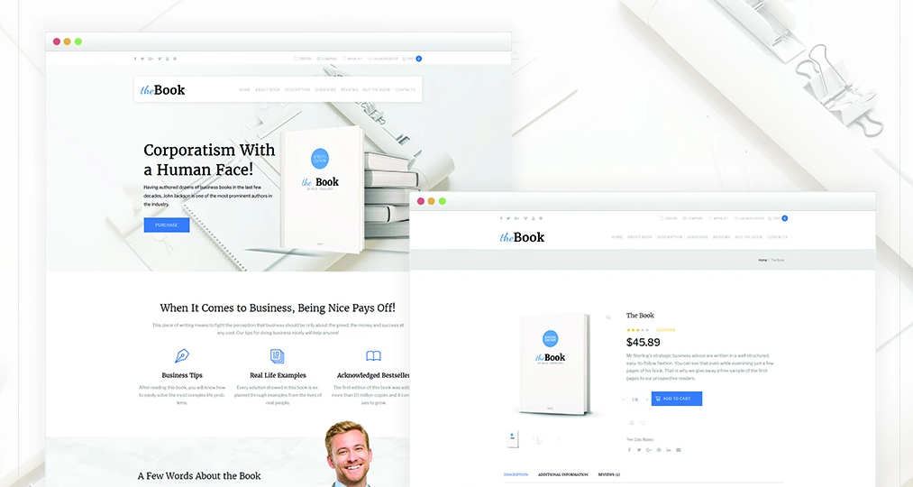
Regarding CTAs, a smart move would be if you choose a website template which already has a bunch of cool CTAs present on the pre-fold area.
Check out these examples.
Monstroid2 - Multipurpose WordPress Theme
The Book - Single Book WooCommerce Theme
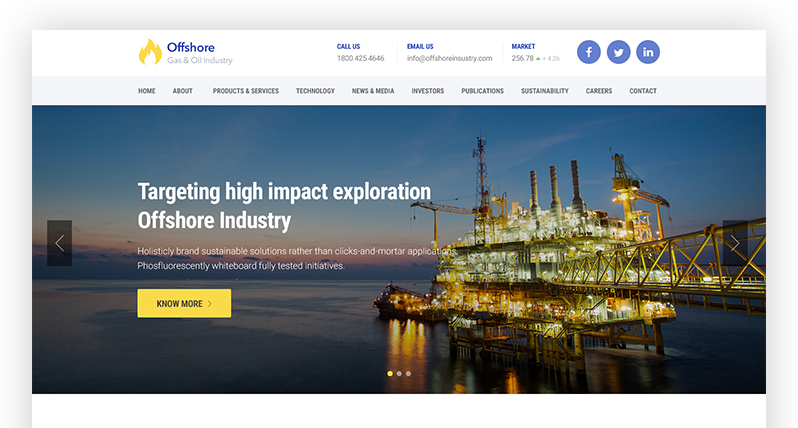
Offshore - Industrial Business Responsive WordPress Theme
Continually Test Different Elements
You might think a particular item looks good, but do your visitors agree? In the end, your design preferences and stylistic opinions don’t matter. It’s all about how your visitors respond and what engages them. To optimize your success rates, be sure to continually “A/B-test” different elements and adjust accordingly.
Applying Theory to Practice
Unfortunately, website template providers do not build A/B functionality into their templates.
There are however a bunch of A/B-testing WordPress plugins which will help you confirm your theories and find which design elements and content plays best with your audience. I recommend you try these plugins:
Simple Page Tester
Simple Page Tester empowers website owners to run “Split Tests” (another name for A/B-tests) in WordPress without having to edit the code as required by so many of the split-testing services out there.
CTA
The CTA plugin allows you to create calls-to-action in just a few mouse clicks. Its handy admin gives you control over statistics as well as providing you with a handy set of tools essential to enabling various tests.
Nelio AB Testing
Nelio A/B Testing helps define, manage, and keep track of A/B-testing experiments. Most notable feature: Nelio is compatible with WooCommerce. With Nelio you can test alternate names, featured images, descriptions for your products and so on.
Use Social Proof
Do you know the secret to success on any web page? Establishing trust. If your visitors don’t trust your brand, they aren’t going to do business with you. What’s the quickest way to build trust? Use social proof to show visitors that other customers approve of you.
“Generally, social proof relates to situations in which the actions and choices of others influence our own decisions,” marketer Rakesh Kumar notes. “According to social psychologist Robert Cialdini, it has a powerful effect on people, serving as valid evidence that it’s okay to do something, if only because others are doing it too.”
Social proof can be integrated into a page in numerous ways. Try pulling some quotes from testimonials or incorporating a few data points into the website copy. There’s a time and place for long-form social proof, but this isn’t it.
You want quick hits that don’t take long for visitors to process. There's a nice article at Kissmetrics blog about social proofs.
Applying Theory to Practice
When you are starting a new website, you’re not supposed to reinvent the wheel. There are already hundreds of design solutions that have pre-built content blocks for displaying reviews, testimonials, badges, media logos, partners and all kinds of things you can get right out the box with any of these templates.
Check out these examples.
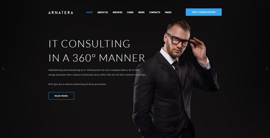
Arnatera - IT Consulting Responsive WordPress Theme
Advertising Agency Responsive WordPress Theme
Medical Laboratory Responsive WordPress Theme
Collecting Leads
Most people aren’t going to click on a website for the first time and make a purchase. If you study the purchase process of online users, it’s pretty clear that most people convert on subsequent visits. The problem is that many businesses find it challenging to bridge the gap and get people to return after their initial visit.
One way to encourage return visits is by collecting their information on their first visit. A simple email subscription form at the top of the page will let you capture some information and encourage repeat visits in the future.
Applying Theory to Practice
Apart from landing pages, which are perfect for generating leads, there are both free and premium tools which can help you gather the emails of your visitors and build your email list.
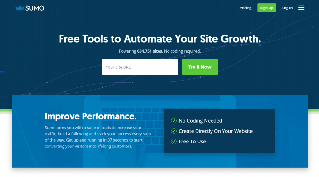
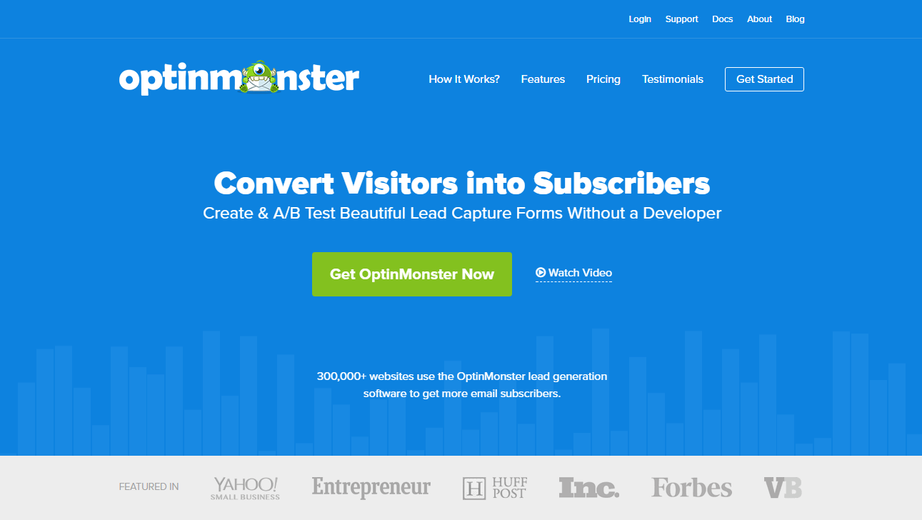
Among all these diverse tools, there are two items which significantly stand out due to their powerful functionality and extensive toolkit; those are Sumo and OptinMonster.
Sumo
Sumo has a number of tools to help you make your websites more attractive to visitors. These will help you encourage your visitors and help you convert them into clients. You can take advantage of the following set of tools:
- Welcome Mat
- List Builder
- Share Pro
- Heat Maps
- Smart Bar
- Scroll Box
- Content Analytics
- Contact Form Pro
- Image Sharer
- Highlighter Pro
- Dashboards
OptinMonster
OptinMonster is a plugin built to help you create highly effective opt-in forms which will make your email list grow quickly. OptinMonster’s features are spread out across three different price points.
- Beautiful form designs
- A/B testing
- Page level targeting
- Exit-intent technology
- Built-in analytics and reporting
- Integration with all major email providers as well as custom HTML forms.
- Ease of Use
- Unlimited forms for use on your site
Over to You
There’s something to be said about a meticulous approach to web design. If advanced A/B-testing has shown us anything, it’s that something as seemingly insignificant as a color choice or button placement can make a huge difference in conversions and sales. However, it’s also clear that certain elements are more important than others.
While something at the bottom of a sales page may have an impact on conversion rates, it’s not worth wasting your time and effort on. You ought to be investing your time in the elements of your website which have a considerable impact on visitors – e.g., above-the-fold design. Get this right, and positive things will come your way.
Web Design Essentials For Non-Designers [Free Ebook]
P.S. Don't forget to check out our web design templates.
Don’t miss out these all-time favourites
- The best hosting for a WordPress website. Tap our link to get the best price on the market with 82% off. If HostPapa didn’t impress you check out other alternatives.
- Monthly SEO service and On-Page SEO - to increase your website organic traffic.
- Website Installation service - to get your template up and running within just 6 hours without hassle. No minute is wasted and the work is going.
- ONE Membership - to download unlimited number of WordPress themes, plugins, ppt and other products within one license. Since bigger is always better.
Get more to your email
Subscribe to our newsletter and access exclusive content and offers available only to MonsterPost subscribers.






Leave a Reply
You must be logged in to post a comment.