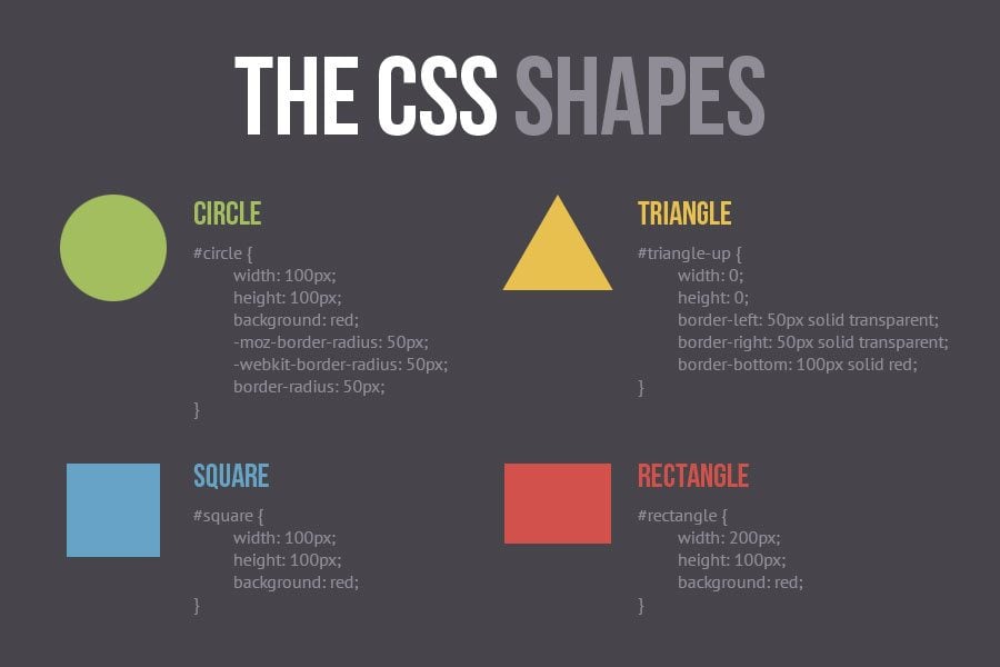
For years web designers have been slicing images, adding round corners, gradients, blur and other effects...when finally W3C made all these things possible with CSS. That was really great, with several lines of code you could create miracles within your layout. And then Flat design came.
All the gradients, blurs, shadows, lens flares, and other things that could show the level of creativity of every designer simply vanished. Now we have sharp corners, bright colors, neither shadows, nor gradients, and not even a simple thing that visually pops out of the screen.
Thank you Metro style, thank you iOS7, you’ve did great job “kicking out the volume” from web design. All that remained are those fancy colorful blocks...duh.
Seems like guys from W3C miss all those things, so they decided to create a bunch of things that will make everyone happy. And those are in CSS Shapes Module.
Imagine that you customer wants to give a mosaic look to the home page, and he wants to put in text inside of those pieces of “glass”. You will probably say that it can be done but requires much effort, and the result is likely to be way far from the sketch.
How did we do it previously? We had to shape content blocks in PSD, then code a lot to make it work, and as a rule it was something like this...
Flowing Content with CSS Shapes
As seen from the screenshots below, you can easily shape up your texts however you want to. The Polydraw tools will help you shape your text giving it even the most extraordinary shape.
See! You can shape your text inside of those rectangles no manner what their shape is.
Guess how much lines of code you need to shape these text blocks? Well, JUST 6!
#rectangle {
    shape-inside: rectangle(0, 0, 100%, 100%, 25%, 25%);
}
#hexagon {
    shape-inside: polygon(25% 0, 75% 0, 100% 50%, 75% 100%, 25% 100%, 0 50%);
}
Unfortunately CSS Shapes Module is not yet compatible with most browsers. At this very point all you can do is to play with them in Chrome Canary browser.
Now let's have a look at items that previously we had to use as images.
Need an oval? No problem
#oval {
   width: 200px;
   height: 100px;
   background: purple;
   -moz-border-radius: 100px / 50px;
   -webkit-border-radius: 100px / 50px;
   border-radius: 100px / 50px;
}
Want to see twelve point star? Here you go!
#twelve-point-star {
   height: 100px;
   width: 100px;
   background: orange;
   position: absolute;
}
#twelve-point-star:before {
   height: 100px;
   width: 100px;
   background: orange;
   content:"";
   position: absolute;
   /* Rotate */
   -moz-transform: rotate(30deg);
   -webkit-transform: rotate(30deg);
   -ms-transform: rotate(30deg);
   -o-transform: rotate(30deg);
   transform: rotate(30deg);
}
#twelve-point-star:after {
   height: 100px;
   width: 100px;
   background: orange;
   content:"";
   position: absolute;
   /* Rotate */
   -moz-transform: rotate(-30deg);
   -webkit-transform: rotate(-30deg);
   -ms-transform: rotate(-30deg);
   -o-transform: rotate(-30deg);
   transform: rotate(-30deg);
}
How about a heart?
#heart {
 position: relative;
}
#heart:before, #heart:after {
 position: absolute;
  content: "";
 left: 70px; top: 0;
 width: 70px;
 height: 115px;
 background: red;
 -moz-border-radius: 50px 50px 0 0;
 border-radius: 50px 50px 0 0;
 -webkit-transform: rotate(-45deg);
 -moz-transform: rotate(-45deg);
 -ms-transform: rotate(-45deg);
 -o-transform: rotate(-45deg);
 transform: rotate(-45deg);
 -webkit-transform-origin: 0 100%;
 -moz-transform-origin: 0 100%;
 -ms-transform-origin: 0 100%;
 -o-transform-origin: 0 100%;
 transform-origin: 0 100%;
}
#heart:after {
 left: 0;
 -webkit-transform: rotate(45deg);
 -moz-transform: rotate(45deg);
 -ms-transform: rotate(45deg);
 -o-transform: rotate(45deg);
 transform: rotate(45deg);
 -webkit-transform-origin: 100% 100%;
 -moz-transform-origin: 100% 100%;
 -ms-transform-origin: 100% 100%;
 -o-transform-origin: 100% 100%;
 transform-origin :100% 100%;
}
Want to see some more shapes? Check out the CSS3Shapes.com or css-tricks.com.
***
This trick is a huge thing for web designers. With its help the layouts we’ve got used to can get an absolutely new face.
I mean those rectangular layouts can be blended with magazine-like layouts (where texts and all other pieces of content are not restrained by strict rectangulars.)
Flat design dropped lots of elements that were purely artistic, and now we hope CSS Shapes Module will find its place in the life of many flat and other websites, giving them really unique and unprecedented touch.
