

Ah, the joy of downloading something from a website - does life get any more exciting? I can't imagine how! And that means web designers should pay close attention to file download interfaces. So many files like images, videos, and plugins can be shared through direct HTTP download. Many freebie websites even release icon sets and PSD files meant to be shared around the world.
Live Demo - Download Source Code
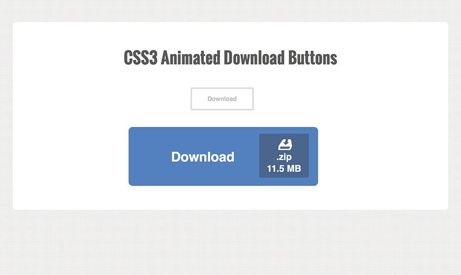
But you need more than just a nice layout to bring attention towards your downloadable content. In this tutorial I want to demonstrate how you can build a simple animated download button using only CSS3. The button can display a filetype along with the file's size in KB/MB/GB. Everything is animated using transition effects and some careful HTML tags. Have a look at my demo to see the final result.
Getting Started
Since this doesn't require any JavaScript all we need is a simple HTML file along with an external stylesheet named styles.css. The larger button will use an icon from Entypo so you should grab a copy of that webfont library as well. I'm keeping all the CSS assets and Entypo fonts in a /css/ folder at the same level as my index.html file.
    CSS3 Animated Download Buttons

    Download.zip11.5 MB


    Download.zip11.5 MB
This block contains all the HTML in my page body. Each of the two buttons are contained within a div using classes .center and .centerbig. You don't need to use these divs in your own layout. I just have these centered containers to help with positioning. Since each button doesn't have a fixed width it's not easy to keep it centered without text-align: center. Unfortunately this also centers the animation which isn't exactly what I'm going for.
Otherwise the internal code of each center container should be pretty straightforward. Both anchor links have a class of .dlbtn which adds the styles + transition effects. Notice both of them also have a span with the class .details containing some extra metadata.
The only difference would be on the larger button with an extra class of .big. This also has an extra icon using the class .dlicon. I've used a simple HDD download icon from Entypo, but the pack includes many other choices you might like instead. Just gloss over the character map page to find HTML entity codes needed for changing the icon design.
Page & Button Styles
The page itself is created with a single wrapper container. This spans a maximum width of 850px but can also be responsive down to smaller screen sizes. The buttons display as fixed-width because the padding values are in pixels.
/** page structure **/
#wrapper {
  display: block;
  max-width: 850px;
  padding: 45px 35px;
  margin: 0 auto;
  background: #fff;
  -webkit-border-radius: 7px;
  -moz-border-radius: 7px;
  border-radius: 7px;
}

.center {
  width: 20%;
  margin: 0 auto;
}
.centerbig {
  width: 40%;
  margin: 0 auto;
}
All the centered page divs just need a certain width value which can adapt to the responsive layout. Normally we could use the centered text alignment, but unfortunately it messes with the animation.
/** download button effect **/
a.dlbtn {
  display: inline-block;
  position: relative;
  height: 45px;
  line-height: 40px;
  overflow: hidden;
  padding: 0 30px;
  font-size: 12px;
  font-weight: bold;
  color: #c0c0c0;
  background-color: #fff;
  text-decoration: none;
  cursor: pointer;
  border: 3px solid #ddd;
  -webkit-border-radius: 2px;
  -moz-border-radius: 2px;
  border-radius: 2px;
  -webkit-transition: all 0.4s;
  -moz-transition: all 0.4s;
  transition: all 0.4s;
}

a.dlbtn:hover, a.dlbtn:focus {
  color: #fff;
  padding-right: 90px;
  background-color: #5381bf;
  border-color: #5381bf;
}
Next is a block designing the button and how it behaves during hover. When hovering we see a clean blue background and border take over the design. Also the right side of the button expands from 30px to 90px padding. This makes room for our extra details box to appear.
Since the button can use a fixed height value it makes positioning much easier. Line-height keeps the text vertically aligned while we also know how to position the details panel accordingly. Each of the transition properties will run in standards-compliant web browsers. Otherwise the details should just appear without any animated effects.
a.dlbtn .details {
  position: absolute;
  line-height: 11px;
  top: 4px;
  right: -15px;
  opacity: 0;
  background: #49668c;
  color: #fff;
  text-align: center;
  padding: 3px 4px;
  -webkit-border-radius: 3px;
  -moz-border-radius: 3px;
  border-radius: 3px;
  -webkit-transition: right 0.4s linear, opacity 0.25s;
  -moz-transition: right 0.4s linear, opacity 0.25s;
  transition: right 0.4s linear, opacity 0.25s;
}
a.dlbtn .details .size {
  display: block;
  padding-top: 3px;
}

a.dlbtn:hover .details, a.dlbtn:focus .details {
  right: 8px;
  opacity: 1;
}
Since the details can't show up beside the text I'm using absolute positioning to solve this little problem. This positioning places the details box outside of the button, and then animates inside. It gives a small bouncing effect when the transition is completed.
Also notice towards the bottom I've split up the animation into 2 parts. The right property animates the details into the button at the same speed that the button expands. But the details will fade in & out a bit quicker, giving a smoother feeling to the effect. You can play around with these values to find a more suitable value if needed.
Bigger Download Buttons
Towards the bottom of my stylesheet I've added an extra .big class for the larger buttons. This style will add some extra padding, increase the font size, and include the Entypo icon within the details box.
/** large download button **/
a.dlbtn.big {
  height: 115px;
  line-height: 115px;
  padding: 0 80px;
  font-size: 26px;
  -webkit-border-radius: 8px;
  -moz-border-radius: 8px;
  border-radius: 8px;
}
a.dlbtn.big:hover, a.dlbtn.big:focus {
  padding-right: 160px;
}

a.dlbtn.big .details {
  top: 10px;
  font-size: 18px;
  line-height: 20px;
  padding: 6px 15px;
}

a.dlbtn.big:hover .details, a.dlbtn.big:focus .details {
  right: 15px;
}


a.dlbtn .dlicon {
  display: block;
  font-size: 55px;
  line-height: 30px;
}
Since I've kept the original class .dlbtn all the properties should carry over. I'm just going to overwrite some of them like the padding and font size. This will cut out a lot of extra CSS while still being economical about which properties to overwrite.
Towards the bottom you'll notice a class name .dlicon which adjusts some other basic properties. This class is tied into the Entypo icon font files which I've added at the very top of my stylesheet:
@font-face {
  font-family: 'entypo';
  src: url('entypo/entypo.eot');
  src: url('entypo/entypo.eot?#iefix') format('embedded-opentype'),
       url('entypo/entypo.woff') format('woff'),
       url('entypo/entypo.ttf')  format('truetype'),
       url('entypo/entypo.svg#svgFontName') format('svg');
}


.entypo {
  font-family: 'entypo', sans-serif;
}
Adding this class onto any element will change the internal font family to the Entypo icon font. This is why we can use HTML entities for displaying icons naturally in the browser. Simple, clean, and easy to update for any webpage layout.
/** responsive styles **/
@media screen and (max-width: 620px) {
  h1 { font-size: 2.7em; }
  .center { width: 30%; }
  .centerbig { width: 70%; }
}

@media screen and (max-width: 480px) {
  h1 { font-size: 2.2em; }
  .center { margin-left: 0; }
  .centerbig { margin-left: -20px; }

  a.dlbtn.big { padding: 0 70px; }
  a.dlbtn.big:hover, a.dlbtn.big:focus { padding-right: 150px; }
}
This last block of code is at the very bottom of my stylesheet. Since the layout is responsive I've included some media query updates to keep the buttons in a natural position no matter the screen dimensions.
If you want to change any of these styles my demo is a great place to start. All the codes are free and open source to edit and copy for any project work.
I would imagine that this download button can fit nicely onto any type of website. Blogs, galleries, forums, anything where users are expected to download some type of content. This button is also easy to restyle for matching your own website's color scheme. Feel free to download a copy of my source code and see how you could fit this animated button into future projects.