Lesson 1. Basic Principles of Landing Pages: What, for What, for Whom
*This article is a part of the Landing Page Building Course by TemplateMonster
The road to profitable online sales requires only two reliable tools. They are landing pages and traffic. Nothing more is needed when you know how these tools work and use them correctly. The main goal is to create a robust working system. How? We’ll tell you in the details!
A landing page is the first page that a visitor sees coming to your site or blog from search engines. Landing pages are very often called one-page websites when they are used as a logical continuation of advertising. According to internet marketing specialists, this format is optimal, as it's laconic and informative. It allows you to attract the visitors’ attention and focus it directly on a product or service.
Landing pages can announce a new product or increase the popularity of one that is already on the market. They are widely used to promote special offers, like holiday sales or giveaways, and events.
That’s why landings are in great demand today. Without losing lots of time they enable modern entrepreneurs to get to know their target audience better to present a product (service) and gain on sales. So, let’s find out what tasks can be solved using landing pages and how!
- What is the Use of Landing Pages?
- Why Are Landings More Effective Than Regular Sites?
- Why Do 70% of Landing Pages Not Work?
What is the Use of Landing Pages?
Landing pages have the real power of influence. Usually, they offer one specific product, service, or application form. While everything seems so easy, the big bunch of marketing analysis, user-friendly design, SEO promotion, and others are hidden beyond.
Anything can be shown on landings. Some products are physically real, others are digital, like courses, tutorials, or ebooks. Any services, ranging from plumbers, photographers, education courses, and ending with catering and industrial construction are often promoted on multiple landings. Or, sometimes a one-page site is supposed to invite new subscribers. Such a page also can receive traffic from email correspondence.
As you can see, landing pages cover a huge number of purposes. Ideally, you can use the one-page system to solve lots of business problems. It’s not so important what is on your site. It’s more important whether that’s the real problem your client has, and you can solve it (you show them the solution!). So, moving ahead, let’s call goods (physical and digital), services, and everything else - just a product. Ok?
Professional Views

Landing pages can be a great tool for creating pages that don't fit in with your main site. This can include making a page that targets a very specific conversion or target audience or making the page AMP friendly to increase page speed and cater to mobile traffic.
We use our landing pages to ensure we get the best conversion possible
from our paid traffic campaigns.


The purpose of a squeeze landing page is to convince someone that
they need to take action and make it easy for them to take action. It's not
to get someone to browse around or get to know in-depth about a product.
Likely you're trying to get someone to sign up to an email list.
There’s a singular goal behind making landing pages. You want your viewers
to enter and submit. Here you could add coupons or discount options to
tempt your visitors into signing up as well.

Why Are Landings More Effective Than Regular Sites?
Every landing page should have one clearly defined goal - to solve one problem of the customers. This all is also well-visualized. That’s why landings are more effective since visitors are not overloaded with random info but “landed” on one specific action (to buy, subscribe, fill in, donate, and so on).
Websites that consist of only one-page simplify the perception of information, as visitors get answers to all their questions. They don’t need to make any effort to look for anything else. You just bring them everything ready on a silver platter. You fully concentrate the clients’ attention on your product–even show the benefits of this problem solution. Along with this, you tell them why they “want” to buy here, now, and from you.
Moreover, landing pages don’t have such problems as regular larger sites. Sometimes while surfing them, a user forgets why they have come there, completely losing concentration on your product. Large sites are full of different links, buttons, and actions. They don’t look attractive and, of course, trustworthy. Their visitors may both be lost in choices and even feel unsafe as if someone is going to impose something on them. In fact, a large percentage of sales are lost at the stage of the checkout basket and multi-step application processing. Alas!
However, by relying on a one-page site you’re already in a winning situation. For example, if the average conversion (percentage of visitors) of an online store is less than 1%, then a corresponded landing has a conversion from 1% to 50%. But if you do not care about the correct structure of your landing page, its texts, and design, then there will be no magic. There are no magic sales that come from thin air.
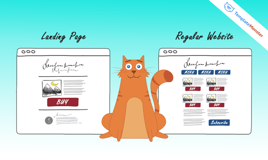
Look at the example below! It explains why users “understand” one-page sites better.
Professional Views

Landing pages are aimed at conversions specifically. They are supposed to make visitors take action and guide users towards this point. Through clever use of copy and design, they turn visitors into buyers.
Mainly to promote a specific product or offer. These are pages deserve special attention as they are the most important for driving new growth for your business.
Landing pages are more effective than regular websites because they put the user first. Landing pages have a clear objective in mind — Provide value to the visitor and provide value for the business. They include only what’s absolutely necessary in meeting these goals. Because of this, every piece of content on a landing page has been placed with intent and the call-to-actions are better defined.
Strong websites are ones that think of every page as a landing page. Even the homepage. Websites can be designed with a landing page philosophy. Asking "What is the one thing that I’m asking the user for on this page?” can help make every page on a website more effective. Then weave in those strong and clear call-to-actions.


Landing pages are more effective in select situations. The main advantage
is being able to build a page that doesn't follow the restraints (technical
and aesthetic) of the main site. This is especially helpful when making
things like pure conversion pages or your main site is slow and you need a
fast-loading landing page.
Any regular page on your website will focus on multiple things, like About,
Services, Contact, etc. As for landing pages, their main focus is just the
one topic they have been constructed for. Say a particular landing page was
built to ask viewers to sign up, that’s what they’ll be focused on, rather
than being distracted by anything else, giving you a higher sign-up rate.

Why Do 70% of Landing Pages Not Work?
The main task of one-page sites is to make visitors interested in a proposition and convert them to a specific action, at a certain stage of a sales funnel. Commonly, the easiest thing you can do is to ask users to fill in an application. Having received contacts from your potential customers, you can start selling them by phone or through email. And, that’s absolutely easier than selling on a website, isn’t it?
“Your landing pages aren’t Wikipedia. Stop adding unnecessary links.”
Oli Gardner
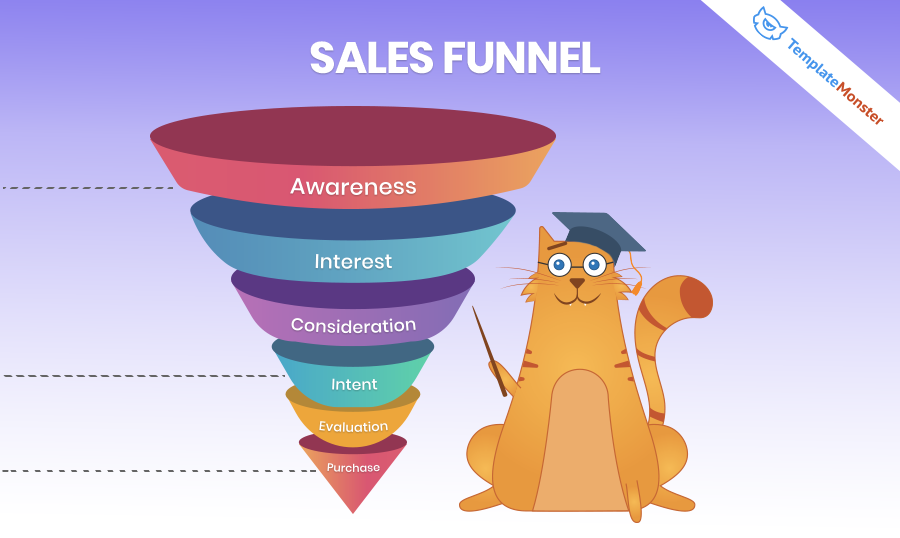
Pay attention to how sales funnel stages normally look. Each of them leads to the next until the “purchase” stage is reached. It is important not to skip these steps.
After all, it also happens that the biggest part of the aforementioned stages is missed. Despite this, owners of such landing pages are surprised why things go wrong and question where the profit is. It can be compared to car driving without theory and practice. You cannot go far on intuition alone. Mostly the same is true about sales, or more precisely, about the process of adjusting landing page sites up to the requirements of the sales funnel. Your client should go through all stages of the sales funnel sequentially; otherwise, there will be no purchase. So, be patient!
Today, a so-called “meeting phase” is often omitted when it comes to simple products. Many entrepreneurs have no doubts that everything is clear enough and just exert pressure on potential clients with BUY, BUY, BUY! Still, the meeting stage is crucial, as an introduction to a large book. It introduces a product to the audience and shows the benefits of its purchase. As for the number of such meetings, it depends on the complexity of the product. Sometimes, from the moment a client has seen a product first and now is ready to buy it, it takes months. And, sometimes only five minutes are required.
In any case, 70% of any sales funnel is customer awareness. It’s based on the way they think, the steps they have to go through to solve their problem by buying the solution you offer. Don’t rush sales! Your business should be built on the priority of the client’s needs that you cover.
And, as for landings that really work, lots of them are based on ready-made templates.
Professional Views

What are the general mistakes while of modern landing page websites?
- Making the landing page too short
- Talking about the features but not the benefits
- Having a boring headline and subheading
- Not using bullet points
- Having a non-compelling copy
- Forgetting visuals
- Weak CTA (Call-to-Action)
- Not adding testimonials and social proof.
The most common mistakes of landing page websites are the over abundance of call-to-actions (CTAs) and the lack of compelling content.
I’ve seen too many landing pages that ask the user for too much. A landing page should include only one offer. Too many and the visitor can get distracted and have a hard time making a decision.
Regarding compelling content — There are some content choices that more compelling and are good to use. For example, do use images in your landing pages. And to go beyond that, use photos of people. A step further would be to use video. These creative tools are more engaging for site visitors.
Another point on compelling content is to showcase credibility on your landing page. I see too many landing pages without testimonials or client/publication logos or accolades. Add these in! These are huge drivers for sales because they show that your brand/product is trusted.


One of the biggest mistakes you can make with a landing page is to
make it slow to load. That means it's probably packed full of graphics,
videos, and more that make the page unbearably slow. A landing page should
always be fast and focused.
One big mistake marketers make when designing a new landing page is their failure to understand their value proposition.
Let me explain....
What is it about their product , service and offer that compels people to say yes? Until they know this any landing page design initiatives are pointless.
For instance, when we first launched, we thought people would like our service because its a cheaper way to get their grass cut. What we found through copy testing in different channels such as ad-words and FB is that the customers ability to get same day service is a much more effective and compelling subset of our value prop that drives more visitors and more conversions on our landing pages.
Nailing your value prop first is crucial before you spend time and effort developing your landing pages for mobile traffic.

In conclusion, a sales funnel is a logical chain of client contacts. At each stage, it convinces them about the high quality of your product, and the value it brings, and moves them to buy it.
*This article is a part of the Landing Page Building Course by TemplateMonster.
To read all the tutorials, follow the link and subscribe!
Our feedback won’t make you wait and
you’ll be able to pass the course on landing pages any time you want!
We also promise to share with you per email more tips, discounts, and hot offers!
Subscribe 😉
Don’t miss out these all-time favourites
- The best hosting for a WordPress website. Tap our link to get the best price on the market with 82% off. If HostPapa didn’t impress you check out other alternatives.
- Monthly SEO service and On-Page SEO - to increase your website organic traffic.
- Website Installation service - to get your template up and running within just 6 hours without hassle. No minute is wasted and the work is going.
- ONE Membership - to download unlimited number of WordPress themes, plugins, ppt and other products within one license. Since bigger is always better.
Get more to your email
Subscribe to our newsletter and access exclusive content and offers available only to MonsterPost subscribers.


Leave a Reply
You must be logged in to post a comment.