

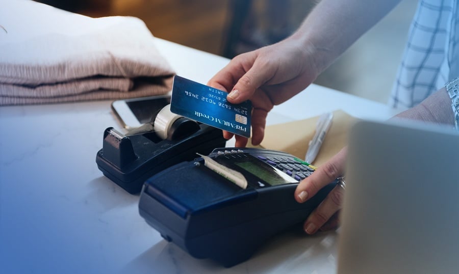
Every ecommerce business selling products or services online needs a good checkout page design. The payment gateway is a platform that allows customers to pay you through the use of debit or credit cards.
Even though the payment gateway may be effective, it is not enough. Not having a good payment page design means customers may not end up paying for products. Instead, they will leave your website without purchasing anything.
When you consider the entire website, most businesses put more emphasis on the first page. Most e-commerce businesses overlook the need for checkout page optimization. Business owners fail to realize the importance of a payment page. This pushes customers into a purchase channel.
According to Statista, 43% of Americans feel their happiest when they complete the checkout process. So, creating a good checkout page is very important. Here is why optimizing your payment page is necessary:
- You can gather customer contact info
- Increase retention of customers
- Increase your revenue
- Increase customer conversion
- Enhance UX
But, how do you tell if your payment page is optimized? To answer this, you have to make sure your website has the following:
- Quick processing
- No distractions
- Multiple payment methods
- A good UI


Top 10 examples of payment page designs
How should a good payment page look? To answer this question, you have to look at some of the best payment page design examples. These provide you with the knowledge of how to create the best payment page design. How you decide to make a checkout page for your website depends on what you want. You can ask for expert help from website designers for better results.
Templates can also help you create a custom payment page. A good UI should be smooth and make it easier for customers to navigate through your website. This also includes having a good payment page design. Here is a list of payment page examples that can work as a guide for you.
1. Jacquemus

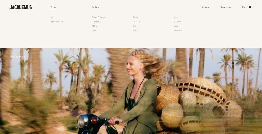
The entire website design for Jacquemus is something to be admired. This fashion business makes sure their customers enjoy the whole shopping experience. The checkout page is simple and has everything neatly arranged. Customers can also track their checkout process through a numbered progress bar that shows the number of steps left to be completed. Should customers have any inquiries, there is contact information that can be used.
2. It's Watch

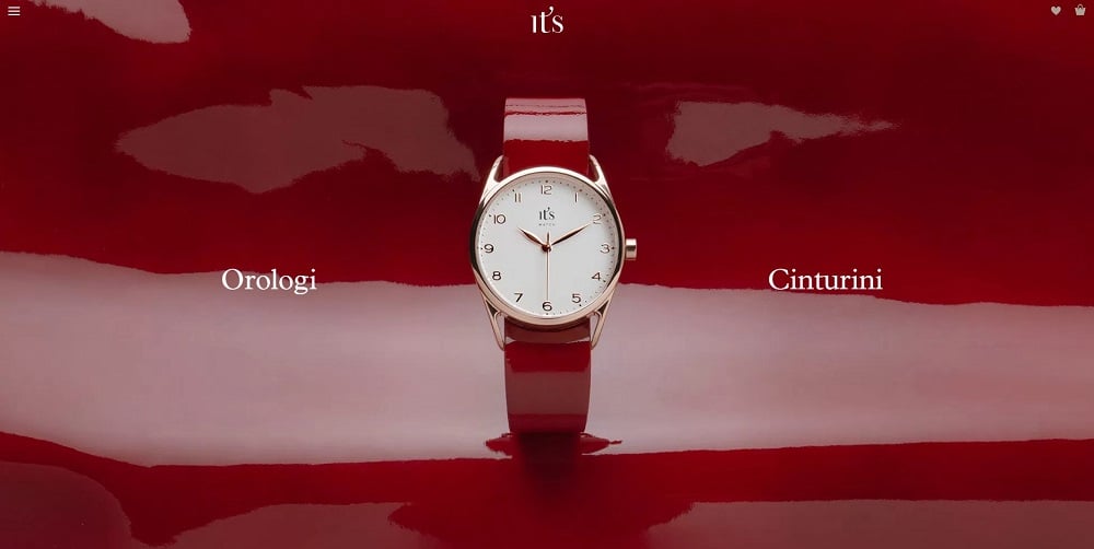
Customers want to be sure their information is in safe hands. It's Watch makes this a priority. Customers can proceed through a smooth purchasing experience. Like most checkout page designs, It's Watch also makes use of a white background. This removes any distraction so customers don’t abandon a purchase.
3. InVision

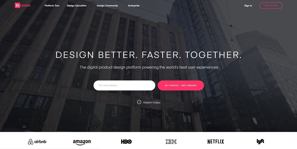
InVision has created a beautiful purchase checkout that incorporates some of the best practices for web design. The type of card a customer uses can be identified automatically. The format customers should use to input data is also clearly stated. Overall, customers can complete the shopping process without any interruptions or distractions.
4. Glossier

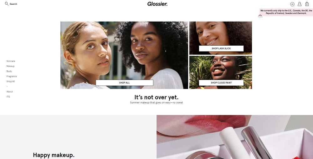
The payment page design for this website is simply elegant, reflecting the image of the brand. The checkout page slides from the right. Here, the customer can see the selected product and total cost. The checkout call-to-action is highlighted in pink and placed on a white background, making it obvious. Customers can continue shopping as guests or log in if they have an account. The next page requires customers to provide their information. Here, customers can even request a gift card.
5. Simply Chocolate

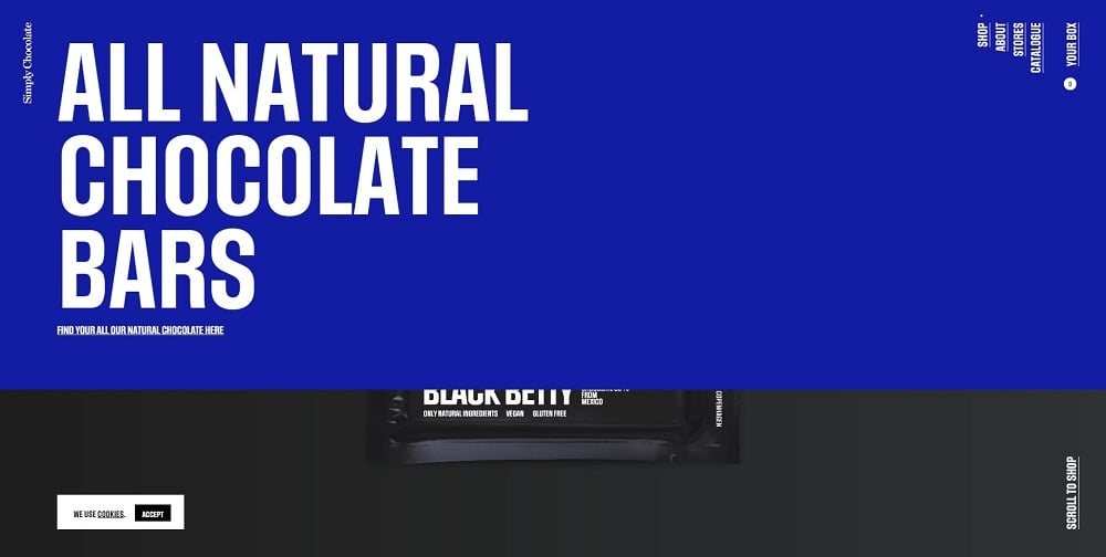
This website design is unique. It has a beautifully designed payment page that slides out from the main page. Customers even know the number of steps it will take for them to complete the payment process. This e-commerce store informs customers of the next step to complete. Once customers have selected products, they can then proceed to input shipping information.
6. Nixon
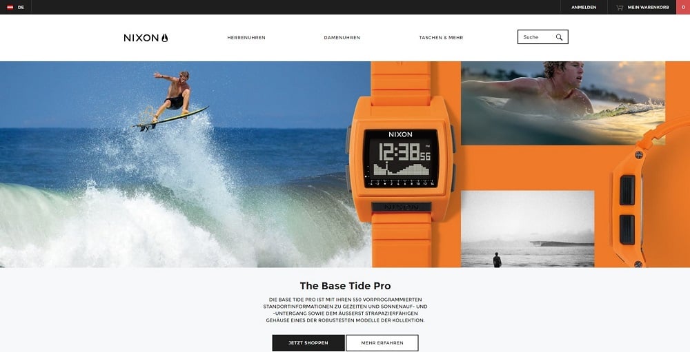
Customers usually have to go through many steps before completing the checkout process. Sometimes, this may be longer than expected. So, Nixon uses a progress bar to show customers how far they have gone with the purchasing process. The progress bar is placed at the top so customers can see it clearly, making this checkout page one of the best to take ideas from.
7. eBags
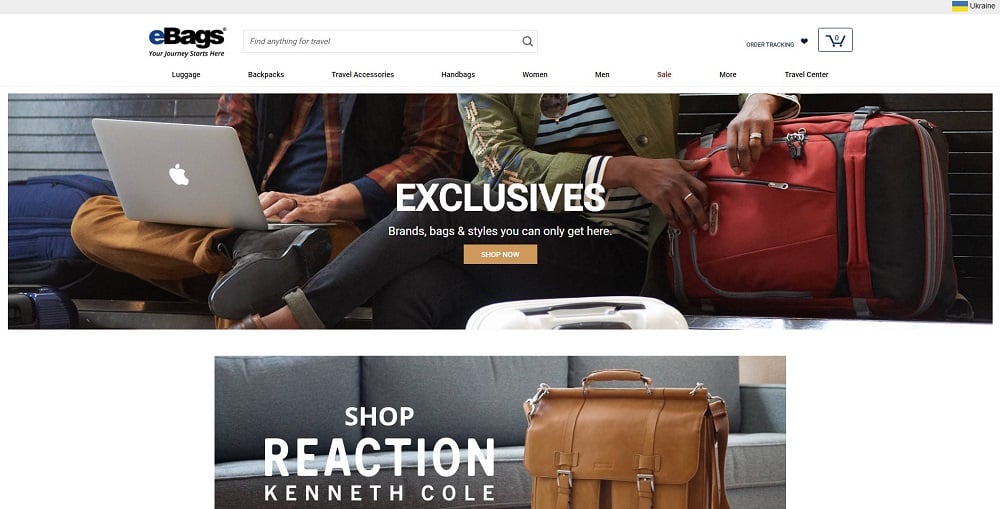
A simple and elegant layout makes this payment page design stylish. Customers are clearly provided with what areas to fill when purchasing products. The website clearly states which information customers should provide. To make things better, eBags has a live chat, so customers can ask questions and receive answers immediately while shopping. Customers also get points for every purchase made, which can be used in the future.
8. Barbour

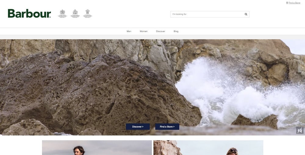
The payment page design contains a clear description of selected products. This helps customers make sure they have selected the right item. Customers have details of the number of steps to complete. With autocomplete features, customers can easily put in their shipping address.
9. Apple
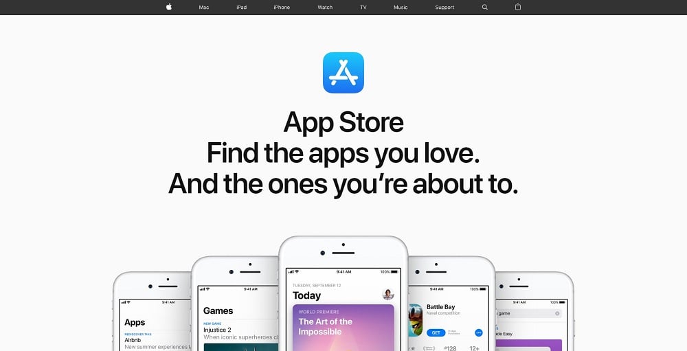
To avoid any distractions, Apple’s checkout page design has a simple white background. All you see are several call-to-action buttons in blue. This makes it visibly easy for customers to know what action Apple intends for them to take. Customers are not required to sign up before purchasing any product. Instead, they can shop as a guest, reducing the problem of cart abandonment.
10. Toys “R” Us
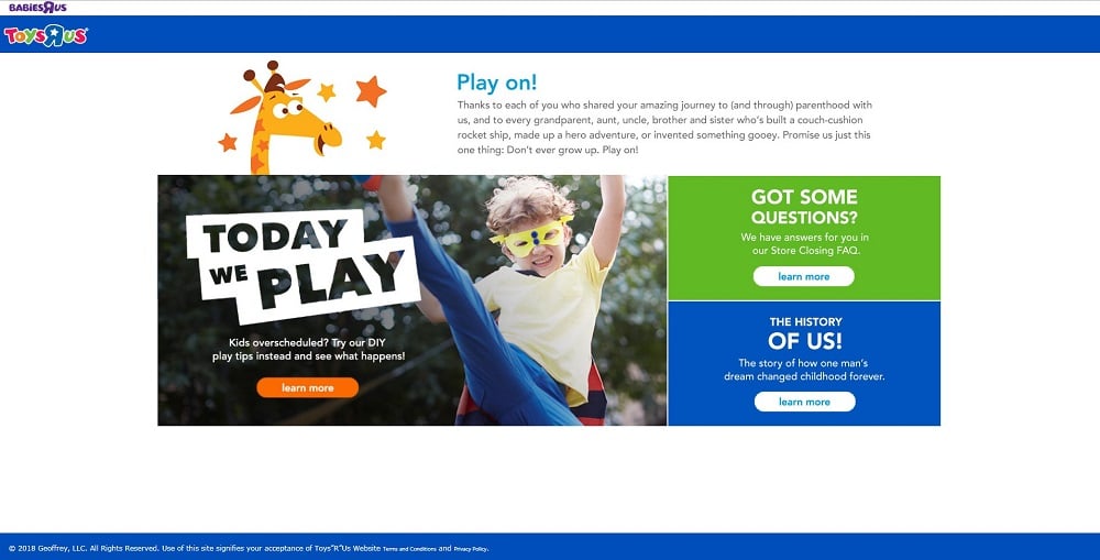
The element of surprise is needed when purchasing gifts for loved ones. However, the description of the item may be placed on the package. This definitely spoils the surprise. Toys “R” Us has a checkout page that overcomes this problem.
In this article, you can see that the payment page is an important part of website design. It can determine whether customers will purchase your products or services. Hence, there is a need to design a page that enhances the customer’s shopping experience.


Read Also
57 Best eCommerce WordPress Themes: Free and Paid
42 Best Shopping Cart Page Design Templates
Top 45 Ecommerce Business Ideas for 2018
Designers & Developers Reveal The Tools They Use The Most