


Black & white web designs are never dull and never outdated. The same goes about photography that was originally monochrome. The world turned in color later with technology progress. But still most of awe-inspiring photos and designs are black & white, with limited colors resulting in truly powerful imagery. How designers make effective use of black & white stylish aesthetics in their works? See it in wonderful designs below.
Black & White Charm
When colors are applied, they record an image, show its easy to notice attributes. Black and white scheme works in a different way, capturing and rendering the feelings that are beneath the surface of the object. In other words, colors are all about superficial initial impression, while black and white is the essence. It can be said that colors in many artworks divert attention from the main idea. They bring saturation in designs, photos, but undertake too much. Simple color scheme has a high value due to its ability to speak straight to the point, to the hearts of the viewers. It’s laconic, never excessive, stylish and up-to-date.
There is some magic in black & white, that’s why it's highly appreciated among mature photographers and designers. It’s hard to imagine that Richard Avedon, Helmut Newton, Irving Penn, Bruce Weber and a number of world-known artists could shoot in color. It hardly seems credible that a wonderful symphony of black & white designs could relapse into silence.
Power
As it was said in the previous paragraph, black & white works are marked with specific style, a punch, and that special magic drawing people in. When modern web designers opt for this classic color palette, they choose high class style and exquisite minimalism, so popular today on the web. Web designs in simple colors bring focus to what truly matters and it’s the content of the page. Being contrasting, this color scheme sets the effective tone of the overall design, making it a bit nostalgic (retro photos come to mind when we look at such classic designs). Potent, definitive – this is how black & white designs behave. Being professionally done, they look so effective that any color implementation would be aesthetically offensive.
Web Designs
The examples below will show you that such designs are never dull. Their noir style can bring melancholy, retro, austere, but never muted tone. Black & white is a perfect style that fits a variety of designs from various business spheres that want to look trendy and definitive. Sleek, full of details, sometimes too perfect, they are amazing to look at through.
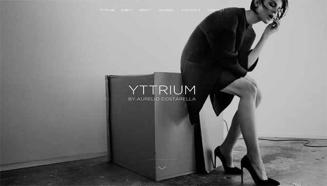
Yttrium
Nifty black & white layout turns this fashion site into compelling one. The outer simplicity reveals the true beauty of all presented models and underlines their originality.

* * *
Less is more. This rule is at the heart of the design you see. It strikes with pure minimalism and simple color scheme.

* * *
What’s important in each book? It’s the content, and the same goes about designs that should speak to the point. Anything distracts from the items this design puts emphasis on – various books that are worth of your attention.


* * *
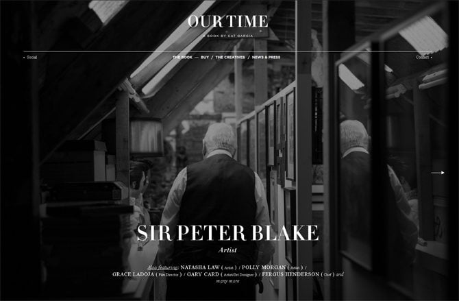
Cat Garcia
The name of this photographer is not the only point for you to visit this site. You’ll certainly enjoy its laconic black & white tone and cool grid gallery with nice framed hover effect.


* * *
This longscrolling design shows black & white photos alternating with bright products in color. Retro grayscale adds style to this layout and pushes the product items into the focus of attention.


* * *
Hoko
Absence of color is a deliberate decision which makes this website undoubtedly stylish and perfect for highlighting the latest fashion collections.


* * *
Iark
The fundamentals of any visually effective website is its vibrant design. This one, in black & white colors sets the austere and at the same time attractive tone.


* * *
Livwrk
Large black fonts against white background and inspiring imagery welcomes viewers to this website.

* * *
Full-width background photos and overall clean look of this black & white design is a reason why it's in this compilation.


* * *
The lack of color in this layout plays the key role in focusing attention on the book presented here.

* * *
Grainy grittiness, black legible typography and green accents make this site a cutting edge one.


* * *
Present Plus
A multicolored line will not destroy the clean look of a black & white web design, but will add nice accent to it.


* * *
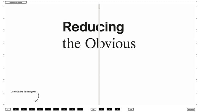
Reducing the Obvious
Enjoy the unusual way of navigating along this simply colored site with the emphasis on its content.

* * *
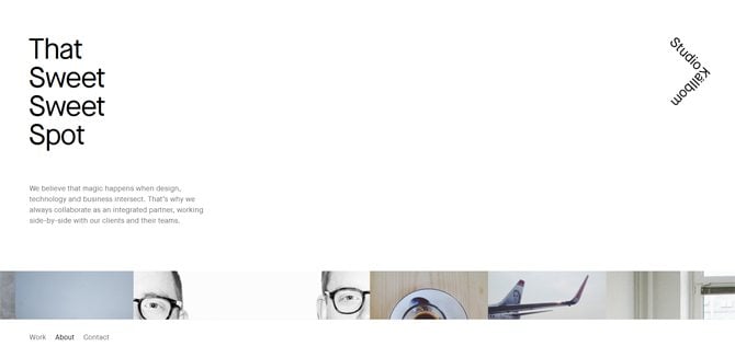
Kallbom Studio
While scrolling down you can notice the changing background (white, black and gray) which makes browsing throughout the site non-trivial.
* * *
The Charles NYC Annual Report
Black and white is a good choice for single page design overloaded with information. The gaudy color scheme will make it too heavy.


* * *
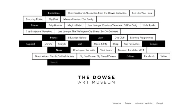
Navigation here is playing with bricks colored in black & white for the ease of visual perception.

* * *
Stunning design doesn't need anything extra. Clean layout in classi colors, large types, a lot of negative space and burger menu for the ease of use.


* * *
Being overspread around the web, these black & white website designs promote special aesthetics, not peculiar for their colored analogues. Lack of color helps them look extremely stylish and puts emphasis on the essence of each design - the content. Let me know in the comment section if I've missed some vibrant examples of such sleek designs.