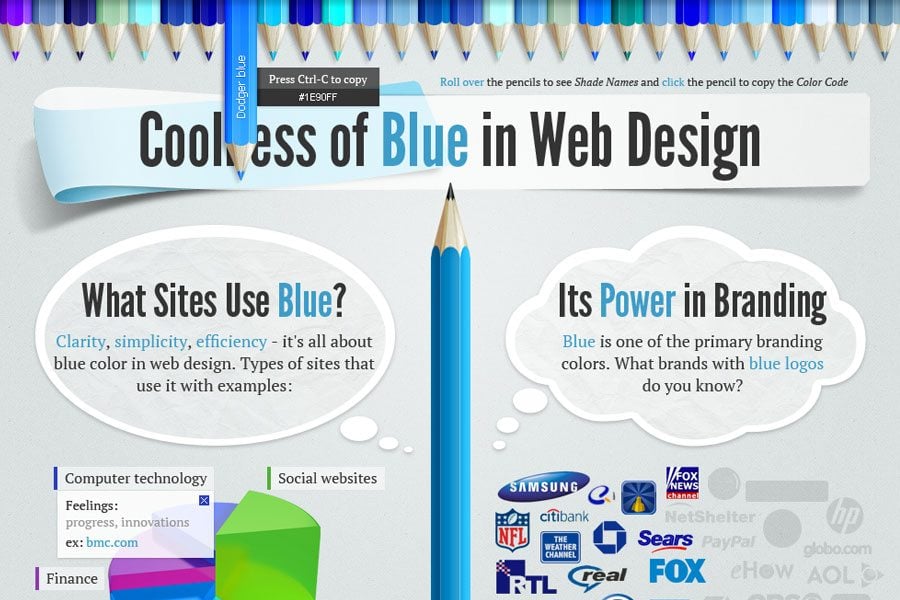
What is the first thing you pay attention to when you visit a website? It’s a color scheme that plays the primary role in its visual perception. It’s really a hard task to choose the proper color scheme for your web page to have a particular influence on your visitors and their perception of your business messages. We want to share the interesting facts about the color usage in web design with you in the following post. It’s going to be a captivating interactive infographic that will tell you about Coolness of Blue in Web Design.
Why have we chosen the blue color? Just look at a number of corporate giants, and notice what color they use in the design of their logos and websites. Yeah, you’re quite right, it’s blue. And not only them, a large variety of websites of different business spheres prefer blue color because of its design qualities. It’s a notorious fact that blue increases brand recognition and the visitor’s trust in it. According to the psychology of colors it is associated with intelligence, stability, unity, conservatism, authority figures, etc. This trustworthy and quality-related color is quite useful for the emotional response.
Color scheme in web design is as a perfect weapon for attracting users, and your choice of blue is the right one for portraying quality and stability of your business. In the following infographic we’ve compiled all the necessary information that will show you the power of blue color in web design. While browsing you’ll discover:
- the sites that use blue as their primary color,
- popular mixes with other colors,
- the power of blue color in branding,
- its 55 shades,
- gender preferences,
- color meanings by culture
– all this will help you make the right choice and start cool, stylish, and attractive site.
This infographic is the interactive one, and it means that we are glad to offer you a captivating journey where you can choose your own way of interacting with the presented information. You just follow the way you like and find its hidden parts with some interesting points. We hope, you’ll like its attractive animation and cute effects (like hovering over the pencils at the header/bottom ), will draw inspiration out of it, and learn something more about the power of blue color in web design.
(What you see below is a static and contracted version of Coolness of Blue in Web Design Infographic, at the bottom of it you will find the link of the full interactive version.)
To see full version of this Coolness of Blue in Web Design, just follow the link.
***
If you want to share the secrets of Blue Color in website design across social media, you’re welcome to do it via Facebook, Twitter, Google+, Pinterest, StumbleUpon. You can also copy the code of a .jpg version of this infographic and incorporate it into your page.
