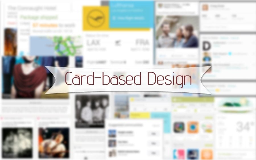
New year means new trends. Which ones have you noticed in 2015? All trend spotters are thrashing over card-based web design, the new tendency that is raving into gear and is worth talking about. The powerful trinity Google, Twitter, and Facebook has already adopted it, and now it’s your turn to learn more about it and, possibly, make use of it.
The term “cards” has acquired larger sense these days. The most common type of cards are playing cards that date back to China. At first they spread to India and Persia, then to Egypt, and only then became a part of popular culture across Europe in the 14th century. These days cards are considered to be perfect for any occasion. Invitation, birthday, business, credit cards - they seem to be everywhere. This post is focused on wed cards, as the new expressive way of presenting information.
Cards have become the most used design pattern today. Why? Web cards are:
- Informative. The common card contains title, user name, image, icons. Aggregating all these elements, cards present them in readable and easy-to-perceive condensed manner.
- Catchy. Wise combination of text and visuals easily communicates the ideas behind each card to the viewers, and make these ideas memorable.
- Responsive. Card-based design nicely performs on screens of various sizes.
All the mentioned above makes cards extremely useful elements of mobile design. Constituent parts of card-based layouts are easily reordered to fit the sizes of whatever devices. Thus, cards perfectly satisfy the requirements of today’s responsive epoch.
Card-Based Web Design
The arrangement of content is a key when it comes to making design user-friendly. Cards of various sizes offer to place the content into separated rectangular/square blocks, thus offering well-ordered structure and enhancing readability. They provide a lot of information in a condensed format, and mean interactivity as a goal. Simple box with information is not a card yet. The web term “card” implies functionality. It demands engagement. The cards I’m talking about are clickable modules with information and offering options for further involvement. It can be an invitation to like, share, add comments, etc. Calling users to action, cards have a great potential of interaction with the site visitors.
At first, let's see card-based design using the examples of Google, Twitter, and Facebook.
“Your information is automatically organized into simple cards that appear just when they’re needed” – this is the motto of Google Now. Google goes away from search and offers you to get personalized information on mobile devices. This app is a kind of your virtual personal assistant who reminds you important, dates, tells about weather, checks local traffic, suggests what to watch on TV, etc.
* * *
Facebook feed is one more example of card-based design. Each card provides you with a portion of information, and options to like, share, comment, report, embed. Such structure works for engaging the audience.
* * *
Twitter Cards – the new innovation from social network that we all love. From now you can attach rich photos, videos and media experience to your tweets. Summary, photo, gallery, app, player, product – Twitter offer such cards for web and mobile clients.
.@skava on mobile commerce: the web has 6× more traffic and 9× more revenue than native apps. http://t.co/eYCadMdMr9 pic.twitter.com/0fc5xprUZ7
— Paul Irish (@paul_irish) January 12, 2015
More examples
Speaking about card-based design, I can’t help mentioning Pinterest with it boards and grids structure. Actually, this type of arrangement content can be called a predecessor of card-based design. Boards and grids layout became one of the main 2011 trends and it’s still one of the most-used. It helps arrange site blocks in a well-structured manner, avoiding content chaos. Card-based design takes this idea as the basic one, and adds interactive option.
* * *
Well-structured layout based on cards provides the visitors with all the information about each particular design piece presented on this site.
* * *
We all love and visit with great pleasure this well-known card-based design.
* * *
This huge depository of photos and tons of creative stuff also features cards-based design.
Just random sites with card-based designs from the net.
* * *
* * *
* * *
* * *
Cards can be called the new-age creative canvas that is widely used on the web. They are really a big thing in design that will make a gret contribution in its future.
