

The cinematography is one of the critical industries affecting our lives and our world’s perspective. That’s not a secret and, to be honest with you, I am okay with this order.
Personally, I am a huge cinemaholic and there is nothing more to adore than a perfectly directed movie.
While watching the latest movie of the director Nicolas Winding Refn, I’ve got a fascinating idea for the article: what if we look at a few movie directors and see how their creativity inspire the design community?
I am a junior designer, and when I sent my portfolio to a friend who worked in this industry for a while, I got an amusing comment from him:
‘Damn, man, you must be a huge fan of Stanley Kubrick, are you? You have this passion for symmetry and, to be honest with you, it’s not always good, get rid of it!’
That was the moment when I smiled and understood two things:
- I do love Kubrick’s movies, and I always knew that he is a sucker for symmetry.
- My friend apparently is not familiar with the works of Wes Anderson, because I am a huge fan of his movies and he uses balance almost in every shot of every film.
But first, let’s give credit to Winding Refn for the fact that his movie inspired me to create this article. Let me tell you what the Refn's true love is.


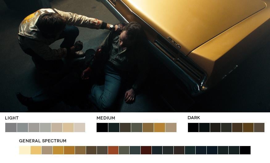
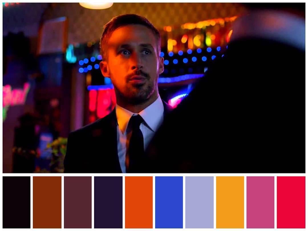
Winding Refn and his color obsession
Winding Refn gets a little bit crazy when it comes to the colors, but first, here are the movies that he is known for.
Drive (2011)

Only God Forgives (2013)

Neon Demon (2016)

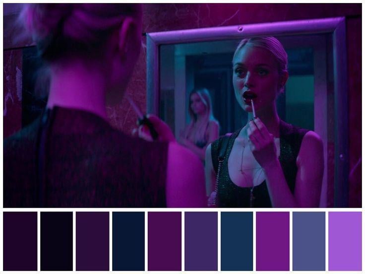
As you can see, all his movies include a lovely acid color palette, but that’s not the most exciting part of the story. Are you ready?

Nicolas Winding Refn is colorblind.
In case you didn’t see any of his movies, you may say now that his acid palettes suck, and they are too eye-popping, but that’s not true, just hear me out…
Refn’s color blindness became his directing technique, and it’s unique. Nowadays I know only a few directors who use colors the unusual way as he does.
Seriously, only Nicolas Winding Refn’s movies will show you something like this. To me, this is a real piece of art; it’s inimitable, and as a designer, this person does a fantastic job.

His work with the color is so unusual and inspiring that, I know for sure, if you look through his movies, you will change the way you deal with the color in your design projects.
Ridley Scott is not a fan of dull and faceless color palettes
I’m not sure what’s your opinion on Ridley, but to me, he is a father of two great franchises:
- Alien
- Blade Runner
Both movies can introduce you to the Ridley’s love for the colors and lights. These two films have amazing palettes, and the director uses the light techniques so masterful that you can only be happy that you see this.
Here are a few examples from the first Alien movie:

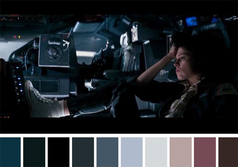

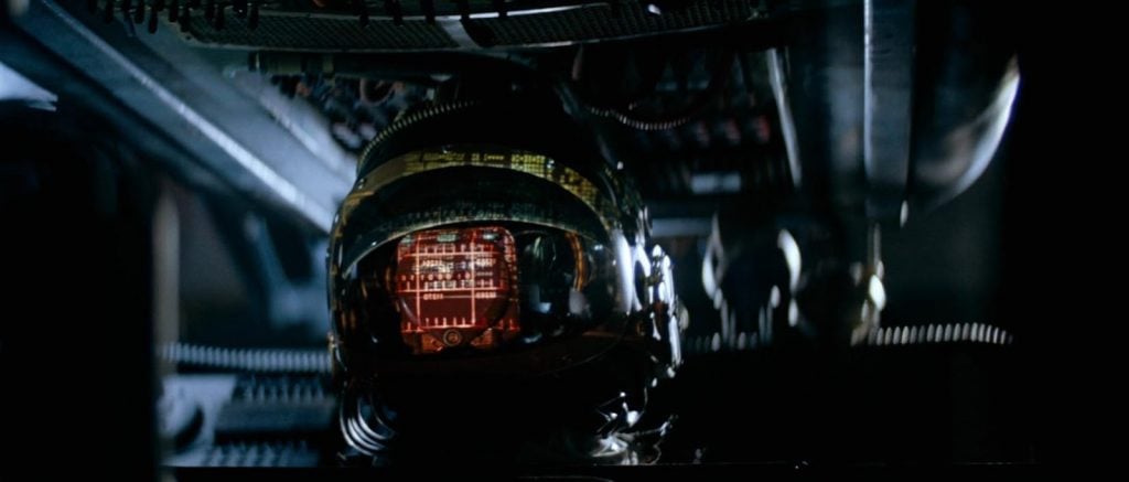

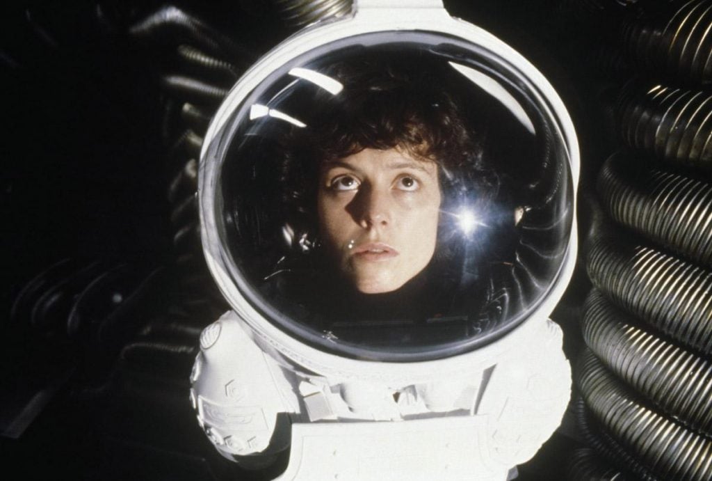
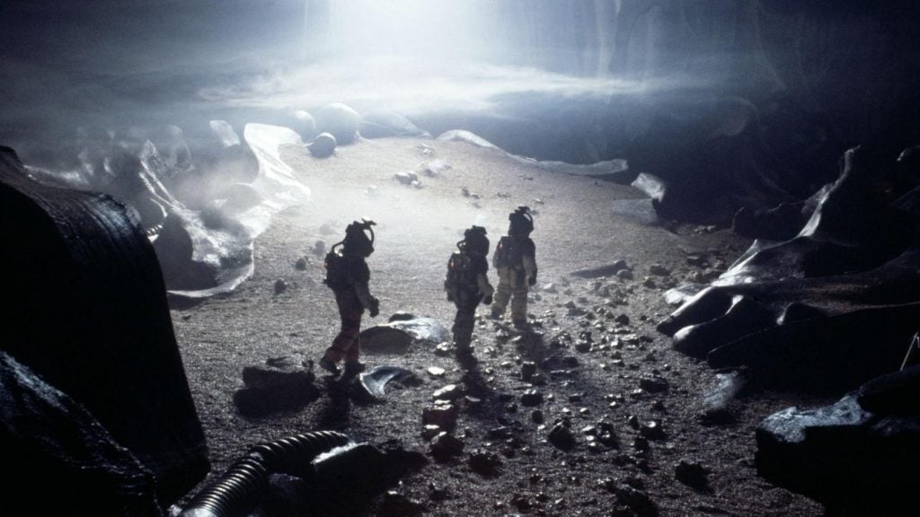

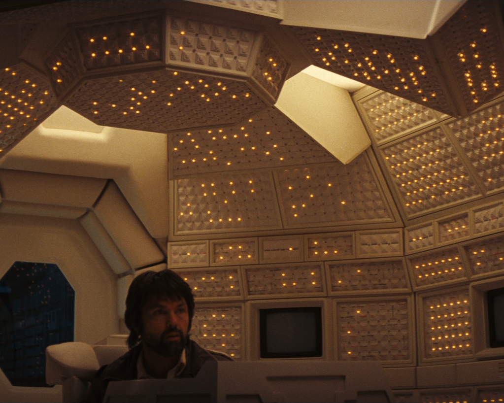
Ridley Scott became our guide to the world of sci-fi movies, and he made everything look exactly how it should: all these futuristic lights, spacesuits that reflect the light in the ship and outside of it, that’s just amazing.
Enough words, here is the video from the beginning of the movie that will make you understand what I’m talking about.


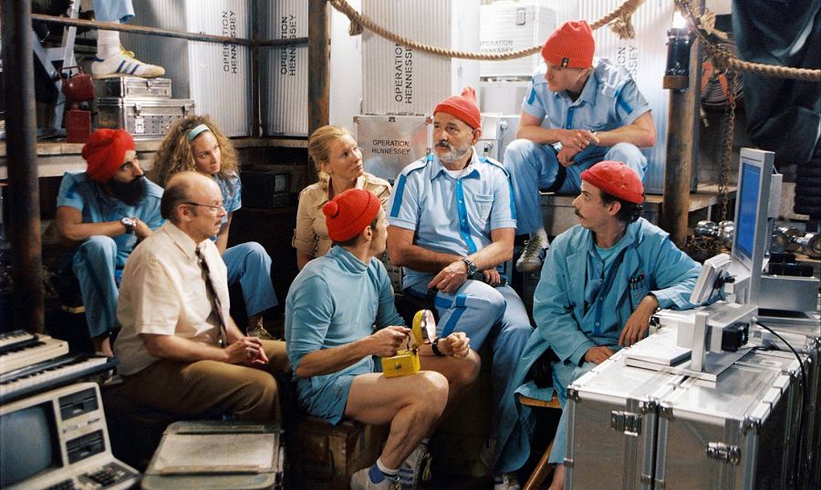
Kubrick and Wes Anderson always value the perfection of the shot
These two fellas have the same passion: perfect shot. The symmetry of the shot is what they love, adore and enjoy personally, so their movies have a lot of such shots.
Here are a few examples from the works of Stanley Kubrick:

Wes Anderson abuses it a little bit more!
His shot is almost always centered and, I’m going to be honest with you, it feels a little bit weird, but as of today I’ve got used to his works, and I like the fact that he has a unique style because of it.
Godard was in love with typography
This is a little bit more old-school person. Jean-Luc Godard has so many great movies that I can reasonably call the masterpieces, but we are not going to talk about the films in general. Today, we will focus on his typography passion.

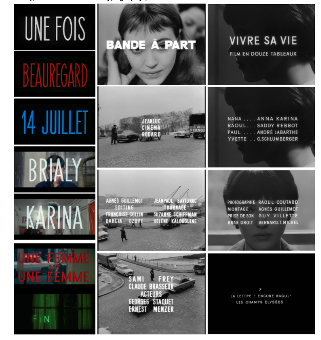
These titles designs are big, bold and just magnificent. The main thing I love about his typography is that they all have these imperfections like they have been drawn by hand. It looks like they have been cut out with the knife with the highest precision.
So, what’s your point?
The cinematography has been with us for a long time now, and we all take the directors’ work for granted. However, don’t forget that when you see a movie that has been directed by a person, not by a studio, it means that a designer and a real craftsman worked on it and tried to give you his perspective on life and creativity.
We, the designers, have so much in common with these people, and we have so much to learn from them.
Watching movies is not a waste of time. I took so many design ideas and inspiring techniques from the films of these talented people. So, don’t think of cinematography as an industry of popcorn and blockbusters, it’s just not true.
Related Posts
Business Plan to Build an Online Cinema for Fan-Made Movies
Cinemagraphs – a Little Motion Flavor for Your Blog. Packed to Grab
Hypnotic Effect of Cinemagraphs & How Can Bloggers Benefit from Them?
Build the Best Online Cinema Blog Ever with These Premium WordPress Movie Themes