Circular Elements in Web Designs – Encompassing Showcase
Well, we have spotted these days that circles have a large sphere of influence on web design trends. Graphic symbols definitely add some specificity to every design, but it seems to be all the rage now to throw out exactly circular-logic shapes in design pieces. Quite possible it is connected with the fact that subconsciously circles are associated with the communication. Being rather simple, memorable, and complete, round symbol tunes in for mutual understanding.
In this showcase we’ve circled the excellent designs that make use of the round shape in many creative ways, presenting navigation menu, background elements or image galleries. Many designs, as seen in the examples below, have their logo round, usually with a slogan or a name in it. Sometimes circles are used in an effective and eye catching way to convey a particular company concept or idea. There are lots of ways possible. As for TemplateMonster designs, we wish as well share our love for circles showing you the range of templates made by our designers. Those examples are simply incredible and fantastic. So, you can go ahead now and browse this well-rounded list spotting web designs with sexy round details. Let’s get it instantly covered.
***
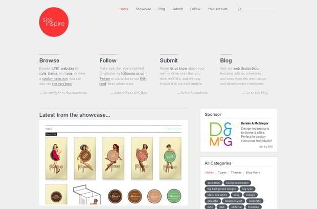
Siteinspire.net
***
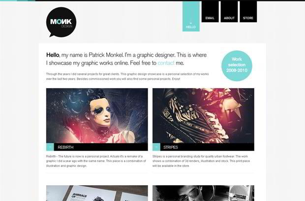
Patrickmonkel.nl
***
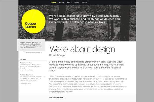
Cooperlumen.com
***
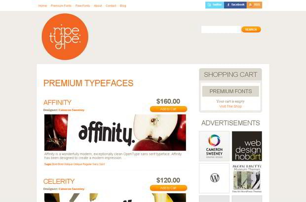
Ripetype.com.au
***
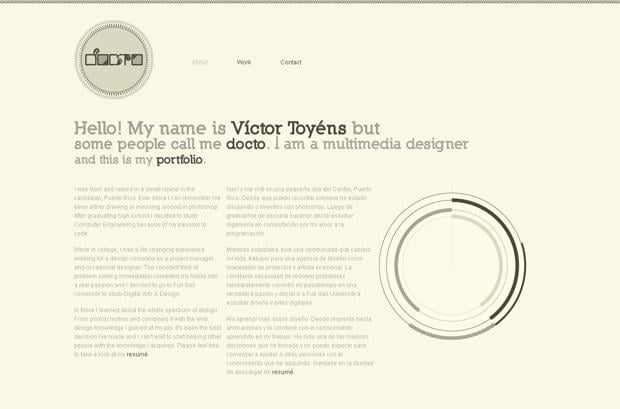
Iamdocto.com
***
Securex Website Template
***
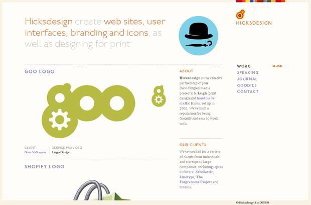
Hicksdesign.co.uk
***
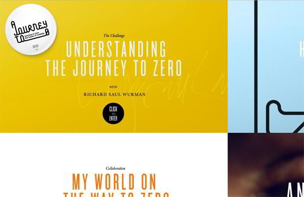
Journey-to-zero.com
***
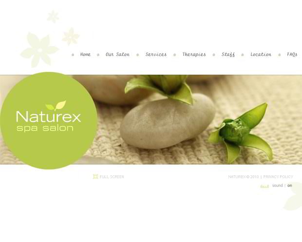
Naturex Spa Salon Website Template
***
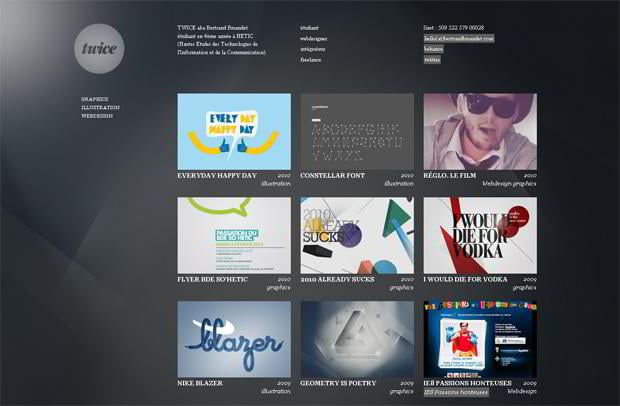
Bertrandbruandet.com
***
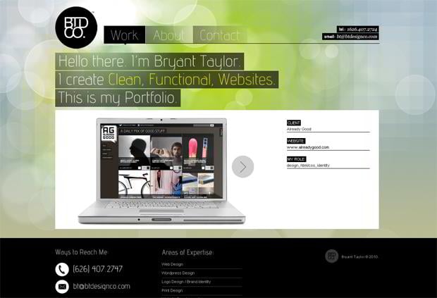
Btdesignco.com
***
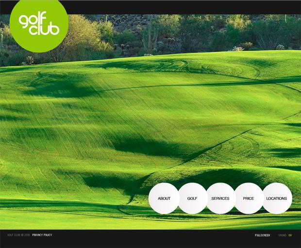
Golf Club Website Template
***
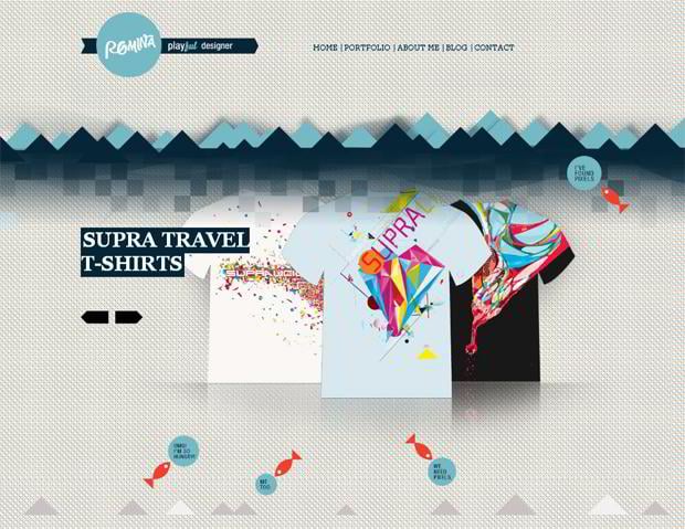
Romina.si
***
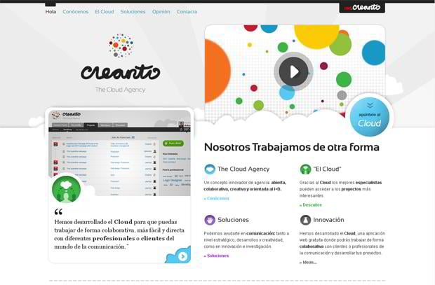
Creanto.com
***
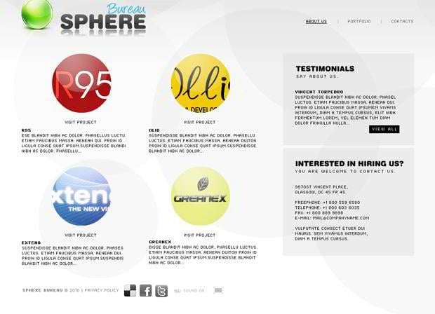
Sphere Bureau Website Template
***
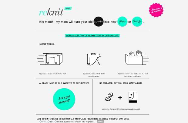
Rekn.it
***
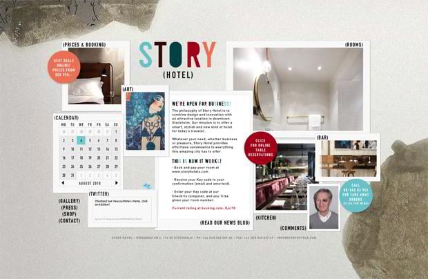
Storyhotels.com
***
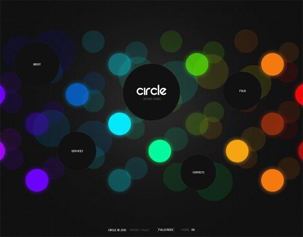
Circle Design Studio Website Template
***
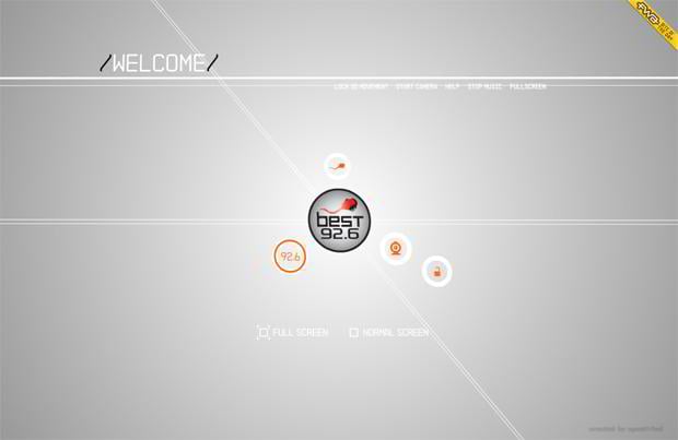
Bestradio.gr
***
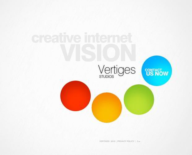
Vertiges Studio Website Template
***
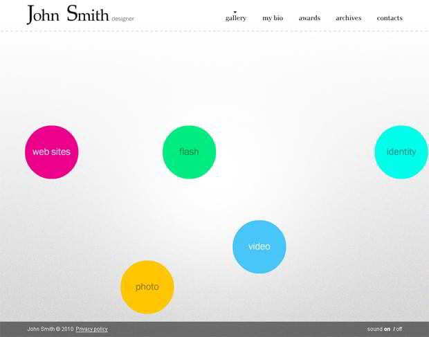
John Smith Designer Website Template
***
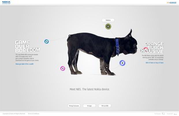
Nokiagameoverboredom.com
***
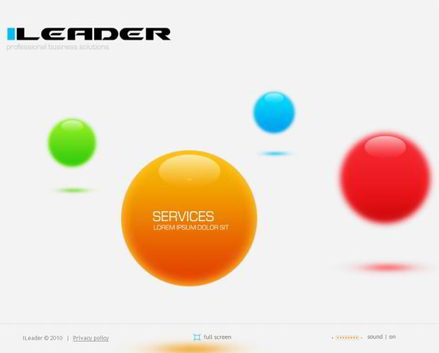
Professional Business Solutions Website Template
***
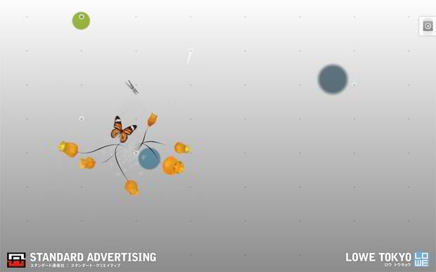
Standard.co.jp
***
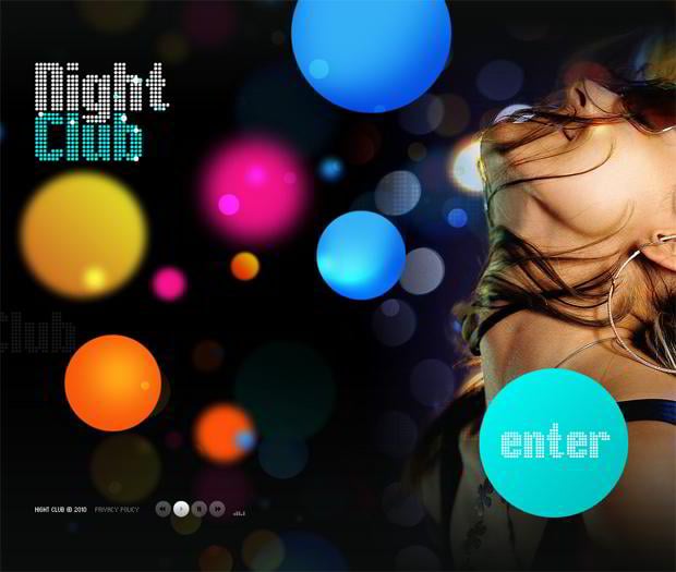
Night Club Website Template
***
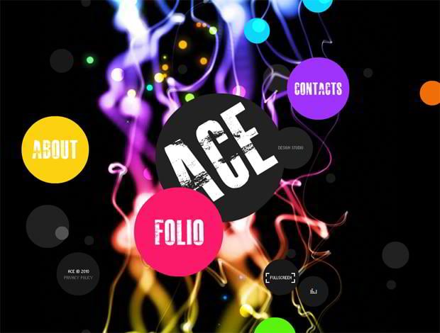
Ace Design Studio Website Template
***
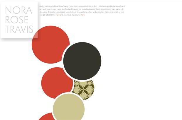
Norarosetravis.com
***
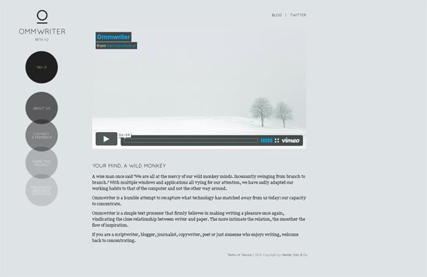
Ommwriter.com
***
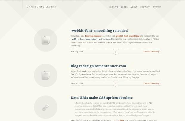
Christophzillgens.com
***
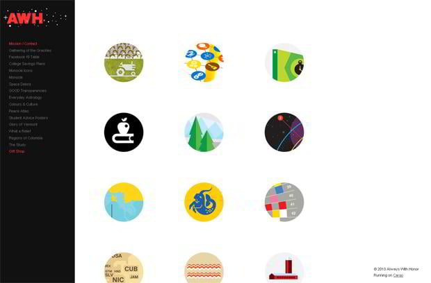
Alwayswithhonor.com
***
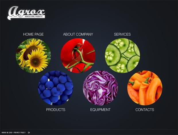
Agrox Website Template
***
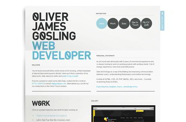
Goslingo.com
***
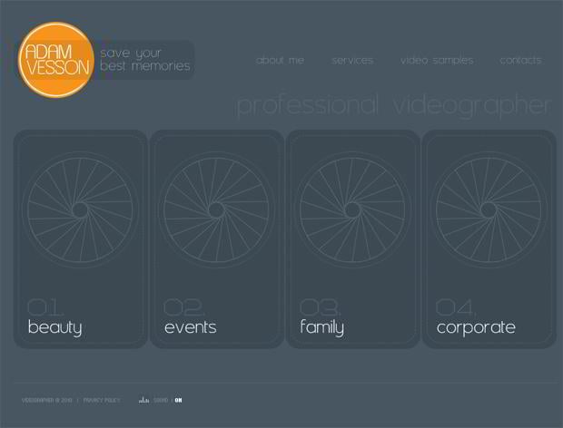
Adam Vesson Website Template
***
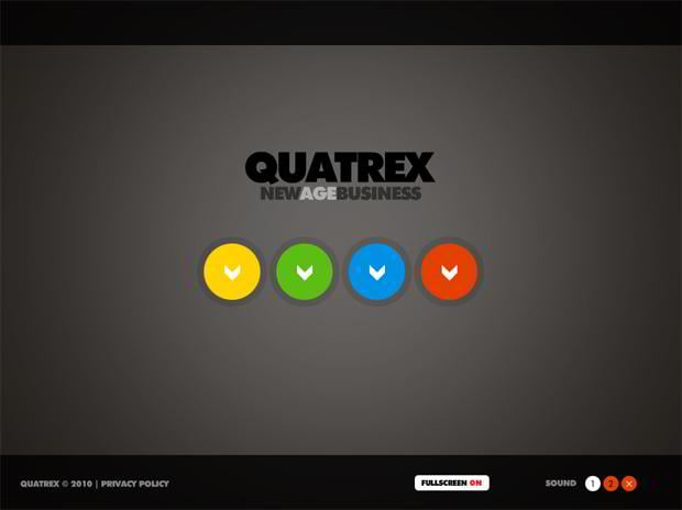
NewAgeBusiness Website Template
***
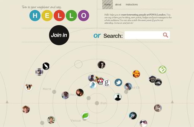
Hello.carsonified.com
***
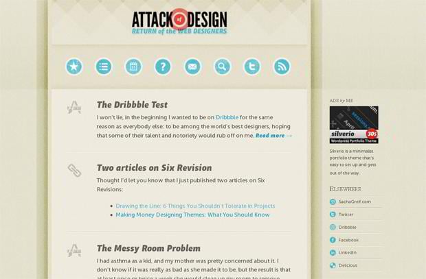
Attackofdesign.com
***
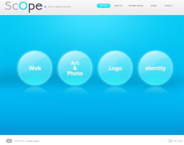
Creative Personal Portfolio Website Template
***
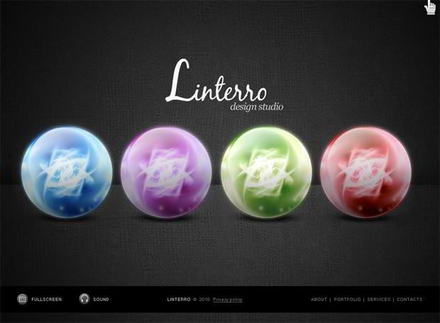
Linterro Design Studio Website Template
***
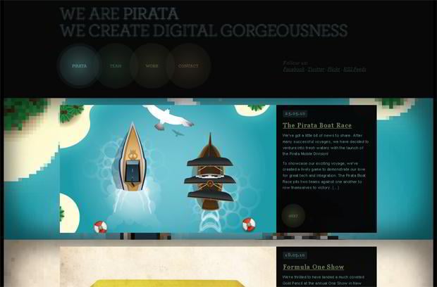
Piratalondon.com
***
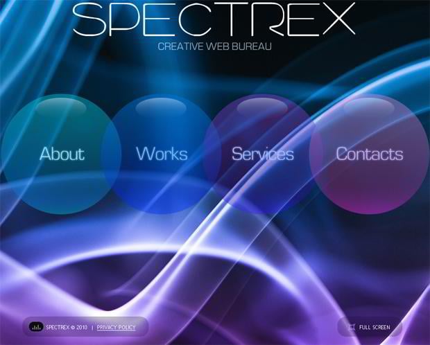
Creative Web Bureau Website Template
***
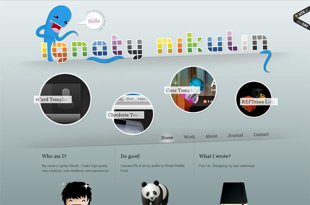
Ignatynikulin.com
***
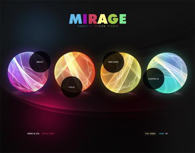
Mirage Creative Design Studio Website Template
***
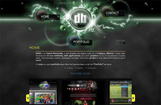
Dbwebstudio.com
***
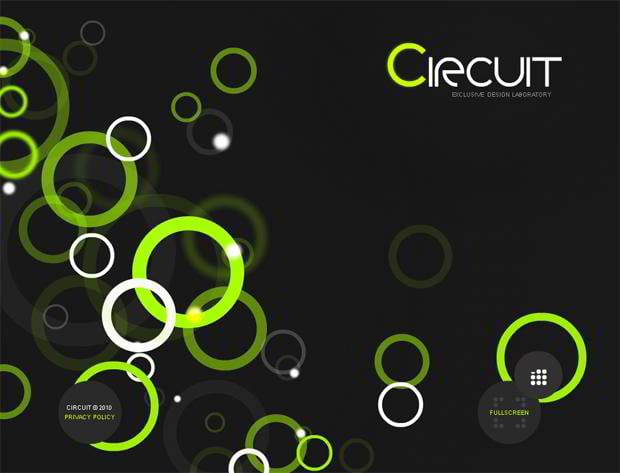
Circuit Design Laboratory Website Template
***
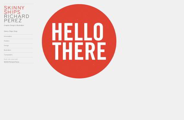
Skinnyships.com
***
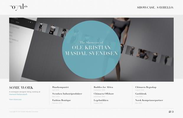
Royale.no
***
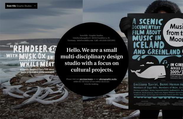
Svenkils.de
***
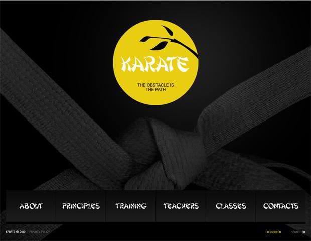
Karate Website Template
***
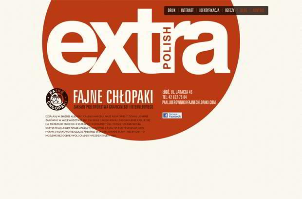
Fajnechlopaki.com
***
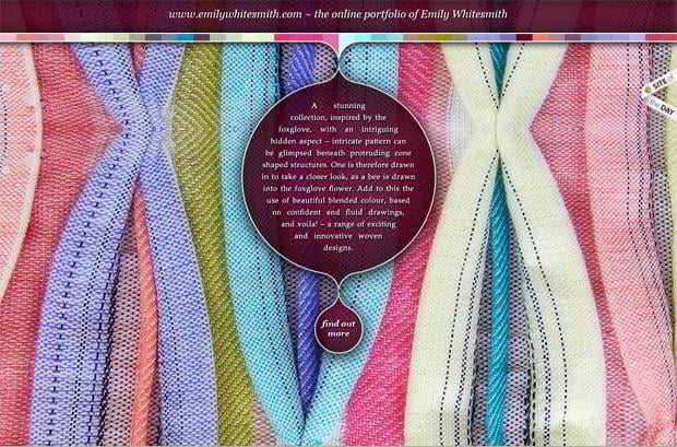
Emilywhitesmith.com
***
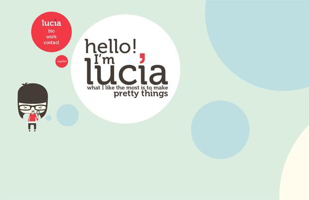
Luciasoto.es
***
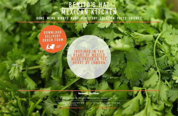
Benitos-hat.com
***
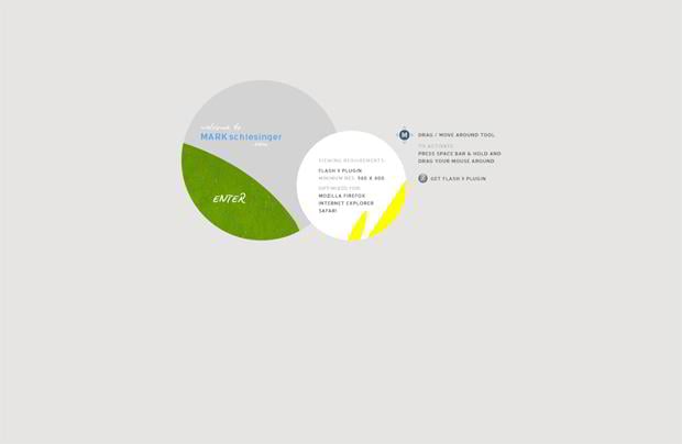
Markschlesinger.com
***
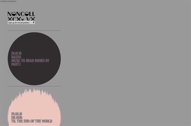
Noncollective.com
***
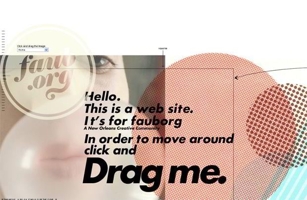
Faub.org
***
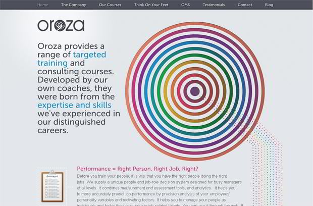
Oroza.com
***
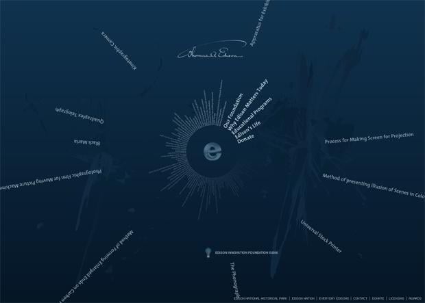
Thomasedison.org
***
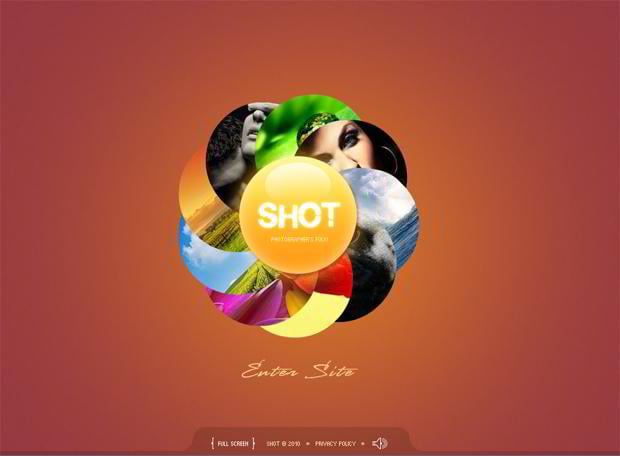
Shot Photographer’s Folio Website Template
***
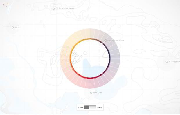
Instantanes.visitprovence.com
***
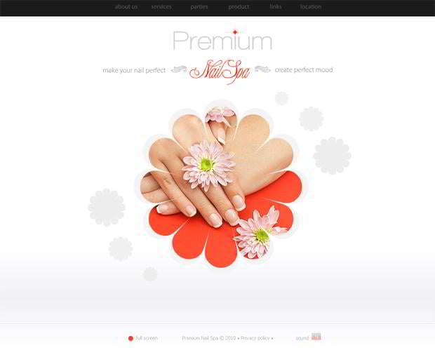
Nail Spa Website Template
***
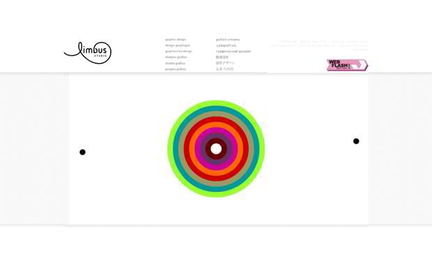
Limbus.fr
***
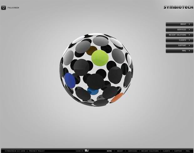
Symbiotech Website Template
***
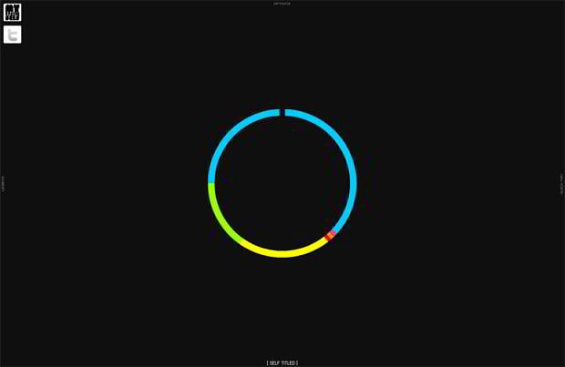
Selftitled.ca
***
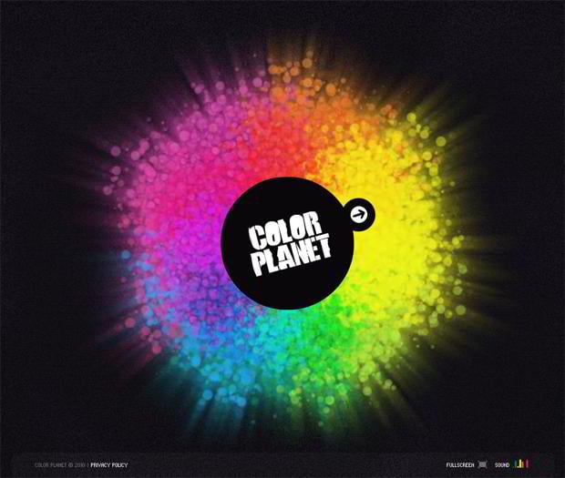
Color Planet Website Template
***
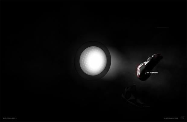
Nike.com
***
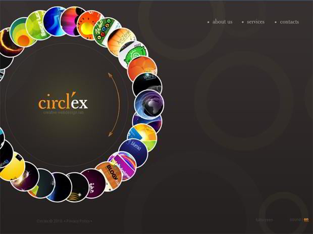
Creative Web Design Lab Website Template
***
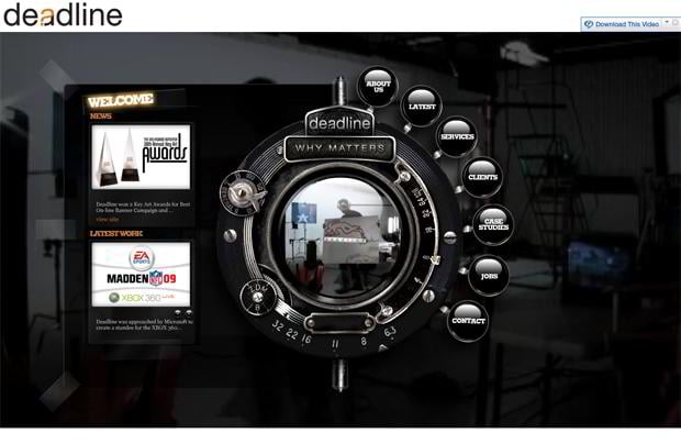
Dead-line.com
***
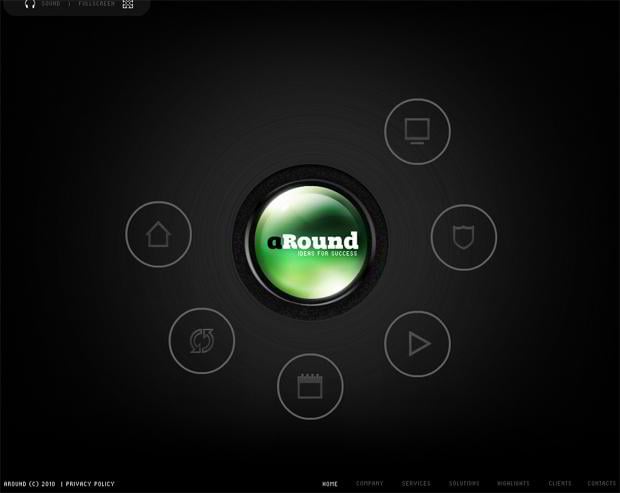
aRound Ideas For Success Website Template
***
Don’t miss out these all-time favourites
- The best hosting for a WordPress website. Tap our link to get the best price on the market with 82% off. If HostPapa didn’t impress you check out other alternatives.
- Monthly SEO service and On-Page SEO - to increase your website organic traffic.
- Website Installation service - to get your template up and running within just 6 hours without hassle. No minute is wasted and the work is going.
- ONE Membership - to download unlimited number of WordPress themes, plugins, ppt and other products within one license. Since bigger is always better.
Get more to your email
Subscribe to our newsletter and access exclusive content and offers available only to MonsterPost subscribers.


Leave a Reply
You must be logged in to post a comment.