Close Up Portrait Photos As a Natty Tendency in Web Design
Strong imagery in a website is a key. It emphasizes the value of the text, leads readers’ eyes through the page and keeps balance between visual and written information. Creating an appealing and consistent visual part is a primary task for every designer, ‘cause it’s really crucial to draw users into the site content.
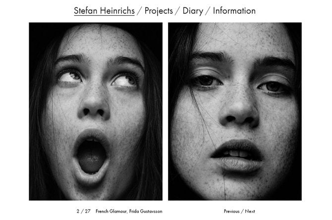
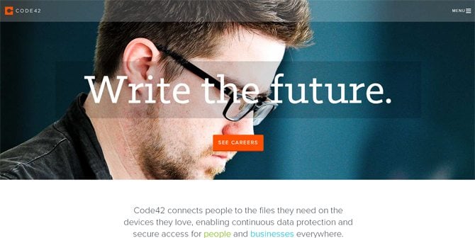
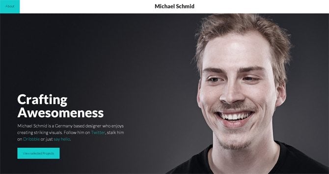
With ever increasing frequency designers choose large imagery in their works, especially close-ups that have a great graphic impact on the viewers. These portraits as a powerful tool in design are shown in the bright examples below.
At first, let’s see how visuals work within the design. A list of facts below will tell a bit more about their goal.
- Images are responsible for supporting site's content. They communicate business ideas and help build a strong visual connection with the viewers.
- Prioritize the information. Visual accents are widely used to underline the key points.
- Guide through the site. Well-organized visual part of the design facilitates navigation by showing visitors the way to follow.
Visual Part of Design
Good visual support of any design adds attractive look and feel to the website and offers its viewers to enjoy working with it. Photos, icons, buttons, backgrounds – all these elements compose visual part of the layout. Today flat design orientation dictate clean approach to the look of the site, and that’s why most of its elements are tiny, natty and polished. Linear or long shadow icons, ghost buttons, sliders with full-width photos, blurred images are in favor today. Incorporating large background images in websites is one more wide-spread technique. They can be implemented in the header of the site, or its whole body. Setting up a certain mood, background photos work for visual appeal and welcome people in.
Actual Tendencies
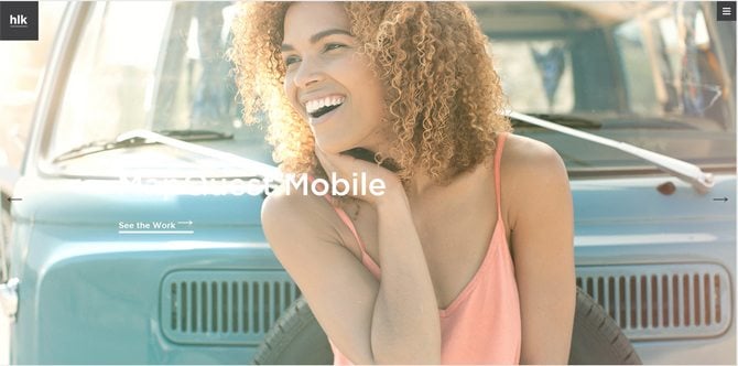
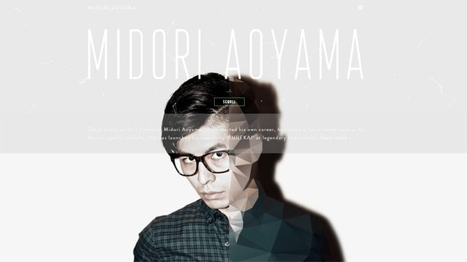
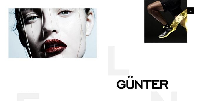
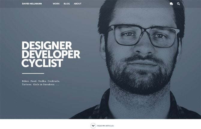
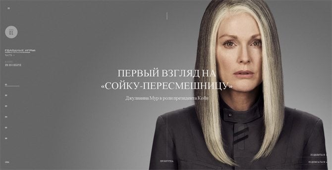
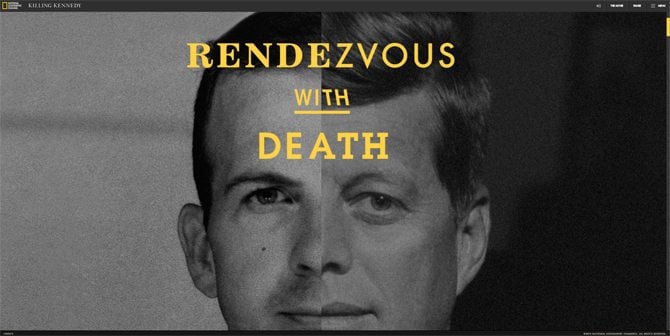
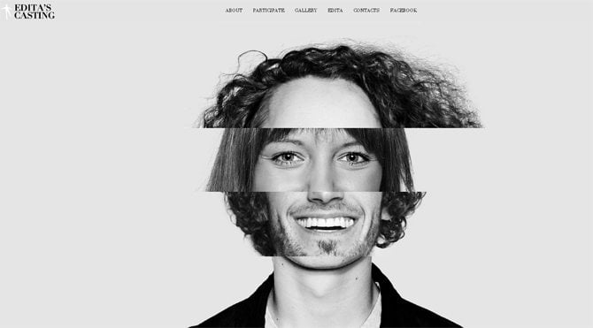
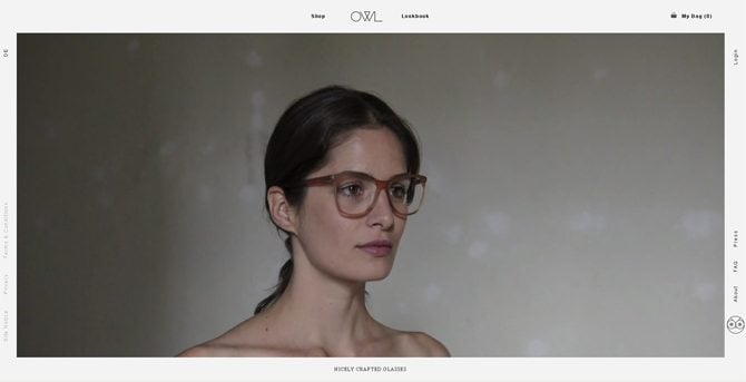
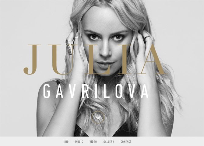
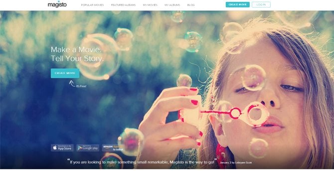
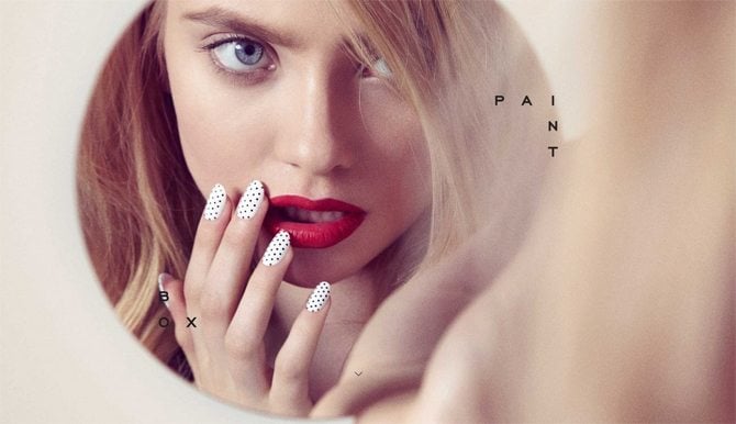
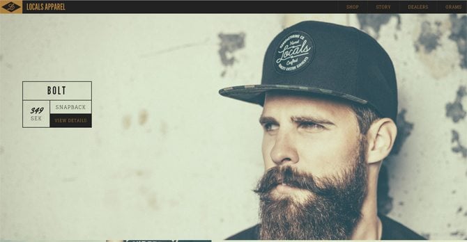
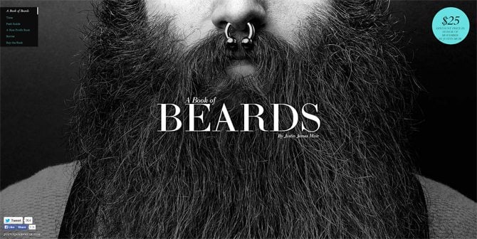
Close up portrait photos are an actual tendency of web design today. You’re mistaken, if think that only fashion or photo projects make use of it. Business, education, medical, art websites successfully implement portraits to make their designs more personal, give a nice unique touch to them and enhance human connection. Actually, it’s the main goal (along with visual effect) of using close-up portraits. When the designer chooses nice portrait that fits the overall look of the site, the mentioned above mission is considered to be accomplished. See how it was done in some of the sites below.
* * *
* * *
Midori Aoyama
* * *
* * *
* * *
Hunger Games Exclusive
* * *
* * *
* * *
* * *
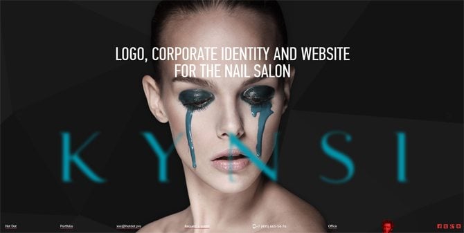
Hot Dot Production
* * *
* * *
Take Your Pulse
img class="alignleft size-full wp-image-56034" src="https://monsterspost.com/wp-content/uploads/2014/09/Take-Your-Pulse.jpg" alt="Close-Up Photography Web Design" width="670" height="340" />
* * *
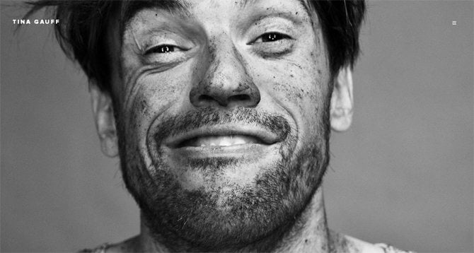
Tina Gauff
* * *
* * *
* * *
* * *
* * *
* * *
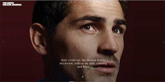
The Green Soccer Journal
* * *
* * *
* * *
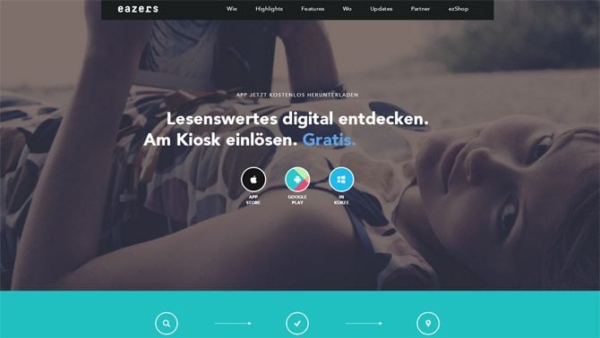
Eazers
* * *
* * *
* * *
* * *
That's it guys, if you have met any other websites with close-up portraits feel free to drop some links in the comments below. Have a great day and an upcoming weekend.
Don’t miss out these all-time favourites
- The best hosting for a WordPress website. Tap our link to get the best price on the market with 82% off. If HostPapa didn’t impress you check out other alternatives.
- Monthly SEO service and On-Page SEO - to increase your website organic traffic.
- Website Installation service - to get your template up and running within just 6 hours without hassle. No minute is wasted and the work is going.
- ONE Membership - to download unlimited number of WordPress themes, plugins, ppt and other products within one license. Since bigger is always better.
Get more to your email
Subscribe to our newsletter and access exclusive content and offers available only to MonsterPost subscribers.


Leave a Reply
You must be logged in to post a comment.