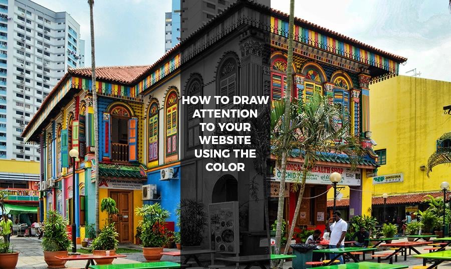
I am not sure if you are ready for that, but I’m about to start a real talk about colors. Yeaaaah, I know, it’s time to discuss a new web-design trend (well, I’m not sure how new is it, but still).
How often do you check the websites for the inspirational content? I am talking about the websites where you can take a look at the different design projects and steal some cool ideas. Yeah, right, you do not still… Who’s a good boy!
So, if you are not new to those websites you could have already bumped into the websites that look colorful as hell and sometimes the colors usage is so experimental that your eyes are surprised and ready to pop out.
But that’s not really a bad thing. Bad examples of the color usage will always exist, but there are so many talented designers that started to use color in the most beautiful way you can imagine. In this article, I will try to outline the key ways to draw attention to your website with the unusual colors usage. Of course, I will attach some real life examples, so you could see where I’m going with this. Let’s start and see if you find this new trend interesting. Who knows, maybe you’ll decide to use some unusual color variations on your website yourself!
Draw attention to your products
A year ago or so it was so cool to design everything in the most minimalistic way possible. It was expectable, even now too many customers are still tired of wasting their time trying to understand the complicated layout and find the way to interact with your website in the most efficient way. However, looks like this year designers got tired of designing in the minimalistic style and they simply started to experiment and try new layout and color variations.
Stores and shops were the ones who used the minimalism more often than anyone else. That’s because they tried to make the shopping process less annoying and more pragmatic.
However, some of the stores are currently trying to jump on the colorful hype train and use the color wisely. So one of the trending ways to use colors on your website is highlighting the products and making them stand out among the other interface elements.
It means that the product images and background sometimes look toxic yet very attractive. Everything is simple: if you use the colors properly, grabbing your customers’ attention by the new pair of running shoes will be much simpler.
Colorful texts are eye-catching
As an author, I cannot miss a chance to tell you how cool and bright your texts may look if you sprinkle it with some colors.No worries, all the serious magazines like Washington Post and New York Times will still have the same boring look, cause they are not about to experiment, their main goal is to write a great piece of journalism each and every day. And let me say, they are doing it great.
I am talking about blogs and entertainment magazines that can use colorful headings, pictures and typography elements in their posts.
Highlight the most important elements of your text and outline the things that should be reviewed more attentively by the reader. But make no mistake, making your text a little bit more colorful doesn’t mean that you have to drop the colorful bomb on your text and make it look like a freaking clown. I would recommend you scrolling Dribbble and Behance and looking and the most colorful blog and magazine designs, you’ll see how talented designers use the colors in their texts in the templates.
Highlighting some specific elements
This one is the simplest, right? You can highlight some specific elements you want your website user to focus on. Especially it works with the minimalistic templates. That’s because they are very neutral and once something colorful appears on the display, the customer is attracted to it immediately.You can highlight headings by underlining it with a bold colored line or add a colorful background to the key interface elements that customer should notice in order to interact with your website in the most efficient way.
This is how you can actually manage the customer's’ attention and play with it like a puppet master.
What about real examples?
As you could have noticed, TemplateMonster like to experiment with different design ideas and if you take a look at their latest releases, you’ll see more examples of the colorful web-templates. Let me show you just a few of them if you missed those latest releases:Magic - Multipurpose Creative WordPress Theme
Creado - Art Gallery Responsive WordPress Theme
Presstige - Digital Printing Company Responsive WordPress Theme
Conclusion
Colors form an important tool that every designer should utilize. Of course, it’s impossible for everyone to create something truly remarkable with it, but I believe that all designers should at least put a lot of efforts into mastering it. At least you’ll learn how to use it in your future project, but who knows, maybe you’ll be the next trendsetter in the world of colorful web-design!
Design studio templates with awesome color schemes are waiting for you.
