How to Create a Construction Website that Will Win at WebAwards?
I bet you like awards. Everyone does! When a thing you created was evaluated like something great and nominated with an award – you feel yourself on the top of the world. If awards are given to your business – it affects how the clients will treat it. They will trust you more and that means you grow more profitable. Those statements are true for any business web platforms, including construction websites.

When creating something it is good to have a worthy example. For your construction website, you could use the winner of the WebAwards contest and build a website that meets all the requirements to be the best. WebAwards is something like an Oskar for websites. Website owners register their sites, judges review them and when the scores are set the website with the highest score becomes a winner and gets his award. It is very useful to look at the sites that got high results – you can understand what trends became new standards and thus you should use them for your own site. After checking the 2018 WebAwards Best Construction Website I’m going to share with you what elements are a must for the construction website in 2018-2019 and also describe you an instrument you can implement those trends into your site with. All right, let’s do it!
The big slider at the top
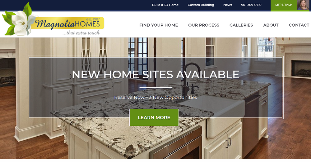
In the WebAwards contest, all the websites are judged on the next criteria: Design, Innovation, Content, Technology, Interactivity, Copywriting, and Ease of use. Some of them, like, for example, copywriting, depend on the skill of a person who writes it and I can’t give another advice but “write an awesome text or hire a cool copywriter”. However, there are plenty of other tips I can share. And the first will be – place a big slider with sharp and good-looking photos at the top of the homepage. It will impress the visitor from the first sight and give him some understanding of the quality of your work. Especially, if those photos will show the building you construct. The WebAwards 2018 Best Construction Website, Magnolia Homes, do it like that:
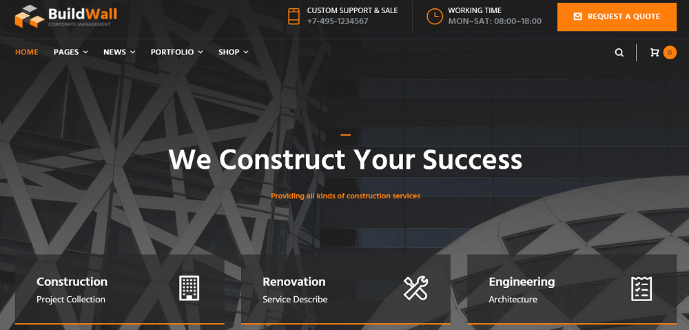
I have told that I will not only point at some clues to make your construction website the best but also give you an instrument. So, here it is – BuildWall, Construction Company Multipurpose WordPress Theme. It has pre-made skins for any type of construction website and was built with all contemporary trends in mind. Here’s how an eye-catching slider looks in it:
Animated Boxes
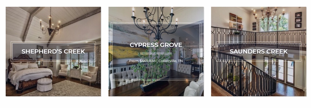
Hover animation attracts user’s attention. That’s kind of instinct – to look at the object that changes its condition as you touch it. It's very wise to use it for the examples of your work – the users will have no chance to miss them. And if there are an attractive picture and a matching font – it's an ultimate combo! Magnolia Homes combined the photo, font, border and hover animation with great taste:
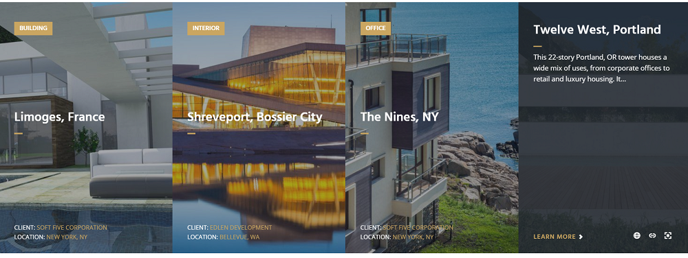
The BuildWall template also uses animated boxes to present the examples of construction website owner’s work. All of the really necessary information is placed right to the tile and if the visitor is interested in details he can go to the other page and check it out.
Easy-to-find contact form
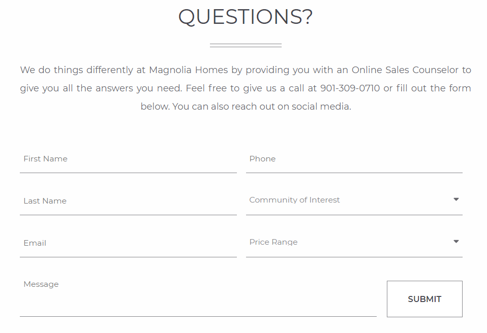
One of the most important parts of the website is the contact form. The whole website is organized to lead the visitor through important points to the contact form. That’s why it should be clearly visible and put to the place where it will be easy to find. Moreover, you should leave visitor no chance of missing it. Magnolia Houses deal with that task perfectly, the contact form of that construction website is big, nicely designed and placed at the bottom of the homepage, where users are expecting to see it.
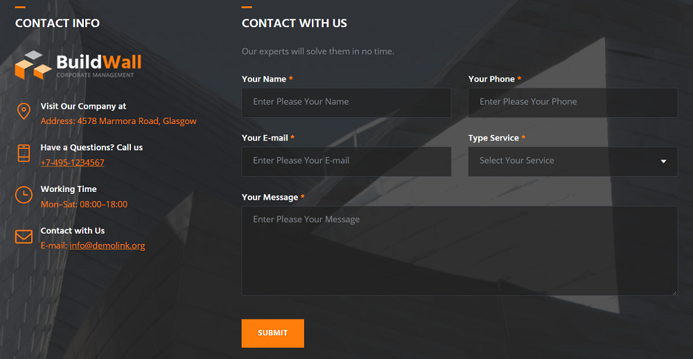
The BuiltWall construction website template put the contact form to the footer, right near the contacts list. A potential client will be able to call, send an e-mail or submit a contact form without searching it through the website – all they needs is located in one place.
Understandable menu
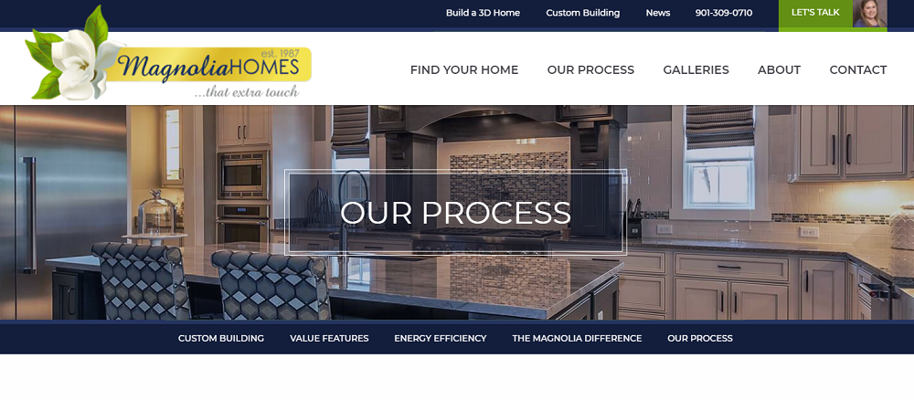
One of the criteria the WebAwards judges evaluate websites is “Ease of use”. When it comes to usability, the most important feature is the simplicity of navigation through the website. The understandable menu plays an important role in creating a pleasant user experience. Magnolia Houses has a very simple menu that makes it obvious where the user can find what he is seeking. That means that the user will meet no issues while wandering the website and have a nice time. Take a look at the Magnolia Houses menu – it's completely transparent.
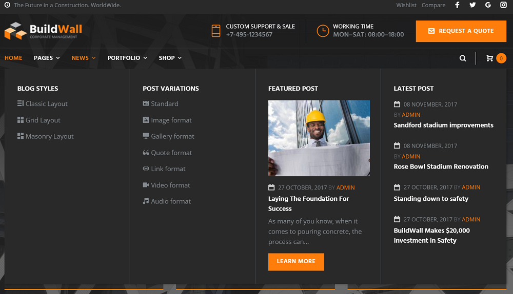
The BuildWall menu is a little more complicated but compensates it with drop-down common and mega menus. Just hovering over the header menu potential clients get all possible information about the content he could find on this website and the pictures make it more attractive and illustrative.
Conclusion
I’m not trying to make you register for WebAwards contest, you may not need it at all, but looking at the winners could help you to catch some insights and make your website better. The WebAwards is not the only website reviewing and evaluating others. For example, you can take a look and the awwwards winners in different categories. So, go look for some inspiration, follow the trends and have a good luck with creating the best construction website on the web!
I hope these tips helped and gave you some milestones in building your website. If you have some additional pieces of advice, comments or experience to share – you are welcome to the comment section below.

Read Also
TOP 45 Construction WordPress Themes
50 Best Architecture WordPress Themes
How to Start a Construction Company Without Seed Money? [Article for Entrepreneurs]
23 Construction Company HTML5 Templates for Building Successful Business
Don’t miss out these all-time favourites
- The best hosting for a WordPress website. Tap our link to get the best price on the market with 82% off. If HostPapa didn’t impress you check out other alternatives.
- Monthly SEO service and On-Page SEO - to increase your website organic traffic.
- Website Installation service - to get your template up and running within just 6 hours without hassle. No minute is wasted and the work is going.
- ONE Membership - to download unlimited number of WordPress themes, plugins, ppt and other products within one license. Since bigger is always better.
Get more to your email
Subscribe to our newsletter and access exclusive content and offers available only to MonsterPost subscribers.

Leave a Reply
You must be logged in to post a comment.