Customize Landing Pages on the Fly in 15 Minutes
What does it take for a non-tech savvy to get a custom landing page? Waiting for a designer to draw the sketch, coder to build its skeleton, QA specialist to test it, programmer to fix bugs… If you don’t like any detail in the end, the whole process starts all over again. Are you longing to break free from the dependency on all these people and tiresome waiting? Try our 5 new landing page templates with drag-and-drop builder to create custom designs in half an hour.
First and foremost, these feature-rich landing pages with drag-and-drop HTML editor are intended for end users who lack HTML or CSS knowledge. There is no need to bother with the backend – customization takes place at the frontend. Just drag and drop pre-defined blocks onto the blank canvas, edit them, add your own text, and voila! The page is ready to deliver the message of your marketing campaign. Besides end users, professional developers can also find these templates helpful, as they reduce the workflow duration to a minimum.
So, what is the HTML builder all about? This nifty customizer is built with HTML, CSS, JavaScript, and a single PHP file meant to export the markup you’ll create. The tool also makes use of a flat UI pro kit to help you design a clean and crispy layout. Once you enter its panel, you’ll see a burger menu with different pre-defined blocks on the left. You can move those blocks to the canvas by dragging and dropping, change their position the same way, and delete them individually or all in one go. In terms of editing, you can customize links, images, videos, icons, titles, text, and some other elements.
Thanks to such an easy-breezy process of customization, you can test many different designs. President Obama raised extra $60 million using A/B Testing of his landing page. What’s holding you back to beat or at least approach his record?
Now, let’s explore the types of pre-defined blocks and styling options you can play with while building your landing page. Keep in mind that their number varies in each template. You can use all the available blocks to build a long, informative page or only some of them to keep it shorter. It’s up to you. What’s curious, long landing pages can generate 220% more leads than the above-the-fold section.
Intro Blocks
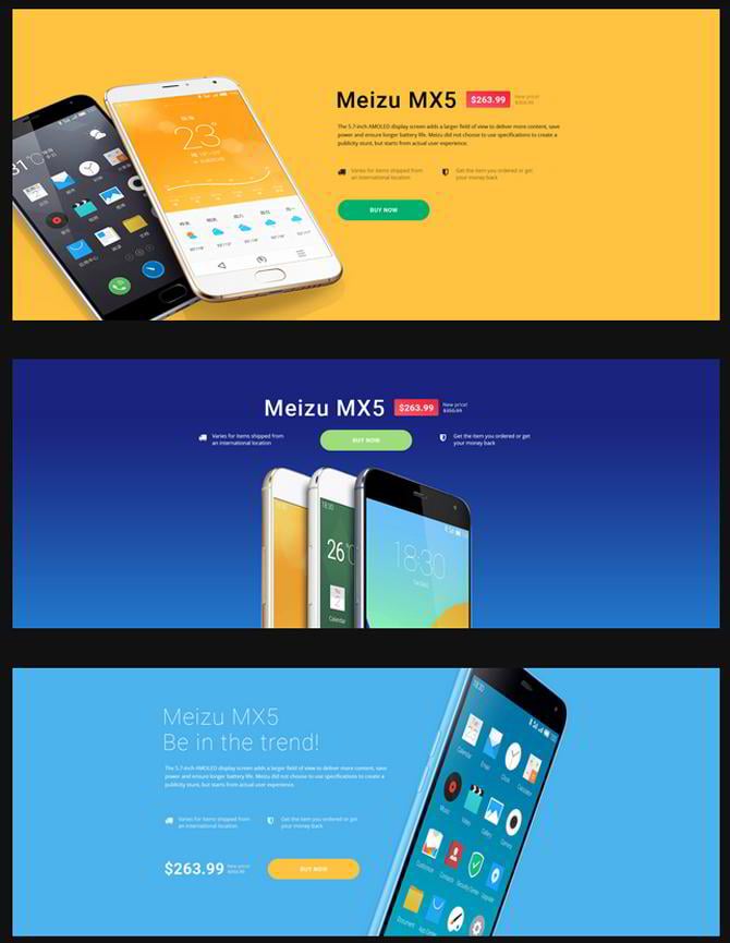
The landing page templates with drag-and-drop builder offer 5-7 intro block layouts to choose depending on your goal. There are stylish options to focus customers’ on product details, motivate them for subscription with a built-in form, cause a sense of urgency with a countdown feature, etc.
* * *
Navigation Blocks
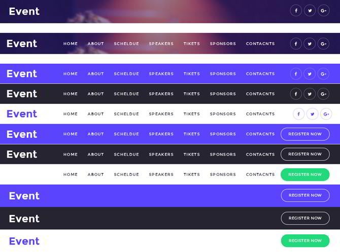
In terms of navigation, you can access 3-11 varieties depending on the template you use. Feel free to choose from transparent, colored, dark and light backgrounds. The navigation block of your landing page can also have or lack your company’s logo, menu items, social media icons, and registration button.
* * *
Benefits and Features Blocks
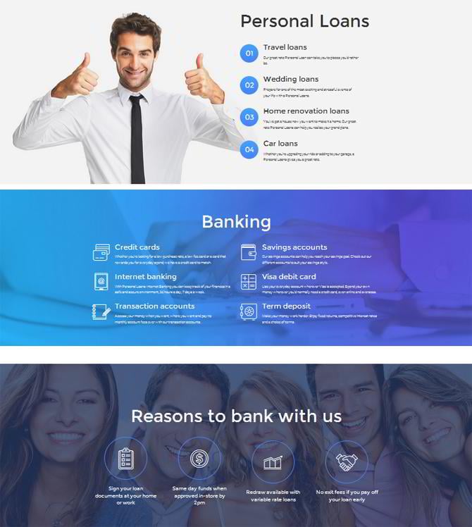
To let you highlight your product’s benefits and features, the templates offer 5-11 different layouts. Arrange the info in a row or column(s), supply it with icons or go without them, mention only titles or complement them with short descriptions, - options are really wide. What’s more, you can leave the background clean or add an image to it.
* * *
Call-to-Action Blocks
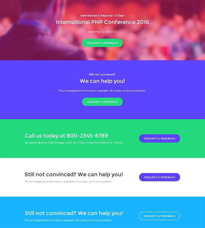
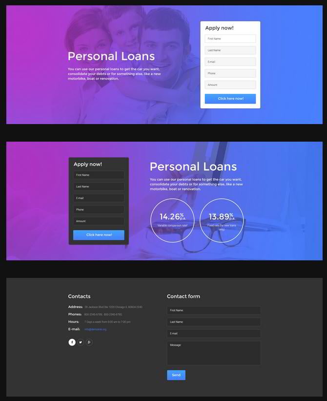
There are 5-8 styles to choose from for building a call-to-action block. CTA buttons to request customers’ feedback or buy items can be either colored or transparent. You can optionally add only captions or drop a line or two of inspirational text. Some pre-defined layouts also feature contact details. Moreover, the CTA block of your landing page can have a colorful or image background.
* * *
General Content Blocks
These templates come with 5-11 layouts to build a general content block. You can display the main points of your business compactly in lists, accordions and toggles. There also carousels to introduce the members of your team and unveil upcoming events. Some blocks also feature a split layout, which will help you focus attention on two content types simultaneously.
* * *
Colorbox Types
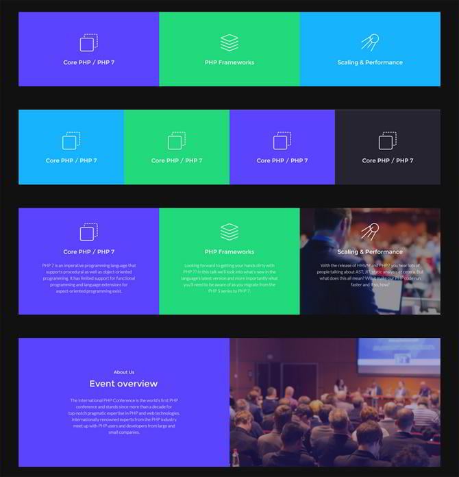
To display your content, you can also choose from 3-4 colorbox types divided into 2-4 sections. Some of them feature colorful & image backgrounds, captions, and small portions of text, while others look more minimal, containing only icons and titles.
* * *
Gallery Styles
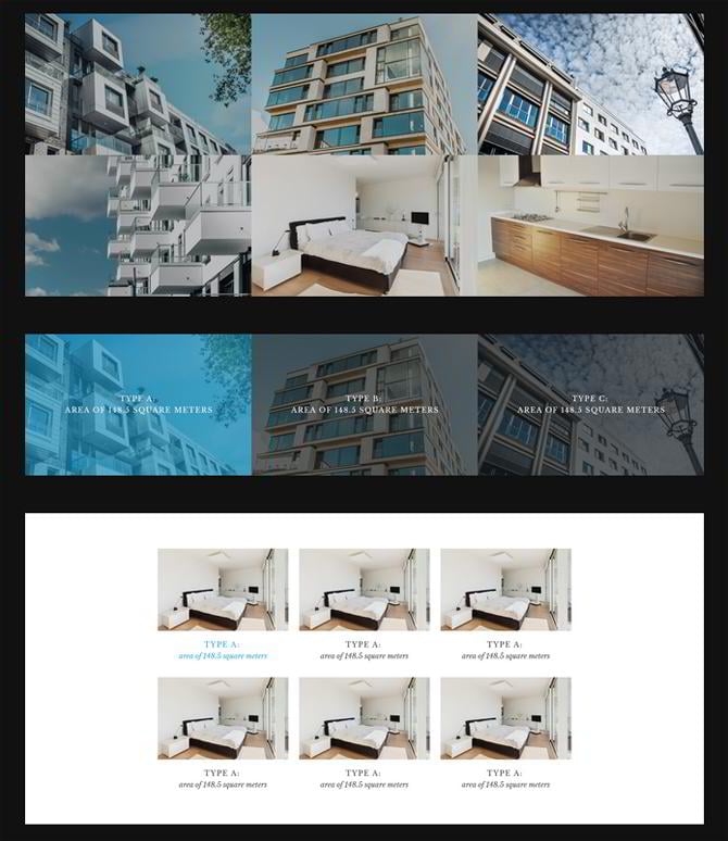
Showcase your projects in one of 2-5 square-tiled galleries available. You can lay descriptions over images, display them underneath or go without any text at all. Pictures can be arranged in a row or two and 2-3 columns.
* * *
Form Blocks
The templates give an access to 6-8 blocks for subscription, contact, and registration forms. As a background of the form block, you can choose from image, colored, dark and light styles. Some block feature only a form, while others also come with extra details such as social icons, counters, text paragraph, etc.
* * *
Partners’ Blocks
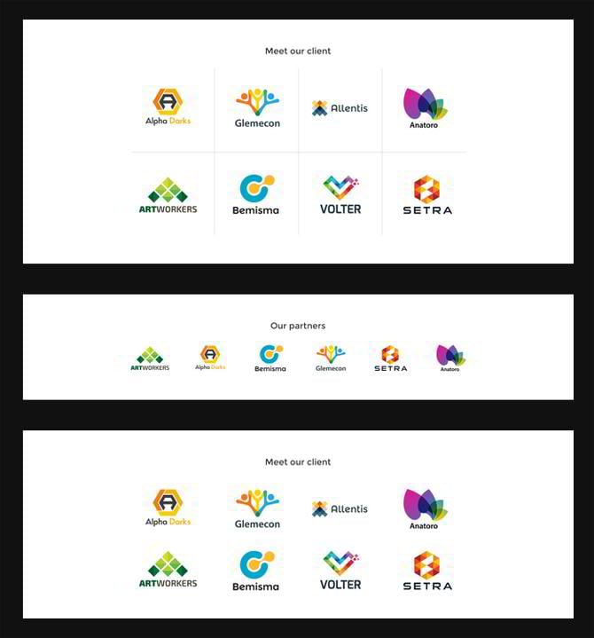
Supply your landing page with a partners’ block to look reputable. You can pick one of 2-3 styles, i.e. two rows of logos divided with lines, two rows with no lines and a single row.
* * *
Pricing Blocks
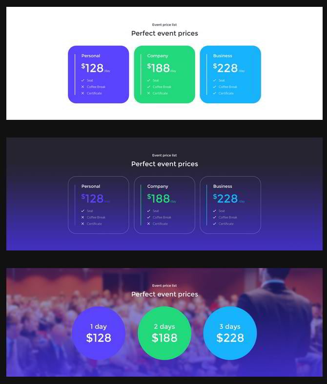
You can show the pricing policy of your company in circles or tables. The latter can reveal what each package includes, which allows for easier comparison. In terms of visual aesthetics, you can opt for colored, white, and blurred image backgrounds. There are 3-6 pricing block styles available in these landing page themes with drag-and-drop HTML creator.
* * *
Counters
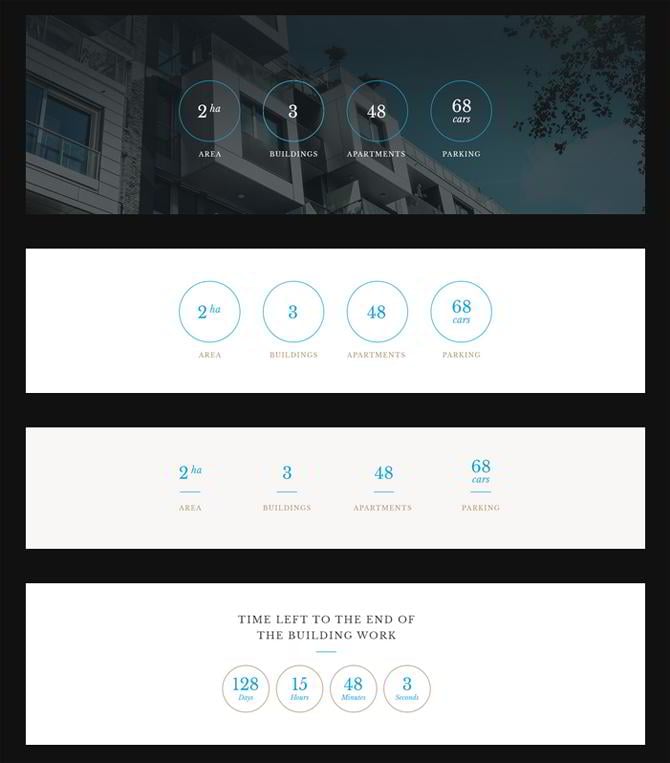
Numbers are known as powerful elements in the psychology of web design. So, make use of dynamic counters to impress your prospects with curious stats. You can choose from 4-5 layouts, where counters are framed in circles, unframed, supplied with icons, and shown in the light, gradient color or image background.
* * *
Testimonials’ Blocks
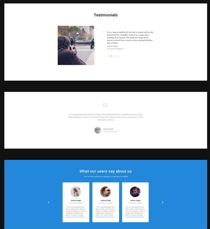
Impart more reliability to your landing page with the help of testimonials. Each template offers 3-4 layouts to play with. It’s possible to arrange testimonials in several columns or show them one by one in a carousel. They can also be framed in boxes adding a sense of structure to the entire block. Authors of testimonials come with names, positions, and photos. You can optionally use the layout without their photos if you like.
* * *
Footer Styles
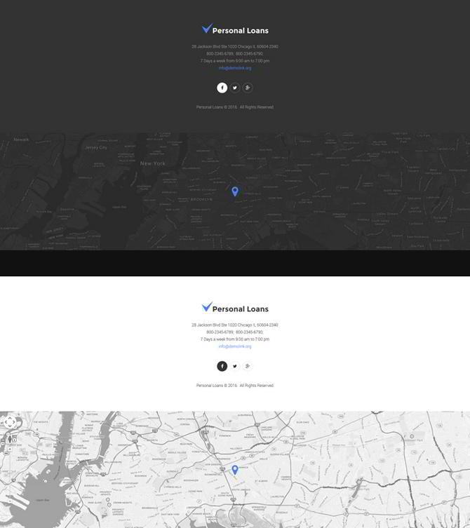
The finishing touch of your landing page is as important as its introduction. The template offers a variety of footer styles to let you choose the most effective option for your individual case. At the bottom of your landing page, it’s possible to reveal your address, phone number, email, working hours, and links to your social accounts. Instead of contact details, you can also use an interactive map powered by Google Maps API. If you want to combine contacts with the map, such a possibility is available too. Depending on the template, you can keep the background dark, light or colorful.
* * *
Now, take a look at the landing pages themselves and checklists of their features. You can also use them as is, if you like.
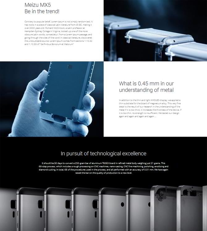
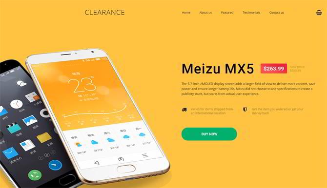
Mobile Repair Service Responsive Landing Page Template
- 5 intro blocks
- 3 navigation types
- 5 benefits and features blocks
- 5 call-to-action types
- 5 general content blocks
- 4 testimonials types
- 1 footer
* * *
Event Planner Responsive Landing Page Template
- 6 intro blocks
- 11 navigation types
- 9 benefits and features blocks
- 5 call-to-action types
- 9 general content blocks
- 4 colorbox types
- 2 gallery styles
- 6 forms (2 subscription form styles, 2 contact form styles, 2 registration form styles)
- 1 map style
- 2 partners blocks
- 6 pricing styles
- 4 counters
- 3 testimonials types
- 6 footer styles
* * *
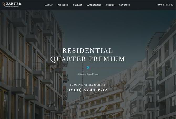
Real Estate Responsive Landing Page Template
- 6 intro blocks
- 5 navigation types
- 7 benefits and features blocks
- 8 call-to-action types
- 11 general content blocks
- 4 colorbox types
- 3 gallery styles
- 6 forms (2 subscription form styles, 2 contact form styles, 2 registration form styles)
- 3 partners blocks
- 3 pricing styles
- 5 counters
- 3 testimonials types
- 6 footer styles
* * *
Financial Advisor Responsive Landing Page Template
- 7 intro blocks
- 7 navigation types
- 11 benefits and features blocks
- 6 call-to-action types
- 6 general content blocks
- 3 colorbox types
- 5 gallery styles
- 8 forms (2 subscription form styles, 4 contact form styles, 2 registration form styles)
- 3 partners blocks
- 4 pricing styles
- 4 counters
- 3 testimonials types
- 8 footer styles
* * *
Education Responsive Landing Page Template
- 6 intro blocks
- 6 navigation types
- 8 benefits and features blocks
- 5 call-to-action types
- 12 general content blocks
- 4 colorbox types
- 2 gallery styles
- 6 forms
- 4 partners blocks
- 5 pricing styles
- 4 counters
- 3 testimonials types
- 5 footer styles
* * *
To conclude, marketers see a 20% growth in sales with the help of a personalized experience. And with these customizable templates, personalization of landing pages becomes easier than ever. Give them just a try, and your marketing campaign will produce striking results with a minimum of your efforts. What do you think about the integration of landing page templates with drag-and-drop builder? Do you have any ideas how to improve it even more? Feel free to share your viewpoint in the comments to this post!
Don’t miss out these all-time favourites
- The best hosting for a WordPress website. Tap our link to get the best price on the market with 82% off. If HostPapa didn’t impress you check out other alternatives.
- Monthly SEO service and On-Page SEO - to increase your website organic traffic.
- Website Installation service - to get your template up and running within just 6 hours without hassle. No minute is wasted and the work is going.
- ONE Membership - to download unlimited number of WordPress themes, plugins, ppt and other products within one license. Since bigger is always better.
Get more to your email
Subscribe to our newsletter and access exclusive content and offers available only to MonsterPost subscribers.





Leave a Reply
You must be logged in to post a comment.