When we say “defensive” we generally mean something protective. Defensive design is also known as contingency design and deals with potential errors and difficulties that users may encounter while working with websites or software interfaces. The main goal is minimizing the chances of the audience drain because of stupid minor mistakes we see on websites every day.
This is all about improving help sections, search and contact forms, error messages and other crisis points. Everything that makes your website joyful but not stressful!
The Bliss Of Defensive Design
After analyzing the users behavior on your website you may often notice that people are using some website options not the way you thought they were supposed to. Besides, they can mistype their personal info which will put them in a middle of dead end - and they will eventually abandon your website. And it’s not necessarily their fault. Defensive design is the younger brother of user-friendliness. It is aimed at eliminating dead ends in case of errors and making users enjoy staying on your web page. Sounds pretty simple, huh?
Humans make errors, systems have glitches, servers can be down, connections can be slow – you should consider all this when developing a project. If done correctly, it all can be minimized and accommodated. In healthcare it's important to locate the disease before it causes you problems. Allowing to check on errors, defensive design is virtually the same story. It improves your traffic quality and boosts your site attendance.
Take Care of Slow Connections
Many users would rather load sites from their mobile devices and smart phones than from desktops. A great amount of people use wireless connections that are normally faster but are not always reliable. So you should think about the possible slow connections and the ways to work with them.
You may easily resolve this issue by optimizing the images, navigation and content and other graphical elements on the websites that normally have high quality graphics. Try to eliminate Flash or other specific content that requires plug-ins. The best option would be creating the cut down version of the site. It is not so money- and time-consuming as you might think. Still it helps to lure more people with mobile devices to your internet pages. Using multi-purpose code, less images and texts will be perfect for low-speed connection.
The problem lays often is designers themselves who want to implement all features imaginable into the layouts they create: special options, players, flash animations and other slow-loading elements. Be careful and think about the consequences of using extra widgets.
You may easily find mobile website templates on the net which even speed up the task even more.
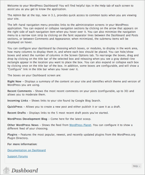
Use Inline And Contextual Help
One of the ways to make user experience intuitive is including pop up boxes with useful information where it is needed. This is far more convenient than creating 'help desk' or 'terms and conditions' pages. Any user will be happy to have no need to search for info on his own.
It is called inline and contextual help.
Inline help is usually provided in some content tabs that appear when hovering over objects or it could be presented by pop ups. You will see a couple of nice examples of inline help below.
***
Spruz offers information on all levels of their plan as long as users browse and go from one step to another. This kind of help seems to be distracting a bit but it's extremely helpful for controlling the whole process and flow of text.
***
Contextual help is a special guidance that shows up relevantly to the page you are viewing or the action you are taking. Contextual help differs from inline help by relating to the entire page. So it appears inside the content itself, without any need to hover on or click.
More Tips To Benefit From Defensive Design
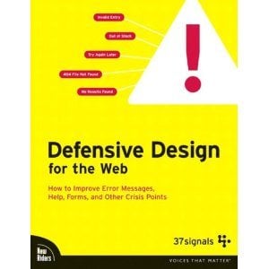
One of the most comprehensive materials regarding the issue is Defensive Design for the Web, written by Matthew Linderman and Jason Fried. It provides with exhaustive guidelines on Defensive Design, with awesome illustrations and comments. After reading the book you'll find out how to write successful error messages, design help sections and contact forms.
We'd like to outline the most helpful tips presented in the book, aimed at the developing the defensive design on the whole:
- Make it fast, not just beautiful.
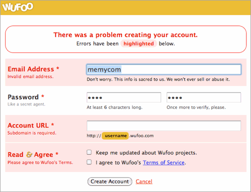
- Offer noticeable, brief and clear error messages.
- Use icons, highlights and wordings to clarify the problem area.
- Outline the errors in the same way.
- Use simple and clear language that is familiar to most of people.
- Don't show what customers can't choose.
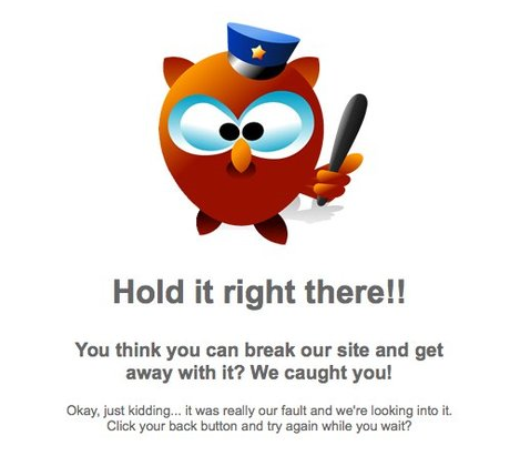
- Customize error pages (like "Page Not Found" page).
- Confirm entries at once.
- Offer alternatives and options if visitors have old technology.
- Upgrade information constantly.
- Answer questions right where they occur.
- Create user-friendly "Help desk" section and offer noticeable links to it.
- Answer emails instantly and provide with real human responses, including phone support.
- Don't disable the browser's "Return" button, but disable the form "Submit" button after it's clicked.
- Don't make registration obligatory.
- Offer a clear statement of no results or inexact matches found.
- Offer filters in case too many results occur.
- Offer suggestions about how to improve results or expand search criteria.
- Create email notification.
- Show up similar items if there are any available.
- Get rid of unnecessary navigation in any multi-step process.
But all these guidelines mean nothing until you analyze the users activity and track where they face difficulties or even give up. The minor things such as fixing spelling and stylistic errors, unclear buttons might also help to fix the picture of the visitors activity. And the last but not least - don't ever make clients feel like they're criminals if they make an error. Be polite and diplomatic. Use defensive web design to minimize damage and guide your website audience.
Other Helpful Info On this Topic
- Contingency Design from 37 signals
- Defensive Design for the Web: How to improve error messages, help, forms, and other crisis points
- Getting Started With Defensive Web Design
Book review Defensive Design for the Web - Steve Krug. Don't Make Me Think
Don’t miss out these all-time favourites
- The best hosting for a WordPress website. Tap our link to get the best price on the market with 82% off. If HostPapa didn’t impress you check out other alternatives.
- Monthly SEO service and On-Page SEO - to increase your website organic traffic.
- Website Installation service - to get your template up and running within just 6 hours without hassle. No minute is wasted and the work is going.
- ONE Membership - to download unlimited number of WordPress themes, plugins, ppt and other products within one license. Since bigger is always better.
Get more to your email
Subscribe to our newsletter and access exclusive content and offers available only to MonsterPost subscribers.



Leave a Reply
You must be logged in to post a comment.