
- Intro
- 2020 PowerPoint Trends You Need to Know
- How to Choose Colors for PowerPoint Presentations
- 10 Tips to Make PowerPoint Presentations Better
- What Are the Three Basic Principles of Slide Design?
- Components of an Effective PowerPoint Presentation
- Top 5 PowerPoint Templates 2020
Intro
Slide presentations? Why do people create them? Presentations can be made not only by sales or marketing managers. This useful tool helps to convince, inform, teach. A well-done presentation causes a long-term effect on those who have seen it.

Just look at the most general situations when digital presentations come in handy:
- To sell
You can apply a presentation to your commercial offer and send to your clients. Some presentations can be also made as independent ads. This is a very convenient way to get to know a company. It gives the reader detailed information in one click.knowledge so as not to collect information on all pages.
- To teach
PowerPoint slides are fully suitable to be used as instructions, step-by-step guides. For example, one slide - one action. Educational presentations are useful for teachers at universities and top managers to train newcomers at their company.
- To make a speech
Digital presentations help while making speeches to keep public attention and explain difficult info. For listeners, it’s also more comfortable to see charts than to perceive stats by ear.
- To promote
A laconic text provided with vivid images and clear infographics is a win-win way to tell about your product, idea, etc. It’s also possible to add a presentation to the “About Product” section of a purposed website.
As for the design of PowerPoint templates, it's not for beauty only. It can help to enhance the whole performance. Let’s find out how the right design can save your presentation!
2020 PowerPoint Trends You Need to Know
If you want to develop your business right, you need to be on the wave with freshest trends and tendencies. This also matters when it comes to PowerPoint presentations.
In 2019, PowerPoint continued to develop the functionality and design of its products. Let's find out what’s already prepared for 2020! Right now, we will talk a little about flat design, minimalism, infographics, and the new morph transition in PowerPoint. The latest updates of PowerPoint are said to make any presentation better. Don’t miss them to let your slides highlight all the uniqueness, creativity, and modernity of your projects!
“Good design is good business.”
Thomas Watson
The following 3 PowerPoint trends 2020 show how to create such a presentation:
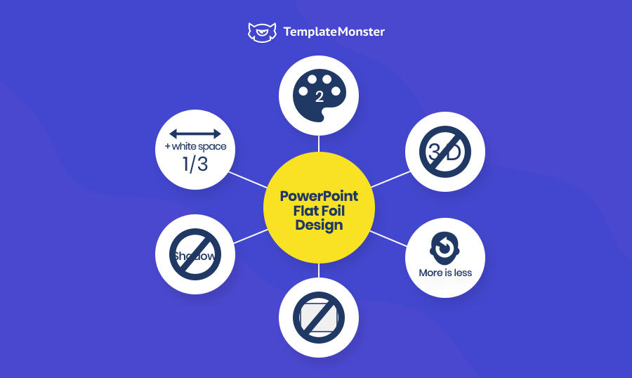
- #1. Minimalism
Make sure that the slides in your presentation contain only the most important information. Most of them should be commented on by you/a speaker. As well, leave 3D effects in the past. In 2020, PowerPoint trends manifest themselves in “flat foil design.” To underline this modern tendency, pick out two-color templates or infographics. Thinking of typography, also remember that large, bold fonts are top of the popularity. Toward white space, don’t neglect its importance. It’s one of the main elements of minimalism and helps your audience to perceive the info on the slides better.
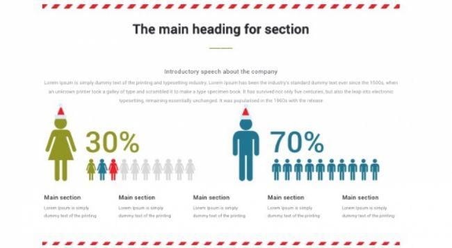
- #2. More visuals (infographics!)
Less text and more visuals! People don’t read slides - it’s not comfortable in the big lecture halls (for example), they just don’t want to do it. Of course, you shouldn’t omit your text at all but add more and more visuals. Probably, this tip is not new for you - so, follow it to get the best feedback on your PowerPoint presentation. And what about 2020? In the mentioned year, ordinary charts and diagrams won’t help you to stan listeners. Instead of this, insert to your presentations more unique infographics.
- #3. Morph PowerPoint transition
In 2019, PowerPoint has given us the possibility to make morph transitions. This effect is becoming even more trendy. It’s also one of the must-haves of PowerPoint 2020. The morph transition perfectly fits presentations with a big number of images. It enables slides to change each other smoothly engaging the audience to screen. With this effect, you can add more visuals to your presentations and place them to varied corners of the slides.
How to Choose Colors for PowerPoint Presentations
There’s to your consideration a small collection of useful tips on how to choose the most suitable colors for your PowerPoint presentation.
Here are a few key principles to keep in mind:
- The colors that you use to design your presentation should match the content. So your listeners will be able to feel the mood of the story that you are going to tell. Will it be fascinating, serious or touching?
- Choose a color scheme that will distinguish you from your competitors and match the area in which you work. For example, environmental organizations most often use green colors in their designs.
- Think about who your audience is and choose colors that suit them the most. If you prepare a presentation for students, vibrant colors are ok. If your audience is business professionals, it’s better to choose some more restrained tone for your PowerPoint presentation.
- If you make a presentation not for the company you work on but for your own needs, choose those colors that emphasize your personality. Especially, it is important for informal cases, and always when you want to underline your artistic view.
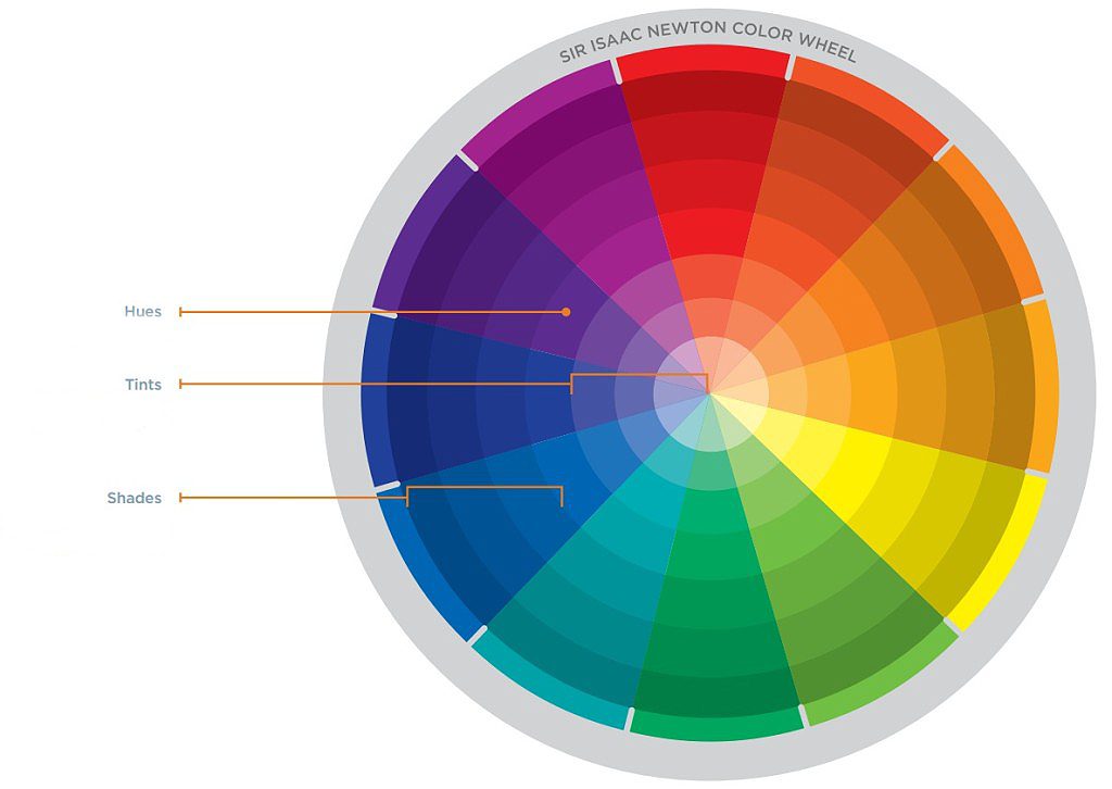
Don’t hesitate to use the Isaac Newton color wheel to combine colors correctly. Each section of the wheel consists of shades of the same color, which is located in the fourth ring from the center.

Have a look at the next win-win color combinations:
- Monochromatic colors combination
You can create spectacular slides combining darker and lighter shades of the same color. For more contrast, add black, white or shades of gray. Choose colors with a wide range of shades.
- Analogous colors combination
Want your PowerPoint presentation to look smooth and harmonious? Then, use colors that are next to each other in the color wheel. It can be both warm and cold tones. However, if you intend to show your presentation on a projector, it is better to choose more contrasting colors.
- Complementary colors combination
To create a bright, contrast atmosphere of a presentation, use two colors located opposite each other in the color wheel. This design style is especially suitable for dynamic presentations, for example, on sports topics.
- Fading colors combination
It’s possible to soften the contrast of complementary colors using three colors. For example, select one cold color and complement it with two warm located in the second half of the wheel opposite the cold one.
- Triadic color combinations
Attract attention to your PowerPoint slides with the help of three colors located in the wheel at the same distance from each other. Combine intense vibrant shades with those that are calmer. Your presentation will look bright, but not vulgar.
- Tetrahedral color combinations
To create visual contrast, while maintaining harmony, mix two colors in the wheel opposite each other. Better choose one color as the dominant, and use the rest as additional ones. This will boost the design of your PowerPoint presentation.
So, use the power of colors to create a unique PowerPoint presentation design in 2020!
10 Tips to Make PowerPoint Presentations Better
A good presentation starts with questions to yourself. The most important part you can do on paper, without even turning on the computer. First, you think of a topic, define its goal, distribute the arguments in the desired order. And only after you can open PowerPoint and also search for pictures for presentation.
#1. Answer 3 questions before you start making a presentation
- What do you want people to do after your presentation? It determines the main goal of your speech and should be obvious.
- Does your presentation have a conclusion? Give not more than 5 points.
- How does your performance help people to take the right decision?
#2. Lead your audience to the right decision
How can you do this?
- Avoid boring info;
- Engage with exciting facts and stories;
- Help the audience to take the only right decision clarifying in what situations they need your offer. Show all the benefits!
#3. Develop a structure of your presentation starting from the end
Conclusion →Decision → Problem → Introduction
#4. Less text - more visuals
Considering this rule while creating a presentation you guarantee that your listeners won’t get bored and understand all you’ll tell and show them. Try to find the balance between your text and images.
#5. Make accents correctly
Highlight those parts of slides that are supposed to draw attention to the most important information.
#6. Use tools that help to perceive info easier
One of the main design basis: contrasting, separating and comparing. Do not mix the text with pictures. Put them against each other!
#7. Get a modern and stylish PowerPoint theme
Unique PowerPoint templates let users avoid standard slides and save money on special constructors. Make your presentation not the same as others. This must increase the chances to remember it.
#8. Delete distracting elements
Look carefully at the design of your PowerPoint presentation. Then, ask yourself about each element on the slidest: why is it necessary? what does it do?
#9. Add animation effects
With the help of the animation, you can give information in small parts, which is easy for understanding. Once elements change each other in some catchy manner also makes the audience to pay their attention to this process.
#10. Learn your speech and rehearse your performance
So, don’t read from slides. The presentation on your computer should correspond to what you tell but not duplicate it. Another thing to be mentioned is, don’t forget to speak to your audience. You can make some jokes or ask them a question.
Only to tell isn’t enough - speak to your audience.
What Are The Three Basic Principles of Slide Design?
Order and structure
An ideal structure of your presentation will help you be clear and straightforward in delivering your idea. Following this rule, you will be the person others can trust easily.
The order of the slides helps you focus on the elements you want and creates the correct logic for reading and perceiving your information.
What does it mean to make the correct order and structure of your presentation?
- Use font, color, and shapes to create a visual hierarchy. Pay attention to the style of your slides.
Look at the example below. This is a simple black and white presentation with a clear hierarchy.
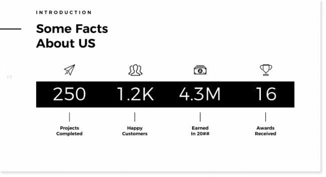


Did you notice a line on every slide?
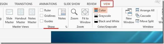
- Use ruler, gridlines, and guides.
Click the View tab and locate the area of the ribbon named Show. Here you can activate ruler, gridlines, and guides.

Here you can see guides to appear on the slide below:
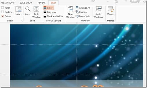

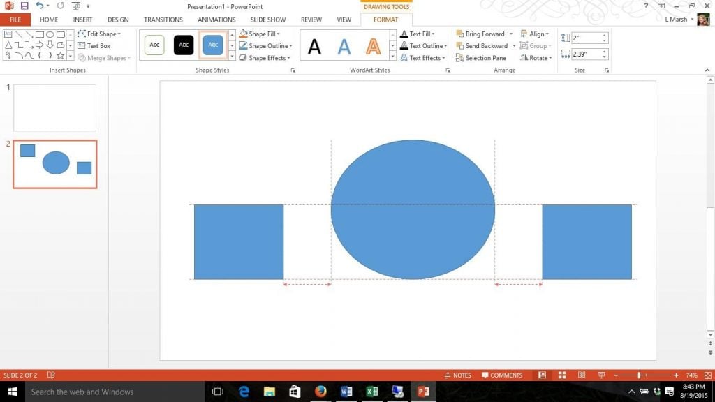
Smart guides are helpful to align and resize shapes with swift precision.

- Copy your slide and its elements creating a new one. A good design of the presentation is a repetition of elements, colors and other objects.
You can see the same one element (line) appeared on every slide.

Focus
It is impossible for our eyes to focus on many elements at the same time. It is essential for your audience to see exactly what you are trying to show and deliver.
You should locate your essential elements in such a way to be noticeable by your audience at once.
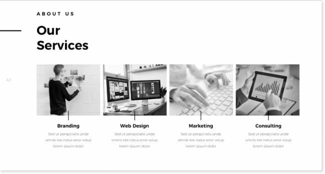
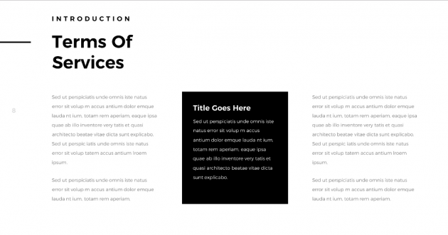
For example, here you will see an image with the word "Services" in the first place.

As an option, you can apply any color or a frame to the important phrase or section of your slide.

You can make your audience focus on the most significant piece of information using different size and color of the font.

Simplicity and clarity
Nowadays simplicity becomes increasingly popular.
For example, the phrase «Meet the team» can be clear and straightforward. Check it out below.


21 Easy Tips To Create A Powerful Presentation For Your Business [Free Ebook]
Components of an Effective PowerPoint Presentation
Text optimization
Information on your PowerPoint presentation should be presented briefly to deliver the most critical points.
Text hierarchy
Look at the side below. First, you see the word AUDIENCE.


The size and color of your font can help you to create the text hierarchy. Also, it is a good idea to use decorative fonts for your headlines.
Pay attention to the semantic structure of the text:
- the main idea;
- the main content of the slide;
- who is still interested, he is welcome to watch the presentation further;
- specific elements and explanations;
- details.
Readability and font size. I would suggest you use 24-28 points for your verbal presentation and 12-14 points for the one to read only.
It is better to use the left alignment of your paragraph. Check the slide below.

Spell checking. Make sure the spelling and grammar of your text are checked and error-free to avoid any inconvenience.
Choosing a font
The main rule is displayed below. Make it big and readable.


This is a tone you are speaking to your audience. I would recommend using no more than 2-3 fonts in your presentation.
A decorative font is usually used for a headline. Make sure there is a font difference between your headline and the central part of the text. Comments and marks are used for detail clarification.
Choosing the color palette of the presentation
Color is important and a significant part of design and communication. Color is a visual part of your presentation.
The corporate palette should be applied to all marketing communications, including PowerPoint presentations. Decide on your focus color first; then you can choose the color palette.

One way to integrate PowerPoint colors is to use an eyedropper.
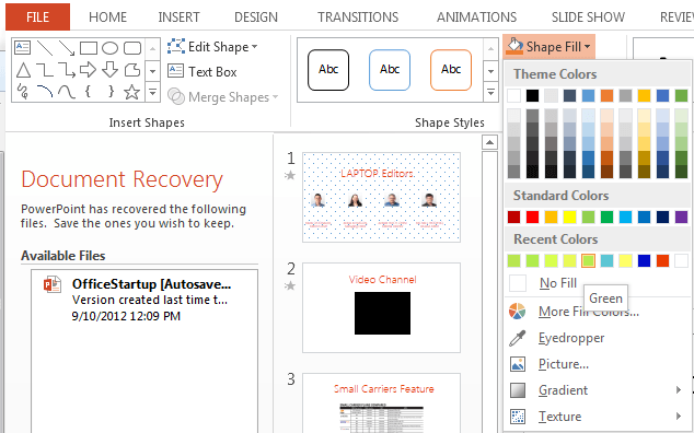

The principle of this tool is straightforward — it copies the color and applies it to the selected object.


Choosing icons
It is always useful to add visual elements to your presentation. There are many ways to get icons online; some are even free. Do not forget to use icons of the same style and in the same color.

Using shapes

- shapes to separate different sections/semantic blocks:


- focus shapes:

Top 5 PowerPoint Templates 2020
Don’t let your listeners experience boredom. Attract their attention using powerful visual effects. Vivid color schemes, trendy fonts, and beautiful pixel-perfect images will help you move to a new level of information exchange.
Presentation templates developed by TemplateMonster experts are already well-structured and powered with pre-designed elements. As well, they are designed up to different purposes. Therefore, don’t hesitate to look at the examples to choose what is right for you. The only thing you need working with our presentation templates is to add your content.
Be sure, these PowerPoint templates 2020 will help you to impress your audience with multiple presentations. Moreover, having made your choice once, it may be useful for many times, as the products are multipurpose.
In our collection of PowerPoint templates, there are diverse topics. Here are some of them:
- education and environment;
- sports and beauty;
- video presentations;
- entertainment and events;
- family and home;
- business and services;
- art and culture, and more.
Using PowerPoint ready-made templates you will prepare a high-quality presentation. Each of the presented templates has its own unique style, color scheme, and animation. These templates are also very useful for creating family photo albums. A large number of special effects diversify any material, make it colorful and easy-to-read. If it’s necessary, you can easily change the concept of any presentation template and quickly customize it for yourself. Our PowerPoint themes guarantee the maximum of your audience's attention!
Plus, don’t forget to check free PowerPoint templates to see the quality of all TemplateMonster products.
| Template Name | Theme Provider | Template Category | Price |
| Infographic Pack - Presentation Asset PowerPoint Template | DigitCase | Medical Templates | $20 |
| Multipurpose Business Infographic Presentation - PowerPoint Template | DigitCase | Design Studio Templates | $20 |
| Business Infographic Presentation PowerPoint Template | DigitCase | Design Studio Templates | $20 |
| XtrimBro - Multipurpose Infographic Presentational PowerPoint Template | artBeta | Marketing Agency Templates | $20 |
| EVOLUTION - Multipurpose PowerPoint Template | Veloz | Accounting Website Templates | $19 |
PowerPoint Design: Basis and 2020 Trends FAQ
What are PowerPoint trends 2020?
The latest updates of PowerPoint are said to make any presentation better. Let's find out what’s already prepared for 2020! So, this year minimalism continues its triumph in web design in general, and in new-fangled templates of PowerPoint presentations. “Less even more!” Up to this, preparing a presentation for your audience, make an accent on less text and more images. It will help to draw attention to your performance.
3 PowerPoint trends 2020:
#1. Minimalism
#2. More visuals (infographics!)
#3. Morph PowerPoint transition
What are components of an effective PowerPoint presentation?
✔Text optimization;
✔Right colors;
✔Order and structure;
✔Visuals;
✔Simplicity and clarity.
What are PowerPoint presentation templates?
PowerPoint presentation template is a pre-designed mock-up of a full-fledged presentation. The only thing that is missing is a content, adding which is out of troubles. Standard PowerPoint templates can be adjusted to multiple purposes. Still, if the way they look is not enough for you, look for premium presentation designs on the Web.
Read Also
Why You Should Use PowerPoint for Business Reporting
PowerPoint vs Keynote: Presentation Tools Compared