Designing & Coding Your Own HTML Newsletters
There hasn't been much focus on the art of designing e-mail newsletter layouts. The process does not require as much intensive work as building an entire webpage or CMS theme. You can make a single-page email template and copy out the styles to work in a myriad of situations.
For this tutorial I want to present a demo newsletter for Template Monster and explain some of the techniques we can use. The codes are more focused around rendering properly within e-mail clients such as Outlook, GMail, Hotmail, and Yahoo! Mail. This means we are building on top of HTML tables because the other methods for constructing layouts just do not work.
Live Demo - Download Source Code
From Humble Beginnings
I like to start email projects by looking over the HTML Email Boilerplate template. This provides a lot of helpful CSS styles and basic table structures for making your own template. There are so many odd browser quirks for rendering e-mails that you could spend weeks studying them.
I try to be reasonable and only keep the CSS classes that I am going to use. This boilerplate is full of code comments which explain why you should be using certain properties or elements. If you are unfamiliar with email design then this is definitely a good place to start. My own demo will use the same XHTML Strict doctype which is also used by Google Mail.
1 2 3 4 5 6 7 8 9 10 11 12 13 14 15 16 17 18 19 20 21 22 23 24 | <!DOCTYPE html PUBLIC "-//W3C//DTD XHTML 1.0 Strict//EN" "http://www.w3.org/TR/xhtml1/DTD/xhtml1-strict.dtd"> <html xmlns="http://www.w3.org/1999/xhtml"> <head> <meta http-equiv="Content-Type" content="text/html;charset=utf-8" /> <meta name="viewport" content="width=device-width, initial-scale=1.0"/> <title>TemplateMonster Newsletter - Tutorial Demo</title> <style type="text/css"> #outlook a { padding:0; } /* Force Outlook to provide a "view in browser" menu link. */ body{ width:100% !important; -webkit-text-size-adjust:100%; -ms-text-size-adjust:100%; margin:0; padding:0; line-height: 100%; } img { outline:none; text-decoration:none; -ms-interpolation-mode: bicubic;} a img { border:none; } .image_fix { display:block; } /* Yahoo paragraph fix */ p { margin: 1em 0; margin-bottom: 10px !important; color: #454545; } a, a:link, a:visited { color: #446db2; text-decoration: none; cursor: pointer !important; } a:hover, a:active { text-decoration: underline; color:#446db2 !important; } table td {border-collapse: collapse; display: table-cell; } table { border-collapse:collapse; table-layout:fixed; mso-table-lspace:0pt; mso-table-rspace:0pt; } </style> </head> |
Aside from all the inline CSS styles the header is actually very simple. We do not need to include fancy meta tags because most of these will be stripped out anyways. However the styles are important and generally render best when placed inside the header. I am not using very many resets because not all e-mail parsers will bother picking them up.
Instead we setup basic defaults for paragraphs, images, links, and table structures. All of the specific customizations should be added inline onto the element. This prevents your styles from being stripped out by the parser and causing your fonts or images to appear distorted.
Digging into Body Content
The most annoying part of building around tables is the amount of repetitive HTML you have to look through. When you are accustomed to adding content into simple HTML div elements it can be exhausting to go through multiple layers of tables. But ultimately this is the most preferred method for supporting all email layouts.
1 2 3 4 5 6 7 8 9 10 11 12 13 14 15 16 17 18 19 20 21 22 23 24 25 26 | <body bgcolor="#d2e2e8" style="-webkit-font-smoothing:antialiased;margin:0;padding:0;"> <!-- wrapper table --> <table cellpadding="0" cellspacing="0" border="0" width="100%" align="center"> <tr> <td valign="top"> <!-- heading --> <table width="600" cellpadding="0" cellspacing="0" border="0" align="center" style="table-layout:fixed;font-family:Arial,Tahoma,sans-serif;font-weight:normal;font-size:11px;line-height:22px;"> <tbody> <!-- top links & text --> <tr style="display:inline-table;margin-top:20px;margin-bottom:7px;"> <td width="250"> <span style="color:#898989;text-shadow:1px 1px 0 #fff;font-size:16px;font-family:'Helvetica Neue',Helvetica,Arial,sans-serif;"><strong>March 2013</strong> Issue</span> </td> <td width="350" valign="top" align="right" style="width:350px;"> <p>E-mail looking strange? View it in your web browser.</p> </td> </tr> <!-- logo image --> <tr> <td width="100%" valign="top" style="text-align:center;"> <span><a href="https://www.templatemonster.com/" target="_blank" rel="noopener noreferrer"></a></span> </td> </tr> </tbody> </table> <!-- /end heading --> |
This code block includes just the heading section of my newsletter. You will notice we only have 2 tables here - one for the 600px wrapper and another which contains the header contents. Most e-mail designers will agree that 600px is a nice estimate for the maximum size of your reader's screen. Software like Microsoft Outlook can render windows even smaller. So it is best to use your own discretion and test out designs in as many e-mail readers as possible.
The elements within a table use different rules for placing content. You will see a lot of attributes which simply do not appear in typical HTML. Things like cellpadding and valign control specific rendering patterns within tables which do not require CSS. For more complicated solutions like border colors we need to place inline style attributes.
Structure of a Table
As long as your HTML code is using a table row <tr> and internal table data cells <td> then your markup should validate just fine. I like to wrap all this content inside a <tbody> element as standards often dictate. However it will not screw up your email to omit this container.
Now the inner body content actually has to use 2 more tables for content structure. First we define an outer container which uses a white background and some CSS3 box-shadow effects(where applicable). In e-mail readers without CSS3 support it will look the same as if we didn't even use these properties at all.
1 2 3 4 5 6 7 8 9 10 11 12 13 14 15 16 17 18 | <!-- body container --> <table width="600" cellpadding="0" cellspacing="0" border="0" align="center" style="table-layout:fixed;background-color:#fff;-webkit-box-shadow:1px 2px 3px -1px #222;-moz-box-shadow:1px 2px 3px -1px #222;box-shadow:1px 2px 3px -1px #222;"> <tbody> <tr> <td width="100%" style="width:100%;font-family:'Helvetica Neue',Helvetica,Arial,sans-serif;"> <!-- body content --> <table width="560" cellpadding="0" cellspacing="0" border="0" align="left" style="display:block;padding:20px"> <tbody> <!-- templatemonster blog section --> <tr style="display:block;padding-bottom:10px;border-bottom:1px solid #dcdcdc;"> <td width="260" valign="top"> <h2 style="color:#343c48;font-size:22px;line-height:26px;margin-bottom:5px;">Enjoy the latest posts from our blog!</h2> <p style="color:#898989;font-size:16px;line-height:24px;">Template Monster has been publishing a lot of great tutorials recently. You can learn web design, CSS3 development, Wordpress, jQuery, and so much more! Visit the blog homepage and check out what we are publishing.</p> </td> <td align="right" width="300"> </td> </tr> |
We set the outer container to a full width of 600px but limit the internal content tables by 560px, to account for an additional 40px in padding. The inner table will hold all the actual page content inside table rows, and each section will be divided using bottom borders. The outer elements are using inline styles to support all the internal content - such as the font-family declaration just outside the container table.
This is very common and easily the best way to encapsulate data. All of the table rows are nested into the 3rd table, contained by a body wrapper and the core wrapper centered at 600px. After the main body section we are left with a closing footer area. This will be held inside its own table structure which you can see below.
Designing the Colophon
More designers are giving attribution for resources in the colophon page area. This could be in your sidebar, footer, or some other internal page on your website. It isn't as common with e-mail newsletters but I think it works really well in my example design.
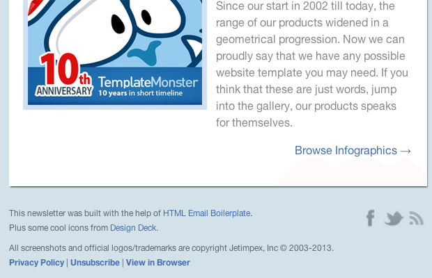
1 2 3 4 5 6 7 8 9 10 11 12 13 14 15 16 17 18 19 20 21 22 23 24 25 26 27 28 29 30 31 32 | <!-- footer colophon --> <table width="600" cellpadding="0" cellspacing="0" border="0" align="center" style="display:block;margin: 0 auto;padding-top:30px;padding-bottom:95px;font-family:'Helvetica Neue',Helvetica,Arial,sans-serif;"> <tbody> <tr> <td width="400" valign="top" style="width:400px;"> <span style="display:block;margin-bottom:3px;color:#5b666f;font-size:12px;line-height:18px;">This newsletter was built with the help of <a href="http://htmlemailboilerplate.com/" target="_blank" rel="noopener noreferrer">HTML Email Boilerplate</a>.</span> <span style="display:block;margin-bottom:3px;color:#5b666f;font-size:12px;line-height:18px;">Plus some cool icons from Design Deck.</span> </td> <td width="200" valign="top" align="right"> <a href="http://www.facebook.com/TemplateMonster" target="_blank" style="" rel="noopener noreferrer"></a> <a href="https://twitter.com/templatemonster" target="_blank" rel="noopener noreferrer"></a> <a href="https://www.templatemonster.com/all-rss.php" target="_blank" rel="noopener noreferrer"></a> </td> </tr> <tr> <td width="100%" colspan="2" valign="top" style="padding-top:8px;"> <span style="display:block;margin-bottom:3px;color:#5b666f;font-size:12px;line-height:18px;">All screenshots and official logos/trademarks are copyright Jetimpex, Inc © 2003-2013.</span> <span style="display:block;margin-bottom:3px;color:#5b666f;font-size:12px;line-height:18px;"> <a href="https://www.templatemonster.com/privacy-policy.php" target="_blank" style="font-weight:bold;" rel="noopener noreferrer">Privacy Policy</a> | <a href="https://www.templatemonster.com/" target="_blank" style="font-weight:bold;" rel="noopener noreferrer">Unsubscribe</a> | View in Browser </span> </td> </tr> </tbody> </table> <!-- /end footer colophon --> </td> </tr> </table> <!-- /end wrapper table --> |
There isn't a whole lot of special code to be found here compared with the body content. I am using the same techniques of formatting table data cells to align the sections properly. It may be worth noting that each image attribute has a set of width and height attributes. This is useful so that your e-mail layout will still hold it's shape before the images have finished loading.
Without a set of width and height values, your images will appear as 1x1 pixel dots. The better solution is to have them appear at the exact size they will render, but display empty blocks until they finish loading. You can attach some alt text which will display in place of the image before it finishes.
Aside from a series of hacky CSS fixes I think an email newsletter design is very straightforward and easy to learn. But it does require practice and some time spent developing your knowledge of table structures. It can be frustrating to deal with bugs in specific rendering engines, but don't give up hope. Check Google if you run into any problems because developers have been blogging about email design solutions for years.
Live Demo - Download Source Code
Final Thoughts
The process of creating your own newsletter is not easy. If you do not have a lot of experience then you will need to put aside time devoted solely to studying these techniques. I certainly hope that my sample codes may provide a working template for interested readers.
But keep in mind that my template codes will only extend so far. After a while you will want to brainstorm some new design ideas and try porting these over into your own customized layout. With enough patience and perseverance almost anything is possible in the realm of HTML newsletters. If you have any questions or follow-up comments on the tutorial please share with us in the discussion area below.
Get more to your email
Subscribe to our newsletter and access exclusive content and offers available only to MonsterPost subscribers.


Leave a Reply
You must be logged in to post a comment.