Parental Advice to iPad Kids App Designers
In a study conducted by Sesame Workshop, on the use of iPad apps for kids the results confirm that iPad apps are a great hit among kids as they highly engaging and interactive.
Kids tend to learn things faster using iPad apps. Kids are becoming an important market for iPad designer around the world. iPad is gradually taking over the use of computers especially in the educational sector. To tap this upcoming market iPad designer must conduct a thorough study of their target kids group and a study about their intellectual and social skills.
Things to keep in mind while designing iPad for kids:
Deploy Smart Pagination
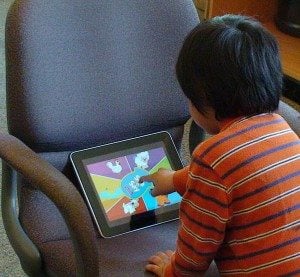
Kids love iPad games because of their gestures. However, kids cannot perform all gestures like pinch, tilt, shaking the device and multi-touch. iPad designer must use smart paginations like tap and simple swipes accordingly. Touch arrows are the easiest for kids as the use of other gestures can be quite tricky at times. Kids have a tendency to hold the iPad horizontally and place their palms at the bottom of the iPad. Therefore it is not advisable to place any pagination controls in the bottom area. Kids might touch that part accidentally and get lost during sessions. The best practice is to use forward and backward arrows at the top right and left corners of the iPad screen.
Place Menus Where Appropriate
As discussed, do not place menus at the bottom of the screen. As kids wont’s be bothered about it once they start using the app. Place menus at the top-middle or top-right corner of the screen. The main motive is to keep the distractions as far as possible from the little butterfingers. Use gesture like double-tap for menu activation so kids do not bump into it every now and then. Place menus strategically at locations like the beginning of the program.
Do Not Fool the Kids
One feature that parents absolutely hate in iPad apps are unintentional purchases. Do not place icons on the screen that may lead kids to buy something by mistake. This practice may lead you into trouble and may even kill your brand appeal among parents. Designers must indulge in ethical and responsible iPad app designs.
Use Familiar Language
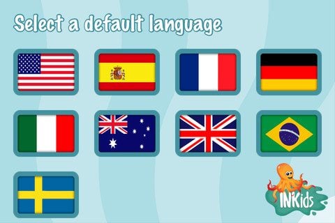
Use animated characters alongside your menu which can verbally direct the kids around. Your app will be used by kids all over the world thus it becomes difficult to customize the apps as per language considerations. One method is to tap the IP address of the kid’s computer using the app. Else the simplest way is to provide a widget on the screen which lets the kids choose their preferred language. Let the kids listen to the instructions before they actually start using it. This will prevent the kids from getting confused once they view the options on the screen coming up.
Use Universal Images and Colors
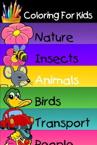
Research about the various cultural differences before designing graphics and applying colors to the apps. This is so because different color signifies different things. Moreover, if a character like an animal is drawn differently kids might not be able to understand it. Stick to simple yet bright colors that kids love. Inculcate appropriate humor as per kids understanding. If an app is being used by a preschooler and a kindergarten kid both differentiate their user experience. In other words, change the layout using colors, graphics and content for kids of different age groups.
* * *
To sum it up
Kids are amazingly fast learners. It is difficult to design iPad apps which are kid-friendly and of superior quality. Nevertheless, iPad app designers must keep these basic rules in mind to design quality apps for their young audience.
Don’t miss out these all-time favourites
- The best hosting for a WordPress website. Tap our link to get the best price on the market with 82% off. If HostPapa didn’t impress you check out other alternatives.
- Monthly SEO service and On-Page SEO - to increase your website organic traffic.
- Website Installation service - to get your template up and running within just 6 hours without hassle. No minute is wasted and the work is going.
- ONE Membership - to download unlimited number of WordPress themes, plugins, ppt and other products within one license. Since bigger is always better.
Get more to your email
Subscribe to our newsletter and access exclusive content and offers available only to MonsterPost subscribers.


Leave a Reply
You must be logged in to post a comment.