6 Mistakes You Should Never Make in Ecommerce Website Design
The average consumer today has an ocean of information available at their fingertips. They typically don’t purchase anything without first reading at least a few product reviews and recommendations. And they’ll often compare the product with other similar products in the marketplace.
This means that ecommerce businesses need to focus more on providing a positive customer experience if they want to be profitable and successful.
With the advent of ecommerce, consumers are even more inclined to search for and buy products and services online. Not only does online shopping offer the convenience of buying something while sitting at home, but also allows consumers to check reviews, compare products, and then make an informed purchase decision.
Hence, as an ecommerce website owner, you need to make sure that your website has been designed well enough to deliver a positive customer experience. Happy customers will come back for repeat purchases, helping you boost your sales.
On the other hand, if your website fails to make a good impression on your target audience, you run the risk of losing to the competition. You could also end up getting negative publicity.
Let’s look at some of the biggest mistakes you need to avoid while designing an ecommerce website:
#1: Poor Image Quality
Perhaps the most basic and most important factor to consider while designing your WordPress ecommerce website is the quality of your images. Since online shopping is an alternative to shopping at a store, customers must be able to see exactly how the product looks. One of the main reasons for customers to shop from physical stores is because they get to see what the product is actually like in person.
In addition to having the products on display, think about how much brick-and-mortar store owners focus on lighting and other display aspects so that it immediately catches the attention of shoppers. The same applies to online shopping. Customers are more likely to browse your website if the images are attractive.
It’s important not to display small images or images that have poor resolution. If possible, have images taken by professionals with a good camera and great lighting so that people enjoy looking at them.
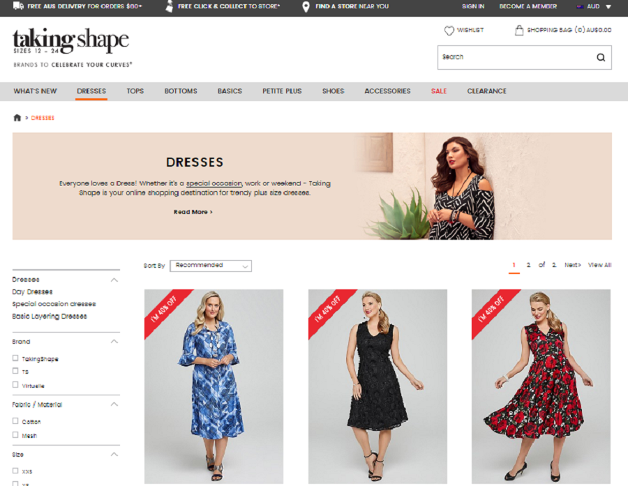
Check out this example of a website with great quality images:

Image via takingshape
#2: Scanty or Confusing Product Descriptions
Your product descriptions are something that can set you apart from your competition. So, it’s important to include clear, engaging descriptions of the look and feel of the product. The descriptions should also clearly express how the product will benefit your customers.
When consumers do not find a description or the description is too vague, it can be confusing for them. This can dissuade them from completing their purchases. Good copywriting and product descriptions are important to your website’s success.
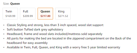
Here’s an example of a well-written product description.

Image via Amazon
While interesting and engaging product descriptions are essential for your website, you must also ensure that you are not overloading your customers with too much information. This can sometimes cause visitors to become disengaged and unlikely to return.

#3: Long or Complicated Checkout Process
Studies have shown that a long or complicated checkout process on ecommerce websites can cause potential customers to abandon the site. This directly affects your conversions.
A study conducted by the Baymard Institute has found that a long or complicated checkout process is the third most common reason for users to drop out.
So, your focus must be to ensure that once a visitor has selected the products, they can complete the purchase easily and within a few steps. It is also important to display all the shipping costs and taxes that are applicable to the purchase and make sure that no such information stays hidden.
#4: No Information About How to Contact Support
Before making a purchase online, an important consideration for customers is the return or exchange policy. Since they are buying online, it’s possible that the product might not turn out to be what they had anticipated, or they might need to exchange it for something else.
So, there is a need for buyers to be able to contact the website’s customer support when needed. If there is a lack of information regarding this, consumers may be less inclined to buy from your website.

#5: Not Being Mobile-Friendly
Online shopping offers the convenience of buying from your home. Mobile devices and smartphones offer even more convenient than having to sit at a desk and open your computer.
There is no denying that more and more users today are using their mobile devices for web browsing. So, your ecommerce website needs to be mobile-friendly or else you run the risk of losing a chunk of potential customers.
You can use Google’s Mobile Friendly Test to find out whether your site is mobile friendly or not.
#6: Slow Loading Time
It is quite understandable that if your site is too slow, most of your visitors will drop off and never come back. Studies have shown that a loading time delay of just one second can reduce your conversions by 7%.
SEO audits can help you resolve any issues with your website’s loading time. Google PageSpeed Insights is a simple tool that can help you identify problems with site speed and what you can do to resolve them.
Conclusion
As mentioned in the beginning, it is important to build your ecommerce website in a way that provides world class customer experience. Great customer experience can not only pave the way for repeat purchases by your customers but also spread positive word-of-mouth from these customers. It can also help you steer above your competition and boost sales.
In addition to the points above, another consideration is the ease of navigating your ecommerce website. Customers should not only be able to search and find you, but they should also land on a relevant page when they click on your links.
For an ecommerce business, your website is your greatest asset. It is the sole source of your profitability and sales. So, you can prevent it from becoming a liability, simply by avoiding these website design mistakes we’ve discussed.
Can you think of any more common ecommerce website design flaws you have encountered? Let us know in the comments below.
Related Posts
10 Things to Consider when Designing an eCommerce Website
10 Things to Pay Attention to When Choosing eCommerce Website Templates
Top 10 Quick Ways to Increase Your eCommerce Website Conversion Rate
Trust Signals for eCommerce Websites and How to Use Them
3 Killer Tactics to Get Visitors to Your Website
Get more to your email
Subscribe to our newsletter and access exclusive content and offers available only to MonsterPost subscribers.

Leave a Reply
You must be logged in to post a comment.