18 Examples of Unique eCommerce Stores
The eCommerce store is no longer just a place online where businesses can sell their wares; it is now a platform to showcase what makes each company unique, a representation of their personality, values, beliefs, and must appeal to their existing customer base and demographics, as well as being able to capture and convert new ones.
Design plays an important role in how each brand shows off to the world and the experience customers have when shopping. Whether quirky, chaotic, stylish, minimalist or just plain nice to look at, this is a collection of brands that have done it right with the design of their eCommerce store.

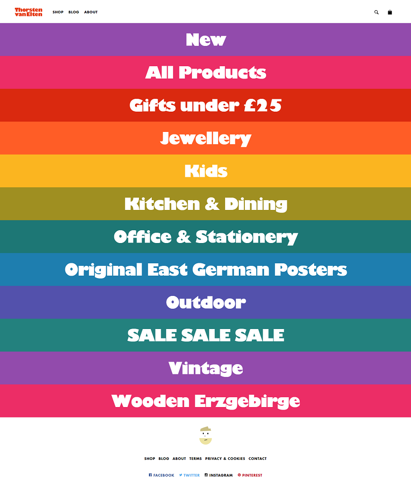
Thorsten van Elten
Simple, eye-catching, clear design and layout are the hallmarks of this site masquerading as a rainbow. The homepage is dominated by bold category buttons that make it clear as day what you’ll find behind each one (though I will admit I actually had to click to find out exactly what "Wooden Erzgebirge" are!)
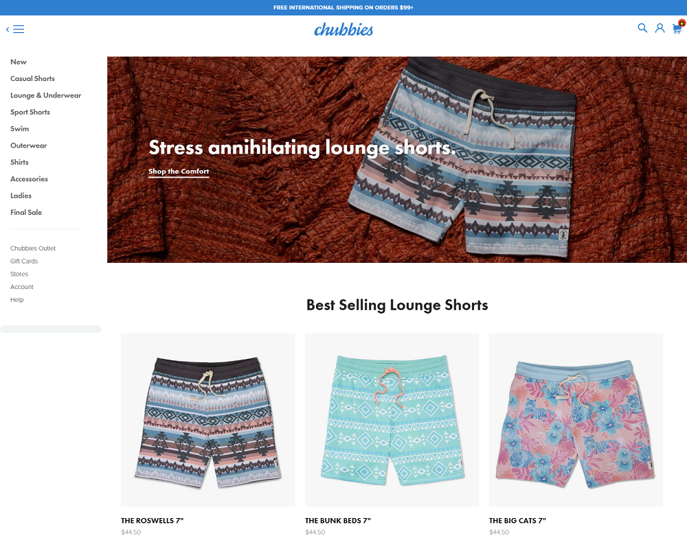
Chubbies
Chubbies bring a real sense of fun to the online shopping experience, from their retro-inspired collection of shorts, swimming trunks, and shirts, to their mission statement that champions shorts that are short, Hawaiin shirts, and “...our fathers - they led the way; we are but revolutionaries standing on the shoulders of amazingly mustachio’d giants in proper length shorts.” This is one site that will make you nostalgic for reruns of Magnum P.I.
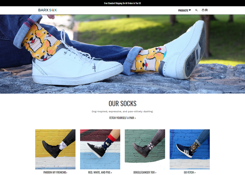
Barx Sox
It’s hard to take yourself seriously when the only product you sell is socks with dogs on them! An image-dominant homepage lets the product do the talking, showing the ways Barx Sox can be dressed up or dressed down.
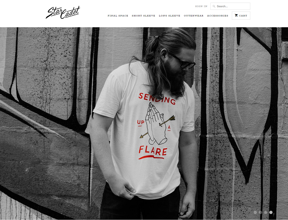
Star Cadet
A store that definitely has the cool factor, from the photography style of the large feature image to the quirky and hip shirt designs themselves. The product shots show the shirts off in a real-world fashion, displayed as if they’d been laid out on the bed at home, wrinkles and all. Integration of their Instagram feed acts a further product showcase.
Norwegian Rain
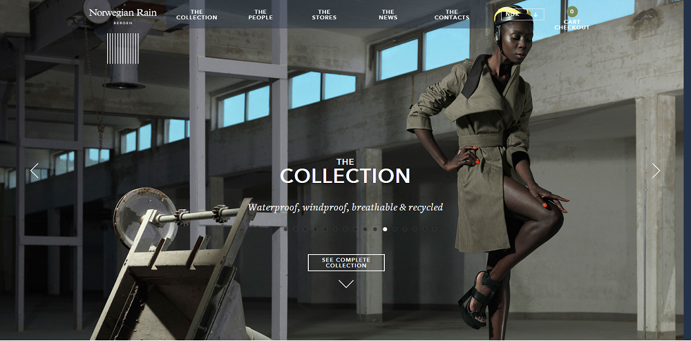
Raincoats are not normally something you’d associate with high fashion, but the Norwegian Rain store that acts as a showcase for designer rainwear by bespoke tailor T. Michael just oozes sophistication. The featured image slider shows photographs you’d expect to see in a fashion magazine, and the product images which fill the page are bookended by a video showing the story and inspiration behind the collection.
Voltage
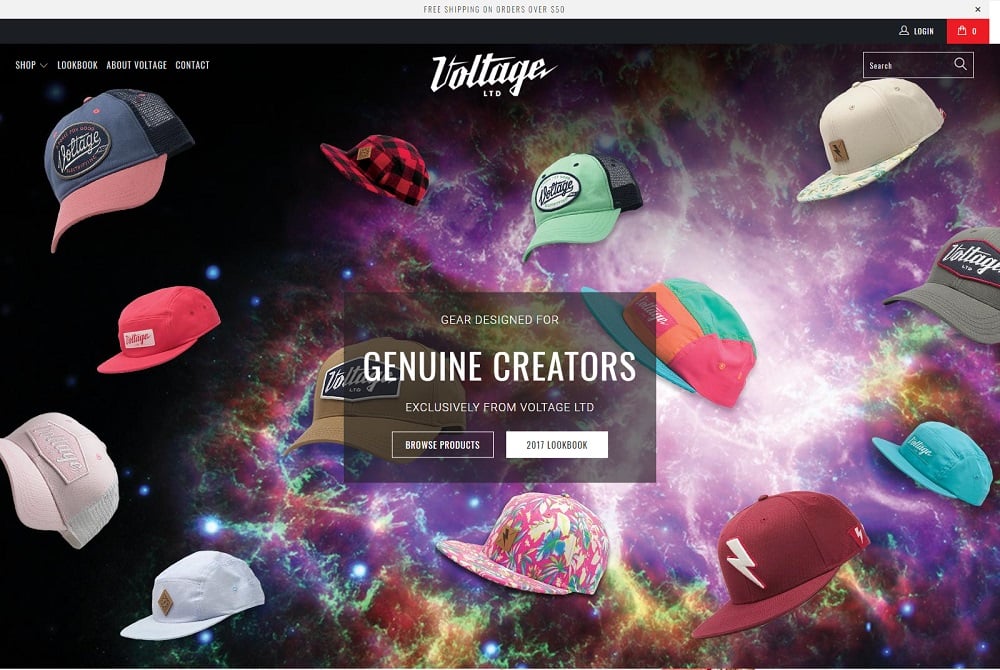
The Voltage store homepage is what the big bang would have looked like had it produced hats instead of the primordial elements - you’re initially hit with a galaxy of color and, well, hats. They really bring the cool factor with their product photography and manage to boost their cred by prominently advertising the fact that 4% of their profits go to helping the community.
Sarah and Bendrix
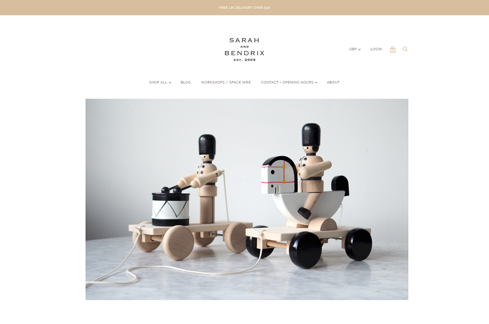
Sarah and Bendrix harks back to a simpler time with their collection of traditional wooden children’s toys and personalized gifts. Their web store feels simple, elegant, and high-end.
Fred Jourdain
You don’t need to be French to appreciate the appeal of artist Fred Jourdain’s site where he sells his artwork. His collection of caricature works inspired by celebrities and characters from the worlds of movies, music, and other parts of popular culture are a real feast of color for the eyes.
Goodwin & Goodwin

Not exactly a niche that would spring to mind when you think e-commerce, Goodwin & Goodwin signmakers of London make business signage interesting. Anyone who has any kind of appreciation for creativity and craftsmanship will get a kick out of this site, and even the embedded video profiling the company, its story, and its staff is a good watch.
Field Notes
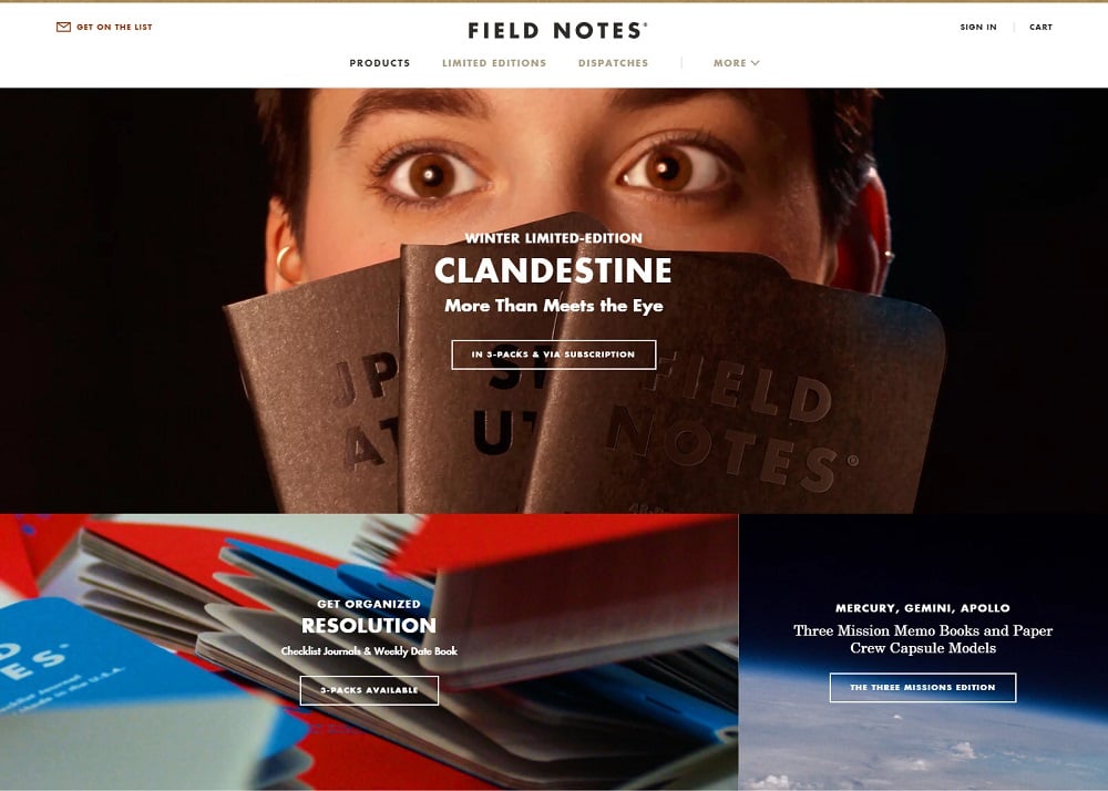
If you thought a notebook is just a notebook, think again. Anyone who has an appreciation for retro style, or prefers using a pen and paper to a smartphone or keyboard will feel right at home on the Field Notes store. They know their customer base well and the store, and products become quite addictive the more you look.
Porter & York
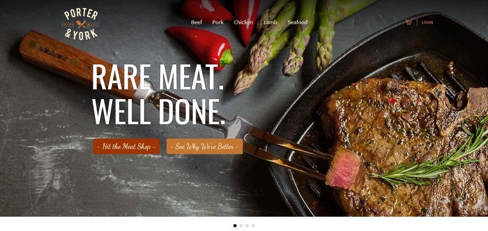
If you’re a meat eater then Porter & York’s meat box delivery service website will have you drooling in no time. From the feature image slider to the product shots of raw meat cuts, to the Instagram feed, this site will transport you to protein heaven.
Joco
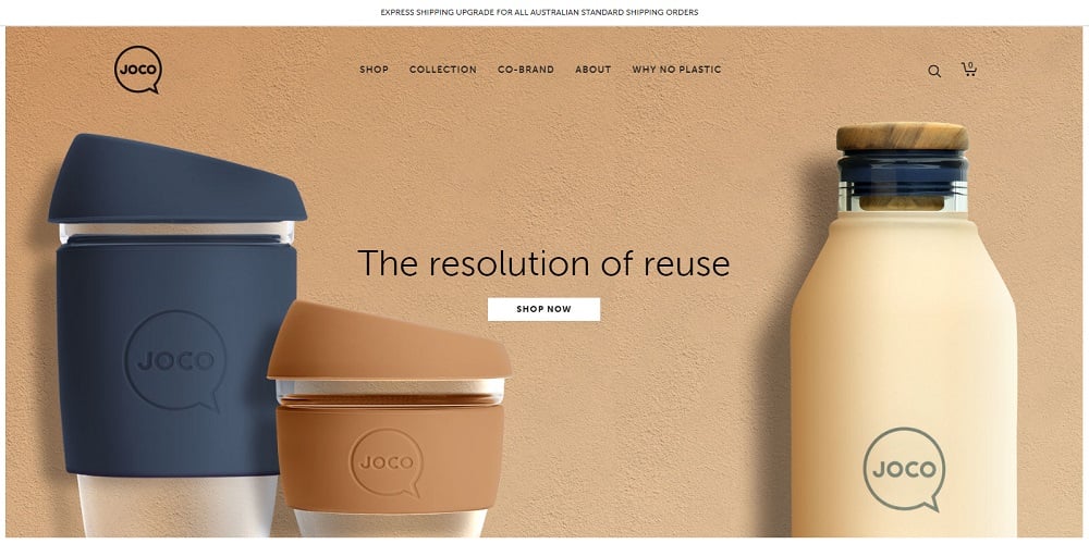
Eco-friendly producer of reusable drinking vessels, Joco’s site hits the user with product shots and a unique but effective color scheme straight away. It packs a lot in, with elements of sparse minimalism, animated product gif, and a large feature image, but it all works well together.
Two Chimps
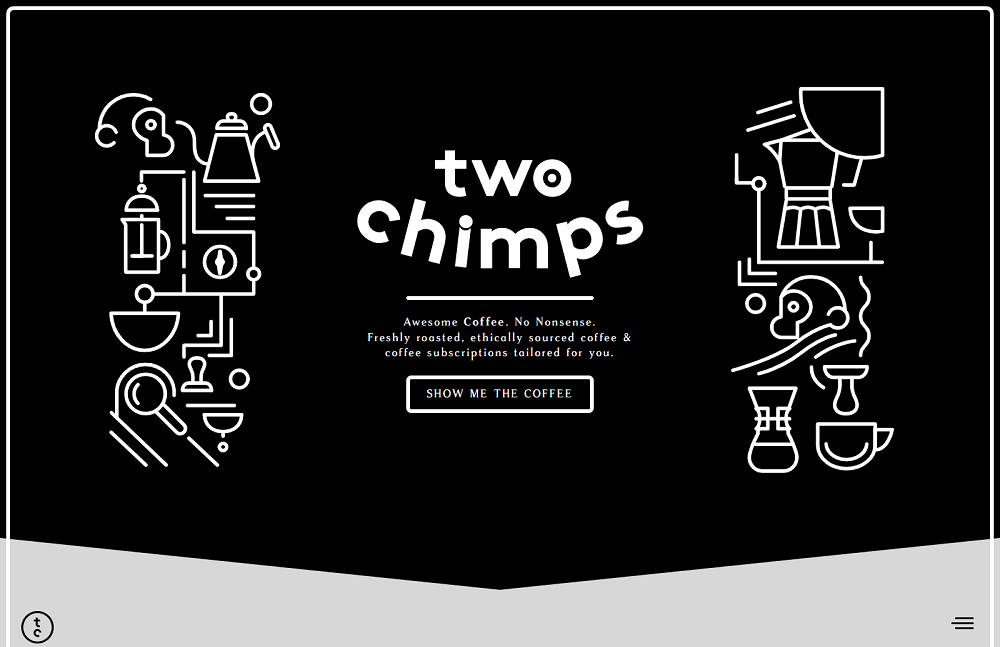
There’s a lot of competition in the coffee space, but Two Chimps pulls off a winning website for their coffee shop and monthly subscription service, from the animated intro the site takes the user through a seamless and smooth-flowing process that shows their product offerings and on to a brief questionnaire to find the coffee that suits them best. A fun site that ticks all the boxes from design to user experience, and most likely conversion rate, too.
Read Only Memory
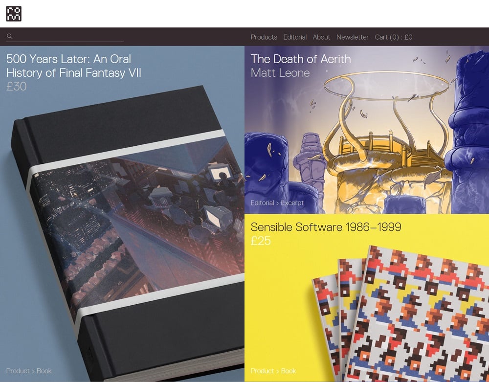
Read Only Memory is a very niche site that publishes illustrated books that document great moments in the history of video games. It’s a visually extremely attractive site, with the homepage consisting entirely of boldly colored product shots that even non-game geeks couldn’t help but find appealing.
Volume
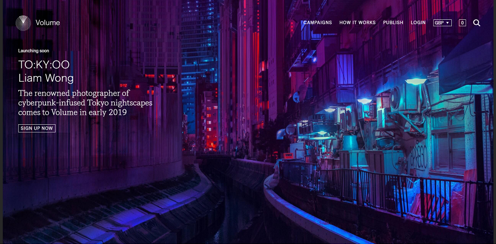
Volume is unique in that it’s more of a crowdfunding-e-commerce hybrid; a publishing platform for high-quality illustrated books, where they host campaigns to fund produce and sell “beautiful printed editions created by the world’s leading artists, designers and as yet undiscovered talents.”
Newlyn
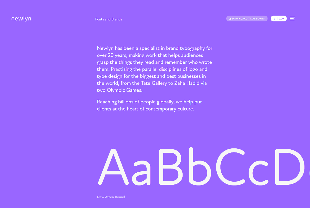
Who would have thought there were e-commerce stores out there that sold nothing but...fonts? Not I, until putting together this collection. It almost deserves a spot for the uniqueness of its offering alone, but the simple yet bold design does the job of telling their story and what they do, showcasing a selection of their fonts, and the big brands they’ve worked with in a way that not many sites manage to pull off.
Tediber
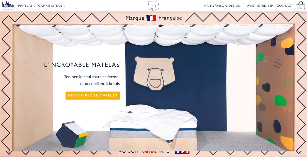
French mattress and bedding manufacturer Tediber aim to make great, comfortable mattresses available to everyone at an affordable price. Their stylish website with its simplicity and consistent color theme acts as an enticing showcase and tells the story behind the company; both its inspiration and origins in a way that brands itself as unique.
Output
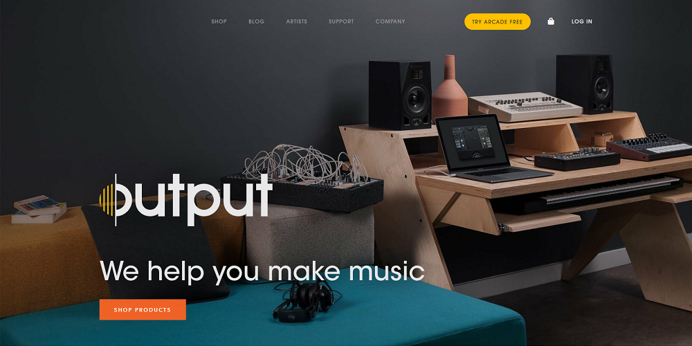
Though Output develops software and gear for musicians, producers, and composers, their site has the feel of a Scandi style furniture boutique, which serves to show their products in an appealing light, as if they could serve as accouterments in a designer home. An attractive four-panel homepage design makes product category navigation a breeze.
eCommerce is becoming an increasingly harder area to stand out in, as the number of online stores grows year upon year. Not only that, e-retailers need to make sure they’re converting visitors to stay viable - the fact that, according to Hostgator, 70 out of every 100 shoppers will bail after adding a product to their cart shows that optimizing conversions at every stage of the sales funnel is a must.
Part of what converts browsers to buyers is user experience and engagement - something these awesome example sites have in spades. When shopping is interesting, fun, or even an experience that makes you laugh, and the site is attractive and engaging, you’re building goodwill as well as encouraging spending - something these eCommerce sites no doubt do well.
How to create a WooCommerce store
So if you want to run your own store and want it to look neat, original and aesthetic, you should care about the quality of the template you buy. There’s plenty of themes on the market. Still, we want to draw your attention to the one we find best for WooCommerce. It’s WooStroid 2.
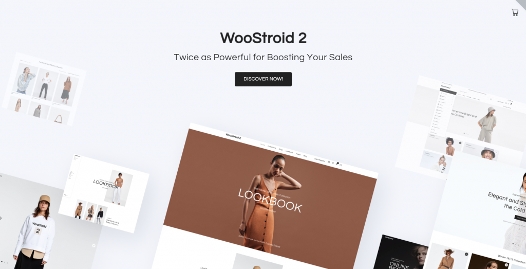
Why is it a perfect theme for an online store?
After purchasing WooStroid 2 you get an Elementor theme with dozens of skins, which means you can choose whatever fits your niche. Moreover, you also get a set of Jet Plugins which make you work with the theme much easier. You don’t need to know how to code to adjust your store in a way you want. As a bonus to all these pros, you get a lifetime 24/7 support if you’ll ever have any doubts on how to exploit it.
Read Also
10 Things to Pay Attention to When Choosing eCommerce Website Templates
Ecommerce Web Design Trends 2019
Top 45 Ecommerce Business Ideas for 2018
23+ Best Jewelry eCommerce WordPress Themes In 2019
42 Best Shopping Cart Page Design Templates
Don’t miss out these all-time favourites
- The best hosting for a WordPress website. Tap our link to get the best price on the market with 82% off. If HostPapa didn’t impress you check out other alternatives.
- Monthly SEO service and On-Page SEO - to increase your website organic traffic.
- Website Installation service - to get your template up and running within just 6 hours without hassle. No minute is wasted and the work is going.
- ONE Membership - to download unlimited number of WordPress themes, plugins, ppt and other products within one license. Since bigger is always better.
Get more to your email
Subscribe to our newsletter and access exclusive content and offers available only to MonsterPost subscribers.


Leave a Reply
You must be logged in to post a comment.