How to Make Content Scanners Happy with the F-pattern?
F-pattern. Each part/element of the website should co-work successfully to achieve marketing targets. Specifically for this purpose there were developed the so-called F-pattern. Further you will find out what these patterns are and how you website can benefit from using them.
The results of search engines are based on this principle, and the texts in the "About Us" section are read. The letter F is chosen not by accident, firstly - from the word fast, and secondly, the shape of attention zones is similar to this letter of the alphabet.
Generally pattern is a psychological term. When translated into the human language it is a characteristic of behavior in particular environment, in this case – it is the perception of information from the screen.
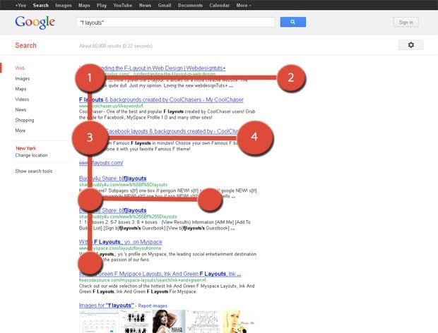
The information is organized in such a way that it is read via simple movement. The diagram shows key points of order and proportion - the extent to which the viewer pays attention to them. To analyze search engine results takes 2-3 seconds:
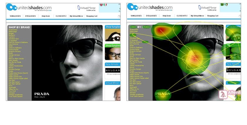
Here is the screenshot that visualizes areas of interest via hot spots:
***
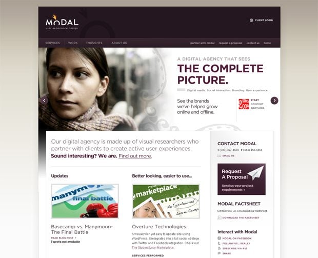
Here are the examples of websites rendered through this principle:
Modal
***
***
The line is very simple: the eye moves from the top left on the first line of text, title, search bar, and then finding some results goes down and reads the next line. But he looks it through not till the end, it’s known that we are on the sites and are we are looking something that resembles something that we need.
Where and Why F-pattern Doesn’t Work?
Various corporate websites are organized according to this principle. Customers adore them, and designers hate creating them. Most customers never heard of patterns, but have seen enough websites to know what they want. And in this case, the F-pattern will not perform what it’s supposed to.
As you know, for one tab in Firefox user spends from two to six seconds. This time is enough for the user to make a judgment if website contains relevant information or not. Custom content section as a rule is stuffed with news or the welcoming word of the CEO.
There is another one reason. Designer (an ill-trained one) often starts "drawing" website from the header, and leaves not much inspiration for the left sidebar with the menu directory. What to say of the content area - it will be packed to overflowing with some uninteresting information and news. Of course it has to be filled with something!
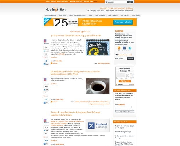
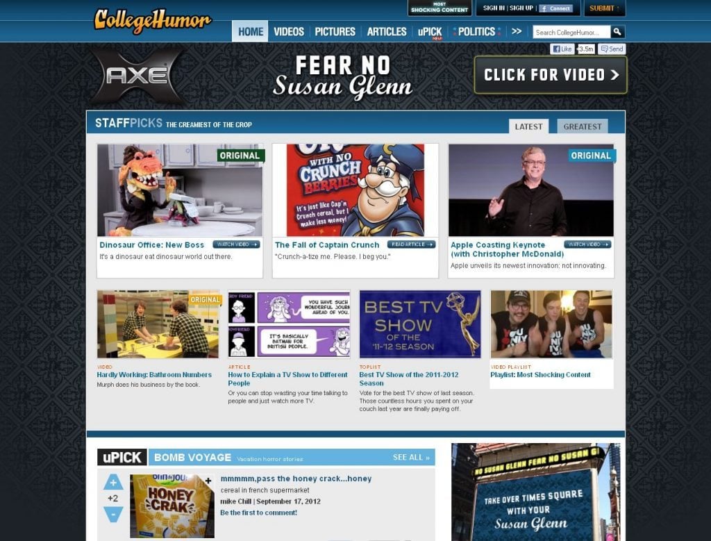
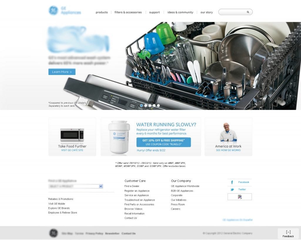
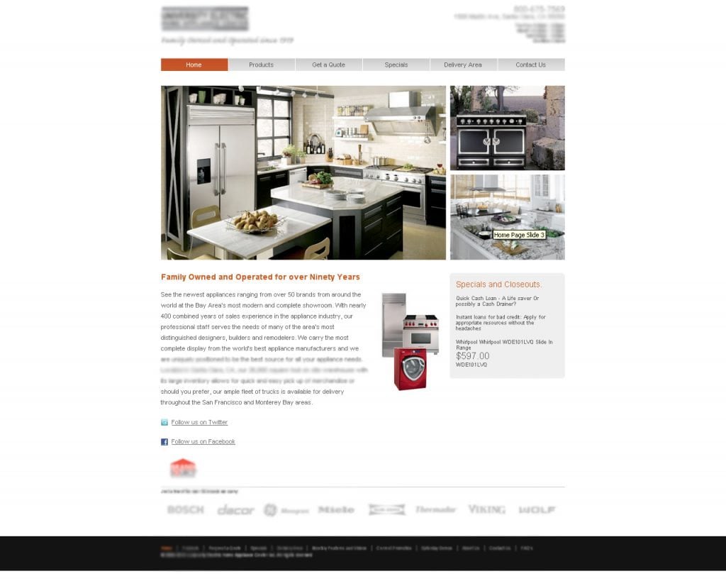
Here are the example of the websites where f-pattern doesn’t work:
***
Example 1
***
Example 2
These sites do not perform their tasks. Quick analysis of site content for the user takes two or three seconds, during this time user faces the “About Us”, and “Contact Us” links. While user was looking for specific information. Realizing that the search will take too much time (and he’s not sure if he/she will find products he/she wanted to), user successfully passes onto the other tab.
Where It’s Gonna Work?
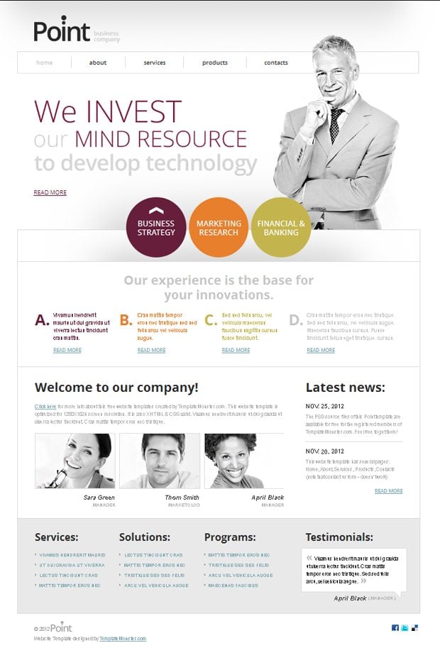
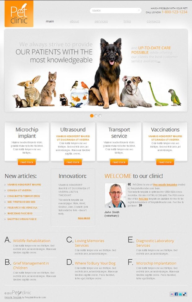
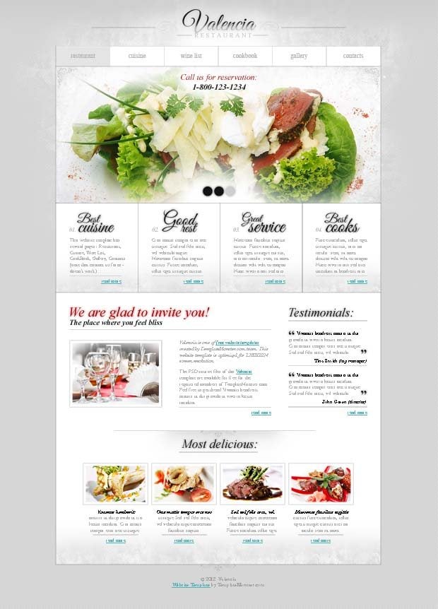
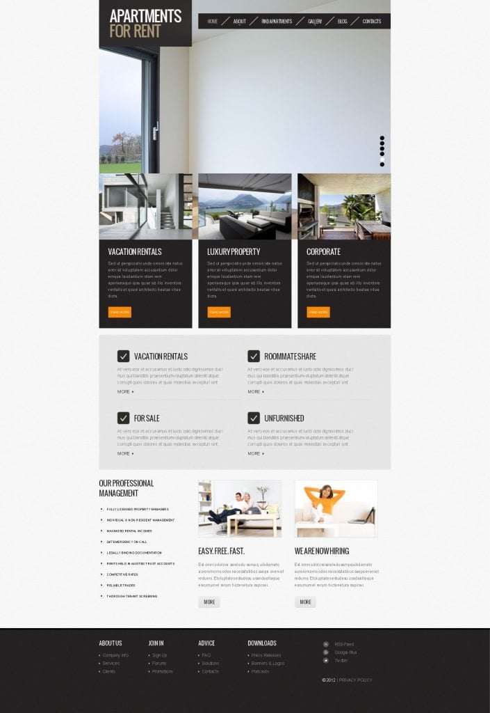
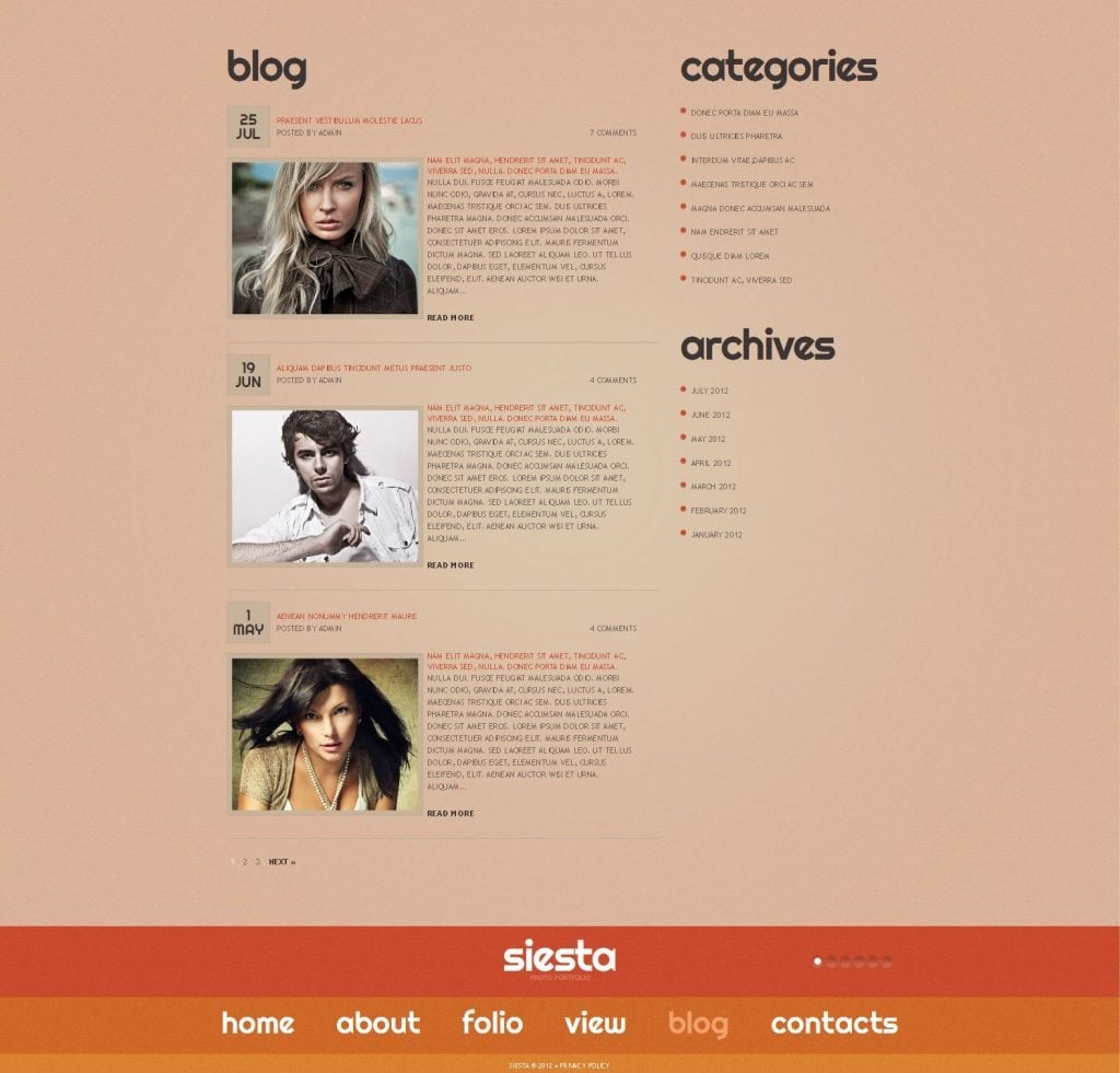
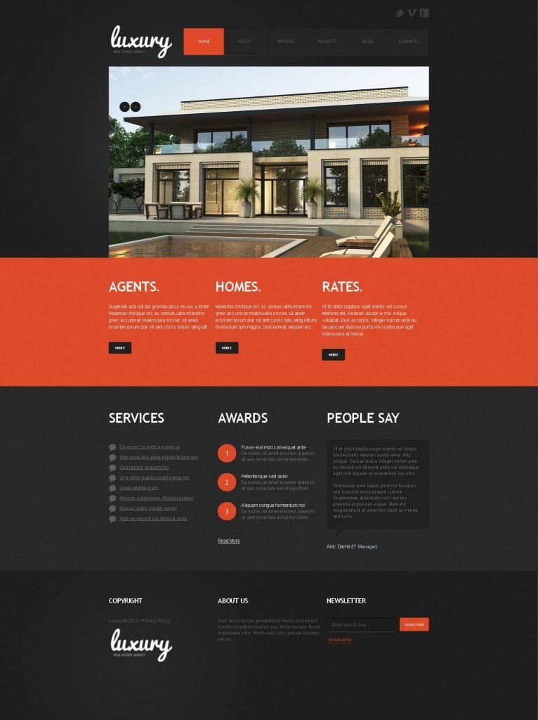
F-pattern works perfectly fine in blogs. They perform their function well: there user spends more time reading a little more carefully. If patterns of perception are used properly, you can achieve good results. Here are several examples of TemplateMonster themes where f-pattern is successfully implemented:
Free Business Website Template
***
Free Pet Clinic Website Template
***
Free Restaurant Website Template
***
Free Real Estate Website Template
***
***
F-pattern and Eye Tracking Tools
Of course we would like to offer you some tools that will help you find out the areas of interest on your website, some of them are free, some offer trial version, but still they can help you highly improve your website, feel free to use them:
Google Chrome Extension Mouse Eye Tracking
Mouse Eye Tracking helps you understand user behaviour and maximize the value of your online presence with four main features - Heat Maps, Mouse Tracking, Page Navigation and Browser Sizes.
***
AttentionWizard
AttentionWizard is an affordable, revolutionary tool for website designers and marketers to validate web designs before they go live.
***
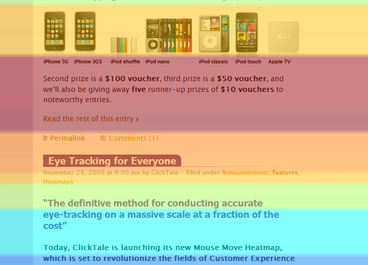
Attention Heatmaps
This tool allows to see how much attention a specific website area gets from your visitors. With Attention Heatmaps you will find what content your visitors care about the most, what they read, and what they completely skip over.
How to Use the F-pattern
There can be pointed out few things that need to be considered when designing layouts:
- How much time will user spend on the tab with your website? You need to decide where the lines of f-pattern will go through and put the elements of higher priority or simply those you need to “sell” into the points 1 or 3(see the first scheme).
- Keep in mind one important principle: the most important/significant elements should be placed in the beginning. It resembles the principle of "reversed pyramid" on how the text are arranged for the website.
- Make headlines as informative, as possible. Point out that the info user is looking for is created not for robots, but for customers on your website.
- Do not forget about the "spots to the right". There, you can effectively place banners and promotional offers.
- Make sketches of pages for yourself. Then the "holes" in the track will disappear, and you will clearly see what should be put there.
P.S. Good luck implementing the F-pattern!
Don’t miss out these all-time favourites
- The best hosting for a WordPress website. Tap our link to get the best price on the market with 82% off. If HostPapa didn’t impress you check out other alternatives.
- Monthly SEO service and On-Page SEO - to increase your website organic traffic.
- Website Installation service - to get your template up and running within just 6 hours without hassle. No minute is wasted and the work is going.
- ONE Membership - to download unlimited number of WordPress themes, plugins, ppt and other products within one license. Since bigger is always better.
Get more to your email
Subscribe to our newsletter and access exclusive content and offers available only to MonsterPost subscribers.

Leave a Reply
You must be logged in to post a comment.