Facebook Page Strategies of Top Web Design and Tech Accounts
It's obvious that Facebook Page is often used as “the second home page” for various web resources. It is known to be one of the most up-to-date and powerful tools to promote your website without spending tons of bucks and making enormous efforts. In this article we are revealing some key refinements aimed at helping you while working with your Facebook accounts.
We made a survey of the 10 most popular Facebook fweb design-related pages so that you could derive some tricks and methods to make your projects rock.
How to explain web design fundamentals in public effectively? Use powerpoint slide themes
.
Facebook profile image
The first task while customizing your personal Facebook page is creating a unique page image that doesn't exceed 200 pixels wide. Profile picture is one of the first things people look at, and this first impression is often determinative. To get a better idea of how to make creative profile pics you may take a look at the article written by Rob Banagale. It describes 5 creative ways to hack the Facebook photo. What we also recommend to check out are the comments beneath the article with the readers' graphical examples.
We have selected 10 top web design and web technologies Facebook pages - Mashable, WebdesignerDepot, Photoshop, AdobeIllustrator, Smashing Magazine, Graphic Design and Typography - and traced the following trends in profile pics presentation:
Simply logo
Topic-related artwork
Artwork + logo (+ some description)
Brand-awareness+original artwork
Graphic-Design account uses the stylish and recognizable motive of I<3NY printing. The last two types of profile pics seem to be more catchy since they imply the brand, the mission and/or the topic of the Facebook page they represent.
Facebook page URL and name
Choose the most appropriate account name and URL name for your Facebook Page and preserve it without changes.
Such names as https://www.facebook.com/pages/Typography/171065220253 or https://www.facebook.com/pages/Graphic-Design/12767141754 are not very much memorable but this fact doesn't prevent them from being rather popular with 67,540 and 59,356 fans respectively.
Some top web design accounts prefer shortening their full names like http://www.www.facebook.com/SmashMag.
The other pages use different wordings in the URL and the actual page name like Graphic Design presented at https://www.facebook.com/graphicarts.
It's highly preferable to preserve the exact brand name or the name that is most associated with your company and your business area.
Art of Facebook Posting
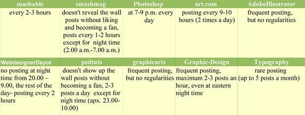
Frequent posting doesn't mean utter success. You should consider not only frequency, but also the schedule of your audience activity and, of course, the quality of the content. According to the prominent marketer Stephen Woessner, two status updates per day is the best formula. Though many successful web design resources post more than 4 times a day as long the material is various and not irritating. Frequent posting will more likely catch the fan's eye, especially if it is some call-to-action posts - such as polls, questions, tests, and the like. On the other hand, if you try too hard and post too much, your users will get tired of this, they may even consider it to be spamming and will 'unlike' your page. So it's very important to know what to post and to be able to stop.
It's highly desirable to update your page when the majority of people are logged on. In order to determine the perfect time for status updating you may make some tests and observations considering demographics of your target audience. You may notice some correlation in the time of posting and commenting. Using Facebook Insights tool allows you to track statistics of your fans activities and indicate what days are more fruitful. This tool is easy to see in the left column of your Facebook page.
The alternative way to update your Facebook statuses is to use such tools as Hootsuite: they can schedule automatic status updates for the entire week. All you need is to log in to your account every day to keep an eye of the process and reply to the comments.
Now a couple of words about the content of updates. It demands specific art of posting. Of course there are some general hidden tricks of drawing fans attention, but the best way to attract more fans is working out your own system. First and foremost, you are to answer the question what you are going to accomplish with your Facebook page? Do you need to sell something through the page or to attract people by a sharp and timely word? You may also want to build a strong community for your goods or services. You should consider your brand exclusiveness and present information in a unique way. Taking into account social news and updates, discussing daunting problems of the mankind is always an effective way of catching the audience eye and soul. It is but natural to mix them with information about your products in a creative way. You may offer your readers videos and photos, polls and simple games, specials and advertisements. Every type of post is nice if it is interesting and relevant.
Video updates look especially appealing for most Facebook users. E.g. Photoshop Facebook page offers the great video tutorial about Cube Wrap Object tool in Photoshop CS5 Extended as one of the latest wall updates. Moreover, Photoshop page offers polls and queries to find out the preferences and motives of its audience e.g. offers to answer the question about what top things people use Photoshop for. The number of votes speaks for itself. This page owners definitely have an idea about art of posting. Feel free to observe the posts on other top Facebook pages and adopt some tricks you will find useful.
“About” text box and “Info” tab usage
The “about” text box is supposed to place keyword-dense content showing up right under the profile pic of your page. The number of symbols used for this area is limited. The “Info” tab on the whole is supposed to include important keywords, links and text.
We reviewed the ways different top web design pages represent information in the about block and info tabs. You may find some awesome ideas from the patterns below and implement them into your pages.


the Info boasts the page started up its work in 2008, and includes information about the owner, the topic and blog position on the net. The tab seems to include such keywords as “web design” and “tutorials”. The short description includes the personal name and occupation of the blog owner, the info is extremely laconic and general.





Working with photos and events
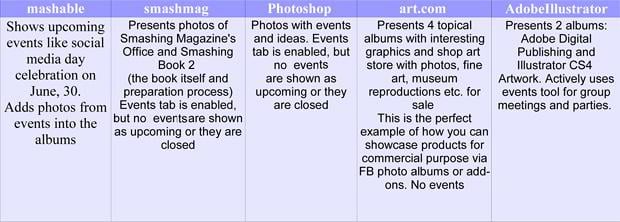
The benefit of adding photos with captions and events with descriptions needs no specific explanation. Share interesting content with the help of graphic – people don't like reading much text but need some visual material for a change. Always use all available descriptive fields on content you share. Posting photos in Facebook allows to use keyword-dense descriptions. The same thing should be concerned when creating events. It's recommended to include text and keywords in the event description fields. These descriptions will be indexed by search engine crawlers, so you may take a full advantage of this feature. Moreover, your page will look closer and friendlier to fans if you include some private photos of the team, the office you work at and some events.
The table below shows how some top web design-related pages make use of photos and events:
Getting inbound links
Number of backward links to the honorable web design Facebook pages:
Always post links to your Facebook Page on all your websites to get more inbound links. You may probably know that getting more links in such a way will boost its rankings. You may include both text links or the “Find Us On Facebook” badge recommended by Facebook. Besides, you may use the Fan Box widget to include links back to your Facebook Page.
The other way of getting more links is intra-Facebook inbound links due to getting more Facebook fans. The more fans you have, the more links to your page you are likely to have.
Remember to post direct links to your website in your status updates. The page stream allows to place direct links closer to the top of your page’s CSS which is a good way for boosting your page's link score. You may add the link to the page stream in two ways: by including the URL into the status content or by using the “attach link” feature.
You may analyze the number of fans and backlinks for different pages and see the vivid interdependency. Looking at the table above, we are not surprised why Photoshop page has the greatest number of fans.
Integrate Applications
Additional applications is one of the best ways to draw the fans attention. Applications catch the fans eye and don't let them leave your page immediately. You will find over 50000 applications that can be easily integrated into your fan page. Applications allow to launch engaging page within a short period of time. Large companies tend to practice games, quizzes, specific polls and other dynamic applications that make fans stay longer at their pages. Not to mention the apps that you can create by yourself on your website and then embed to Facebook via iFrame.
Adobe Photoshop Facebook page represents the widest range of options activated through such applications as Feedback, Ratings, Celebrate, Photoshop live, Photoshop Polls etc. This enables better interaction with fans and provides them with a variety of activities.
WebdesignerDepot presents only one additional option – Discussions, which is actually a Facebook default app. But the lack of applications doesn't prevent it from having 64,305 fans. Although, using more interesting add-ons and other aforementioned features could tenfold boost the fans activity.
Mashable calls fans to action with its “Submit news” application, AdobeIllustrator encourages to leave a review or take part in the discussions, Smashmag page even offers a chatroom for its admirers and Psdtuts gives free bonus tutorials for their fans in the “Fan Bonus” section.
Art.com page is good for having a pretty wide range of addons such as Shop Art Store, iPhone App, Newsletter Sign Up, Spring Catalog etc. This makes the page look more complete and appealing and allows the page owners to showcase products through the Facebook account.
Feel free to derive some applications you will find appropriate for your page and engage fans.
Individual Approach and Private Strategy
People are terribly curious about private life. Therefore individual approach and private strategy will quickly boost the fans attention. You may offer exclusive promos, testimonials and discounts, organize events and upload photos and videos from the events to your albums. Give readers a short glance at your private life, at your company office, your team and parties you collectively visit. This will add some air of romance and trust to your page. Fill it with a corporate spirit and speak on behalf of the company. But always remember you deal with real people who are seeking for communication, news and entertainment, so you's better use an individual approach to answer the comments and updates.
E.g. Photoshop offers the video to honor the Father’s Day taking fans behind-the-scenes with their Photoshop team. According to the status, “in this video, Quality Engineering Manager Jackie Lincoln-Owyang discusses a childhood project she worked on with her grandfather that taught her teamwork and creativity.” In the albums of the Smashmag page you will see great photos of the Shashing Magazine's office that open the curtain slightly over the Smashing team working days.
Considering the aforesaid tips, we can sum up some key, effective Facebook strategies as follows:
- Select the proper unique Facebook profile image and name;
- Master the art of Facebook posting;
- Get more inbound links to your Facebook page;
- Work with photos and events;
- Reason out the Info tab content;
- Integrate applications;
- Work out individual approach and private strategy.
Following these simple principles and deriving experience of top web design-related Facebook accounts you will quickly promote your Facebook page without some shadow tricks and additional tools. Experiment with your pages and get millions of dedicated fans!
Don’t miss out these all-time favourites
- The best hosting for a WordPress website. Tap our link to get the best price on the market with 82% off. If HostPapa didn’t impress you check out other alternatives.
- Monthly SEO service and On-Page SEO - to increase your website organic traffic.
- Website Installation service - to get your template up and running within just 6 hours without hassle. No minute is wasted and the work is going.
- ONE Membership - to download unlimited number of WordPress themes, plugins, ppt and other products within one license. Since bigger is always better.
Get more to your email
Subscribe to our newsletter and access exclusive content and offers available only to MonsterPost subscribers.







Leave a Reply
You must be logged in to post a comment.