Features of the Design of a Multilingual Site
Today, it is impossible to imagine your life without the Internet. People from all over the world visit a huge number of sites every second, thus, any company that wants to enter the international level you will need multilingual WordPress themes to reach audiences from different countries. When web designers understand that, thanks to the Internet, it is possible to attract customers from all over the world, they then try to create a website that will be convenient and useful for every user anywhere on the planet. Websites allow you to forget about different time zones, languages and mentalities… or do they?
If you have your own business and want to increase the number of countries with which your website cooperates, it is necessary to create an international website so that absolutely every user anywhere in the world can find it and find something useful in it. More information on how to determine what site your business needs is available here. The main problem is language. Users are more comfortable with sites in their own language, so if your site is not multilingual, then this can be a serious problem and hinder your business.
With great confidence, I can say that within your life, you have at least once encountered a site whose content was in another language. At such times, users either try to use translators or they just completely shut down the page. So… how can you avoid losing the audience in order to increase the loyalty of users and to enter the international level with dignity? To avoid the major mistakes of a multilingual site, we have selected several tips that will surely help you.
What Are the Features of Creating a Multilingual Web Design, and What Should I Pay Attention to?
Translation of Content
If you use automatic translation which offers Google Translate for your site, then be prepared for confused users because such a translations are not reliable. If you want your users to understand you correctly, then use relevant, real translators. This will make your content understandable and will also show your users your care for them.
Translation of Interface Elements
Do not forget that you need to translate not only the site, but other elements and buttons as well. It will be very difficult for users to perceive information and perform any actions on the site if they do not understand what is at stake. In this situation, they will most likely leave the site. To avoid these errors, pay attention to the pop-ups on your site - it doesn’t matter at all whether it's an alert about an action or an error - it needs to be understandable to the user.
Language Changes
When creating an international site, you should not forget about the parameters for changing the language. If your site is very thoughtful and designed to change languages, do not forget to offer it to your users. You can do this in several ways:
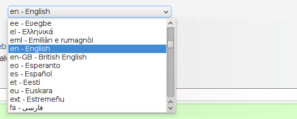
Select language from the drop-down menu
This is a very convenient technique that allows users to choose their prefered language. The convenience of this method lies in its simplicity. It is important to place this menu in a visible place for the user, so the best place for this menu is the right upper corner since it is in this place that various menu buttons and settings are often located.
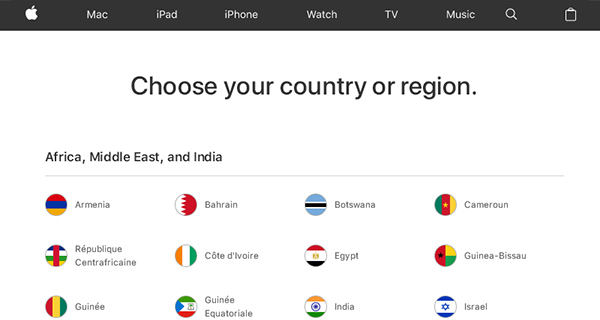
Select language using country flags
This method is convenient for those who perceive visual information well. It's also a very nice way to offer a choice of language. Nevertheless, this method can confuse your users, because the flag most often represents a certain country, and in many countries, there can be two or more official languages. That's why this method is not the most successful.
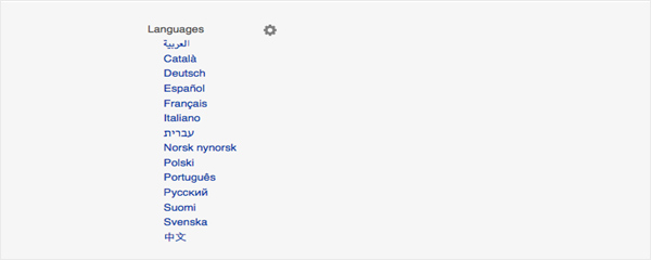
Alphabetical list
This is the most successful method of choice. It is very light and simple, it does not contain unnecessary elements, and does not make it difficult for the user.
Automatic detection of the default language
Once a user has moved to your site, you can automatically determine his/her prefered language based on the default language to which his/her device is set and invite him/her to select it by default. Naturally, do not limit the actions of users. Give them a choice to accept the default language or choose any other.
Common Mistake - Redirect to Main Page
After your users have chosen the desired language, the main page of the site usually opens. Try to avoid this as this is confusing and you force users to waste time searching for the page they were previously browsing.
Correct Font
When you select a font for your site, you must first look to make it harmonious with your site and also with your brand. However, you should pay attention to a few nuances as well. First, not all fonts support all languages. Most often, there is a problem with languages whose symbols differ from Latin. Secondly, when translating into another language, some words may be longer than you expected, causing all the text to become deformed. Therefore, when selecting fonts, be sure to pay attention to compatibility and how the font is combined with one or another language because the changed text size can greatly change the appearance of the page. In any case, an adaptive interface will help to solve this problem.

Features of Reading
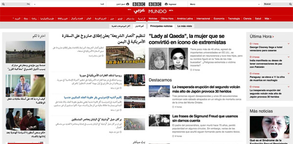
Do not forget that different people have a different manner of reading. For example, we know that Arabs read from right to left. That is why you need to take into account the manner in which your users read and be ready to provide users with the page in the form to which they are accustomed. It's not just about the text, but about navigation and content in full.
Correct Interpretation of Colors
People perceive different colors in different ways, depending on their mentality and culture. For example, in Europe, black means sophistication as well as mourning and anxiety; in India, the same color means the restoration of strength and health. Before choosing a single color for the site, you will need to conduct a thorough analysis of the perception of colors and different nationalities to try and find an approach to each culture.

Cultural and Ethical Differences
When choosing themes, pictures, and articles for your site, you need to know your audience well. Due to the ethical differences between your users, some things may seem insulting to some people while they seem normal to others. When choosing content on your site, you need to consider and understand that all people have different perceptions of humor, symbolism, sexual themes, and so on. Carefully choose the content - take care of the feelings of your users.


Changing Graphics
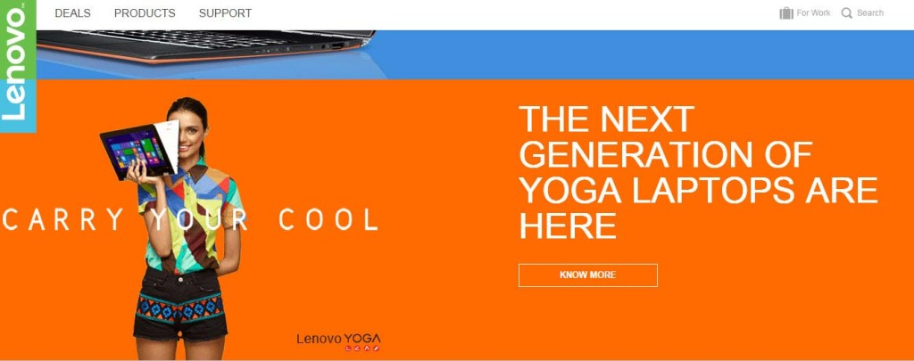
If you made a unique and interesting piece of content and have translated it for users from all over the world, then do not forget to make the images understandable for all visitors to the site. Try to avoid images with embedded text. If your image makes sense but has a key header on it, then your users will not understand it if they speak a different language. Try to place the images separately from the text in order to preserve the entire meaning. Also, pay attention to the cultural differences of the pictures. You can adjust the display of the image depending on the choice of language or country.
Third-party Javascript Elements
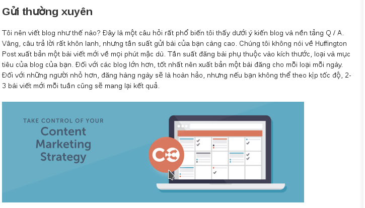
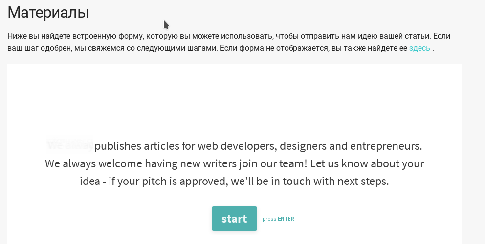
Often, we forget about such an important point. If you host third-party Javascript elements on your site, be prepared that not all of them can be automatically translated. If your user cannot interact with your site because he/she does not understand it, then this is a serious problem for your business. Try to find an element that will be understood by your users in any language and solve the problem you need, or, give up this element altogether.
CAPTCHAs
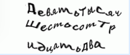
CAPTCHAs helps to distinguish the real person from the computer, thereby protecting the website from spam and various debris. If you want to protect your site from spam and invite users to pass through CAPTCHAs, consider the language features of different people. For example, an American will find it difficult to pass CAPTCHAs in Russian due to a lack of understanding of the language and a lack of necessary symbols on the keyboard. If you still offer your users CAPTCHAs, make it as convenient as possible for them.
Date and Time
Take care of your users to the fullest. Remember the date and time format is different in different countries. It is also worth remembering that some countries follow the Persian calendar while others prefer the Gregorian calendar. Such nuances will show your users the real multilingual support of the site.
There are many more nuances that will help make your site international and, most importantly, user-friendly… but this is the work of programmers. Here, we examined the main nuances of international web design. By observing our advice, you will be able to better cater to your users, making them more loyal to you.
Related Posts
Boost Your WordPress or Shopify Website with Multilingual by Weglot
Best Practices for Creating Multilingual Websites
how to Create a Multilingual Joomla Website
Build Multilingual Sites with Monstroid WPML Compatible Theme [Reason #6]
Don’t miss out these all-time favourites
- The best hosting for a WordPress website. Tap our link to get the best price on the market with 82% off. If HostPapa didn’t impress you check out other alternatives.
- Monthly SEO service and On-Page SEO - to increase your website organic traffic.
- Website Installation service - to get your template up and running within just 6 hours without hassle. No minute is wasted and the work is going.
- ONE Membership - to download unlimited number of WordPress themes, plugins, ppt and other products within one license. Since bigger is always better.
Get more to your email
Subscribe to our newsletter and access exclusive content and offers available only to MonsterPost subscribers.

Leave a Reply
You must be logged in to post a comment.