“Heads or Tails?” Creative Footers & Headers
Couple weeks ago we've already touched upon this topic but in a more general form. The article was called Web Design Trends of 2012, there was a part that was briefly describing so popular this year big headers & footers.
Still web design trend is a very broad concept because different points of view can include various options into this notion.
From time to time web design world is supplemented with something new. In case this new thing is appreciated by the audience, it immediately spreads all around the web like flu in the overcrowded bus. Everyone tries to implement this (already not so) new thing to their website. The same thing happened to the headers & footers. Every article in the web dedicated to 2012 web design states that huge or extremely abnormal (in a good sense) footers and headers are popular this year. But why does it happen? Who states what's popular and what's not, if everyone creates a website to their own taste. Still, copycats live everywhere and it would be better to say: "Let's talk about the most popular things to be copied, today we are going talk of interesting designs of headers & footers."
Heads or tails? Let’s start from the heads.
The root of the word “header” is the head, the most visible and the most important part (for most of us). By making your header bright, and here bright does not mean that there should be used some psychedelic colors - it needs to be catchy/funny/interesting/making everyone say “wow!” than your website will definitely be a success. What's more important, header is the most appropriate place for your logo and contact info, place your phone number or an e-mail an any other contact just one finger below your bookmark toolbar if you're using Google Chrome.
Capture the eye of the user with well designed logos which describe the content of your page. This will serve in the form of a splash page.
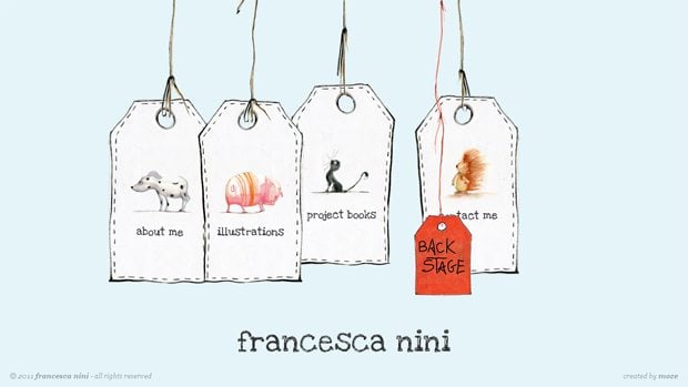
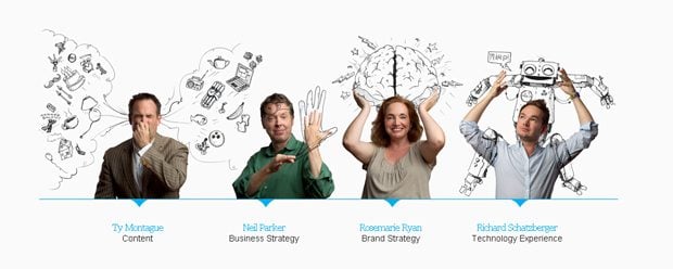
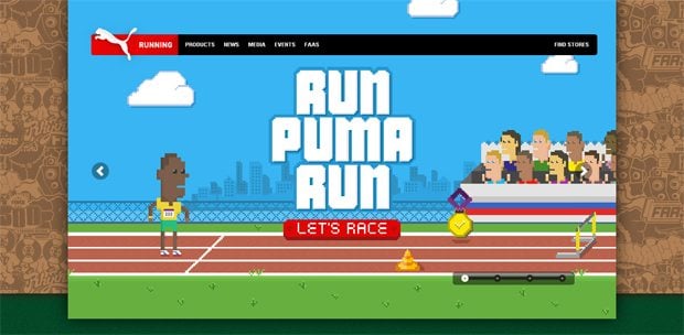
Use Hand Drawn Graphics
Although this is not completely new, yet it is a trend that can be commonly used by several generations of web designers. Still a lot of designers do not include hand drawn sketches due to their inability to draw them. A simple hand drawn sketch can bring more personality to the website and focus the viewer's attention on the graphics.
***
***
***
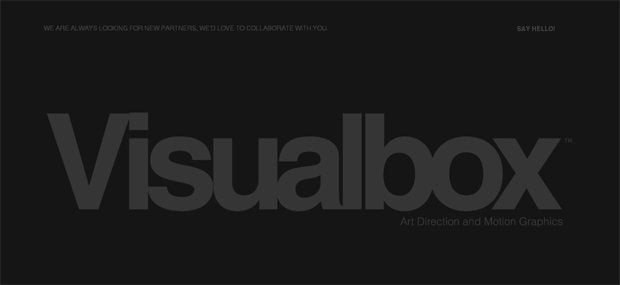
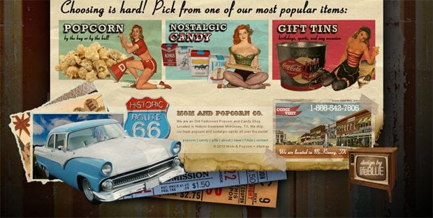
Big Typography
This will bring about a fresh outlook and help get rid of the monotonousness. Web designers are not comfortable experimenting with an assorted list of fonts. This will improve the design and will be more effective than saturating the web content with just images.
***
***
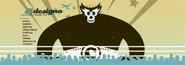
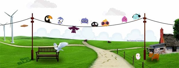
Vector Art in Headers
Websites often feature upbeat mascots that hover around. Implementing these oversized vector images in the form of any avatar can seriously boost the marketing abilities of your site.
***
***
***
Flight of the Conchordes
***
These were some examples of interesting headers, and now let's go down to the basement and see what interesting stuff we can find there.
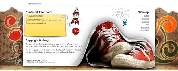
The footer itself plays a supporting role. Most designers pay little to none attention when creating a website, but its wrong. After all, there are usually located relevant info that should not be included into the header of a site or into the sidebar.
The most common element in the footer is Copyright Symbol (©) and the year of the site launch. This sign tells visitors about the author's materials located at the resource. As a rule footer contains contact information, social-media icons, last comments, history of the blog posts and information about website owners.
Making a good footer also needs some good color contrast. The contrasting color in footer section adds a special effect to the page. If the footer is vivacious in color, it can draw the attention.
One more important part of the footer are the "Terms and Privacy Policy" links. If you are providing a service or a product, this is your chance to link to all of the good legal jargon. This is a great self-protective measure and is very important to have. By placing these into the footer users will definitely find it there because it's a very standard location for these options.
Also do not forget to add your site map. It allows users to navigate easily through the rest of your site. This way, if anyone gets lost they can find their way right there in the footer. As many people who are getting lost will scroll all the way down a page, this is the perfect location for that link.
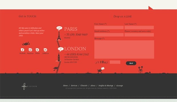
Here are the examples of footers that clearly do not fit into the grey commonness:
***
Allan Dickens
***
***
***
***
***
Afterword
Man steps ahead trying to better already existing forms and create new ones. In the world of web design, changes are a must and congestion is unacceptable. Design needs to be appealing, attractive and related. No matter what you do to your website, changes should improve the viewing experiences of the users.
Don’t miss out these all-time favourites
- The best hosting for a WordPress website. Tap our link to get the best price on the market with 82% off. If HostPapa didn’t impress you check out other alternatives.
- Monthly SEO service and On-Page SEO - to increase your website organic traffic.
- Website Installation service - to get your template up and running within just 6 hours without hassle. No minute is wasted and the work is going.
- ONE Membership - to download unlimited number of WordPress themes, plugins, ppt and other products within one license. Since bigger is always better.
Get more to your email
Subscribe to our newsletter and access exclusive content and offers available only to MonsterPost subscribers.







Leave a Reply
You must be logged in to post a comment.