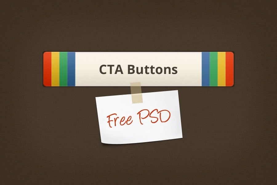
Smart CTAs (call to action buttons) – this is what each well-done design needs for better conversion. They are used to guide the visitors further on the products/services, direct to contacting you, offer to exchange their information with you, warm them up for sales.
Emails, blog posts, site pages, landing pages – CTA buttons are inserted throughout the site, attracting the users’ attention and encouraging them to make an action. There are 2 types of buttons according to their look:
- Simple buttons;
- CTA buttons with images.
These both types of buttons make use of pleasant on the eye color combinations and thought-out design to make the visitors notice them and click. Their look should clearly communicate what exactly the viewers can expect when they click the CTA button. Here are simple rules that each CTA button should follow to be effective:
- Be informative;
- Be hard to miss;
- Should attract attention.
Free Call to Action Buttons
Following the latest web design trends, these UI elements should look clean & clear without obtrusive elements like gloss or extra coloring. The compilation of Free Call to Action Buttons will ease the process of your tiresome finding them all over the web. Skillfully done, in clean effective design, highlighting the action the visitors are supposed to perform, these buttons work for your benefit.
***
***
***
Button
***
***
Download Button + Ribbon
***
Dropbox Sync Button
***
***
***
Signin in with Google Button PSD
***
***
***
***
***
Facebook & Twitter Sign-in Buttons
***
Blue Learn More Buttons
***
Download Buttons
***
Download Button
***
Simple Buy Button
***
Newsletter Signup Form
***
Now, when you’ve seen all of them, you can make the right choice and download the buttons that fit the needed purposes and the style of your site.
