Face Your Project with Masonry. Free HTML5 Theme
Aesthetically pleasing and usable – these are key ideas behind today's freebie. Its design have combined several trends that won the hearts and minds of web audience in 2013.
Masonry layout, clean style, focus on typography – this is how today’s freebie is going to charm and inspire you to redesign your design studio site. There it is – the theme that’s the point of our interest today - Free HTML5 Theme for Design Studio, and you’re welcome to try it for your designs.
Core Features of the Free Theme
Couple of Words About Free HTML5 Theme Style
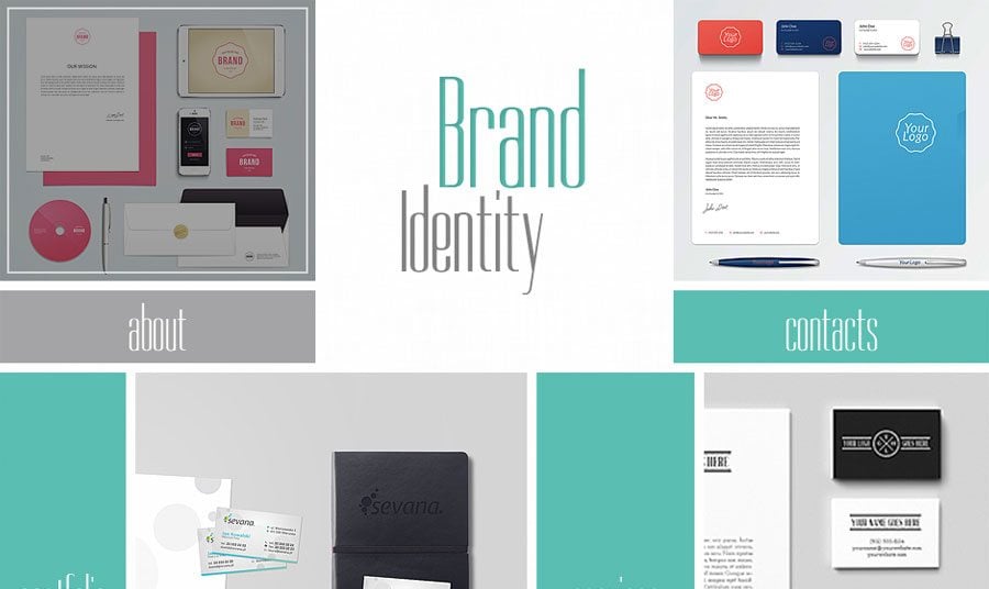
The content centric design features masonry layout for presenting the home page of a site. It can be a web presence of design studio, photographer’s portfolio, personal page of an artist, or any other website you'd want to use it for.
The content blocks are neatly placed around the page, thus look quite clean and well-structured. The menu blocks pop-out against others due to their mint coloration. Other blocks contain featured images from the gallery which you can enter by clicking each of them.
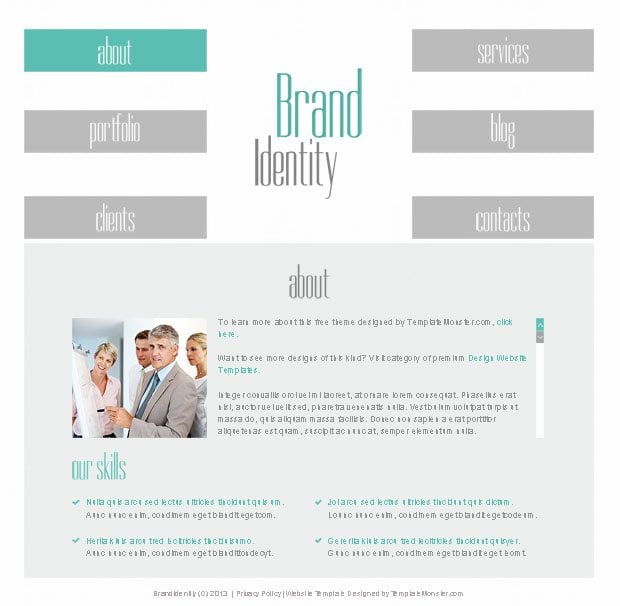
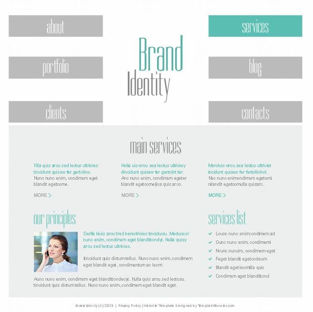
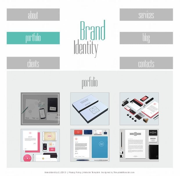
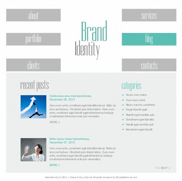
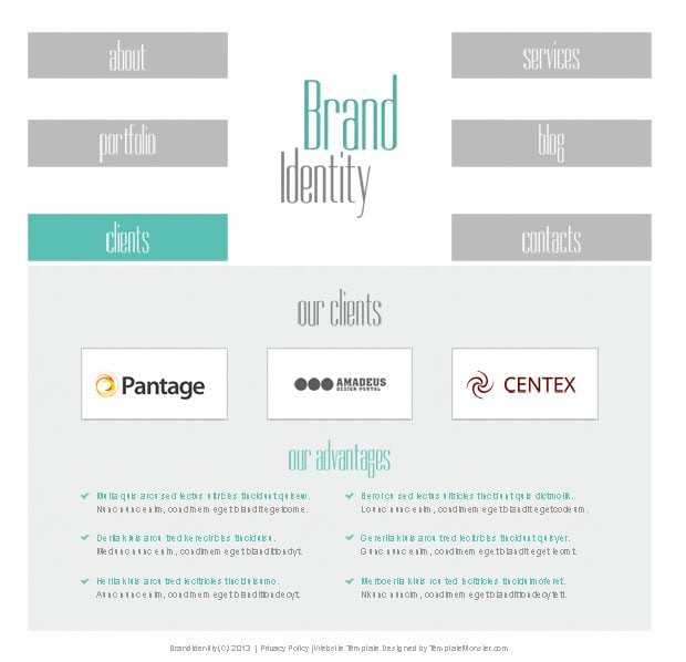
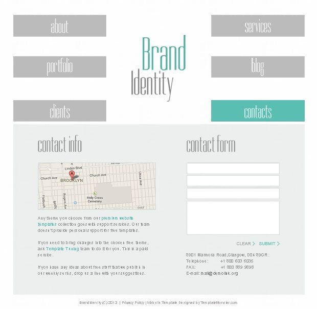
Color variations of this layout make it visually pleasing. Check out the whole set of subpages (featured below) to get an idea about the look of this theme, or see its live demo.
Neat organization of the Home Page can easily tell users what the site is about, or what services it offers. The focus on menu makes it noticeable, along with featured images on other blocks that tell about company's products. Enjoy nice hover effect when working with all these blocks.
Starbis - Multipurpose HTML5 Theme
Get more to your email
Subscribe to our newsletter and access exclusive content and offers available only to MonsterPost subscribers.


Leave a Reply
You must be logged in to post a comment.