


2015 is the year to give web design a bold upgrade. The new trends like Material design, micro-interactions, large hero areas – the<U+0443> are just the beginning. The onrush of technology provides the right circumstances for the emergence of a number of developments that are likely to turn into trends. Fullscreen websites is one of them, and you’re welcome to check them out in this post.
Fullscreen designs refer to layout trends. Split or bi-frontal screens and grid based layouts can also be listed among them. The appearance of so many new approaches doesn’t mean that the look of the sites has completely changed during the last few years. The basic scheme remains unchanged and it consists of the header, footer and content part. Since 2005, when the withdrawal of a standard site structure took place, the position of these elements became less rigid. The sites adopted non-hierarchical content organization, and this approach remains unchanged today. In other words, the fundamental structure for web pages is fixed, but tiny alterations can take place.
Fullscreen design is the one that fills a single screen. Its adaptive design and it fits any type of screen resolution well.
Reasoning from this fact, this trend can be called a subset of responsive design. A large number of web designers make use of full screen images for their websites backgrounds as screen sizes and resolutions are growing and internet speed is increasing.
- clear establishment of content within one page.
- strong focus on the content.
- a click-reach information. Visitors don’t need to scroll up and down to get the desired info.
- lack of scrolling.
- full-width images/videos can be stunning and work as great attention triggers.
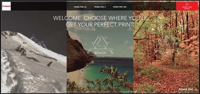
The most interesting fact is how all the information is arranged within a layout in fullscreen websites. It can be a large background image, ambient video background, a full-width slider, a site with horizontal navigation, split layouts where one part is for menu, and the other is for displaying the content. Most often, such sites feature a fixed header and fly-out or burger menu. If you designate a site as a fullscreen one, it doesn’t mean that all its pages are nicely placed within a screen size. If it is a gallery element, it goes without saying, that it takes more space than just one screen.
This trend, and many others that you can find on the modern web, are aimed at making it an exciting medium with which to work with. Explore them, and dive deeply in what the web design really is.
* * *
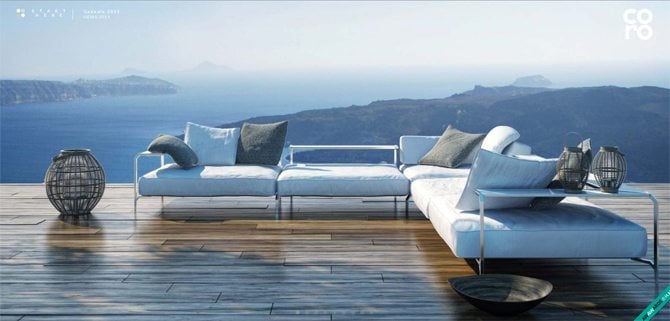

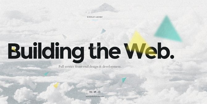
The landing page of this site looks like a huge slider. To view the rest of its pages you have to click a kind of burger menu in the corner.
* * *
Raphael Malka
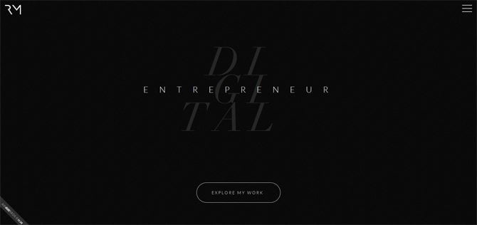

A website with a stylish dark background in diagonal lines, large legible fonts in the center and burger menu, focuses heavily on the layout aesthetics, thus creating a strong impact on the viewers.
* * *
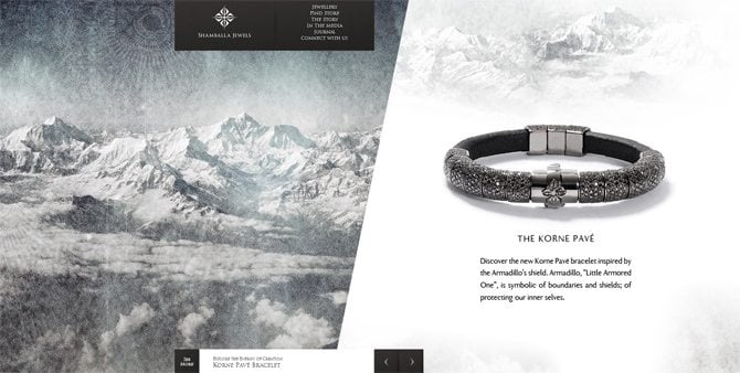

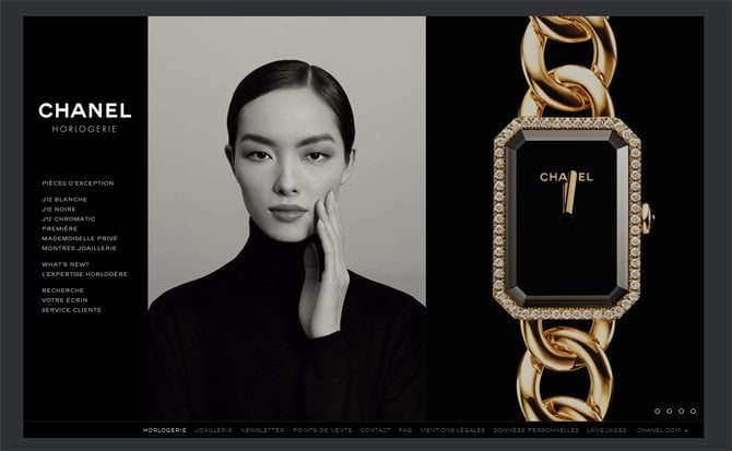
This fullscreen website shows a split layout with a part of its page featuring a large image, and products with short description. Some pages make use of horizontal navigation.
* * *
Hatch Collective
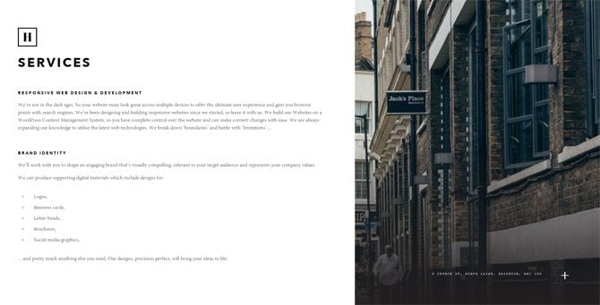

This site welcomes the visitor with a full-width image, ghost call-to-action button and tiny menu sign which, when clicked, enables you to browse a menu in a large pop-up.
* * *
The next site featured a trendy design approach which results in the usage of large background image with Parallax effect, cool polygonal grid and graphic elements.
* * *
Yara'n'Yared
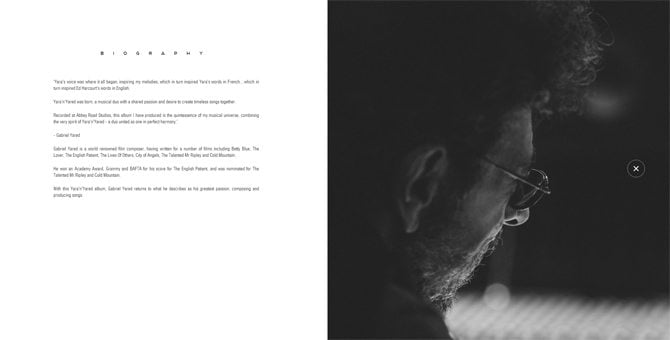

Trendy minimalism is a great choice of most contemporary websites. Here is the one.
* * *
De Haus
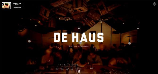

Automatic navigation through all site pages – this is what you’ll see when enter the next website. Being fullscreen, it still offers to scroll to enter the next page. While scrolling you see the pages change one another with all that background images and texts.
* * *


Here is one more “antagonistic” layout. As it was said before, fullscreen designs negate scrolling. This example shows how a scroll can be used to navigate through the menu items and check out all categories presented on the site.
* * *
This cool one-page site, with radial menu, offers you intuitive navigation facilitated by an additional bar in its bottom left corner. Nice transitional effects move the visitors smoothly one page to another.
* * *
Tomas Bata University
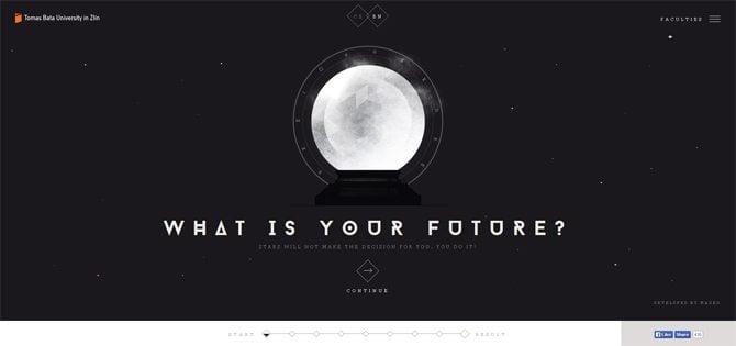

Sleek design with animation effects on the background shows a horizontal navigation which helps browse all pages remaining within one screen area.
* * *
Iambaaz

The landing page of this fullscreen website refreshes the eye with effective video, and the whole site pleases with extreme cleanness.
* * *
Cotonificio Olcese

Fullscreen site with tiny blocks shows how to organize even a huge amount of content within a limited space.
* * *

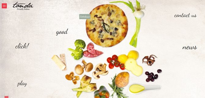
The whole site looks like a large slider that fits the screen size. Burger menu shows in a pop-up window one more page containing information about the site owner.
* * *
Trendviz
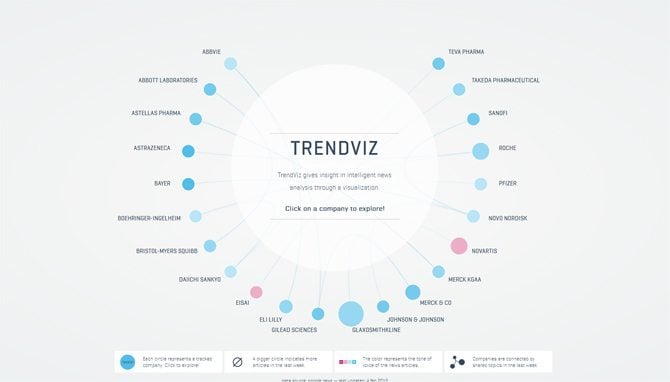

Content-heavy sites can also be fullscreen, like this one with radial menu.
* * *
Background video, Accordion slider, hipster graphics, diagonal elements – this fullscreen website causes a WOW effect the first time you enter it.
* * *

The site welcomes with embedded video, and then offers interactive navigation – the site content moves in the opposite direction to the mouse.
* * *
Here we have a fullscreen website that cleverly arranges information within a limited space, focuses attention on it, looks refreshing to the viewers. It is trendy and hyper welcoming to the audience. If you're going to create a site, this can be a good approach to its design.