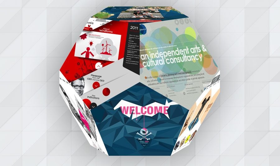
Design of a website can be viewed as a way to deliver content, so taking care of its shaping is a matter of importance. Most of the websites are based on grids, columns, where geometrical shapes are at the core.
Squares, rectangles, trapeziums, rhombuses, hexagons, triangles, circles are the most-used framing elements that you can find in design.
The mentioned above geometrical shapes are used as:
- Navigation elements
- Framing components
- Visual accents of parts of the site
You can notice geometrical shape implemented in design as a figure itself or mixed with others creating original visual effect. Using shapes in design transforms it into extraordinary one with a number of sharp angles. These clean-cut edges (not about circles) are often associated with advanced technology, that’s why are widely used in sites that keep up with the progress.
Website Geometry Now and Then
Not only website designs make use of these shapes, branding, illustrations also find great interest of playing with angles. It is due to the ability of these simple shapes communicate strength, dynamics and movement. Geometric web design calls associations with modernism and something that it up-to-date. Each year designs with certain geometrical figures become extremely popular. Metro style (simple squares of various sizes and colors) in 2013, circular design elements in 2013, diagonal designs in 2011. 2011 year with overall madness about parallax websites brought the same popularity to various shapes that were widely used in such sites (triangles, hexagons, diagonals).
These days, when most designs strive for clearness and simplicity, geometric shapes turn up just at the right moment. Their laconic forms are extremely good for wise arrangement of content and images inside, they don’t overload the layout and make design look well-structured and organized.
Check out examples of geometric web design with simple angular and circular forms. All of them are simple, creative and beautiful, as I see them. Now it’s your turn to enjoy.
HexagonsA lot of designs turned hexed in 2013. It came as a new shape in town after circular website designs and usual squares. The sites became fresh, new and eye-catching. Speaking about psychology of this geometrical figure, hexagon still retains its scientific and mathematical roots and has strong association with nature at the same time (I mean honeycombs). In web design it is associated with strength, flexibility and cutting-edge technologies.
BigBangWP
* * *Passeig de Gracia
* * *Kinder Fotografie
* * *Webey Web Design
* * *AmplifiQ
DiagonalsStandard grids that use vertical and horizontal lines for arrangement of content make any site look well-structured and austere. Diagonal layouts bring the fresh note into site's appearance. Diagonal lines perfectly work for pulling viewers’ eyes from one point of the site to another, they take away “tension” of classic layouts, bringing feeling of freedom. The last characteristic makes them so popular in designs of various creative studios. Check out some examples below and experience how diagonal lines naturally lead attention to navigation and content.
* * *Small Multiples
* * *EDP Renovaveis
* * *Cinqfinch
* * *Lacca
* * *Hyundai Veloster
PolygonsAny closed shape that has at least three sides and angles is called polygon. Regular, irregular, simple, complex – there is a variety of them. This exciting geometric shape style is widely used for creating Photoshop illustrations as well as in website design ( creating a visually effective element.) Polygons are often used as a part of website background, bringing sharpness and depth into it. Designers choose polygon graphics to add some original (sometimes futuristic) touch to their works.
Dare with Us
* * *Mokhtar Saghafi
* * *The Brave
* * *Vagrant
RhombusRhombus elements are also called diamonds. They can be implemented into the layout as separate elements or connected with each other in diagonal manner. The other geometrical figures like triangles, lines, hexagons often accompany rhombuses in such designs. They contribute to the contemporary look of the design.
* * *Jessica Caldwell
* * *Paseo de Gracia
* * *Neo Lab
* * *Mindworks Interactive Agency
CirclesCircle as one of the first human inventions has become a recognizable symbol. It calls associations with unity, wholeness, infinity and it’s pleasant to look at it. Circles catch viewer’s attention quickly, effectively highlighting the chosen elements of the site and pointing out areas to press (circular/oval buttons on touch screens). You can find them in icons, logos, image thumbnails, social and other buttons.
* * *Cultural Solutions
* * *Web Species
TrianglesTriangles are considered to be the strongest shapes in design. Forcing the viewers focus, they can make any composition powerful. Presence of their clean-cut edges in design speaks for their modern or futuristic orientation. These pointy edges were a massive trend not long ago. You can still find some examples of their implementation in designs.
It's hard to find some examples where they are used as a separate shape, more often you can see them as a part of other more complex geometrical figures (rhombuses, squares, polygons.)
Douglas Menezes Design
* * *Yuna Kim
OtherAmong other geometrical shapes, that are used in designs, you can find zigzags, bubbles, trapeziums. Presence of these angular forms as main elements of design allows a site to stand out from others, look modern and a bit futuristic.
* * *Loxageek
* * *Fifteen Robin
* * *Sunera
* * *As you see, geometric shapes perfectly work for enhancing web designs. When used in clean & clear (flat) designs they add modern look and innovative tone. If you have seen any other examples of such websites, feel free to add links in the comments below.
