Understanding Web Design – What is Gestalt Law of Continuity?
Recently, we began posting on Gestalt psychology's theoretical application to web design. I've already described four principles: Symmetry, Similarity, Proximity, and Common Fate. This article is about the Law of Continuity, the fifth Gestalt principle.
Our brain experiences visual lines of elements that are grouped together using the Gestalt continuity law. A line tends to continue in its established direction. In web design, this is one of the most important principles because it has the widest application. The same principle applies to graphic design, clothes design, landscape gardening, architecture, etc. Architecture follows continuity law in all styles, from ancient Greek to postmodern and art deco.
The continuity law may make someone think the pattern "continues" even after the end of the physical pattern itself, i.e. our brain can see the connecting lines between various elements of the design even if there aren't any. By using this brain-function, we can see some elements in a picture that aren't in reality. This is our "personal Photoshop" that fills in some of the picture with elements, so we can see the whole picture. Gestalt psychology tries to figure out how people see patterns rather than individual parts.
As we age, our brain functions slowly fade out, affecting our perceptions and ability to process visual information.
By the way, have you heard our latest update about the new subscription service ONE? If no, keep reading what I’m writing about. The new subscription service ONE can give you a chance to download a lot of templates, themes, plugins, graphics, etc. from ONE package for only $19 a month! Can you imagine how great it is? You don’t need to buy only one expensive template anymore.
You just join the subscription and download any items you want to and download them with no restrictions and limits. Then, you can choose the best one and apply it to your website. Check out what HTML Templates are available now in the pack. If you are a blog reader, use the promo code BecomeThe1 to get a 5% discount.
Shapes have edges that extend into space and meet other shapes or edges of other planes. In this example, we're more likely to follow an established pattern rather than deviate from it. Rather than four lines meeting at the center, we see two crossed lines.
Compositional elements that are connected by lines, edges, or directions that create a sense of continuity.
According to this principle, lines tend to be perceived as continuations of established directions. In other words, when we perceive contours heading in a direction, we tend to keep following them. There's a continuation of each line when two lines intersect.
The Law of Continuity Creates Hierarchy
When you're done experimenting with your design features, evaluate if the information you presented is easy to comprehend. Make sure you don't use too many different design instruments at once, as distract the user. Visual cues should only be added when they're needed.
According to the law of continuity, items arranged in a certain row or direction are considered a group. As you can see in the following examples, the main menu items and vertical submenus are also in columns. Law of continuity strengthens the perception of grouped items. Just move the submenu items a few pixels to the right and place them closer together and they'll look like a group.
Our eyes are invited to follow something that guides you – this principle is applied in all medias especially in advertising. Without any arguing we usually let ourselves be guided by previous objects or recognitions. Following template visualize this principle:
Following the girl’s glance we will stuck our eyes upon the headline with some additional information
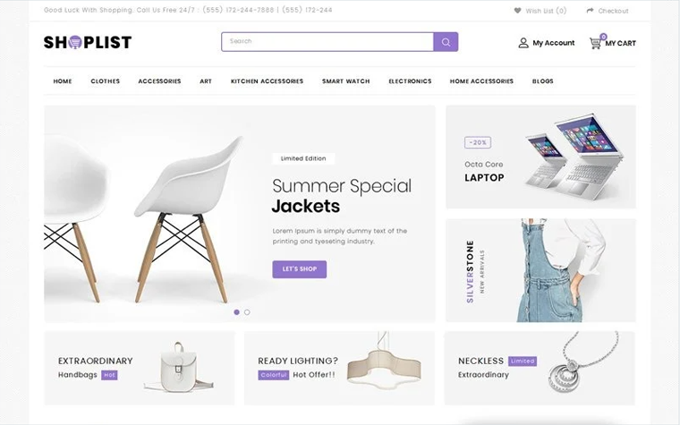
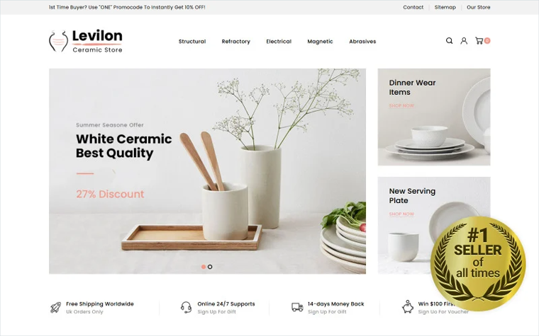
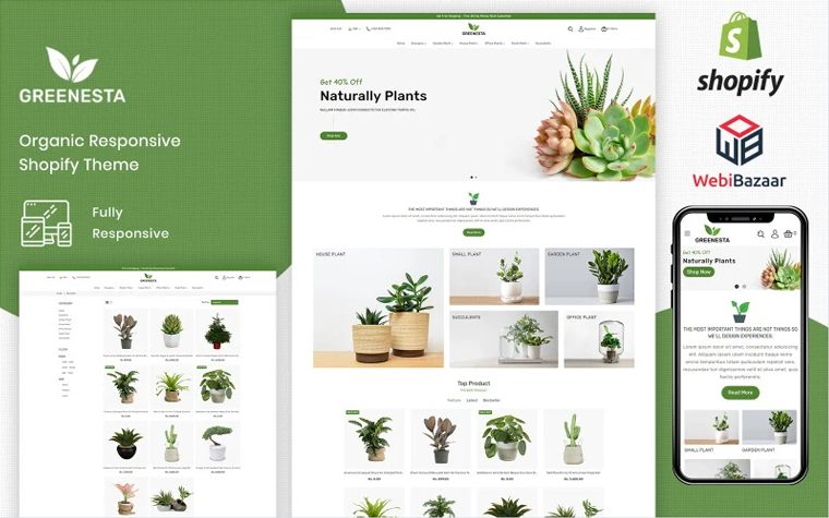
These brushes visualize examples of products available in this store.
Apparelix – Extreme Sports Store Shopify Template

Apparelix Vegan Shop Shopify Template

Apparelix Shopify Template for Print Store

There's a sense of symmetry going into the perspective with the lines of the underground and the train.
Both the design and the content aspects of elements can use the Law of Continuity. If elements are arranged along a continuous line, the eyes can easily follow them, so they are perceived as one. As well as logically following elements, visually following elements are also seen as units.
When our designers create templates, they place elements in the layout so that users can easily guess that these elements are part of a group. Each of these elements shares a common direction line and is easy to trace. Find "these lines" in your everyday life and understand how they affect you.
The Law of Continuity FAQ
The Gestalt Continuity Law explains how our brain experiences visual line of elements that are grouped together. There is a tendency to perceive a line continuing its established direction.
There are 5 Gestalt principles. We’ve already described all of them principles: Symmetry, Similarity, Proximity and Common Fate.
The person who is looking at it, that the pattern "continues" even after the end of the physical pattern itself, i.e. our brain can trace the connecting lines between various elements of the design if there are none.
The law of continuity says that items placed in a certain row or direction are seen as a group. In the following examples you can see the main menu items and vertical submenu items that are placed one under another are placed in column as well.
Don’t miss out these all-time favourites
- The best hosting for a WordPress website. Tap our link to get the best price on the market with 82% off. If HostPapa didn’t impress you check out other alternatives.
- Monthly SEO service and On-Page SEO - to increase your website organic traffic.
- Website Installation service - to get your template up and running within just 6 hours without hassle. No minute is wasted and the work is going.
- ONE Membership - to download unlimited number of WordPress themes, plugins, ppt and other products within one license. Since bigger is always better.
Get more to your email
Subscribe to our newsletter and access exclusive content and offers available only to MonsterPost subscribers.









Leave a Reply
You must be logged in to post a comment.