

Responsive design is an innovative way of handling the layout of the website on different devices to fit as per the screen resolution. The most challenging part of designing responsive website is to decide on ‘how to display navigation menu’. In this blog, we shall discuss top 3 ways of showcasing navigation menu of a responsive website.
The concept of Responsive Web Design, once a trend, is now the reality of design expression. This word from Ethan Marcotte in 2013 has revolutionized the entire web design industry. It brought forth some drastic changes in navigation and interface for providing consistent user experience across multiple devices.
Living in the Post-PC era where usage of smartphones, tablets, wearables and Smart TV has become a part of daily routine, having a responsive website is a mandate. It is quintessential to provide consistent and seamless browsing experience to users, irrespective of the device they use to access the website.
Let’s understand the basics of responsive web design to know of the possible ways for optimizing its navigation menu:
What is Responsive Web Design?
Responsive is an approach to designing the website that automatically responds to the screen resolution of multiple smart devices. This is more of a design philosophy that provides an opportunity for designers to control the look and feel of a website when opened on the desktop, laptop, mobile, tablet or Smart TV.
This design method allows website layout to magically adjust itself to the size of the window.
Responsive websites have emerged as a result of the growing demand of clients requesting for building web pages loading with a perfect layout in almost all types of devices. To deal with such challenge in an increasingly complex world, designers turn to the responsive approach of website design.
Popular Ways to Handle Responsive Website Navigation Menus
Among all web design trends, the responsive approach has taken the mainstream. Following are some popular types of responsive navigation menus patterns that are user-friendly and ensure seamless flow of information:
Hamburger Menu
In this digital era, it is hard for you to not have come across a website with hamburger menu. Whether to use hamburger menu for the responsive website is still a topic of debate for UX designers. Let’s know what’s the buzz all about:
How Did Hamburger Menu Come into Existence?
Finding its roots in the mid-00s, hamburger menu emerged from diverse needs of UX, UI and web designers:
- It avoids distractions on the main screen by hiding all options under 3 stacked line icon. This option of navigation menu saved screen space and helped the user in focusing on core functions displayed on the main screen.
- Hamburger menu option does not overload user with choices and leaves no scope of confusion. The user can expect a clean and unobtrusive display in case of hamburger menu.
- This is a simple navigation that lets users point in the right direction towards making a conversion by eliminating extraneous options.
Why UX Designers Avoid Using Hamburger Menu?
After trying and testing the results of hamburger menu, UX experts have figured out following problems:
- Discoverability becomes low: Some people cannot recognize the icon unless it is supplemented with menu’ label or tooltip. Content visibility drastically reduces as users are clueless on where to look for information as the content is hidden under the hamburger icon.
- Clash with platform navigation: Hamburger menu clashes with default navigation of some platform, iOS being the popular one. For example, there is a clash of ‘Back’ option and ‘hamburger’ icon to display in left side corner on the screen.
- Increase in navigation time: User has to make multiple clicks to reach the desired page or access the required option. Browsing through multiple pages increases the overall navigation time and task difficulty ratio, which may not be appreciated by the end user.
A/B Testing of Hamburger Menu: Case Study of Beamly
To know the effectiveness of hamburger menu in comparison to other visible navigation types, let’s take an example of ‘Beamly’ website (formerly Zeebox) that conducted A/B testing on their UI designs:
A: website with side navigation (hamburger navigation pattern)
B: website with top navigation (visible navigation pattern)
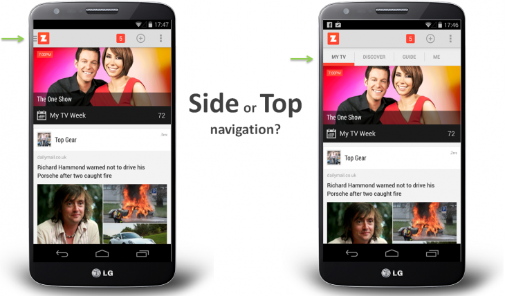

- Replacing the top navigation bar with a sidebar featuring a hamburger menu icon, the user engagement suffered half of what it was originally.
- Weekly results of engagement were significantly higher for top navigation bar compared to the sidebar.
Though hamburger menu gives a cleaner look to the website, it is not always the best choice for responsive websites. Beamly continued with top navigation website design after a successful A/B testing.
When to Use Hamburger Menu & Best Practices for Implementing It
Usage of hamburger menu has always been a topic of debate for UX experts. While some suggest using this navigation menu, others prefer to avoid it. However, there are times when hamburger menu proves to be an ideal choice. Following pointers discuss the best practices for implementing the hamburger menu:
- Use primary navigation as ‘on screen CTA button’ and secondary navigation in form of ‘hamburger option’. The best example is Uber that highlights its primary functions directly on screen and hides secondary ones behind hamburger icon:
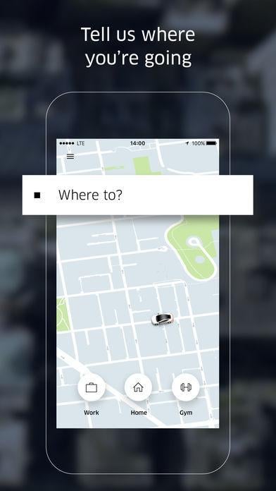

Image Courtesy: Uber
- Design the hamburger icon in a way that it is obviously noticeable and implicitly tells users about the navigation options hidden inside these three stacked lines.
- Accompany your hamburger icon with a strong CTA line either in the header or within the body of the page. This step overcomes the low discoverability issue of hamburger icon.
- Draw user’s attention to hamburger menu by making it attractive using animation, vibrant colors or other visual tricks. Styling the icon like a button helps users in understanding that this menu is clickable.


Alternatives to Hamburger Menu: Beyond Hidden Navigation
To rise above the criticism of UX experts and avoid the risk associated with hidden navigation options, use alternative methods that have proven good results. Let’s discuss other patterns such as bottom navigation bar, on-screen toggle, and vertically elongated menus along with real-world examples:
Bottom Navigation Bar
This navigation pattern is designed considering the accessibility of features within the reach of the thumb. This type of navigation is powered by ‘intelligent UX’ and ‘user-friendly interface’. This navigation pattern makes it easier for users to understand the page they are landed upon and what other options are accessible from there.
Example:
This pattern has evolved as the recent trend with ‘Facebook’ and ‘YouTube’ adapting this navigation type.
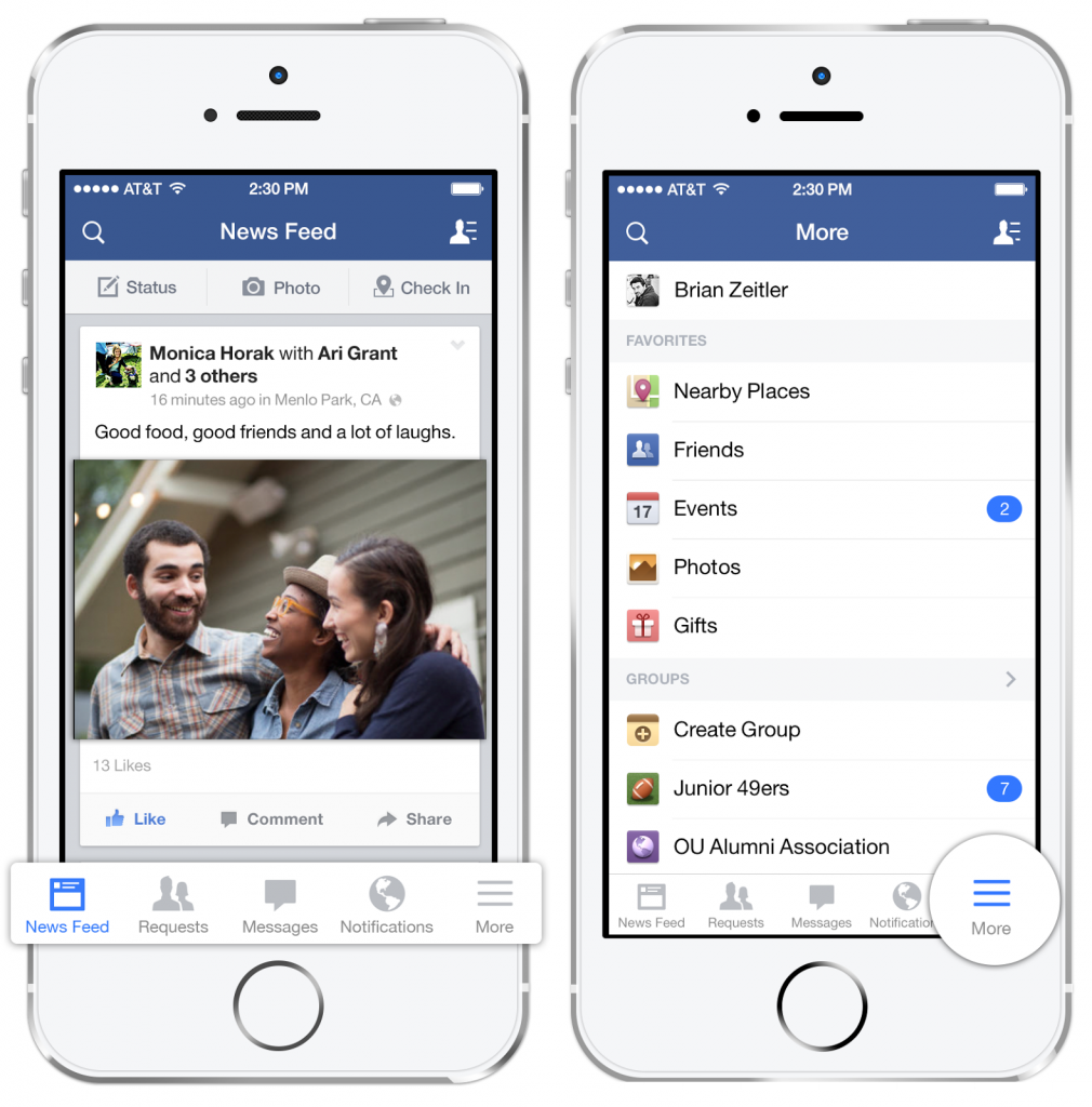

Image Courtesy: TechCrunch
On-Screen Toggle
If you want to save some extra room on the screen yet enable users to toggle the subsections easily and see the contents within, an on-screen toggle is just the right option. Using small viewports, this pattern handles simple two-level navigation structures.
This navigation allows the user to open and close the main menu that too without any redirection to another webpage. This is the most stable and controlled navigation pattern where even the sub-menu options can be toggled from the same page.
Example:
Starbucks - a popular American coffee company and coffeehouse chain uses ‘on-screen toggle’ navigation pattern for a mobile version of the website.
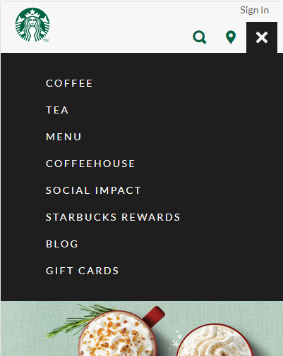

Image Courtesy: Starbucks
Vertically-Elongated Menus
This is one of the cleanest solutions that uses vertical display menu for the convenience of users. This type of responsive navigation leaves no scope of confusion and makes the website extremely easy to tap and browse. In fact, this is the perfect fit for websites whose main menu contains sub-menu that can be conveniently adjusted in small screen size.
Small screen size makes the horizontal menu of website look untidy and messy. The vertically elongated menu is a solution to this problem that realigns the menu in a vertical format – all options placed one below the other with efficient utilization of entire screen.
When menu options are displayed vertically, it becomes easier for users to read them compared to the more compact horizontal menu. The clean grid structure menu makes the links simpler to tap and easier to browse.
Example:
The non-profit organization named Hirondelle USA uses a vertically elongated menu to give a simple and clean look when opened in the mobile browser.
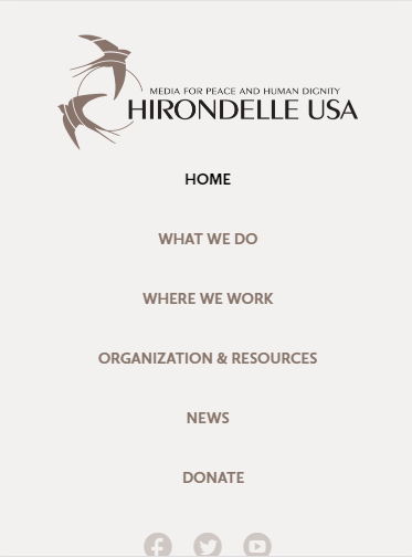

Image Courtesy: Hirondelle USA
What to Consider Before Deciding on Navigation Menu of Responsive Website?
Following are a set of questions you need to ask the client before moving on to building responsive website design:
- What’s your strategy for information architecture?
- What is the major area of focus in the website? Content or Images?
- Who is your target audience? How tech-savvy are they?
- Does navigation and flow of webpage align with user’s goals in visiting the website?
The main purpose of asking these questions is to analyze the primary purpose of building the website. Only when the purpose is clear, designers can decide on the navigation and overall flow of information and media. Navigation structure of menu should be such that users have access to major options on the screen, no matter on which page they are landed.
Understanding the purpose of navigation and significance of information architecture in your website helps in deciding which navigation pattern to follow. Though most companies take the correct decision of building a responsive website, hardly some of them succeed in implementing it properly. Providing an exceptional experience for different screen resolutions requires implementation of best responsive web design navigation techniques.


In a Nutshell
The argument of whether to use hamburger menu on the responsive website is vague if not understood with overall context and suitability. When the flow of webpage demands a better alternative that could simplify the workflow of a user, consider choosing other options. The alternatives discussed in this blog are not exhaustive as there are diverse solutions to fit all instances. A well-designed website with appropriate menu navigation enriches the overall aesthetic value and stands out from the crowd.
The best way to measure the usefulness of responsive website design is to analyze the ease of transition between mobile and desktop layouts. One thing to keep in mind is that user behavior and needs change over time; thus websites have to be continually reevaluated to adapt to the current market trends.
Read Also
How to Add More Navigation Menus to Your WordPress Theme
How to Build a Slide-Out Navigation Menu With CSS & jQuery
The Ten Best WordPress Navigation Menu Plugins for Your Website
Code a Path-Style Flyout Navigation Wheel Menu
Creative and Innovative Eye Catchy Website Navigation Design