Choose Your Axis: Y or X! Vertical and Horizontal Scrolling, Which one is the Future?
Browsing various websites on the net, you can notice that greater part of web projects are presented as vertical scrolling websites and horizontal ones are not so widely used. The only logical explanation is that this design will not fit every single website and it’s quite important to understand when it’s necessary to use it and when it’s better to avoid such non-standard scrolling.
But from other side, if you’re striving for creative and unusual design – horizontal scrolling is a great navigation solution for your website. For example, you can create unusual shapes and forms of text information, insert impressive photo gallery with different images that change one another in some interesting way. Either you can create some advanced animation that will be interesting journey through your website. In this case visitors will find such website more attractive, catchy and entertaining than regular ones.
Statistics shows great popularity of vertical scrolling and its simple usage. So if you plan to build website for a blog, forum or online store you’d better choose vertical scrolling. But if you’re creating design for your portfolio, photo gallery or any other presentational projects – horizontal scroll will be the perfect complement to your design.
But still, let’s make a step back a have look at all these websites from another point-of-view. What is the most important thing in every website? Of course it is usability, and what we see when browsing through one of these websites – mostly, they are not usable at all. One has to make extra movements to scroll the page while vertical websites require you to move only one finger. But this is just a matter of time, brainy developers will find the way how to scroll these websites without moving the mouse all over the table.
Some designers think that the future is a horizontal rectangle, but let’s face it there was a time on the Internet when .jpeg was not a format non grata, because it caused slower load times, but still time passed technology got more advanced, designers became more and more creative and users were adapting their brainchildren.
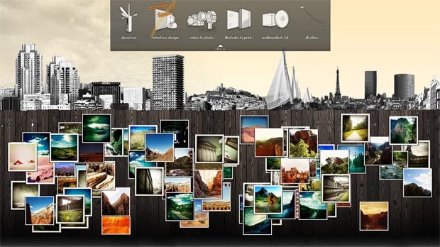
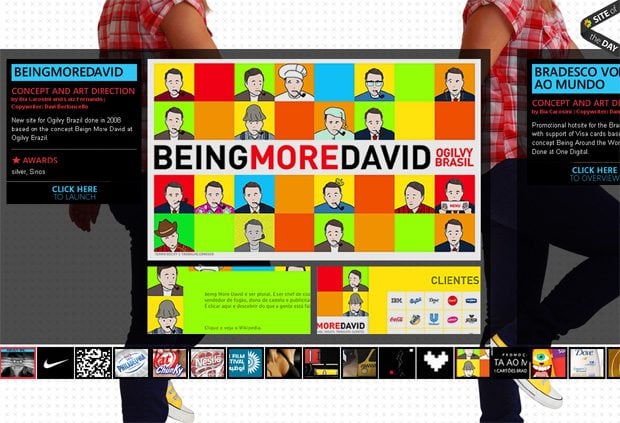
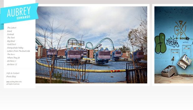
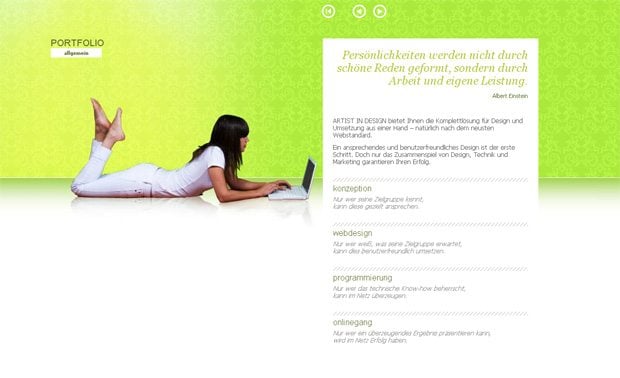
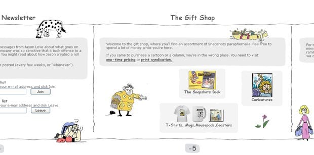
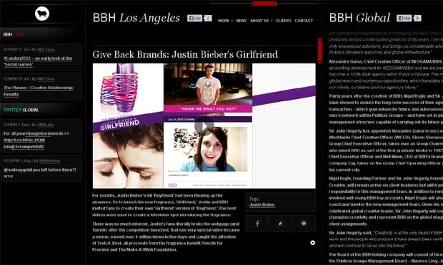
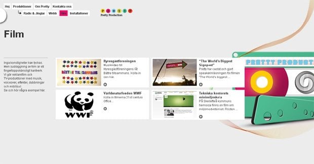
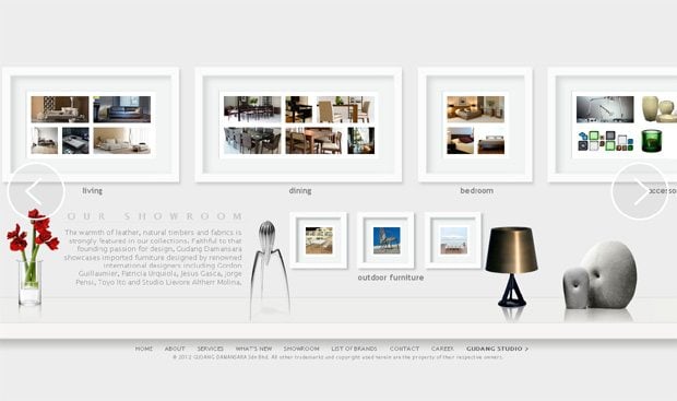
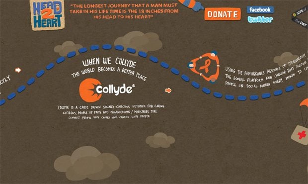
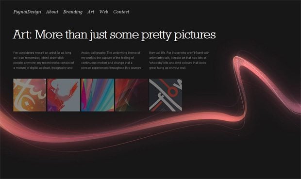
But these are just words and now let’s have a look at this striking collection of live websites which demonstrates horizontal scrolling as the main advantageous element of design:
* * *
* * *
Bcarosini.com
* * *
Thelostthing.com
* * *
* * *
Artist-in-design.de
* * *
* * *
* * *
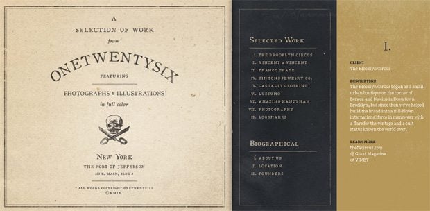
Onetwentysix.com
* * *
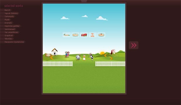
Gelisiguzel.com
* * *
* * *
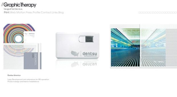
Graphictherapy.com
* * *
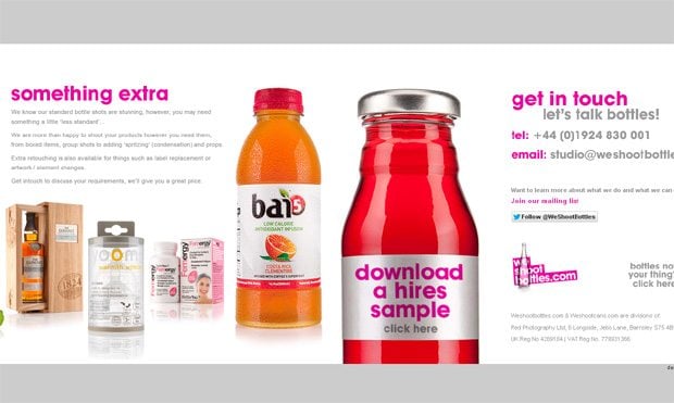
Weshootbottles.com
* * *
* * *
* * *
* * *
* * *
* * *
* * *
* * *
Gudanghome.com
* * *
Ericj.se
* * *
* * *
* * *
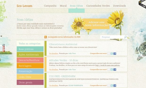
Experiencialecom.com
* * *
* * *
* * *
* * *
* * *
* * *
Making conclusion, it’s necessary to mention that your web project’s topic and its design should be the main basic components which you should take into account when choosing the most suitable type of scrolling. Remember that everything is good, but in moderation.
Don’t miss out these all-time favourites
- The best hosting for a WordPress website. Tap our link to get the best price on the market with 82% off. If HostPapa didn’t impress you check out other alternatives.
- Monthly SEO service and On-Page SEO - to increase your website organic traffic.
- Website Installation service - to get your template up and running within just 6 hours without hassle. No minute is wasted and the work is going.
- ONE Membership - to download unlimited number of WordPress themes, plugins, ppt and other products within one license. Since bigger is always better.
Get more to your email
Subscribe to our newsletter and access exclusive content and offers available only to MonsterPost subscribers.









Leave a Reply
You must be logged in to post a comment.