

If you open any website gallery like Best Web Gallery, you will see that all (well not all, but major amount of) designs showcased there will be flat.
Flat is here, flat is there, anywhere you look on the web you will see flat websites. Only those created earlier than 9-12 months ago will not be flat.
Flat design has arrived as the preeminent stylistic trend in interface design today. From startups to news that Apple's IOS7 will be Flat, it seems this trending pattern in visual display of content will be the dominant style for the foreseeable future.
- Kyle Stalzer

* * *
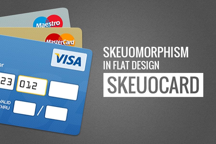
We’ve already said much about flat design, and it seems we’ve already said everything we could. So let’s give honors to the so beloved skeuomorphic design elements. Even though flat design is highly promoted on the web, everyone misses those skeuomorphic elements. That’s probably the reason we have something like this...

Web designers call them SKEUOCARD. This is some sort of a tribute to the so-loved skeuomorphism.
This trend describes a method when design borrows some features from the past (or from the real world) even when there is no functional need.
The Problem of Skeuomorphism
The only problem of skeuomorphism can be described with one word "overuse".
When all those textures and realism are used badly this can turn into an ordinary bad taste. After all, even in real life artificial leather and artificial wood is not considered the sign of a good taste. So why it should be any different on the screen?
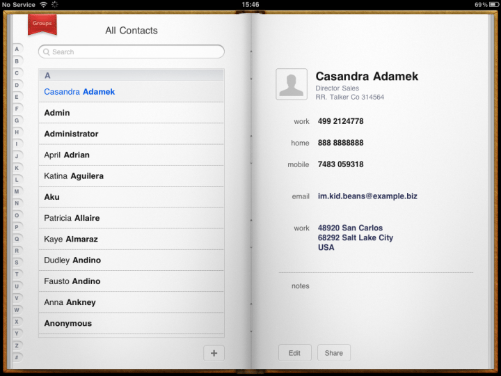
There is also a problem in a misinterpretation of skeuomorphism: for example, making something look like a physical object, but not work like one is also called "sinister valley" in UI design.
A good example was an iOS application "Contacts" for iPad (before it was flattened in the latest version of iOS), which used a visual image of a book. But unlike iBooks, Contacts did not allow to turn the pages to the left and the right, which completely violates the image of the book.

* * *
Restrictions of Flat Design
Like any other design trend, flat is likely to be used-up. Well, because many designers will move to the side of a majority, without thinking about the choice. But if the primary aim of skeuomorphism was a good taste, the excessive use of minimalism can lead to serious misunderstandings in usability.
Users got used to rely on a large number of subtle hints that accompany them through the entire interface: small gradient on buttons, rounded corners, soft shadows internal fields to fill in, and the "floating" above the rest of the content navigation bar.
Remove all these hints, and you have a flat world in which all elements are suddenly on the same level, knocking you to the collision: Is it a button or it’s just a banner? Should I click on it?
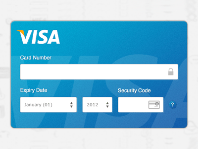
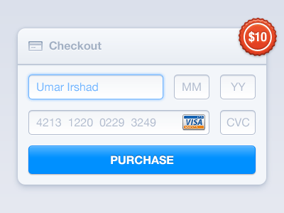
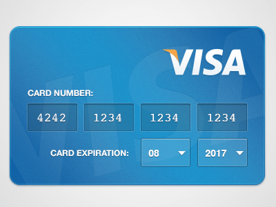
Skeuocard: Payment UIs
This is all about skeuomorphism, everyone wants it and misses it. And finally it found its way into the flat design. How exactly this happened no one knows. But finally we have a tiny bit of those things we miss so much.
These skeuocardsare very practical: one can adorn the payment process on the check out page and make the credit card validation step look like actual credit card. Or to make a contact form look like a credit card (this will work for credit card companies or resellers.)
This is an example of a Skeuocard plugin - it's free, so you can use it in your checkout process.

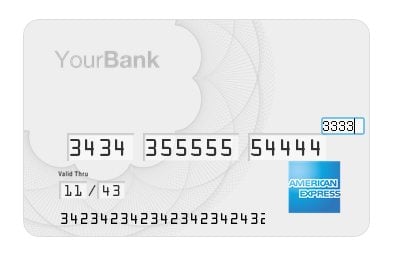
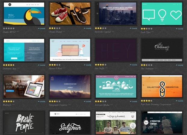
Have a look at some design examples from Dribbble.
* * *
* * *
* * *

* * *
Looking at these skeuocards, we can see that flat design trend haven't yet 'hit the glass ceiling'. There is still space for more developments and visual upgrades.
SPEAK UP! If you're a supporter of skeuomorphism, will you use skeuocard at your checkout? Use the comments to give us an answer.