Simon Morgan
Simon is a TemplateMonster sales operator who helps small businesses and startups by day and passionately rocking on the stage with his bass guitar by night. Simon is a truly creative spirit and idea generator who can draw almost everything he imagines.
Choosing a theme might look like a pretty simple task. Well, “I need a theme that just looks great”, you’ll say. But when you start, you’ll understand that it’s just the tip of the iceberg. I will show you how deep the rabbit hole goes...
You’ll Learn About:
- PrestaShop themes developers
- Support
- Documentation
- Updates
- Valid coding
- SEO friendliness
- Responsiveness
- Crossbrowser compatibility
- Editability and customization
- PrestaShop Theme features
- Design trends
1. PrestaShop Theme developers
It doesn’t matter whether you are ordering a custom design or purchasing a pre-designed theme for PrestaShop, you need to check with whom you are working. So don’t forget to learn more about the company or person you are going to deal with. You wouldn’t give money to a stranger on the street, so why would you do that on the Internet? Here is what you should do:
- Check the company information. When was it founded? Where is it located? Did it win any awards in its field?
- Find the testimonials section on their website and read them.
- Research this company on the Internet: check reviews and opinions of regular users.
Finally, look through their terms of service, privacy policy, etc.
2. Support
Who will you contact if something goes wrong with the template? That’s right, the company which developed it. Do they have support? Better check that before you place the order, otherwise you are taking a risk of finding yourself alone in the middle of a desert with a broken car. Sad situation.
If they do have support, what kind of support is it? Is it 24/7? Is it free? Is it time limited? What channels do they work through: chat, email, phone? Never thought of it this way? You should, because support is a life belt if you suddenly face difficulties with the website.
3. Documentation
Besides support, it is also recommended that you check whether the template package includes documentation. The theme should include instructions on how to use each of its specific features. If the template is not documented, it raises suspicions as to whether the developer is reliable enough. Would you buy a washing machine without a manual? Same here.
Furthermore, ask for access to documentation before you purchase the template. This way you will see how to work with the template prior to ordering.
4. Updates
PrestaShop is an engine which is upgraded and revamped by developers all the time. That is how they improve the product. If you are going to use the theme for a long time, check whether it comes with updates for future versions, and if these updates are free or paid.
5. Valid coding
Here I go down this road again.This page will never be turned. You always have to check whether the template is properly coded. Valid HTML and CSS. You can do it pretty quickly using various online validators, no need to be a coder:
- https://validator.w3.org/
- http://www.htmlhelp.com/tools/validator/
- http://www.css-validator.org/
6. Responsiveness
Do you have a PC or laptop handy all the time? Probably not. Why would you? No need to roam around the city with several pounds of steel and plastic when you have a smartphone that is 10 times lighter.
But what if your website is not optimized for mobile devices? Users will just avoid it. So make sure your website is mobile friendly. You can do that using online validators like:
7. SEO friendliness
You need to check whether the theme is initially SEO friendly to make sure it doesn’t kill your chances of ranking high in search engines. Here are a few online tools to test SEO of the template/website. They will show you mistakes and suggest fixes:
- https://www.pluginseo.com/
- http://seositecheckup.com/tools/seo-friendly-url-test
- http://www.powermapper.com/products/sortsite/checks/seo-checks/
8. Crossbrowser compatibility
Creating a website requires a well-thought-out strategy. One of these strategy points is to think about how users will reach your websites. We have already mentioned responsiveness to make your website work with mobile devices.
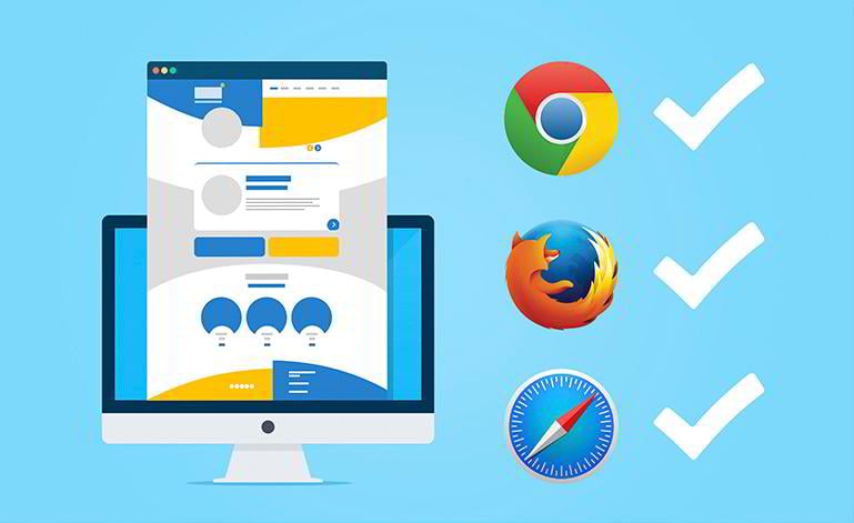
Nevertheless, you also need to make sure your website works and looks great in all browsers (e.g. Google Chrome, Mozilla FireFox, Safari, IE, Opera). You can quickly check browser compatibility using this online tool: http://browsershots.org/
9. Editability and customization
Would you buy a house which you wouldn’t be able to refurnish or redesign? Same situation here. Check what you are allowed and not allowed to change. Of course, it’s better to go with a theme where you can edit every tiny element.
Alright, being able to edit everything in the theme is good… but how will you edit it? Is it all hard code or did developers add extra tools for end users to avoid dealing with code when it comes to simple adjustments?
By the way, documentation will help you to answer this question as well, so pay close attention when looking through documentation.
10. Template features
The PrestaShop platform provides the initial functionality, but a developer can add something to it. For example, a special section for product videos, additional payment or shipping gateways, extra modules for customization, blog, etc.
You can always ask the theme developer or company representative to give you the list of extra features that come with the template. They should also be mentioned in the documentation.
11. Design trends
This is a tricky one. Web design is pretty similar to fashion. It can change drastically from year to year. Not so long ago we had rounded shapes and textured backgrounds, but today we have sharp corners, clean and flat design.
So, prior to ordering a theme, check modern web design trends. Yes, they might differ from what you personally like, but that’s what the majority of people prefer to see today. The exception is if you are developing a web store for a specific audience whose taste doesn’t match modern design trends.
But let’s take a look at what modern design is. I won’t bother you with a long and boring description, so check the list below:
- Clean colors - not more than 3 colors, one main color prevails; colors are light and easy to look at
- Flat design - square or rectangular shapes, sharp edges, no blocks, website must look flat
- Images oriented design - full-screen images, background HTML videos
- Parallax -when you scroll, an element and its background move at different speeds
- Lazy load - website elements appear on the page only when you scroll down to them
typography - the term “flat” can be used here as well; fonts have to be sharp, wide and readable - Minimalism - it is the key feature of today's web design
Finally, we’ve reached the end. Lots of information, but it is vital to choose a theme that matches all these criteria. To cut a long story short, take a look at the themes from TemplateMonster. They meet all the requirements listed below. Do you have a question or have you noticed something we’ve missed? Write to us in the comments below.


