How to Create Parallax Effect with Pure CSS
Once upon a time, I took a project on Upwork to design a site for a party planning company. The client wanted it to be cheerful and convey the atmosphere of fun and joy. To meet his requirements, I did a lot of work, particularly mixed bright colors, picked up lively icons and geometric typefaces, added subtle textures and breathtaking images, etc. I polished literally every inch of my design, which took me so much time. And guess what... The client rejected my work.
He said all of that wasn’t enough to engage prospects with the story of his company. After an hour-long heated discussion, I understood that he wasn’t the one who would back down. So, I had no choice but to look for other ways to get readers involved in the content. On Quora, some guy mentioned a parallax effect as one of UI trends that made the evolution of web design.
It seemed interesting, so I decided to learn more about this technique and did the right thing. For using it in my design, the client rewarded me with a bonus and kudos in testimonials on Upwork. Would you like to spice up your designs with parallax too? Learn how in this post.
First, let's find out what this popular effect in web design is all about. It makes the background image move at a slower speed compared to the foreground as you scroll down the page. In this way, it gives the pages the feeling of depth and makes them look more dynamic.
Parallax can be used for both separate images or the entire layout of the website. It is quite a universal solution for any project. Take a look at the samples below:
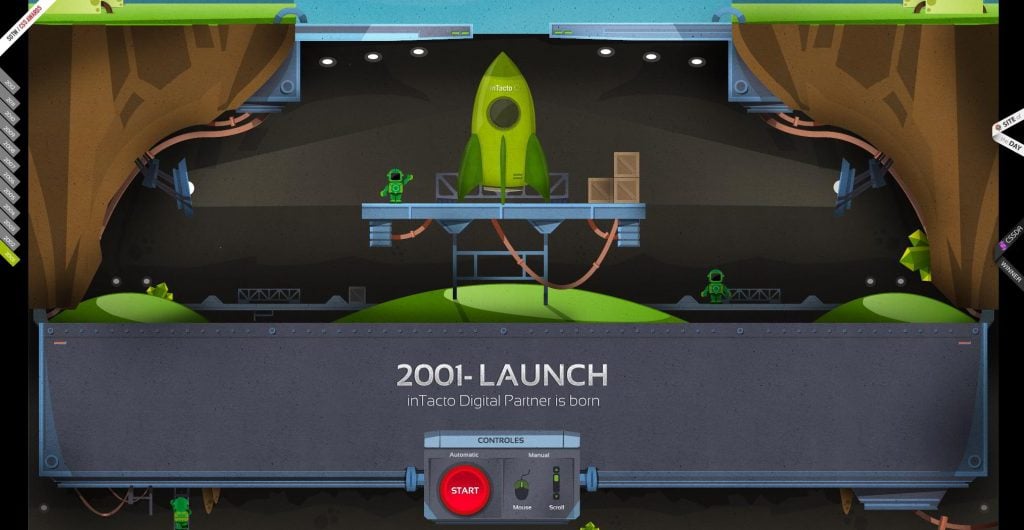
Intacto
Here is a great example of an interactive timeline page. It looks quite cool ad dynamic and is a great solution for showcasing the "About" section of the site.
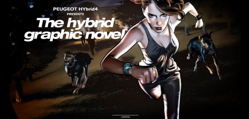
Graphicnovel
A comics like page from Peugeot company is another great alternative to introducing new products to a wider audience. The company created a short story to advertise their hybrid model.
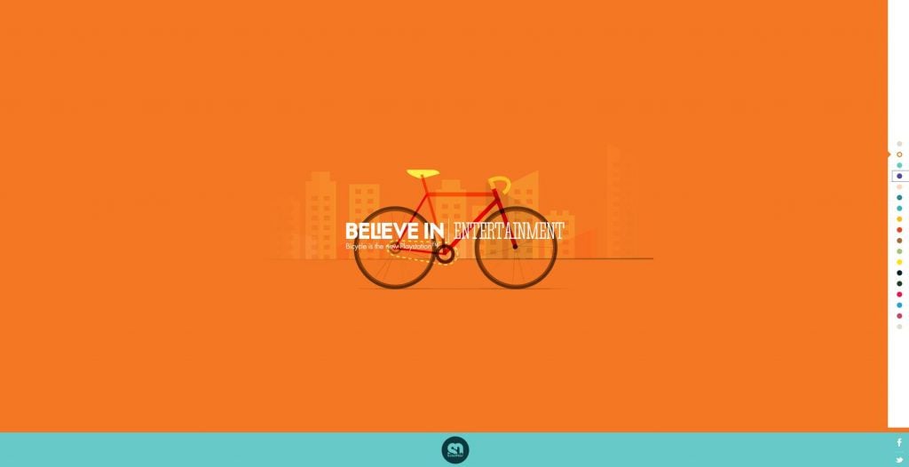
SoleilNoel
An attractive and at the same time fast website with smooth parallax scrolling. This kind of layout will be a great fit for portfolio and landing pages.
That’s pretty cool, isn’t it? Let’s take a look at how create the same effect and integrate it into any of your projects. So, basically you can create parallax scrolling with the help of JavaScript and on pure CSS.
What’s the difference you ask?
Well, you won’t see a great difference on a single image. The sites that feature multiple parallax scrolling will load much slower if built on jQuery. At the same time, the CSS based parallax is more difficult to adjust to the viewport of the browser. So, let’s take a look at this method.
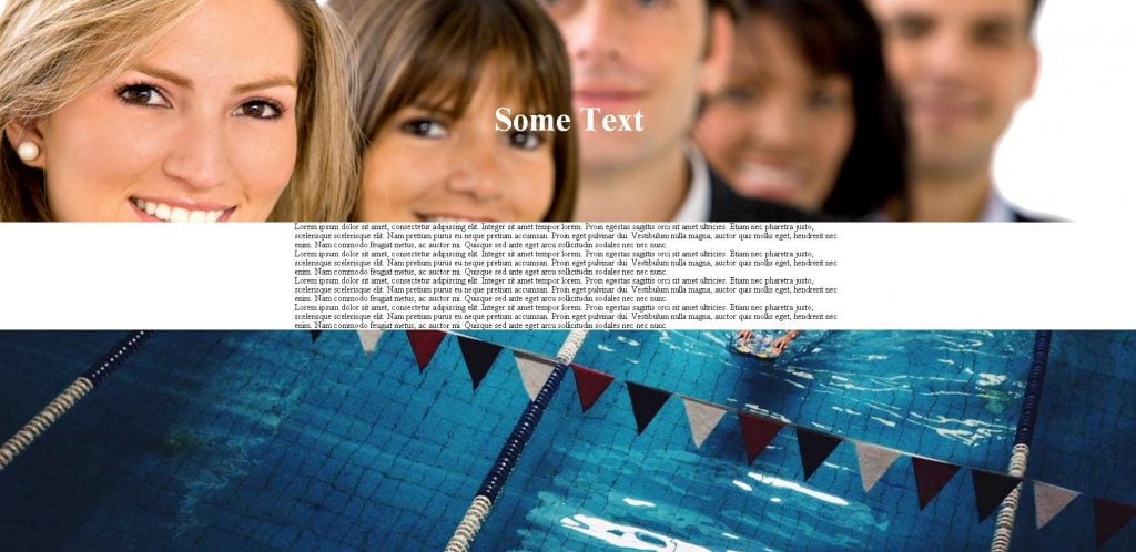
First of all, we will built the HTML structure of the page. The first block will contain the image, in the second section we will place some content to make parallax look more distinct. Eventually, we will get something like that:
<div class="parallax_section parallax_image_first">
 <div class="center">
 <article>Some text </article>
 </div>
 </div>
<!--Block with content-->
<div class="content_block">
 <div class="center">Lorem ipsum dolor sit amet, consectetur adipiscing elit. Integer sit amet tempor lorem. Proin egestas sagittis orci sit amet ultricies. Etiam nec pharetra justo, scelerisque scelerisque elit. Nam pretium purus eu neque pretium accumsan. Proin eget pulvinar dui. Vestibulum nulla magna, auctor quis mollis eget, hendrerit nec enim. Nam commodo feugiat metus, ac auctor mi. Quisque sed ante eget arcu sollicitudin sodales nec nec nunc.</div>
</div>
<div class="parallax_section parallax_image_second">
 <div class="center">
 <article>Some text </article>
 </div>
 </div>
<!--Block with content-->

<div class="content_block">

<div class="center">Lorem ipsum dolor sit amet, consectetur adipiscing elit. Integer sit amet tempor lorem. Proin egestas sagittis orci sit amet ultricies. Etiam nec pharetra justo, scelerisque scelerisque elit. Nam pretium purus eu neque pretium accumsan. Proin eget pulvinar dui. Vestibulum nulla magna, auctor quis mollis eget, hendrerit nec enim. Nam commodo feugiat metus, ac auctor mi. Quisque sed ante eget arcu sollicitudin sodales nec nec nunc.</div>

</div>
Now let’s proceed to the CSS file. We need to customize the .parallax_section. Give it a proper height, and other attributes like, background attachment, position and size. In my case they will be the following:
.parallax_section{
 height: 600px;
   background-repeat: no-repeat;
   background-attachment: fixed;
   background-size: cover;
   background-position: 100% auto;
  position:relative;
}
Next, insert the required image. For that we will use another selector - .parallax_image_first. Add pass to the file.
.parallax_image_first{
  background-image: url("../images/del/diagonal_background.jpg");
}
Finally, let's give styles to the text on the image.
    font-size: 60px;
    position: absolute;
    top: 50%;
    margin-top: -15px;
    left: 0;
    right: 0;
    text-align: center;
    font-weight: 600;
    color: #fff;
Eventually, we came up with something like that.

DEMO | DOWNLOAD
Parallax with JavaScript
Now, let’s take a look at how to build parallax scrolling with JavaScript. For that we will use a readymade jQuery plugin from pixelcog.com. It is actually one of the simplest plugins I’ve worked with. To make it work, you need to download the jq library. Copy the parallax.min file to your project and add it to the html code.
Now, we need to add an image. For that, use a piece of ready made code
Type the specifications in the CSS file.
.parallax-window {
    min-height: 400px;
    background: transparent;
}
Style the text and preview the page. You can also change the options of the image right inside the html code. Thus we need to give a data- prefix to the variable and type it in the lower case.
For example, we need to change the scrolling speed. For that we add data-speed=”0.8” to the html and that’s it.
As you can see, it looks much distinct with the script, and requires less hand written code. So if the scale of the image is vital for the project, using the script is the right choice in all other cases you can do everything with CSS.
DEMO | DOWNLOAD
There is also a plethora of other parallax scripts on the Internet, let us know which one you prefer and how it performs. Share your ideas in the comments and let me know if I've missed something.
Parallax scrolling is a graphic technique, when background and foreground images move with different speeds creating a depth effect. It was widely used in early pseudo-3D video games, improving the gameplay with illusion of volume and dynamism. But let’s get back from the dawn of computer graphic to more recent times.
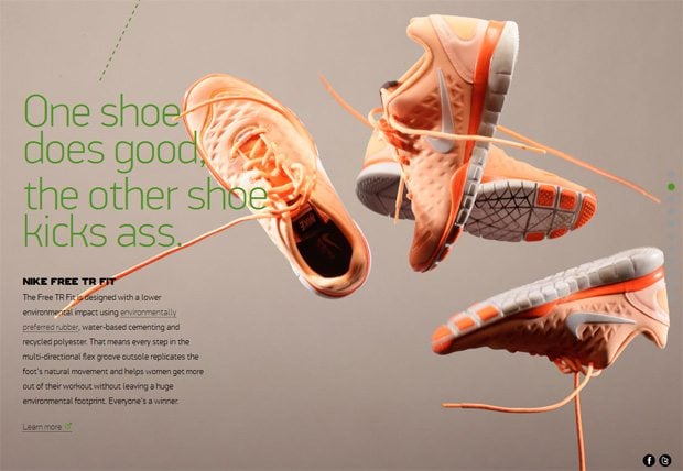
Parallax scrolling design became extremely popular in web after Nike launched this technique on their website “Nike Better World” back in 2011. And it’s not surprising, because parallax scrolling effect creates a pretty volumetric effect making website more animate. As always, we should remember about the principle of golden middle. Once parallax scrolling is overused - website starts looking silly, and not beautiful at all. Keeping that in mind skillful web designer can greatly improve a website with parallax scrolling, so users would be delighted with a balance of attractive original look and high level UX.
The great advantage of parallax scrolling is that this trend usually seamlessly connects with other fancy techniques. For example, parallax scrolling and one-page design became almost indissoluble in designing websites. However, it doesn’t mean that the parallax scrolling is constrained with one-page design, but just demonstrated high level of flexibility to use it with different styles. To confirm it I want to represent the best parallax scrolling designs. Scroll to down to see them.
* * *Dancing with Fruits
The website was awarded numerous times for its outstanding design. And for a reason: I would call this website a web art masterpiece. And parallax scrolling technique takes an important place in this composition, aimed to promote a healthy way of life.
* * *Andrew McCarthy
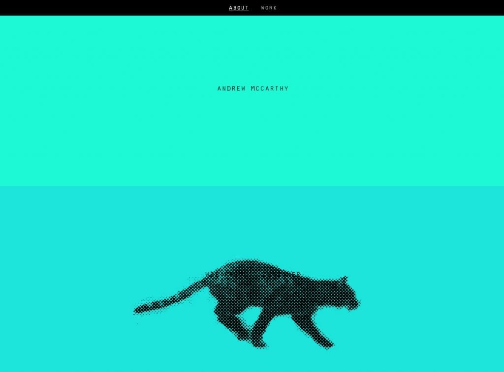
Animation is immortal. The running cat in this design surely proves that thesis.
* * *Pi's Epic Journey

This website presents a story of making the film "Life of Pi". You will find out all the secrets and hard work the creators have done to provide us with such a cinematographic masterpiece.
* * *Numéro10
This French website will put you into the world of grotesque graphics, which is creatively parallaxing once you've scrolled.
* * *Peugeot HYbrid4
This is a very conceptual thing. Actually, this parallax website represents a graphic novel, with a certain plot, with impressively drawn picture, even with sound effects. All of this will put you in the adventure atmosphere to advertise Peugeot Hybrid 4.
* * *Tag Reaction

This example drops a user into the minimalist atmosphere of chemical engineering. The design is pretty clean, which is the main feature of this website.
* * *Cyclemon
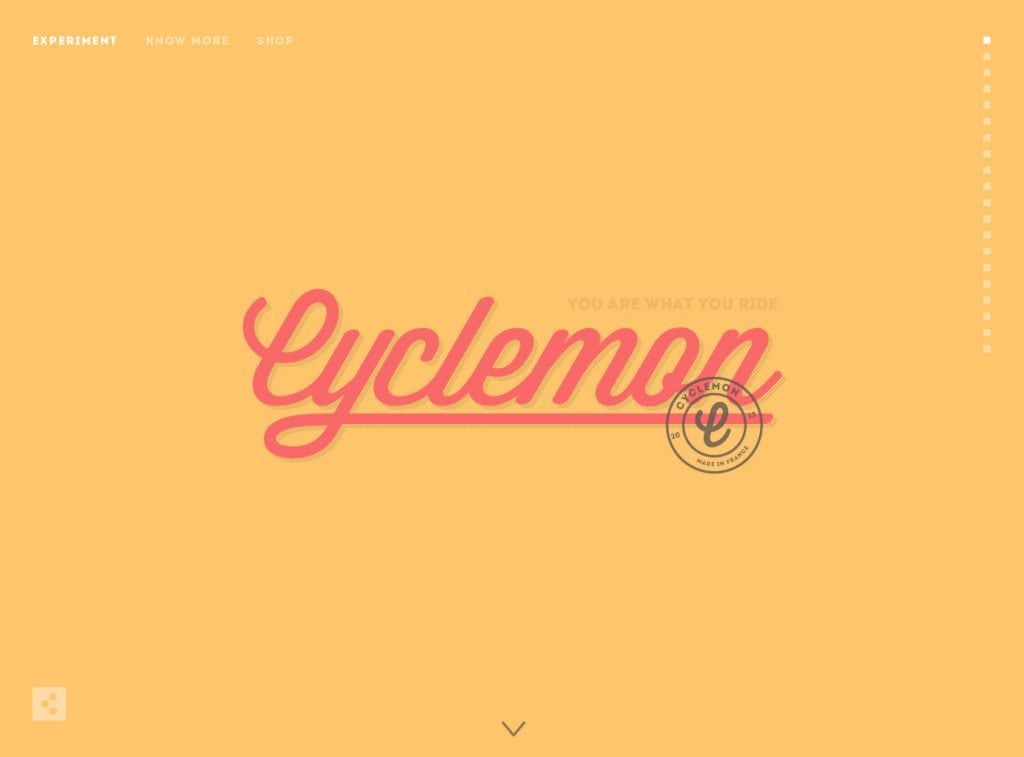
Would you like to choose a bike? This website will share with you all types you can see on the streets. A bit of humor is attached.
* * *Every Last Drop
An interesting and informative story is waiting for you on this website. The theme is close to every human being - it's about water. Vector graphic and parallax scrolling have made the story extremely pretty to perceive.
* * *Michelberger Booze
Do you like alcohol? Well, you can be hardcore straight edge guy, however you can't deny this website is totally beautiful, using parallax scrolling as a catalyst.
* * *Boy-Coy
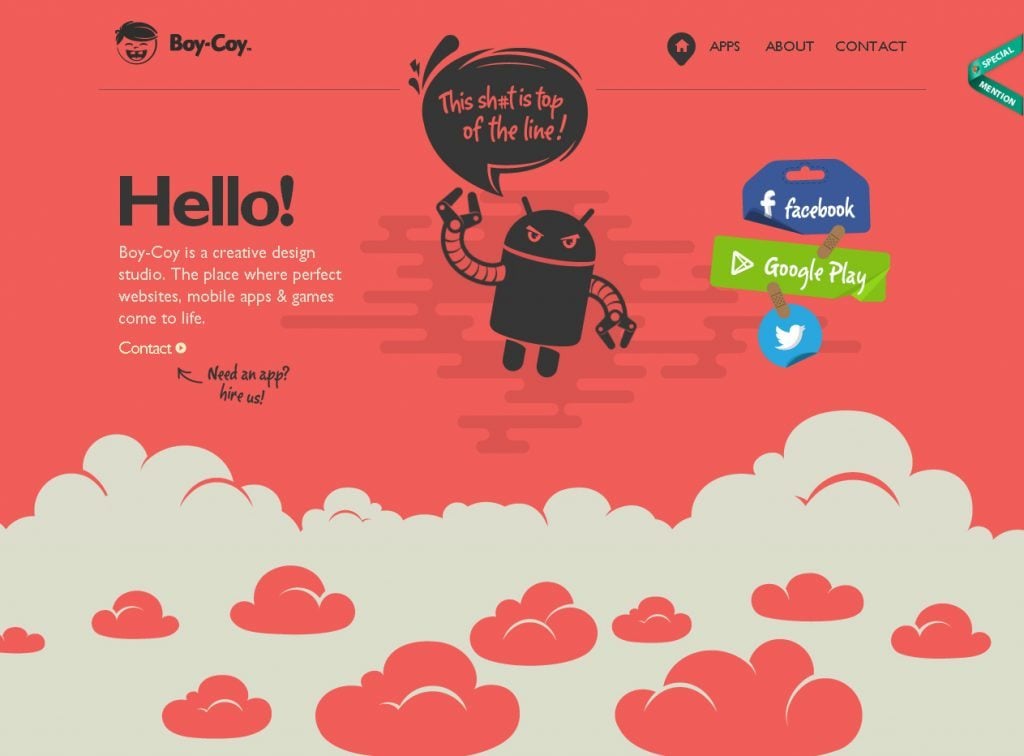
I can't outline some outstanding feature of this design, so I'll just say: it's good parallax scrolling design.
* * *iStrategyLabs
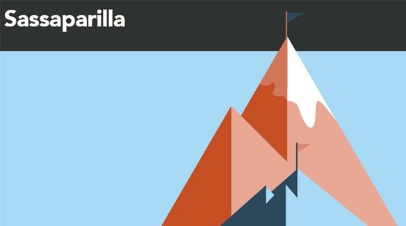
Open space, 8-bit elements, flying saucers, astronaut - all of these are included in this creative parallax scrolling website.
* * *Flash vs HTML
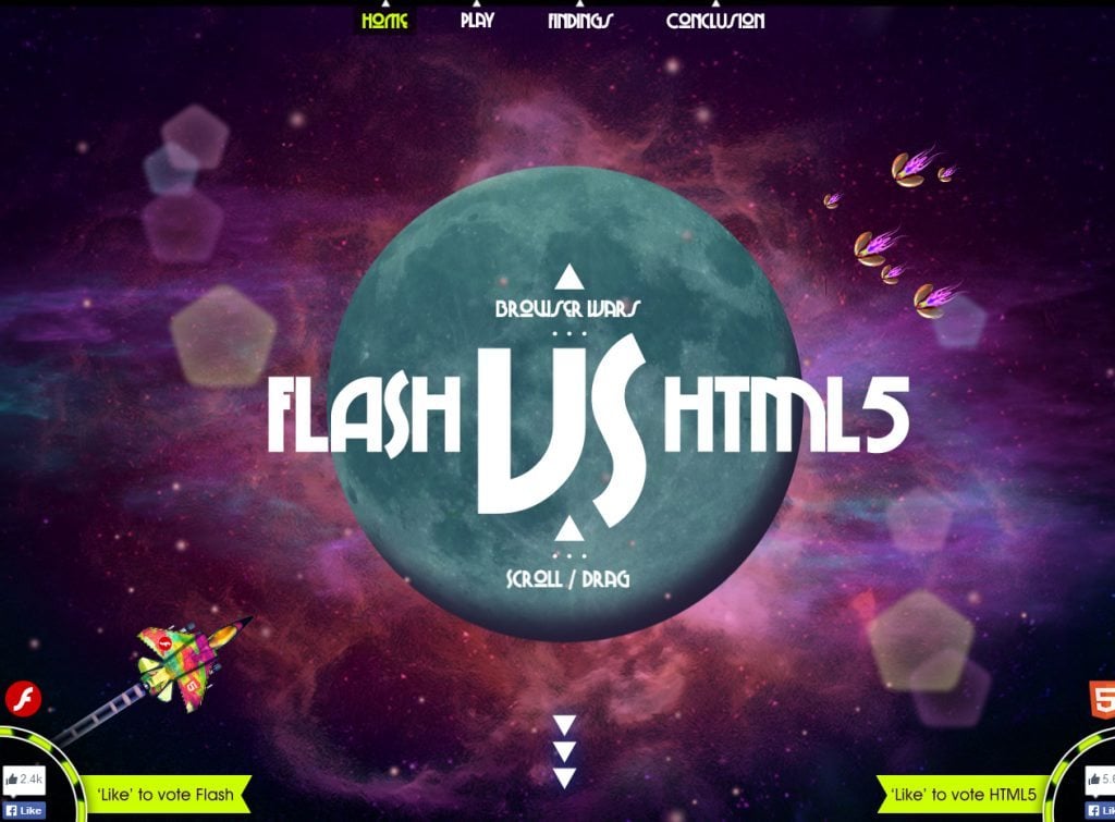
Flash or HTML? Of course, HTML. However, this website is worth existing due to beautiful design, improved with animations.
* * *Steven and the Unique Horn
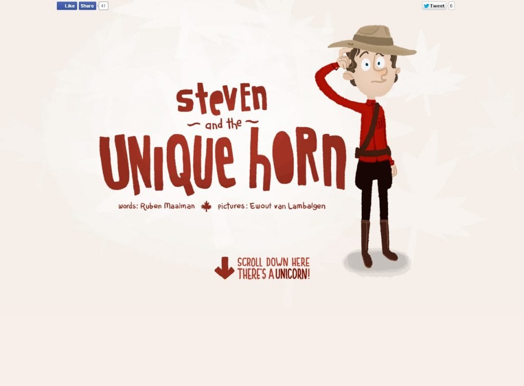
If you like ironic stories you'll definitely like a poem about Steven and Unicorn. The parallax scrolling serves as a mechanism for changing illustrations in the plot.
* * *NASA: Prospect

NASA glads us with attractive parallax scrolling design, which depicts an exciting trip of an astronaut through the space depth.
* * *Ophir - The Town That Came In From The Cold
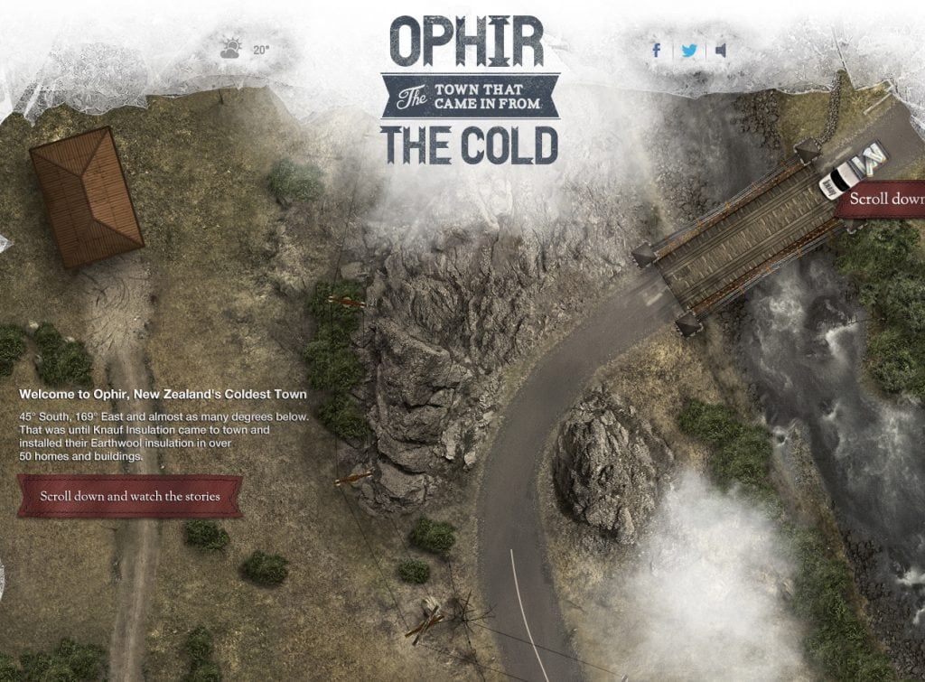
Here parallax scrolling helps you watch the whole city from the aerial view. The concept is quite original.
* * *Savages
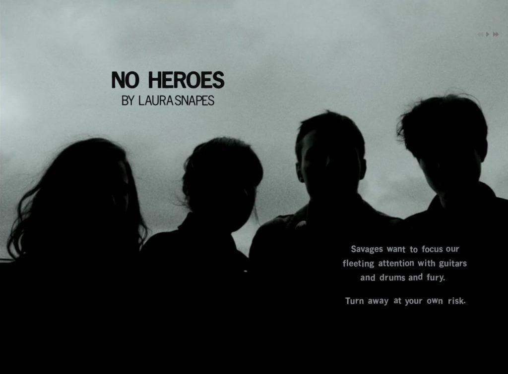
This is a cover story for female band Savages. The most interesting elements here are freezing video shots that create atmosphere of presence.
* * *The Rise and Rise of David Bowie
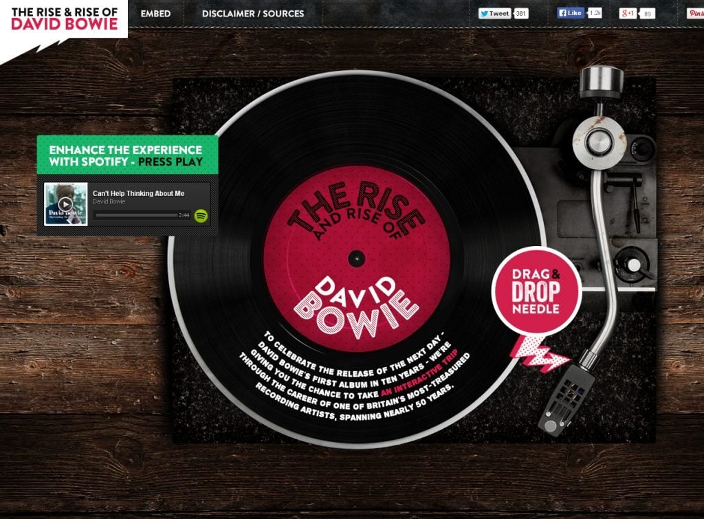
Don't you like David Bowie? It's up to you. However his career, especially the evolution of his stage images, is extraordinary. This website presents it in a quite attractive manner, using parallax scrolling.
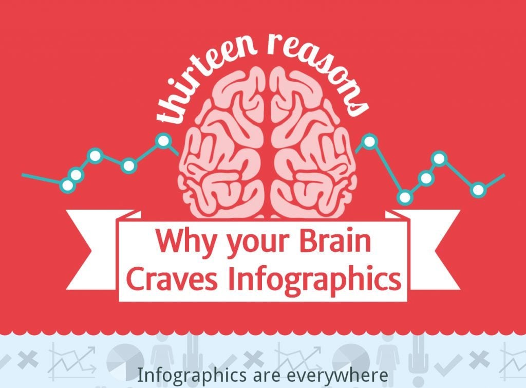
* * *13 Reasons Why Your Brain Craves Infographics
It's an usual infographic, which is nevertheless unusually represented in the form of parallax scrolling website. The style is nicely designed with vector graphics.
* * *As you can see, the listed designs are really diverse. Sometimes they are based on parallax design as their main element, in other examples the parallax technique serves just as a fancy flavor. Anyway, I believe you won’t refuse that parallax design is still in use by having a great feature of adaptability to new trends. If you disagree, you are welcome to express your arguments in the comments below.
25 Catching Websites with Parallax Scrolling
Parallax effect may not sound like something familiar to you, but believe us - you know what it is and you know it very well. The good old video games where games had moving background and static foreground (or on the contrary) were the first to have used parallax.
Nowadays static websites can boast with some cool effects that add dynamics and enliven website navigation with original solutions like parallax. There are many different ways of how you can use this effect on your website. For example the classical static background with horizontally of vertically moving foreground, the in-depth pseudo 3D effects, dancing elements of the menu – there are no limits for your imagination. Here is a collection of 25 websites with parallax scrolling and if you want to surprise your visitors with interesting browsing experience this is a right place to look for good examples. Please don’t forget that parallax effect is a very unusual effect, and you shouldn’t apply it everywhere you want. So use it wisely, because visitors might be distracted with the non-standard navigation ( this may even cause some troubles with conversion rates etc). The perfect area to use parallax is web design studio website and personal web blogs where there can never be too much of creativity!
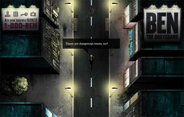
BenTheBodyguard
* * *
Unfold

* * *
Iutopi

* * *
NikeBetterWorld
* * *
WeCamefromMars

* * *
JanPloch

* * *
BeautifulExplorer
* * *
LostWorldsFairs

* * *
FingerBilliards

* * *
Terredevenements
* * *
Pojeta
* * *
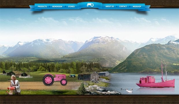
MoodsOfNorway
* * *
RapidBoot

* * *
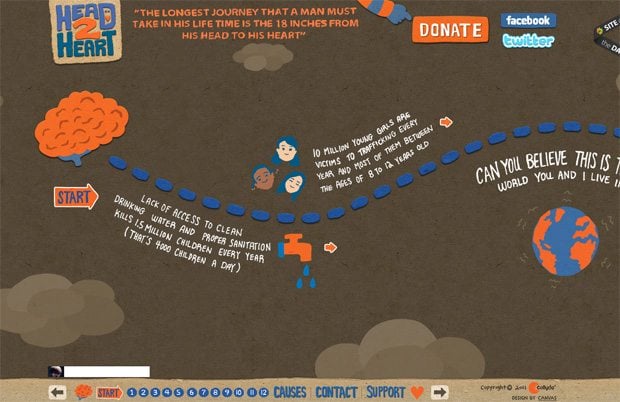
Head2Heart
* * *
Culturalsolutions

* * *
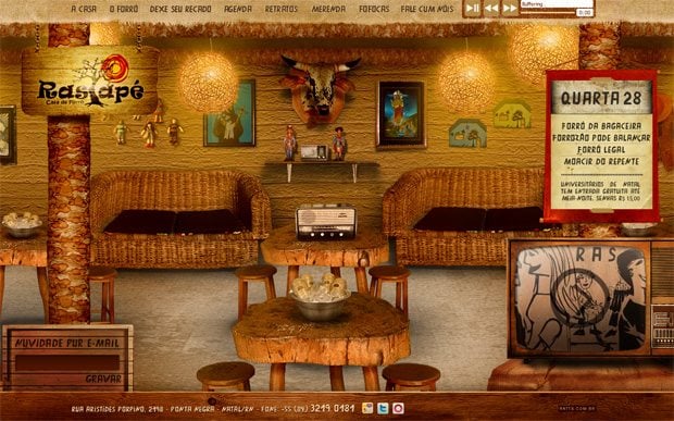
Rastapenatal
* * *
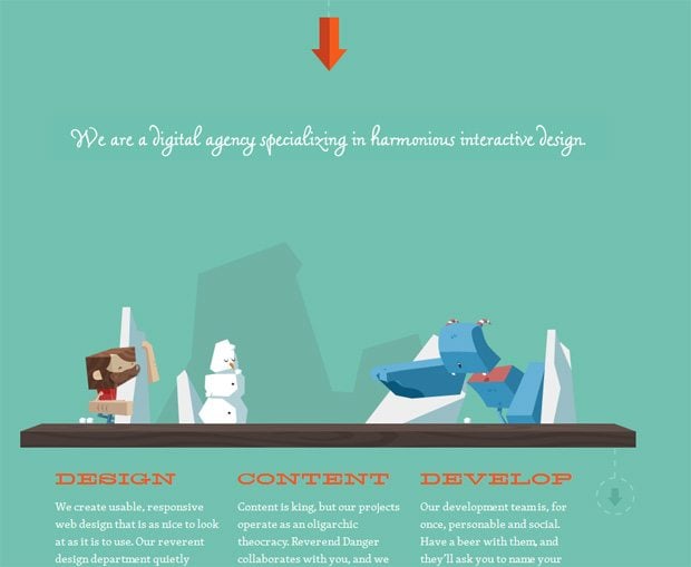
Reverenddanger
* * *
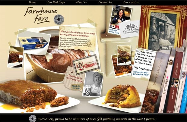
Farmhousefare
* * *
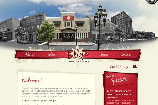
Billysdiner
* * *
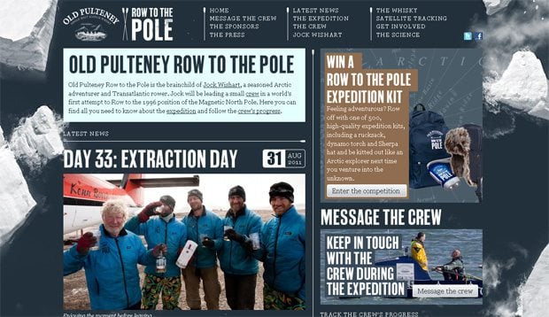
Rowtothepole
* * *
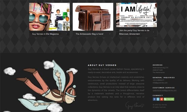
Guyvernes
* * *
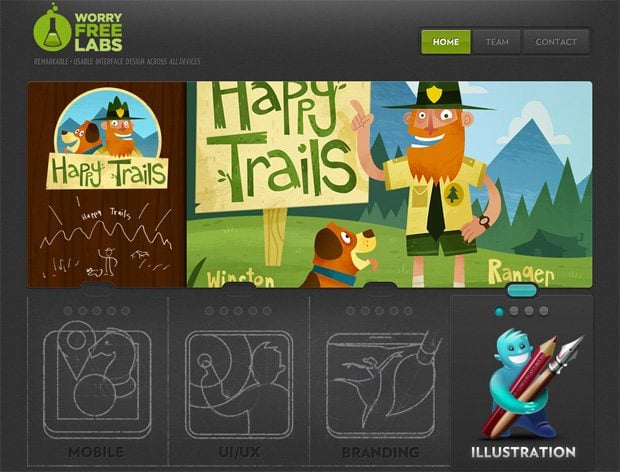
WorryFreelabs
* * *
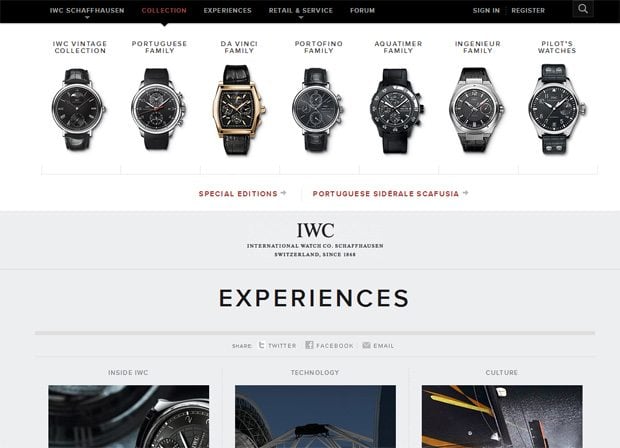
IWC
* * *
DavidBeckham7

* * *
Lagentehadichosi

* * *
Get more to your email
Subscribe to our newsletter and access exclusive content and offers available only to MonsterPost subscribers.

Leave a Reply
You must be logged in to post a comment.