You can talk about your skills our talents as long as you want, but it doesn’t matter if you have nothing to show. Especially if you are looking for a job and apply for a position of a designer or artist to big companies. Being able to showcase your skill is a crucial part of your job seeking journey.
I think it will be fair to assume that a huge number of the MonsterPost readers are designers or developers, so you all will need to get a portfolio one day. Well, some of you may already have one, but it’s always good to review it once in awhile and make necessary adjustments to improve it.
Alright, I’m gonna be honest with you. The reason I am writing this article is very simple and obvious: I have recently reviewed my portfolio and understood how old it was, so I spent last month trying to figure out how to create a truly kick-ass portfolio. While working on this project I acquired a lot of knowledge and experience that I wanted to share with you. Take out your portfolio and get ready to modify it if you have one. Otherwise, let me explain to you how the actual portfolio should look and after this article, you’ll be able to create one and avoid common mistakes.
Suit up for a job
I have seen this situation myself on both sides: I have been a designer with my own portfolio and a bag of ambitions and I have also hired designers and reviewed their portfolio. I believe that it gives me enough rights to speak freely that in order to get a job you should be suited for it. No, I’m not talking about being a designer, not a cleaning expert. I am talking about the content of portfolios and it’s integrity.
Let’s say you are applying for a position of the UI/UX designer. It means that the majority of your portfolio works should include your UI/UX experience and showcase your skill in this particular field of expertise.
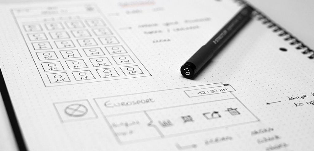
I’ve seen so many portfolios that included the illustrations, UX design, web-design and motion design works at the same time. No, it doesn’t really work like that. I am very happy that you are fond of motion design and want everyone to know it, but if you apply for a UI/UX designer position, make sure your portfolio doesn’t look like a Billy Milligan’s list of identities.
Less is more
This is one of the mistakes that I had to fix while working on my old portfolio. I was one of those guys who think that collecting all my work from the ancient time till now is so cool. I thought that it’s all about showing progress, but the reality is brutal: no one has time to dig through your old stuff and look for the best works among them.
Make a small selection of the greatest works you have on hands and stick to your guns. Make sure that your portfolio represents the best version of you.
Background story
People care so much about the storytelling nowadays. Even portfolios now require stories and that’s understandable. The only thing we can do is trying to meet these requirements and make sure our portfolio is not ending up in the hr’s trash can.
Each and every work in your portfolio should have a background story. Tell everyone about the company you designed this logo for or how you enjoyed the working process while designing the website for the bakery near your house.
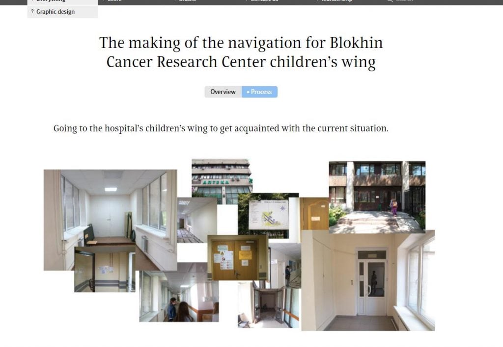
I would say that ArtLebedev studio is one of the greatest examples of storytelling in the portfolio. If you click on any of their works, you’ll be redirected to a page with a full story that stands behind that particular design and that’s really amazing. I’m not sure, but I think that they have someone taking care of these stories only, they really care about this aspect of the design presentation.
Be up to date
The last thing is doing your best to keep your portfolio up to date. Are you sure that it includes the all your latest works? Did you check if it’s time to exclude some old pieces out of it?
While working on your portfolio you also push yourself to take more and more work, cause that’s the way you expand your portfolio. Analyzing all your new works and selecting the best ones should become your routine procedure, like brushing your teeth in the morning or having a cup of coffee after your wake up.
Templates for your portfolio
Even if you are a great designer it doesn’t mean that you know how to code and vice versa. That’s why I think it will be fair to give you a few examples of great portfolio templates you could use. Let’s see what I’ve got for you.Laredo - Exterior Design Company WordPress Theme
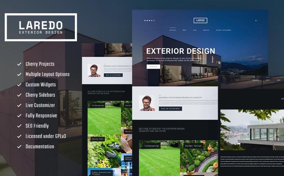 You can also check the full list of the TemplateMonster premium templates and find something for any purpose.
Remi - Photographer Portfolio WordPress Theme
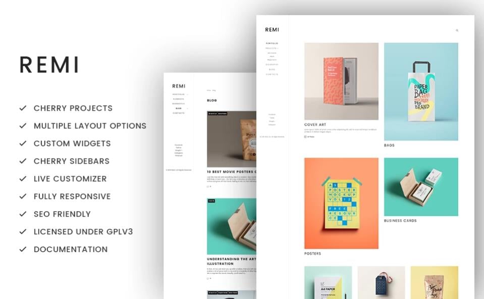
Photo Moments Responsive Photo Gallery Template
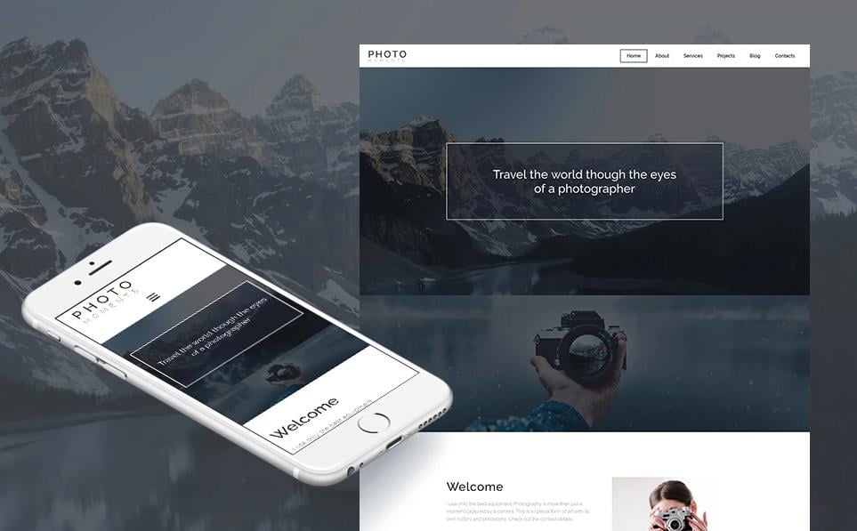

Don't forget to take a look at any of these photographer WordPress themes.
Related Posts
- PhotoShelter vs. MotoCMS: Build a Stunning Portfolio Website
- Is Personal Portfolio Still Worth the Effort?
- WordPress Portfolio Themes to Arrange Your Projects in a Neat Way
- 20 Mind-Blowing WooCommerce Portfolio Themes For Your eStore in 2017
- 15+ Best Joomla Portfolio Themes to Boost Your Business
- Defrozo: A New Creative Portfolio Website Design from MotoCMS
- How To Create Your Own Portfolio Website (Without Any Tricky Coding!)
Get more to your email
Subscribe to our newsletter and access exclusive content and offers available only to MonsterPost subscribers.

Leave a Reply
You must be logged in to post a comment.