How to Design Your Blog to Maximize Readers?
Today’s generation demands a content-driven website – with a whole bunch of interesting and meaningful text, pictures and videos together in an artistically pleasing way. Blog content is all about ideas, and ideas are meant to be read easily and appreciated, and if everything goes well,discussed at length. For a web designer, facilitating this process is personally very satisfying, yet very challenging.
Providing content will always remain your first line of defense. However, you need to think beyond! Why not give your blog a little style? This undoubtedly give your readers a positive experience. Read more to learn the best tips to design a stylish blog.
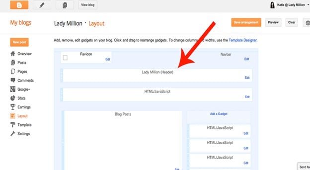
Headers and footers
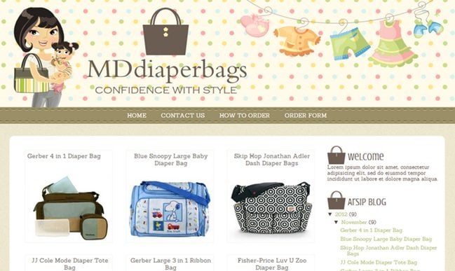
Header section is an important part of your blog that contains the logo and some of the site’s important navigation. Users intuitively search the top for some kind of navigation options to dig deeper into the blog. If your blog lacks intuitive design, it can confuse the users and cause them to bounce from your site.
Similarly, footers complete your blog. This section contain support links and disclaimers for users to find the ‘ABOUT PAGE’, CONTACT PAGE’ or ‘BLOG’. A broken blog design can completely ruin the appearance of blog page and the feel for your users.
Font size
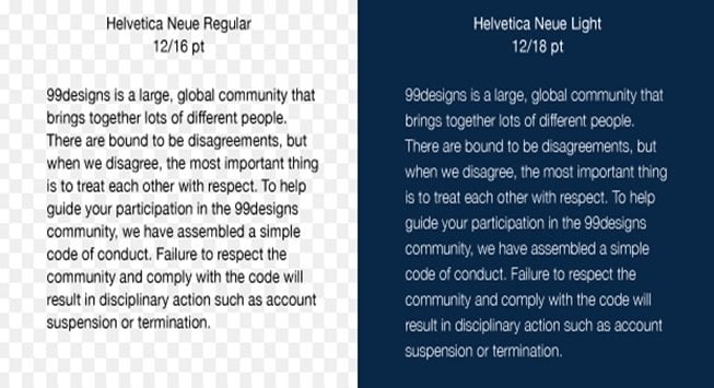
Make your font readable. Increase its size to at least 14px.You may also increase the font size to maximum 16px to make it even easier for the users to read. You should not forget that more and more people are reading blogs on mobile devices with smaller screen. Check our Google Web Fonts for ideas and instructions regarding its installation. Sans-serif web fonts are commonly used around the web. Choosing a font difficult to read can turn off your readers immediately.
Color theme
Considering color to design your blog is an important aspect especially when you think of your audiences. Of course, you need to keep the demographic in mind. For instance, if you decide to start a culinary blog, your obvious typical readers will be either chefs or someone passionate about cooking. This category of people will obviously prefer color themes which will be completely different from the one preferred by gamers.
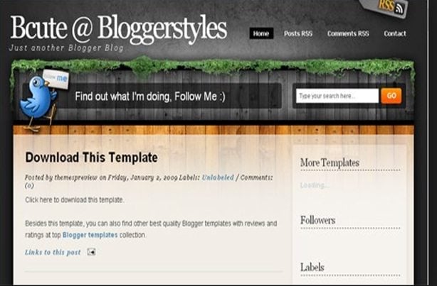
The main concern is using black background with white fore colors. This makes reading very difficult especially if your audience older or you require them to read several pages of content. If your blog uses different background color, make sure it’s a soothing light color which will be easier on the eyes and enable your readers to stay on the page for longer period.
There are a few blog software that will allow you to set color of your links in there different stages – link before it is clicked, as it is clicked, after it is clicked. If you wish to give a touch of personality to your blog, use a cool link color, but make sure the color is recognizably different from other text colors.
Sidebar
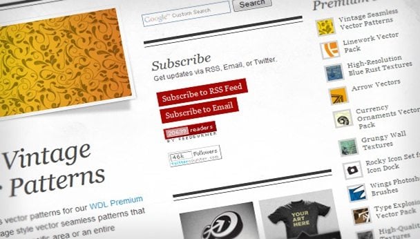
Often sidebar is distracting especially if there are colorful animated ads with sound and no mute button or when the sidebar itself clashes too harshly with the rest of the site. This might become personal irritation to some viewers. Therefore, many designer often drop the idea of sidebar altogether. However, sidebars have gradually become a major focus for the site and contain elements like special highlighting graphics, list of blogs, navigational links, archive links or something you want to share with your visitors outside the context of a blog post.Instead of completely eliminating the idea of sidebar, the best is option is not to stuff it with more information and widgets. In a nutshell, the sidebar should not dominate the page. They are meant only for navigational aids.
Width
Column width
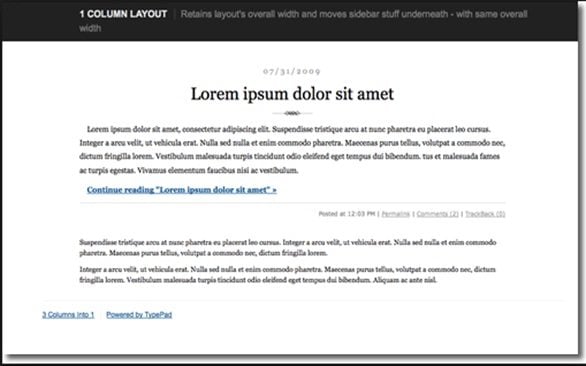
If you notice, newspaper, novels and even magazines use narrow columns of text. This is because narrow column makes it easier to read the content since your eyes do not need to travel a far distance from left to right to read each line. That is why structuring the blog is vital as it is a tendency of most of the blogs to utilize a side bar and limiting the content area automatically. Make sure that your content does not span the entire length of the screen.
Content width
The perfect width is between 480 to 600 pixels and 100 characters per line. This is the optimal line length for reading speed. Additionally, the size of the images will vary depending on the content width. It has been observed that shorter line length appears more organized and easier to comprehend. The actual line length, therefore, ranges from 40 to
55 characters per line.
Line height
The line height represent the total amount of space between each line of text. If the text is too close together, it makes reading very challenging. The trick is to increase the line height more than the browser default to make it easier to read.
Images and clip art
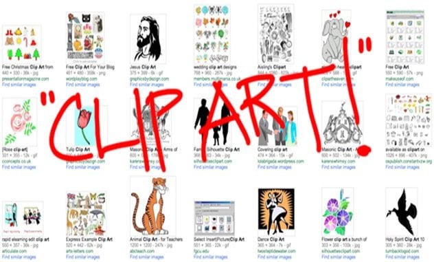
Graphics add visual interests to your blogs. Including great photos with each blog post is an easy substitute to design your blog. However, the photos should be formatted properly to add value to your post.
Responsive theme
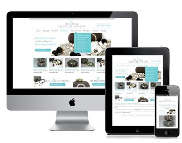
Responsive web themes are becoming mandatory for blog-owners. Tablets and Smartphone web traffic gradually overtaking desktop traffic. The layout and scaled images are created responsive to fit smaller screens. Responsive design works with HTML5 and CSS to respond to user’s screen size by using media queries. In fact, responsive typography should also be considered while designing a blog. Small screens have low bandwidth, and demands reduced size of images and code to make it more user-friendly.
Blog design and SEO
A good blog design has several elements to help the search engine ranking. Search engine optimization is all about good code design. The primary factors that impact the SEO includes
- Blog title
- Impressive Meta title
- Free from critical coding issues
SEO is an integral part of the web design, and it should be operable enough for the blogger to edit the design in order to update any changes as and when required. For instance, if the designer feels that the algorithm is not enabling a site to rank well due to ad placement, he/she should be able to edit the layout to place them in a different location.
* * *
Be rest assured, that these designing guidelines will give your readers a pleasant experience reading your blog.
Don’t miss out these all-time favourites
- The best hosting for a WordPress website. Tap our link to get the best price on the market with 82% off. If HostPapa didn’t impress you check out other alternatives.
- Monthly SEO service and On-Page SEO - to increase your website organic traffic.
- Website Installation service - to get your template up and running within just 6 hours without hassle. No minute is wasted and the work is going.
- ONE Membership - to download unlimited number of WordPress themes, plugins, ppt and other products within one license. Since bigger is always better.
Get more to your email
Subscribe to our newsletter and access exclusive content and offers available only to MonsterPost subscribers.

Leave a Reply
You must be logged in to post a comment.