Photoshop Tutorial: How to Make a Stitched Leather Header
Design trends please us with their variety. Just choose any you like and make the most of it. No boundaries for your creativity. But which one to choose...Well, let's take Skeuomorphism, for example. This trend is not the newest one, still, it hasn't lost its popularity and can be observed on multitude websites. Skeuomorphic elements are easy on the eyes and can add any design some habitual charm.
Still hesitate or just want to learn more about the trend? You are welcome to follow the link – a cool Interactive Infographic will help you clarify all its pros and cons.
And if you have nothing against and want to start your own skeuomorphic experience, let me offer you this tutorial which will show you how to create a leather header with navigational menu.
This a starter-intermediate level tutorial that will show you some simple tricks which can lead you to the desired result. So, let's start!
1. First of all, let’s create a new document with a size of 1071×263. The Background color is white.
2. Now we go to our tools and choose a rounded rectangle tool. Set the radius to 15px and create a rectangle similar to the following. The color is set to #f98909.
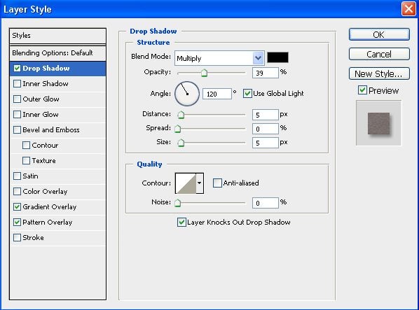
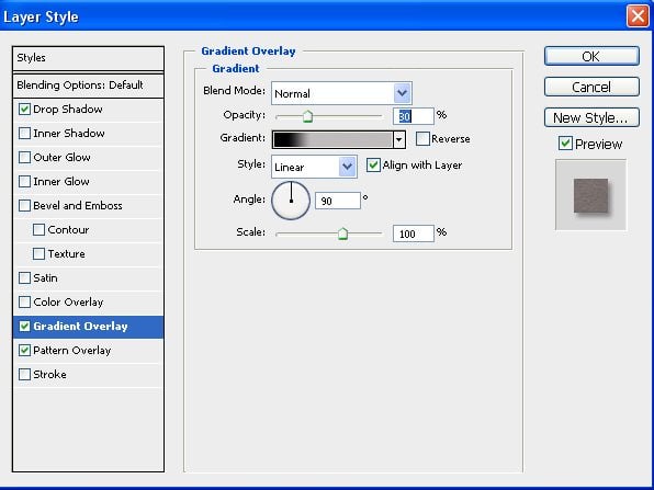
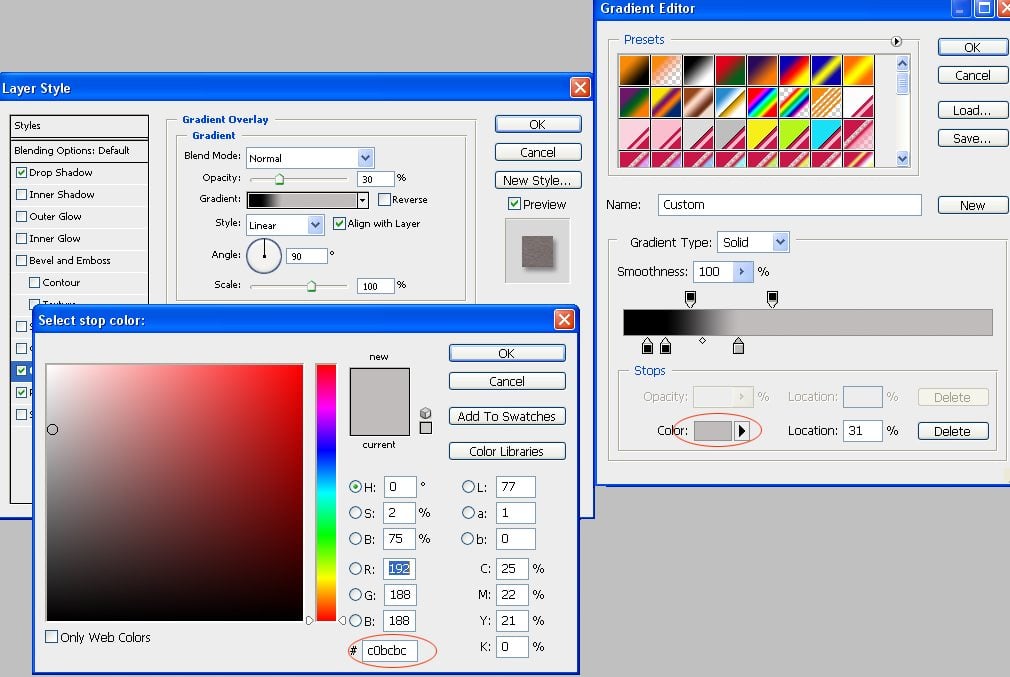
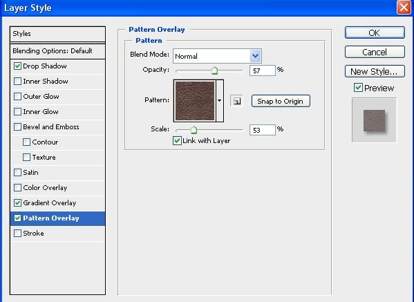
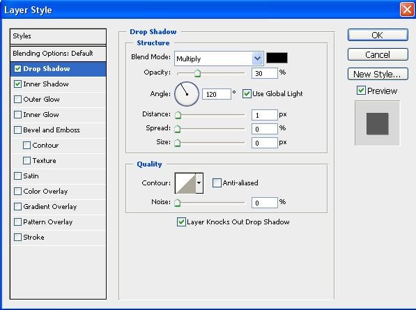
3. It is time to add some blending options to the layer. Right click the layer with the rounded rectangle and choose Blending Options and insert following:
I've chosen the color #c0bcbc in order not to make the gradient too contrast.
Some nice leather textures you can find following the link. Download them and make the following steps to add them to your patterns set: Edit - Preset Manager - Ctr+5 ( or just choose Patterns)- Load - Done.
And that is the result we got after all these manipulations.
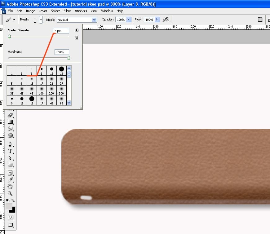
4. Now let’s make our stitches. Take your brush tool (set the radius to 4px, color #c0bcbc). Press Shift and draw your stitch. Choose Blending Options and insert the following:
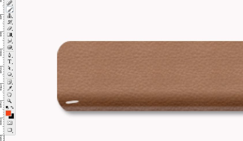
5. Press Ctrl+T and transfer the stitch.
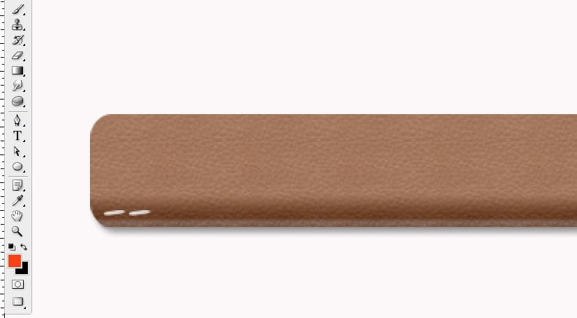
6. Duplicate the layer and shift it to the right.
7. Merge the two layers and duplicate again. Shift to the right.
Thus merging the layers you increase the number of stitches on the same layer and duplicating it you add the necessary number of stitches to your header.
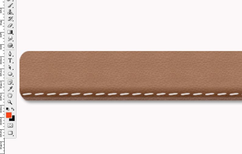
Finally you'll get the following.
All your stitches are on the same layer.
8. Duplicate the layer with the stitches 2 times. Place the original layer over its copies.
9. Change the color of the first copy to #c08554. Shift it to the right and down.
10. Change the color of the second copy to #010101 and shift it to the right.
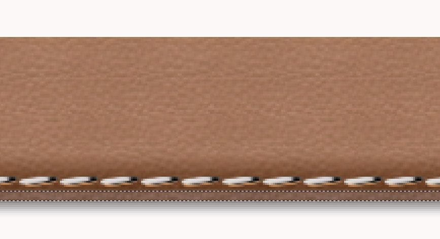
You will get the following result:
11. To make our stich elements look more realistic we need to add one more detail.
Let’s draw a stripe using brush tool and #8a695d color. Go to Blending Options and choose the same pattern overlay as we have already done (step 3).
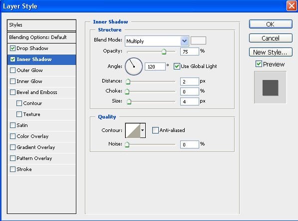
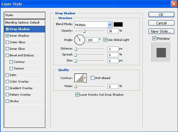
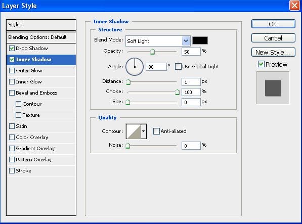
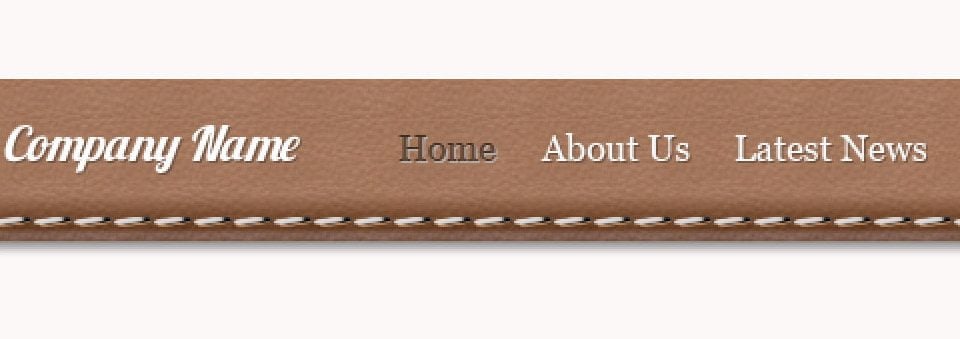
12. Now we will add some text to our navigation bar. I used Georgia 18 for the menu and Lobster 24 for Company Name. White color. Add the following blending options (all buttons except HOME button):
13. To show what our active link will look like we will duplicate the layer with a HOME button, change the color of the copy to the #785641 and add the copy with such blending options:
14. Shift the original layer with the HOME button 1px to the right and down.
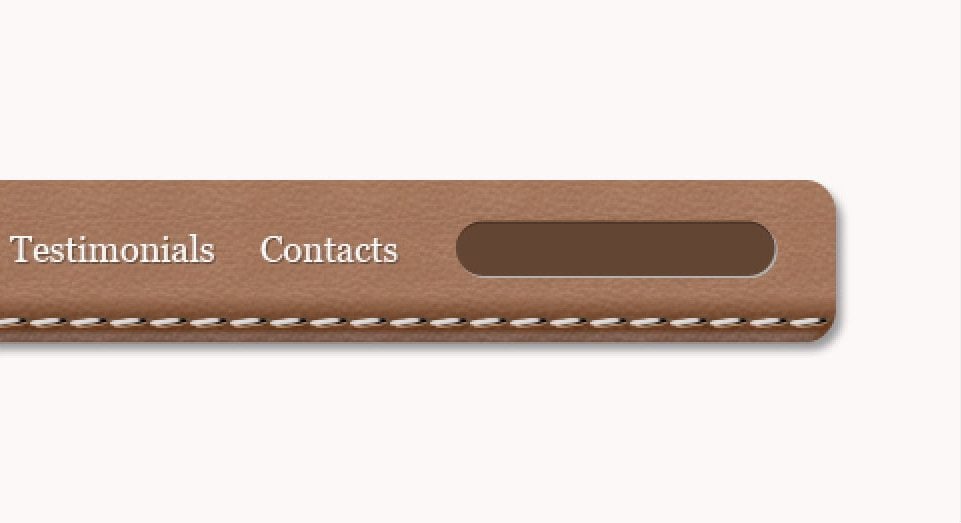
15. Choose rounded rectangle tool. Set the radius to 15px and create a search form. Fill it with white color - the Basket Tool (G) - and repeat the same manipulations that we have already done to the Home button (steps 13-14).
16. Add a magnifier custom shape which you can find following the link. Change its color to white.
That's it. Your header is ready. Good work! Hopefully it was quite simple for you to follow the tutorial. Here you can download the PSD file, by the way. Take care!
Get more to your email
Subscribe to our newsletter and access exclusive content and offers available only to MonsterPost subscribers.





Leave a Reply
You must be logged in to post a comment.