Learn How to Redesign Your GPL WordPress Theme in About 15 Minutes
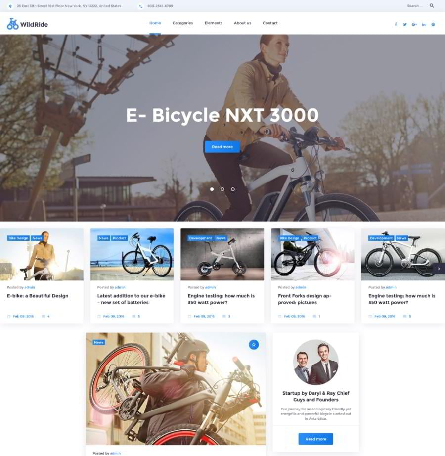
You've probably heard that TemplateMonster has released a number of GPL-compatible WordPress themes. WildRide was the first of them, and the most popular one. But some of our customers get confused about what websites to use it for. Although its demo is styled as a website about bicycles, this theme is capable of much more.
We have redesigned this WordPress theme to show you its flexibility. Each quick redesign took about two hours, so you will be able to create your own unique website in about a day.
Have a look at this theme. We are going to transform it into a fresh-looking blog for adherents of a healthy diet, and a stylish gallery of graphic design freebies. You will see the final result in the end of this post, and now let’s move to the fun part.
Preparations
After you successfully install the theme it will offer you to download some free plugins as well. Here is a short overview of them:
Cherry Sidebar Manager – helps you create and manage custom sidebars.
Contact Form 7 – adds improved feedback functionality to your website.
Easy Twitter Feed Widget and Facebook Widget – lets you deeply integrate your website with the most popular social networks by adding dynamic widgets.
Give – Donation Plugin – enables you to accept donations via flexible forms.
Track Kickstarter Project – shows the summary of your (or any other) Kickstarter project in a form of a widget.
We recommend that you install at least Cherry Sidebar Manager, Easy Twitter Feed Widget and Facebook Widget. The other plugins mentioned are either very specific and/or rarely used (Give or Track Kickstarter Project), or have more preferred alternatives (such as Disqus).
Step by step
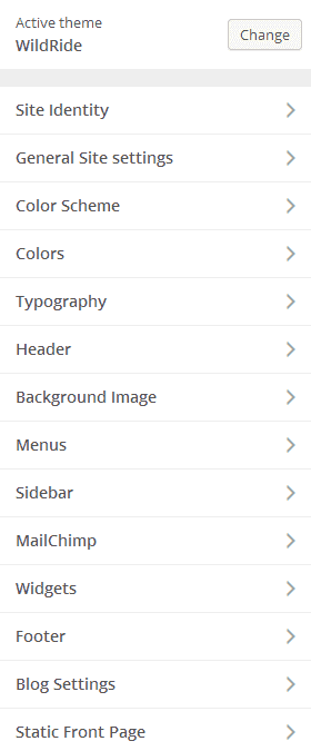
Site Identity
General Site Settings
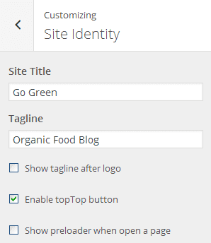
Logo & Favicon
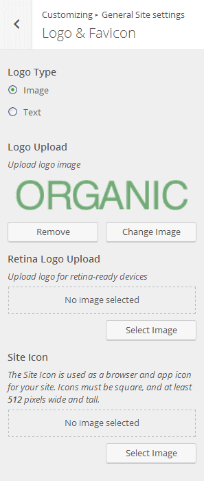
Breadcrumbs
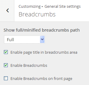
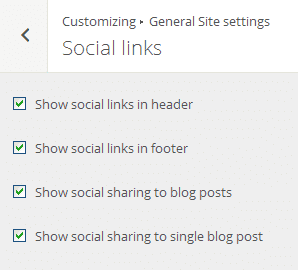
Social Links
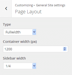
Page layout
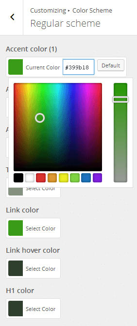
Color Scheme
Typography
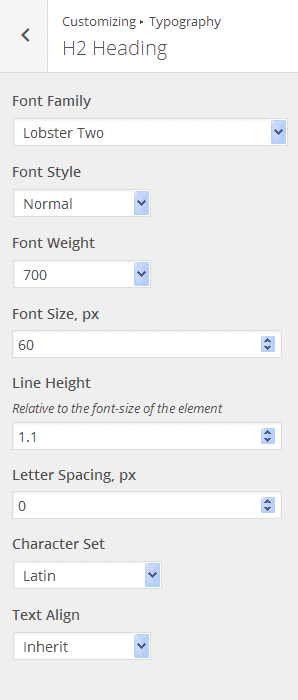
Note: if you can’t apply a certain font, try to decrease its weight – it should help.
Header
Header Styles
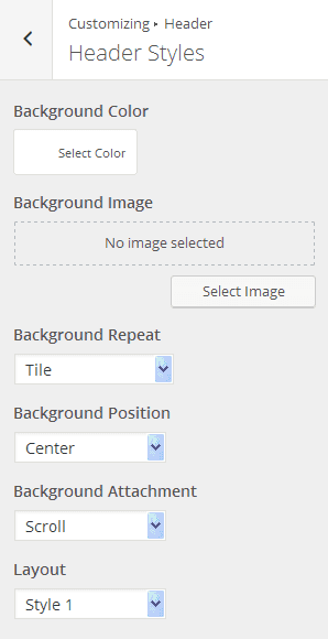
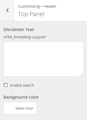
Top Panel
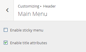
Main Menu
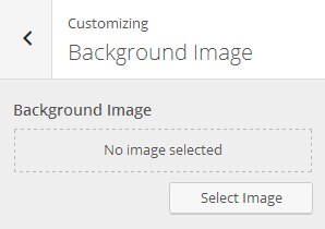
Background Image
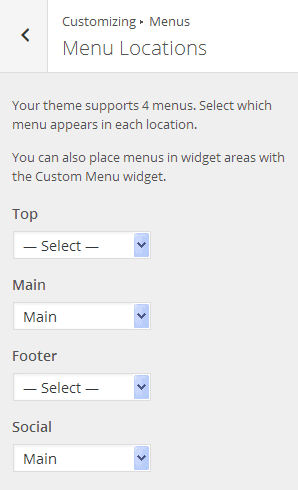
Menus
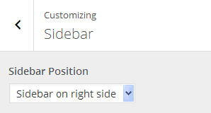
Sidebar
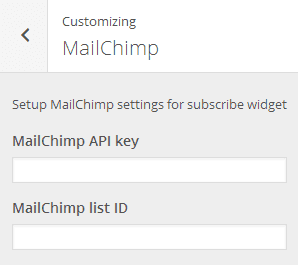
Mailchimp
Widgets
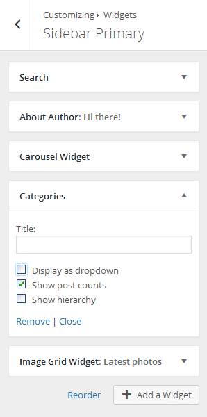
We tried to keep things as simple as possible to not overwhelm you with dozens of widgets, that’s why our Organic Blog includes only the most essential of them: Search, About Author, Carousel Widget, Categories, Image Grid and Smart Slider.
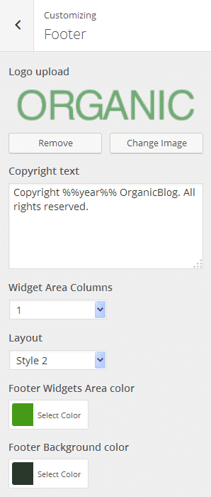
Footer
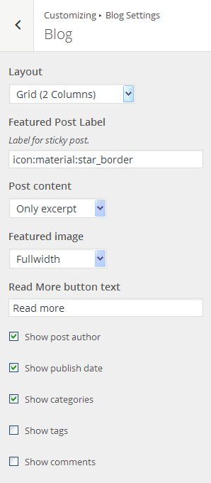
Blog Settings
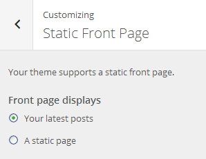
Static Front Page
The fruits of labor
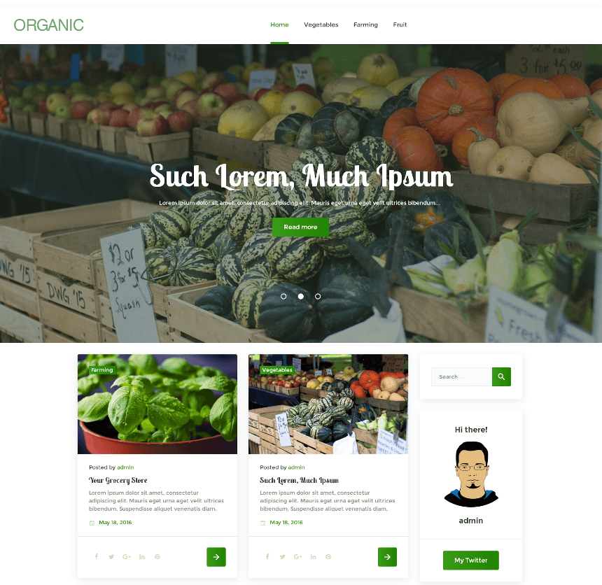
Organic Food Blog

Our first specimen is a simple blog executed in a juicy green color palette. It has a two-column grid layout with a sidebar, a large page-wide slider, and a custom font of post titles.
In a nutshell:
- Theme: WildRide;
- Layout: 2-Column Grid;
- Sidebar: Left sidebar (1/4 width);
- Header: Style 1;
- Footer: Style 2;
- Widgets: Search, About Author, Carousel Widget, Categories and Image Grid in the Sidebar Primary; Smart Slider in the Full Width Header Area;
- Colors: Various shades of green;
- Typography: Mostly default, Lobster Two for post titles.
What else can be done:
- You can improve your sidebar with Social widgets;
- You can add banners, email subscription forms and other marketing-oriented elements;
- You can make the main menu sticky and add dropdowns in order to improve the navigation of your website.
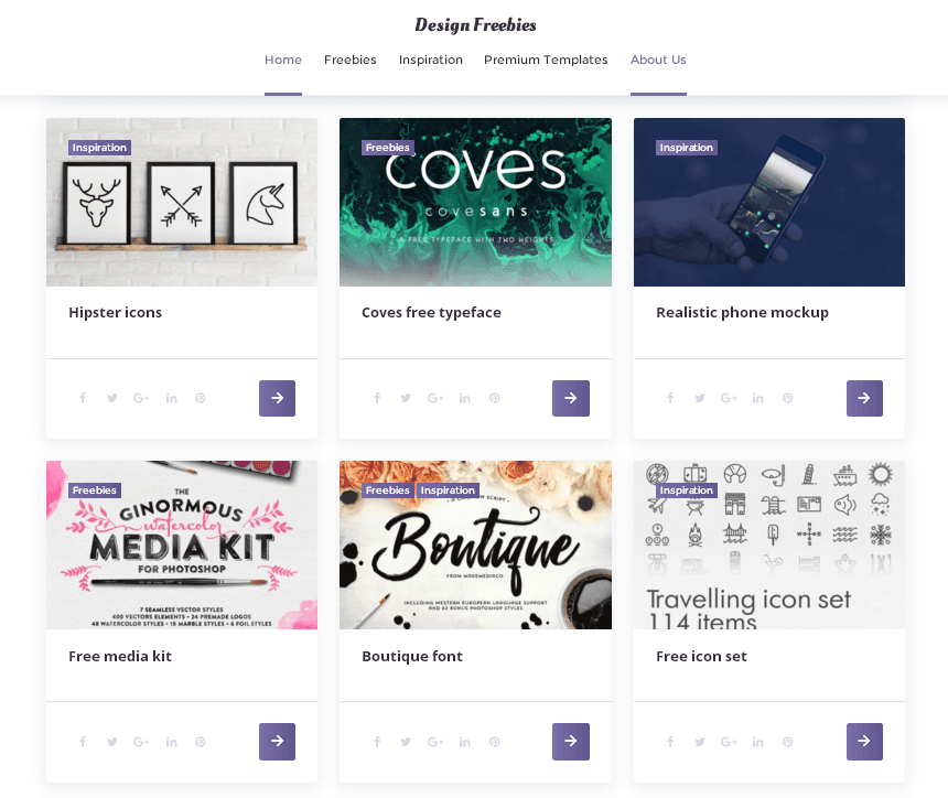
Design Freebies Blog

As a bonus, we would like to share with you another custom redesign of WildRide. This one is a blog about graphic design freebies – just like GraphicBurger or Freebiesbug. It features a very popular grid layout, a large, clearly visible search form, and a sticky menu. Take a look at the result:
In a nutshell:
- Theme: WildRide;
- Layout: 3 Column Grid;
- Sidebar: No sidebar;
- Header: Style 2;
- Footer: Style 1;
- Widgets: Search in the Before the Content Area;
- Colors: Various shades of purple;
- Typography: Default fonts.
What else can be done:
- You can add a narrow 1/4 sidebar if you need additional widgets to be displayed;
- You can connect your website with your social media accounts, and display their feeds in the footer, or in the sidebar;
- You can add Mailchimp subscription forms, and run email marketing campaigns;
- You can personalize your blog by adding an About the Author widget.
Wrapping up
As you can see, the number of possible layout and color combinations is virtually infinite, especially if you know CSS. And don’t forget that you can boost the possibilities of this theme with third-party plugins not included in the basic installation.
So, why hesitate? Grab the WildRide theme and launch your awesome blog right today! (Or tomorrow. I'm not here to tell you how to live your life).
Don’t miss out these all-time favourites
- The best hosting for a WordPress website. Tap our link to get the best price on the market with 82% off. If HostPapa didn’t impress you check out other alternatives.
- Monthly SEO service and On-Page SEO - to increase your website organic traffic.
- Website Installation service - to get your template up and running within just 6 hours without hassle. No minute is wasted and the work is going.
- ONE Membership - to download unlimited number of WordPress themes, plugins, ppt and other products within one license. Since bigger is always better.
Get more to your email
Subscribe to our newsletter and access exclusive content and offers available only to MonsterPost subscribers.

Leave a Reply
You must be logged in to post a comment.