12 Tips On How To Make The Perfect Resume or Why TemplateMonster Recruiters Trashed My Friend’s Resume
This is the third lesson of our Perfect Resume Creation: Ultimate Course. If you would like to get through the whole course – follow the link and subscribe.
Who wouldn’t want to help a jobless friend get hired at a successful web design company like TemplateMonster?
When I found out about a vacancy at the Design Department, I've sent the link to my buddy I met on campus. I knew him not only as of the life of the party but also as a good specialist with lots of skills and ideas. I was pretty sure he's a good fit for the job opening and would contribute a lot to the company.
Luckily, we’ve been mates with one of TemplateMonster’s HR specialists, Julie, since my first days there. So, I didn’t lose a chance to tell her about my friend during a lunch break. I praised him like the most talented designer I’d ever met and given her a hint that he should be the top priority on the list of candidates for the vacancy.
She didn’t mind at all. We shook hands, and I told my friend to send his resume promptly. That was exactly what he did.
In a week, Julia introduced a new designer to our team. That guy wasn’t my friend unless he underwent sex reassignment surgery. I was confused. The first thing I made was a phone call to my friend who said they’d never got in touch with him.
The fact that Julie neglected my request pissed me off. Disappointed and mad, I went to her cubicle to find out what the hell went wrong. She seemed to be as confused as I did and said she’d never received my friend’s resume, but still decided to double-check her mailbox. In a while, we finally found it (guess where) in the trash.
As it turned out, Julie didn’t even read my friend’s CV and deleted it at once. His resume design looked as if it was made by a schoolboy rather than a professional graphic designer. She said that if a candidate couldn’t even present himself appropriately, they didn’t expect him to be useful for the company in any way.As soon as I calmed down, we had a heart-to-heart talk with Julie. She told me how to create the perfect resume and get noticed. Today I want to share everything I learned from her with all of you who are desperately looking for a job at a prestigious company.
Check out tried and tested tips for making a creative resume design.
1. The Shorter, The Better
Your resume design tells a lot about your candidacy. It is tasteless and actually out of common sense to send a long, multi-page list of all the skills, previous jobs, and courses taken over your lifetime. The funniest thing is that most candidates list their achievements only on the left side of the page, while the right one remains empty…
What’s the point in wasting the layout space? If you aren’t savvy enough to understand obvious things, then you’ll end up like my friend. I don’t think someone needs an employee short of wit.
Designing a resume, try to place all the info on a single page (or two in extreme cases). Do you have a lot to say? Sorry, but recruiters do not want to hear that. Your resume is not an essay. There’s no need to go into details about taking introductory PC courses at school. We all did that. Tell only the facts related to the position you are applying for.
Here’s an example of a one-page resume for candidates who have a lot to tell about themselves. Its layout is rich in text, but the candidate still can place it all on a single page.
2. Stay Well-Organized with Columns and Rows
To put your words in order on the page, use a grid layout with columns and rows. That way, your data will be easy to digest and scannable. Recruiters love such a well-organized structure, as it lets them find the necessary info about the candidate in a blink.
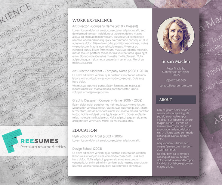
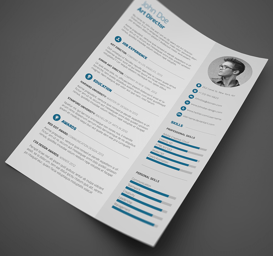
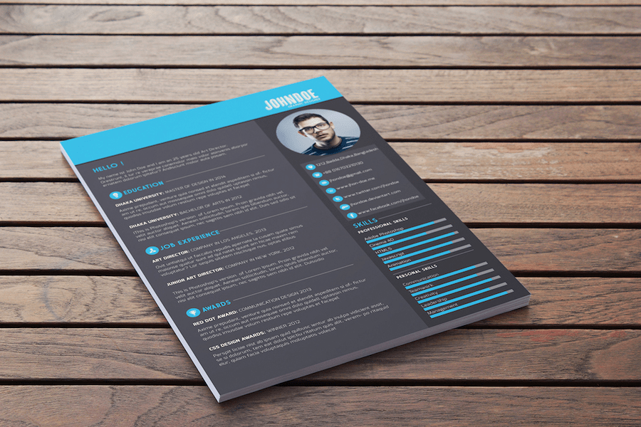
A good idea, in this case, is to use a page-long sidebar. It will help you separate the general info from your education, experience, and skills visually. As an example, look at the perfect resume with a sidebar.
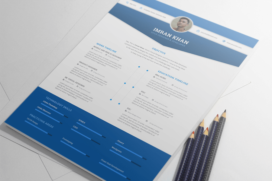
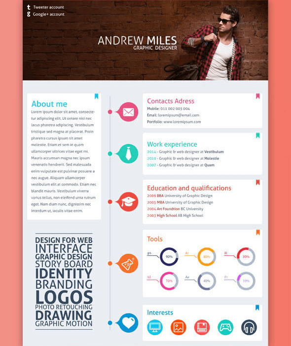
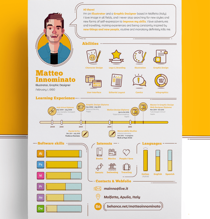
You can also use a timeline to list the main milestones in your education and previous work like in this resume design.
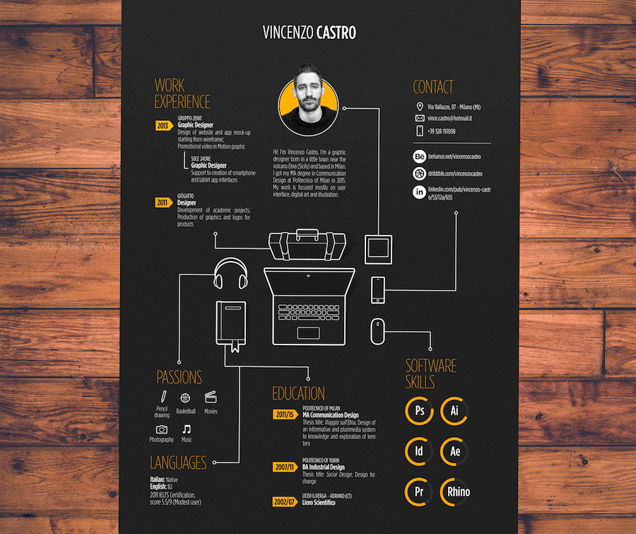
3. Draw Attention to the Important Info with Infographic Elements
One of the secrets that Julie revealed to me is that most recruiters are negligent lazybones (hope it will stay between us). They don’t dig deep into every CV to think over each word written there. They just scan the text. The only person who is interested in reading your CV from A to Z attentively is YOU. No one else cares too much unless a company has a serious shortage of manpower.
The important info like your skills must stand out among the other data. Otherwise, it may get lost among the other text, and recruiters will overlook it.
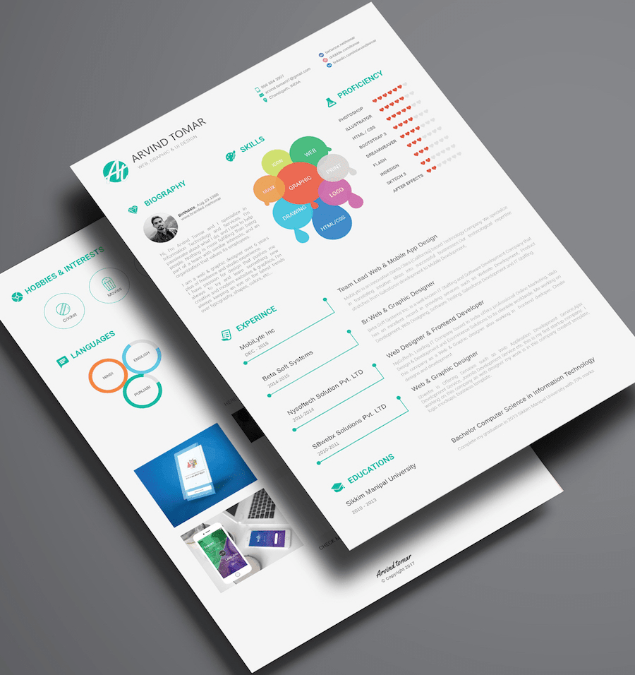
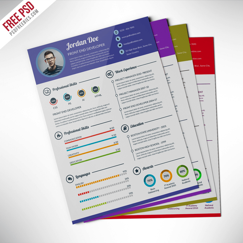
In this designer resume, skills come into view instantly due to colorful graphs.
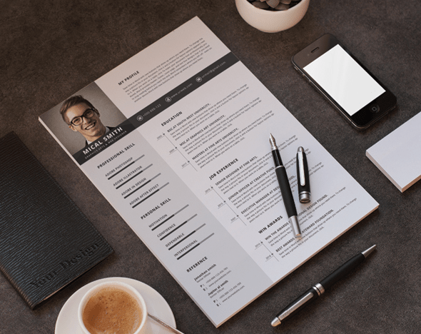
You can also use horizontal bars to show your professional and personal skills.
4. Reduce the Amount of Text with Icons
There are some pieces of information that you can present visually. Not only will it keep your CV less text-heavy, but it also attracts attention to those details.
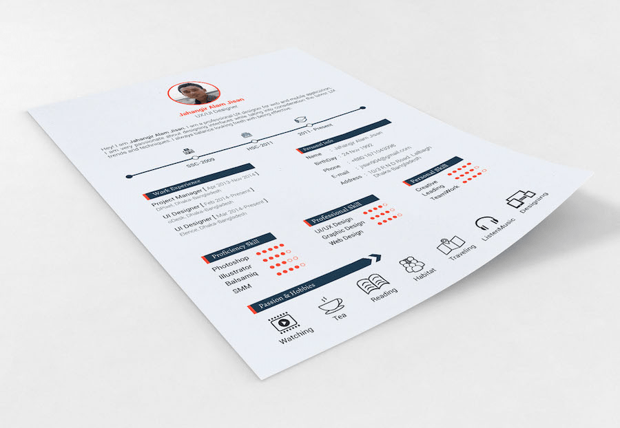
For example, hobbies and interests are shown with icons at the bottom of this CV. It’s a great final word. Unless your interests have something to do with the position you apply for, it makes no sense to waste the layout space for describing each of them in words. We all love music, movies, traveling, and many other things. Who cares about that?
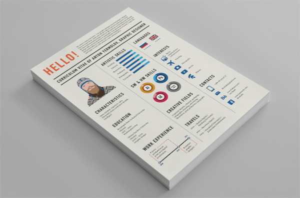
Besides interests, you can also use icons to list your contacts like in this graphic designer's resume. Note that the languages the candidate speaks are also shown visually, by means of national flags.
5. Visualize Your Resume with Images
Your main goal is to make your resume perfect, eye-catching and interesting by all means so that recruiters wouldn’t send it to trash. Using images is a surefire way to achieve that goal.
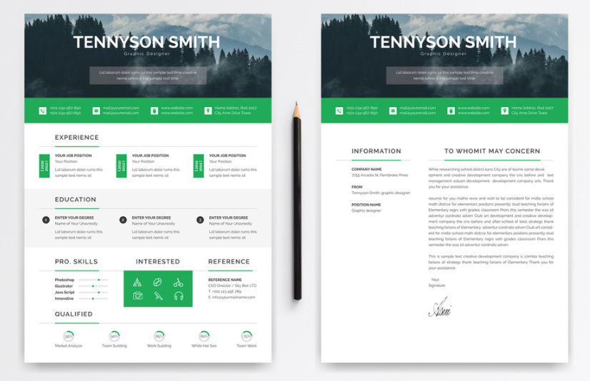
In this CV, a page-wide header image is used to present the content on a visually appealing background. Note that interests are shown with small circular images, which can be a good alternative to icons.
6. Look Stylish with Geometric Shapes
Looking stylish is a must not only for applicants to fashion and beauty companies but for everyone else. One of the best ways to get an edgy look is to use geometric shapes.
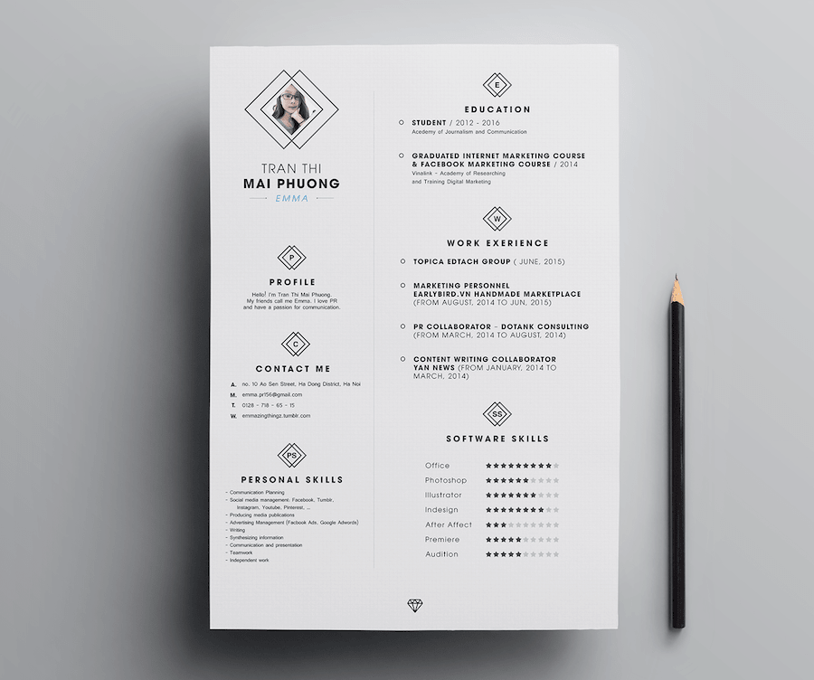
Here is a perfect resume to demonstrate this trend. A rhombus element presents each section, which improves the content hierarchy. To keep harmony, the candidate’s photo is framed in a rhombus too.
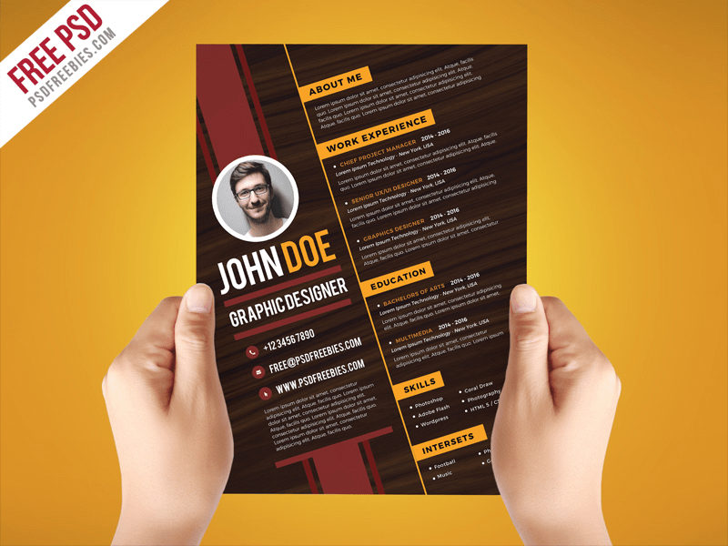
What also can give your CV a sense of style is a background with skew lines.
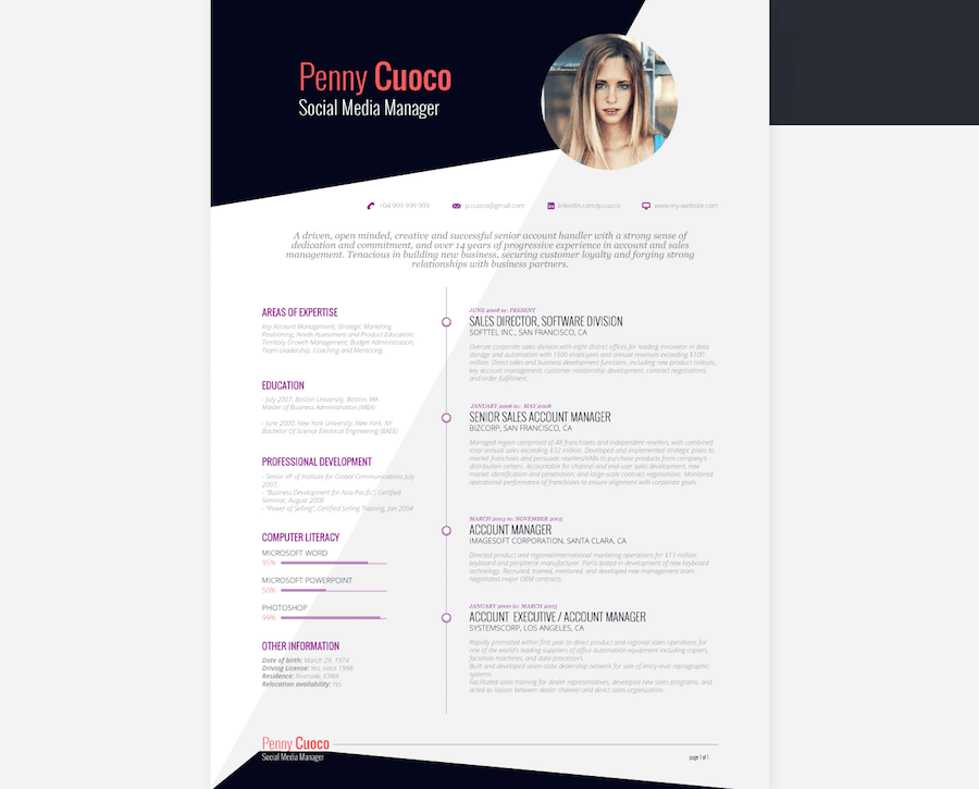
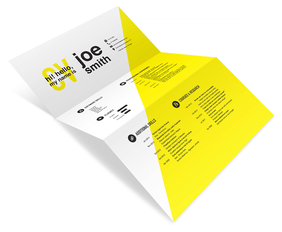
You can also divide your resume background diagonally as shown below.
To step aside from cliches, consider an idea to keep your CV layout oblique.
7. Focus on Readability with Simple Fonts
Let’s face it. Your CV is not the place to dick around. The next of our tips for a good resume is to use simple fonts only, which will ensure maximum readability. Some recruiters may read your CV at the end of the day. They will hate you if you make them strain their eyes to understand your writing. Using arty-crafty fonts like Gothic increases the chances of your CV going to trash.
8. Keep Your CV Clean with White Space
The perfect resume is easy to the eye. Otherwise, recruiters will blow out their eyeballs, which will give them another reason to give up on you. To keep your CV user-friendly, use some clean space between blocks.
9. Highlight Resume Details with Colors
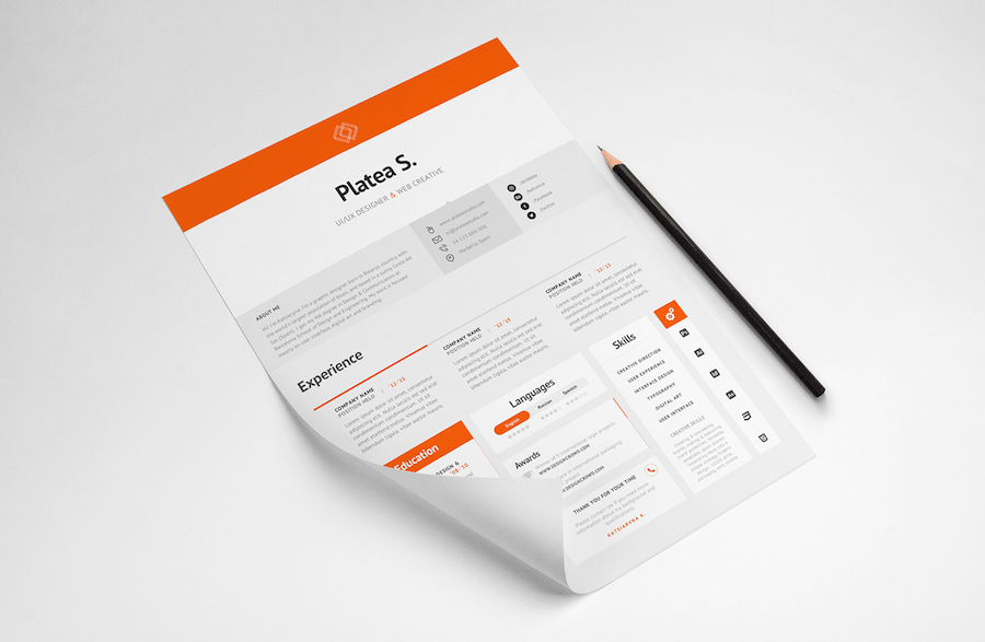
Another effective way to accentuate some resume details is to use colors. If you stick to minimalism, use only one color like below. Colorful elements guide an eye across the layout and make the info more scannable.
You can also highlight different details in different colors. It will make them distinct from each other.
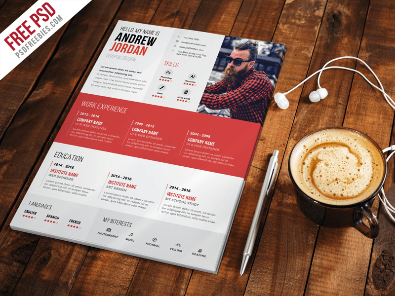
In addition to separate details, you can color the entire section to bring it to the forefront. In this designer's resume, the most important section with the candidate’s experience catches an eye immediately.
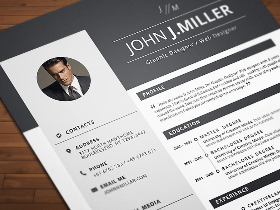
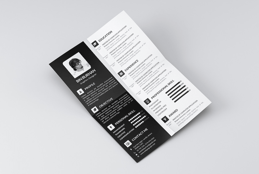
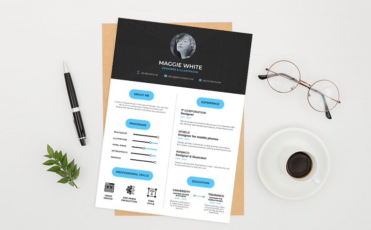
Depending on the position you apply for, you can also go with a black and white palette. This is a timeless color combination that will never go out of date.
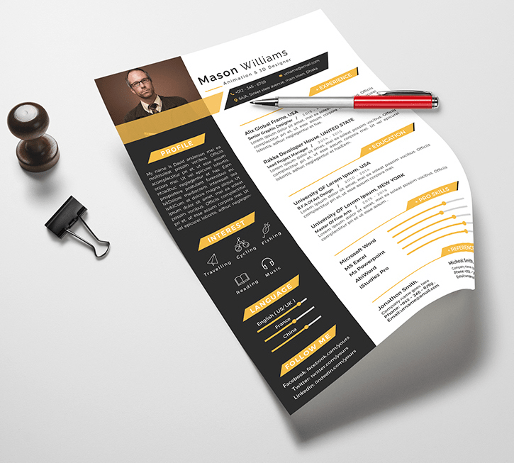
A Million Dollar Resume Tip! Be careful with using a dark background. Sometimes HRs print out CVs to take them to the interview or give to project managers. If you use black backgrounds, your CV will consume a lot of ink, which may create an unfavorable impression of your candidacy. How much ink do recruiters need to waste on, say, 30 resumes like this one even though it looks professional and has a thought-out structure?
10. Personalize Your Resume Design
There are cases when nothing sets a candidate apart from the faceless mass. Come on, your CV is the only way to introduce yourself to employers. You must personalize your resume design with your photo, a catchy tagline, logo, links to social accounts, etc.
Besides a traditional small photo framed in a circle or square, you can use a page-wide picture of yourself in the header. Here’s a great example.
Important Note about Photos. When adding your photo, use only a professional one, not the unsuccessful picture most of us have in our passports and driving licenses. Some bitchy recruiters may not want to see an ugly face every morning, and we all understand what that means for you.
11. Stick into Recruiters’ Minds
Another curious thing Julie told me is that recruiters have short memories, that’s why your resume must be memorable. To become a forget-me-not, add some creativity to your CV, especially if you try to get a job in spheres like graphic design.
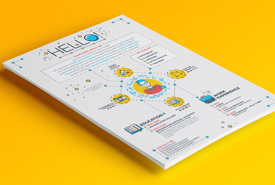
This graphic designer resume gives an opportunity to show your creative potential without even sending examples of your work.
If you apply for a position related to software or hardware, this resume design with sketchy devices is an ideal option.
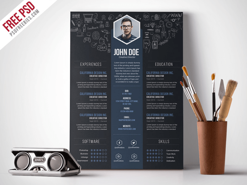
Are you afraid of overdosing your CV with creativity? In such a case, you can add a creative touch to a certain layout area and keep the rest formal. This resume has an inventive header background with hand-drawn items related to the position applied for.
12. Keep Your CV Formal If Your Profession Requires That
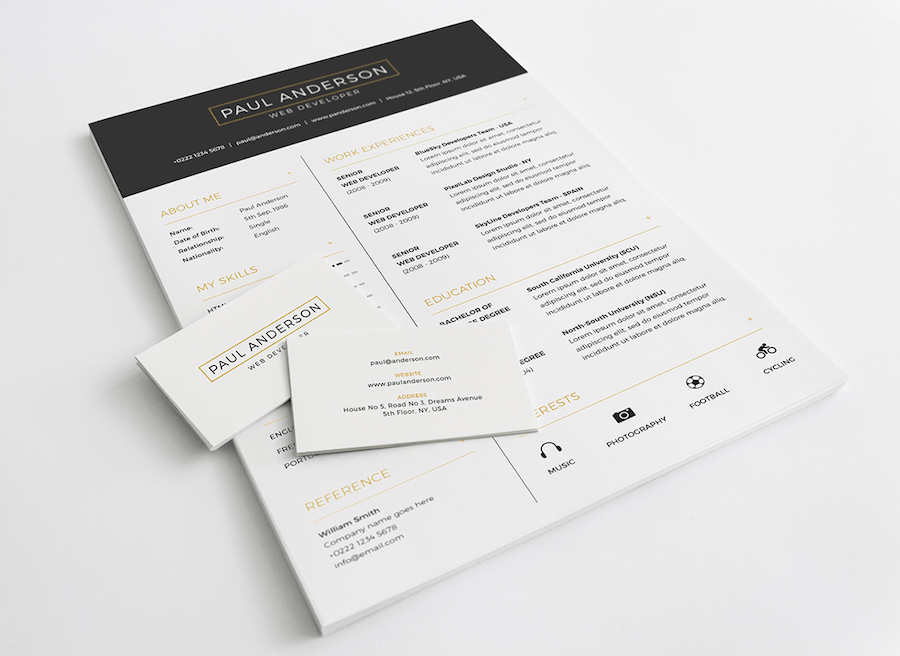
What works for graphic designers may not work for financial experts. Sometimes a hand-drawn style is simply inappropriate. If you want to get hired as an accountant, lawyer or, say, insurance agent, you’d better stay more formal as shown below.
Every day recruiters of TemplateMonster and other companies receive tons of resumes that look all the same: a typical multi-page Word doc with a white canvas and black text. Scanning through dull and alike resumes makes recruiters sleepy very fast. And when they are in that condition, they can overlook important details and make wrong choices. Don’t let that happen. Create an outstanding resume design that will engage recruiters in your candidacy.
College 2020 Resume Template
To create a bright, memorable resume, the College 2020 template was specially developed for you. Ready-made design and structure, quick launch of the site.
This online product is elaborated for a constructive and perfect resume.The styling and basic settings of this model have already been developed. The site management system is easy to use, so the timely publication of information will not be a problem for you.
The web layout is made in white-black color basis. In the header of the site there is a place for your photo. Under the portrait is the student’s personal information.
Brief information about education, employment, professional qualities, work experience, the list of computer programs that a candidate can use are placed in the white field of the pattern.
MotoCMS service will alter the background and coloring of the site within 24 hours at the request of the user. You can choose a hue using the circles of yellow, green, pink, blue, gray colors located on the side panel.
You may purchase a standard and commercial license.You can buy with them additional offers:
- Personalize CV;
- Changing Color Scheme;
- Writing Services;
- Reference Page;
- Icons Set.
The proposed function is used to upload your photo, help in changing the background color, entering the necessary data into the resume template, for sending it in time no more than 2 working days to your employer.
This product will help in modifying the color project to your taste and writing a one-of-a-kind text with a volume of 500 words.
Now you know how to correctly create a resume that will help you find vacancies.
The Perfect Resume Checklist
But remember! When you try to stand out among other candidates, you must know where to draw the line. After reading this post, you may be inspired by multiple ideas. Make sure you can stop before you turn your CV into an eyesore with a tasteless palette and unreadable text.
Look how skillfully you can implement all these tips on how to make the perfect resume. Can you suggest your own tips? Feel free to do it in the section of comments.
Don’t miss out these all-time favourites
- The best hosting for a WordPress website. Tap our link to get the best price on the market with 82% off. If HostPapa didn’t impress you check out other alternatives.
- Monthly SEO service and On-Page SEO - to increase your website organic traffic.
- Website Installation service - to get your template up and running within just 6 hours without hassle. No minute is wasted and the work is going.
- ONE Membership - to download unlimited number of WordPress themes, plugins, ppt and other products within one license. Since bigger is always better.
Get more to your email
Subscribe to our newsletter and access exclusive content and offers available only to MonsterPost subscribers.


Leave a Reply
You must be logged in to post a comment.