

In doing this roundup we wanted to see how online retailers approached the layout of their shopping cart pages. Such pages are so critical to the customer purchase process, however, they often feel as if being thrown together without much concern. Yes, the shopping cart page is very hard to design well.
Ideally, it should include product summary, promocode field, multiple paying options, shipping methods, final pricing, privacy and return policy, complementary products, continue shopping or proceed to checkout links, and more of this important stuff.
Shopping cart must be considered carefully during the design process because the future success of your work directly depends on how well you manage to drive customers to the checkout stage.
UI Tips for Web Design Enthusiasts: Free E-Book
The main objective of each shopping cart page is to lead the customer to the checkout, but how you can do it more effectively?
This article was first published in 2011 when we picked 42 well-known online stores to analyze them and bring you the statistics on their cart usability. But times change and the approach to shopping cart design has changed too. So, we decided to visit the same online stores once again to check the changes made to their shopping cart pages for the past 4 years. Surprisingly, most of the pages became simpler and more minimalist. You won't see arrows and additional icons even on the buttons of the largest eCommerce stores, and a laconic "Checkout" is now used more often. Today's examples illustrate that online retailers mostly:
- highlight the checkout button with color (26 times);
- sometimes they embed visually complementary arrows (4 times);
- or add shopping cart icons (1 time) to the textual call-to-action.
Plus, the checkout button inscriptions may be different:
- in the majority of cases we see word 'checkout' (24 times);
- other popular words are 'proceed to checkout' (10 times);
- 'proceed to purchase' (2 times);
- 'proceed with your order' (1 times);
- 'go to checkout' (1 time);
- ‘proceed’ (2 times);
- ‘check out now’ (2 times);
- ‘begin checkout’ (1 time).
Security seals became particularly popular as they increase trust and credibility of a store in 50% customers. In a study conducted by Baymard Norton appeared to be the most trusted one with 35.6%, McAffee is a runner-up with 22.9%. Still, only 12 stores from our list use such seals.
When the users choose to checkout, they need to be presented with a final list of items on the order, as well as options as to how they want to pay. You may see that not all the shopping cart pages in this list include the logos of credit card next to the payment option; this aspect, however, would have been highly convenient. Plus, consider - a good shopping cart needs to have secure seals (we spot them scarcely here) to ensure safe transactions and good security standards.
Considering all these aspects would be lot better from a customer standpoint, so it is definitely important to really take the shopping cart to the right level. Now you can get some useful ideas from observing how other shopping bags are created. We've helped you out a little bit by gathering up 40 examples that represent efficient shopping cart designs. There are no doubts that they provide customers with a pleasant purchasing experience.
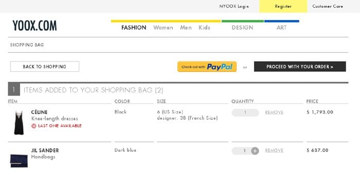
1. Yoox.com

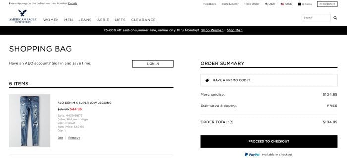
2. AE.com

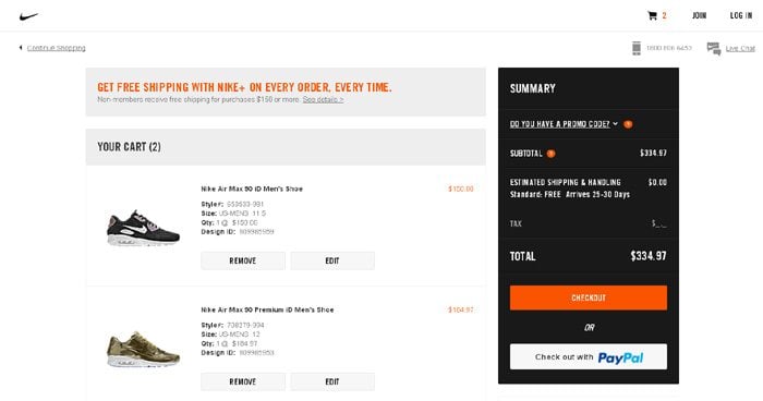
3. Store.Nike.com

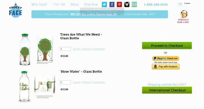
4. FaucetFace.com

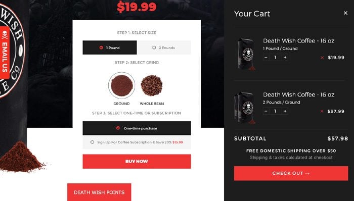
5. DeathWishCoffee.com

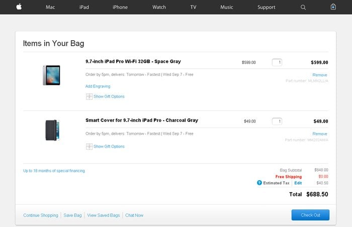
6. Store.Apple.com

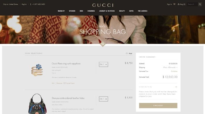
7. Gucci.com

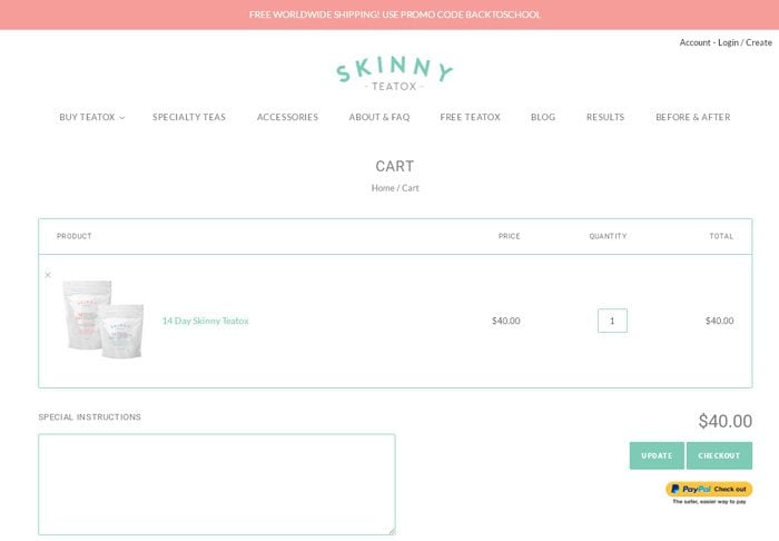
8. Skinny-Teatox.com

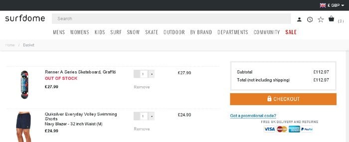
9. SurfDome.com

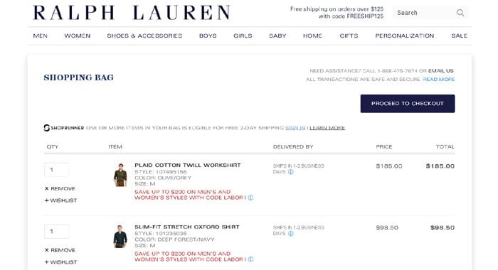
10. RalphLauren.com

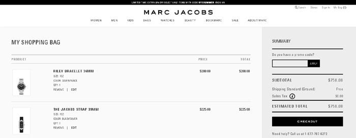
11. MarcJacobs.com

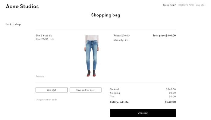
12. Shop.AcneStudios.com
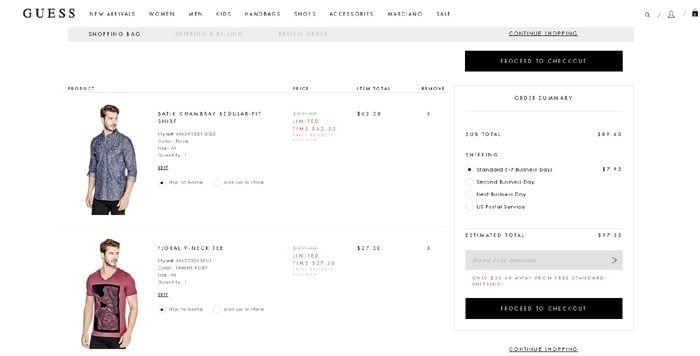
13. Shop.Guess.com

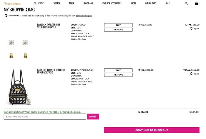
14. JuicyCouture.com

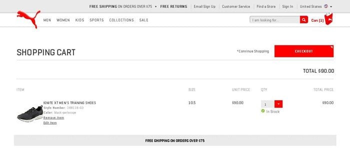
15. Shop.Puma.com

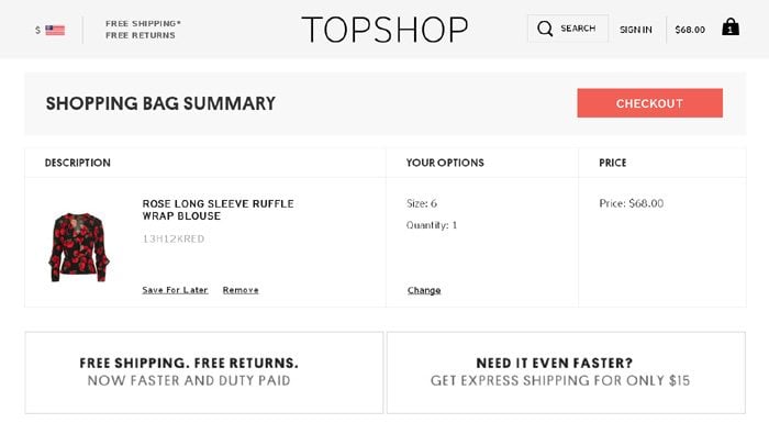
16. TopShop.com

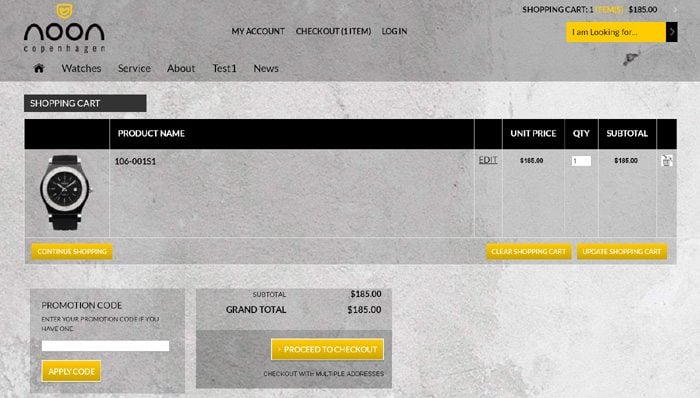
17. NoonCopenhagen.com
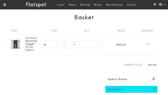
18. FlatSpot.com
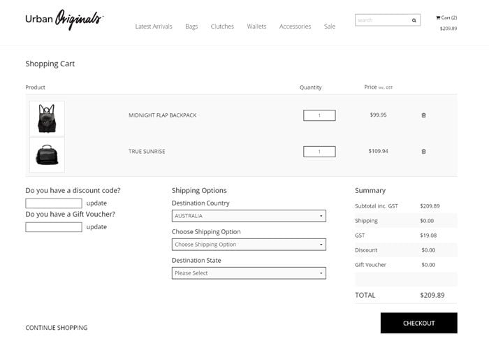
19. UO.com.au

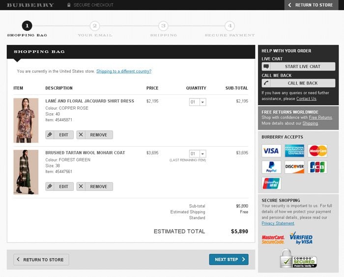
20. US.Burberry.com

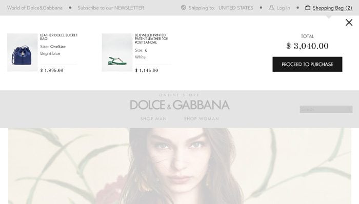
21. Store.DolceGabbana.com
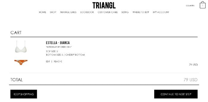
22. Triangl.com

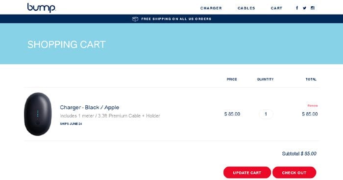
23. NeedaBump.com

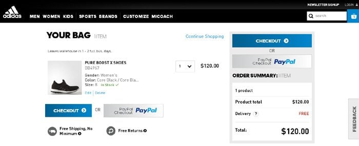
24. ShopAdidas.com
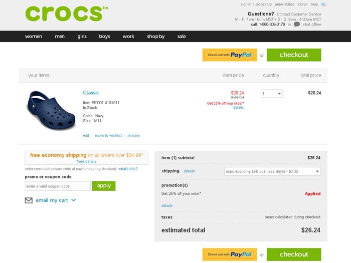
25. Crocs.com

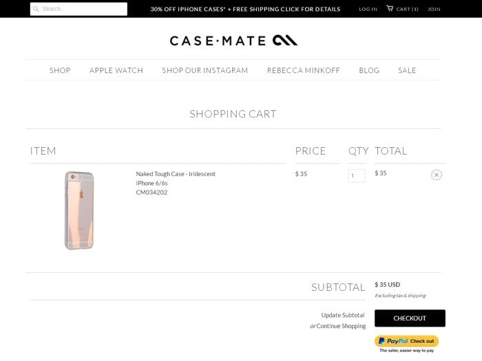
26. Case-Mate.com
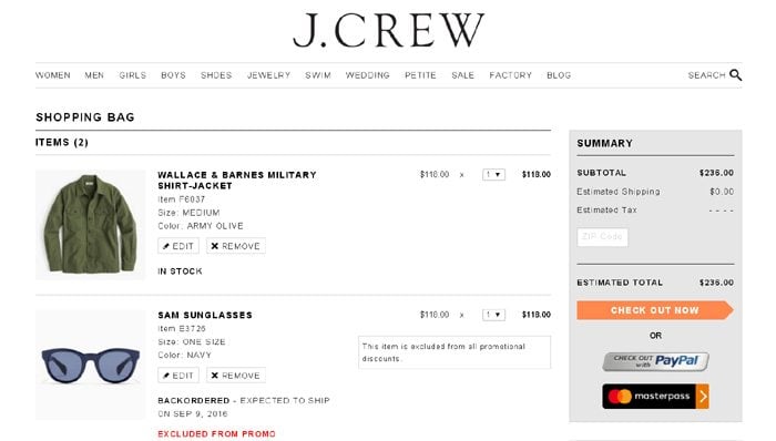
27. JCrew.com
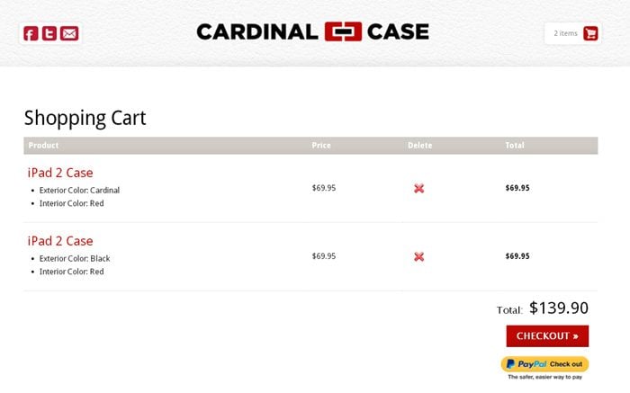
28. CardinalCase.com

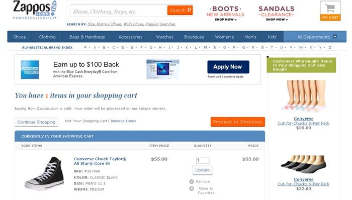
29. Zappos.com
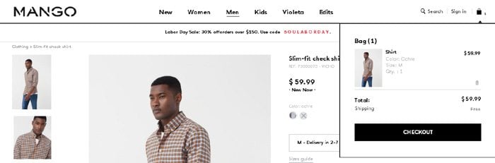
30. Shop.Mango.com

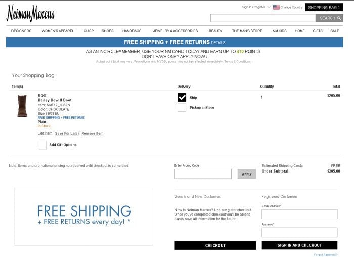
31. NeimanMarcus.com

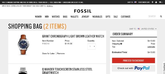
32. Fossil.com

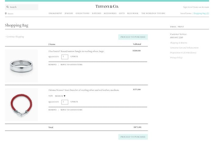
33. Tiffany.com

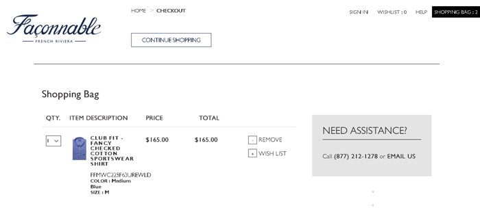
34. US.Faconnable-Store.com

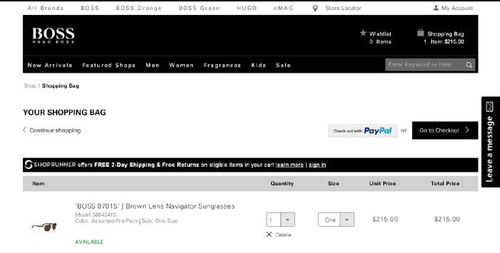
35. Store-US.HugoBoss.com

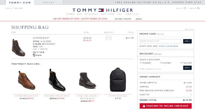
36. USA.Tommy.com

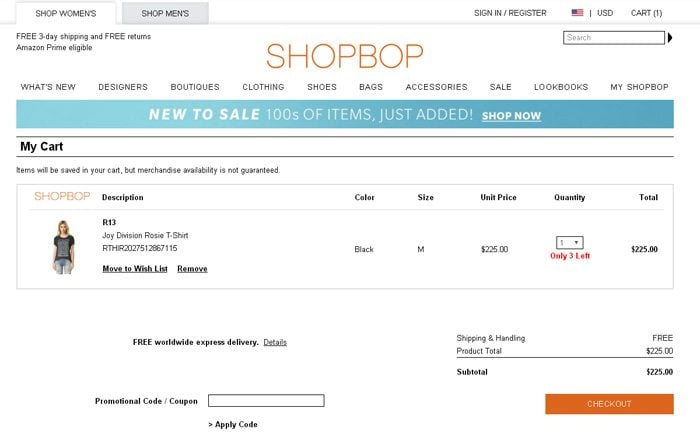
37. ShopBop.com

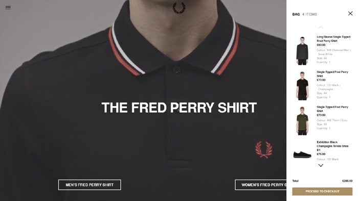
38. FredPerry.com

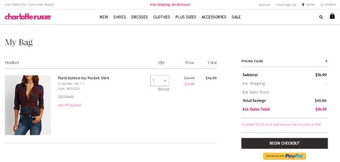
39. CharlotteRusse.com

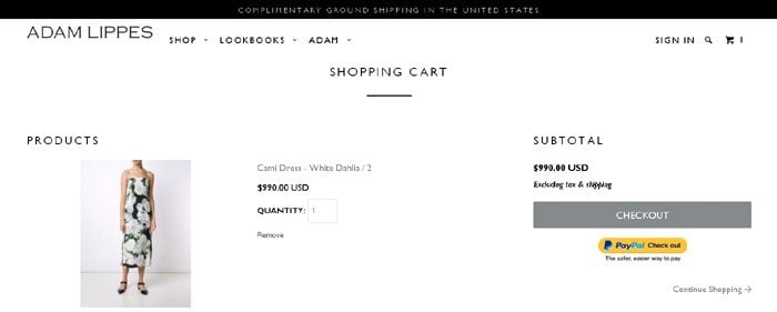
40. ShopAdam.com

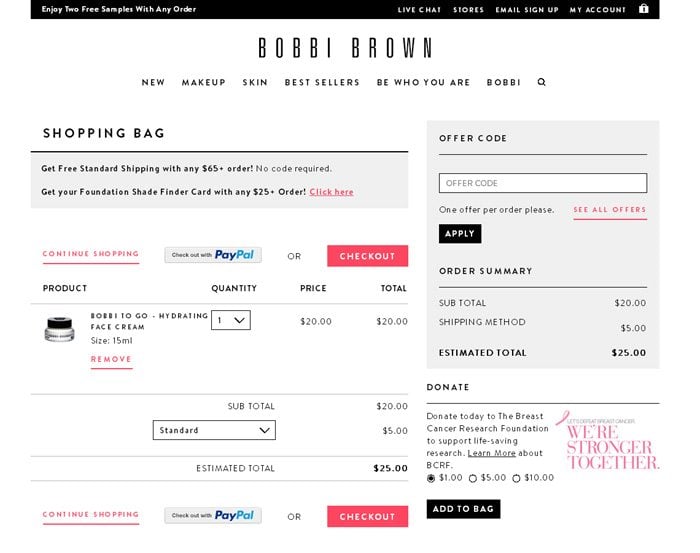
41. BobbiBrownCosmetics.com

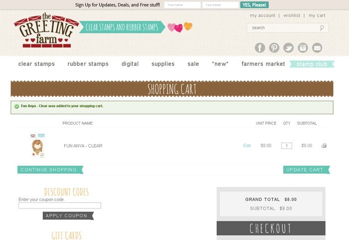
42. TheGreetingFarm.com

All aspects of a shopping cart design are important. Here’s the checklist you may have at your disposal to compare and see whether your cart is adequate.
1. Product summary – there should be an image of the product, its name, additional descriptions (size, color, etc.), items quantity, price, an ability to remove the item from the shopping cart or edit its features like size, color, or price.
2. Shipping methods – do you include them, mention the difference among the options, indicate their prices?
3. Promo code field – if you allow using the promo codes, make sure that you have a section for it on the shopping cart page. As the promo code decreases the price – that will positively affect the customer’s purchase decision.
4. Final pricing – whether you have it or not, does it include the cost of all products in the cart + delivery. The customers must see the total amount of money they need to pay for the order, to avoid unpleasant surprises within the checkout process that may cause a sale break.
5. Multiple paying options – if you accept different payment options, you should include them all, but you must not burden the customer to make a decision out of 10 payment systems. Ideally, you may offer two payment options, which are most popular among your customers. If you are the USA-based retailer, it's a must to have PayPal as a payment option since it's the most popular payment system in the US. However, it is not overall suitable, plus it has a high percentage rate for card processing. So, you'd better offer additional payment option that will accept payments through credit cards. Consider adding icons next to your payment options (PayPal icon, credit card icons). Thus, the customers are assured that you have a trustful store and they can carry on payments themselves.
6. Secure seals – if you have The VeriSign Seal or McAfee Secure Seal, you need to place them on the shopping cart page. This would be an extra sign that customers can trust you. These seals are however available as payable options. The free alternative is to place on the checkout button an inscription – 'Proceed to secure checkout.'
7. Privacy and return policy – remember to include the links to these pages. It is also preferable that they are opened as pop-ups (not as new tab pages), so that customer will not abandon the page.
8. Complementary products – offer complementary products, which is needed to be done to increase your average sale or 'transaction value.' Yet remember, to maximize the result the products must be really complementary, not the ones that remain unsold in your store. A better way is to offer a discount for the complementary product, and one more important point – the price for the complementary products should be less than 50% of the main product price. Thus, the customers will feel comfortable to spend an extra sum of money to improve their experience with the main product. Plus regarding that you offer a complementary product discount – the total sum will not therefore much exceed the amount of money a client was intended to spend.
9. Continue shopping – this is a highly important link to include as it gives customers an opportunity to keep on filling their shopping cart with more products.
10. Proceed to checkout link – this is the most important button on the shopping cart page. Your task is to attract attention to it – how? You may accent the button with color, to make it the most conspicuous on the page, and bigger its size. What do you have as an inscription – boring 'checkout'? You should imply call-to-action, for instance, simple 'checkout now' or 'proceed to checkout' is far better. Note that with the help of a 'secure checkout' button inscription you can raise the trust in your eCommerce website (that is especially vital if you don't use secure seals).
To find the unique combination of design, textual stuffing, complementary products, you need to experiment. Use different inscriptions, colors, checkout button sizes, placement for complementary products, and so on. A good adviser to evaluate your work may be Google Website Optimizer we have wrote about lately.