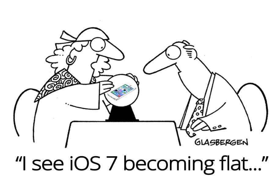
According to Apple, nearly 9 million iPhones were sold during the launch weekend for the new iPhone 5S and 5C. This is not the end, more than 200 million iOS devices have been updated to iOS 7 since its release date on Sept 18 making it the “fastest software upgrade.”
Why not? After all, iOS 7 was dubbed as the biggest thing ever since the inception of iPhone. And iOS 7 is truly a complete transformation. It has bid farewell to skeuomorphism and gone flat. Chrome, navigation buttons, and textured title bars have been replaced with gesture-controlled navigation and single-colored panels. It is now no longer about mimicking real-life objects.
You don't have to go through layers and layers of navigation to get specific information or click back button repeatedly to access another part of the app. Undoubtedly, this is one of the most significant changes.
However, in this mad rush to roll out iOS 7 compatible apps, developers have taken the concept of flatness a bit too far. It is important to remember that your app will be used by both baby boomers and millennial generation. With very less chrome, it is likely that different content can blend together to cause chaos and confusion for the less savvy mobile user. Your user is likely to wonder what needs to be done next tap or touch? A bit of skeumorphic cues will help such users a great deal in not missing out the buttons or parallel hidden planes of apps.
Here are a few quick tips that will help you take a plunge into Apple's all new flat world:
- Update the app icon (120 x 120 pixels) and launch image in app
- Provide support to retina display
- Adopt translucent UI elements
- Redesign custom bars
- Support borderless buttons
In this article, I have compiled a list of apps that have effortlessly adopted the flat look and have created buzz among both users and tech experts alike.
Changes on Facebook are geared towards highlighting content. Navigation bar at the very top is now translucent making it more context driven. Several icons have been redesigned. With this change, Facebook tries to make a sincere attempt to curb the infinite scroll of the previous app by incorporating a row of fixed icons at the bottom of screen. This makes the app easy to maneuver.
Twitter's iOS 7 optimized app has a flat toolbar on top and a host of new buttons that simply and gracefully appear as symbols drawn flat on its background. In a move that surprised many, the four buttons at the very bottom of the screen for Home, Connect, Discover, and Me have been retained.
Fancied up icons and updated UI all amalgamate beautifully and work flawlessly with iOS 7. Tan background makes way for larger content entries. The “fresh coat of paint on Foursquare” and several tweaks make Foursquare app align with iOS 7's flat feature.
Evernote takes few drastic steps to adopt the flat aesthetic. It has shunned its background and textured title bar. In a bid to allow easy access to books, tags, notes, as well as announcements tabs and shadows have been eliminated from the home screen. There are several other improvements such as quick note shortcut, image annotations and AirDrop note sharing.
This immensely popular and addictive connect-the-dots style iPhone game has embraced the flat look concept to the core. It has minimal design elements with a soothing pastel color system that compliments the new paradigm shift.
Hipmunk sports an elegant, clean, and simple look devoid of all elements that distract. The focus is to allow users to find a flight or hotel. This flight search app has flattened out completely, knocking off shading as well as depth from its navigation chrome.
Reeder, a news-reading app, recently launched a brand new app Reeder 2. It is evident from the design that the new app is in sync with Apple's latest flat evolution. It is neat, intuitive and extremely minimal. Striking simplicity leaves you to focus on what you're reading and nothing else.
Yahoo Weather can proudly flaunt its iOS 7 flat design. In fact, this app was one of the first apps to adopt the much talked about flat look. Yahoo collaborated closely with Apple to integrate its new design into iOS 7's default app for weather.
This read-it-later app has brushed off its title bar clear of texture and eliminated chrome (at least a major part of it) to give a feel of stories floating around without any form of restraints.
This highly rated app which allows you to make and share payments has got away with its side bars and stripped down its buttons.
